Specialist AI for Fitness Comparison Website Template
Pulse is a single-page fitness AI chatbot landing page built around a Problem-to-Solution Arc. It features a Feature Tab Switcher header, a side-by-side comparison table, case-study cards, and a chat-screenshot proof section. The design uses a dark Dashboard Pro theme with an Acid Digital color system, targeting intermediate lifters, remote coaches, and competitive CrossFit athletes.
by Rocket studio
Quick summary
Pulse is a click-through landing page template for a fitness AI chatbot. It guides visitors from recognizing their training plateau straight to a free-trial signup. The page uses a Feature Tab Switcher header, a sharp comparison table, and a chat-screenshot section to prove AI intelligence before the visitor ever clicks.
Who this template is for
This template is built for fitness tech founders, app developers, and coaches who are launching or marketing an AI-powered training product. It speaks directly to the people that product serves, so the page converts at the moment a visitor recognizes themselves in the copy.
- Intermediate lifters who have hit a training plateau and need smarter program adjustments
- Remote coaches managing thirty or more clients through spreadsheets who want to demonstrate a better tool
- Competitive CrossFit athletes who require daily periodization that no manual process can keep up with
What problem this template solves
Most fitness product pages tell visitors what the AI does without showing them what life looks like without it. That gap kills trust and kills conversions. This template uses a direct comparison structure to make the contrast impossible to ignore.
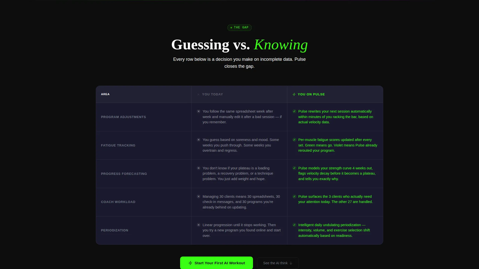
- Visitors cannot see the difference between guessing and data-driven training until a side-by-side table forces the comparison
- Skeptical buyers leave before they click because no page section ever proves the AI reasoning is transparent
- A generic hero section fails to qualify the right audience quickly, wasting attention from the people most likely to convert
What you get with this template
The template delivers a fully structured, single-page layout with every section pre-built and connected into a logical scroll journey. The visual identity, interaction pattern, and copy architecture are all defined in the brief, so there is no guesswork about what goes where.
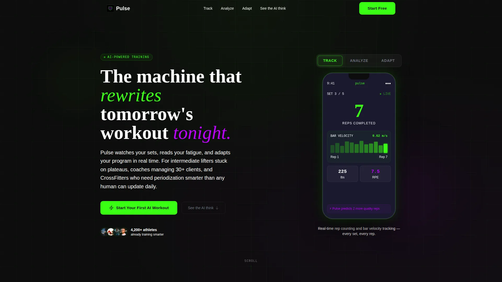
- A Feature Tab Switcher header with three interactive dashboard views inside a phone mockup
- A Problem-to-Solution comparison table, three case-study cards, and a chat-screenshot proof section
- A primary call-to-action button that carries UTM data and a secondary anchor link for skeptics
Feature list
The template includes six purpose-built sections and interaction patterns grounded directly in the source brief. Each component serves a specific role in moving a visitor from awareness to action.
Feature Tab Switcher Header
Three clickable tabs labeled "Track," "Analyze," and "Adapt" each reveal a different dashboard view inside a phone mockup. The active panel glows at the edges, and tabs pulse with terminal green on hover, giving the header immediate visual energy.
Side-by-Side Comparison Table
A "You Today" versus "You on Pulse" table anchors the first section below the fold. Three rows cover program adjustments, fatigue tracking, and progress forecasting, making the gap between guessing and knowing concrete and personal.
Case-Study Result Cards
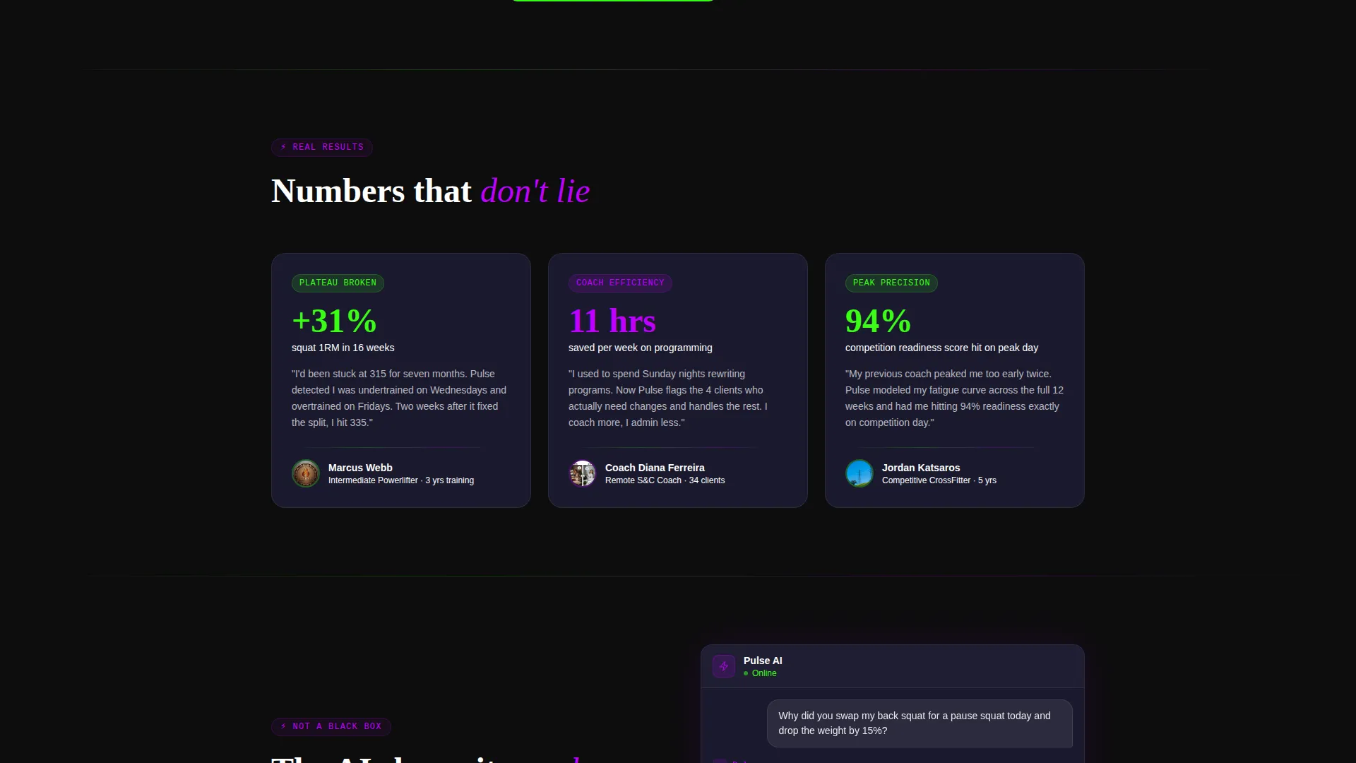
Three short cards stack below the comparison table, each showing a real percentage gain tied to a specific training outcome. They provide social-proof momentum right after the comparison lands its argument.
AI Reasoning Screenshot
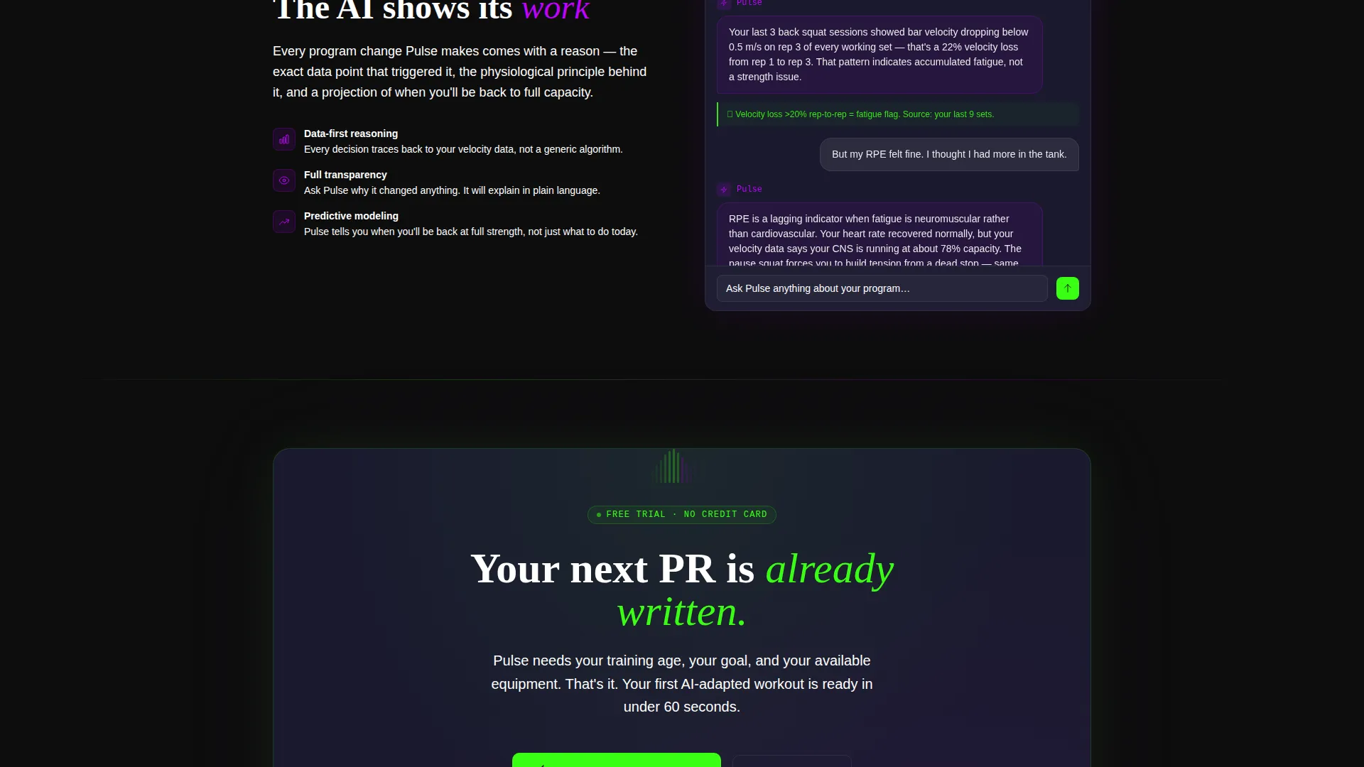
A single chat screenshot shows the AI explaining exactly why it changed a user's squat day. This section addresses the "black box" objection directly and is the scroll target for the secondary text link "See the AI think."
Primary and Secondary calls to action
The main call-to-action button "Start Your First AI Workout" appears in terminal green after the comparison table. It repeats as a sticky bottom bar on mobile. A secondary text link anchors skeptical visitors to the proof section before they decide.
UTM-Ready Click-Through Flow
The primary button carries UTM data and drops the visitor into an onboarding flow that asks for training age, goal, and available equipment. There is no form on the landing page itself, keeping friction at zero.
Page sections overview
| Section | Purpose |
|---|---|
| Feature Tab Switcher | Hero header showing Track, Analyze, and Adapt dashboard views |
| Comparison Table | Contrasts current training habits with AI-guided outcomes |
| Case-Study Cards | Stacks three proof cards with percentage performance gains |
| AI Chat Screenshot | Proves AI reasoning is transparent, not a black box |
| Primary call to action Block | Terminal green button driving visitors to free-trial signup |
| Sticky Mobile Bar | Repeats the primary call to action persistently on mobile scroll |
Design & branding system
The template uses a Dashboard Pro theme powered by the Acid Digital color system. Every color has a functional role, so the visual language communicates meaning, not just style. The overall feel is dark, reactive, and almost bioluminescent, like a heart-rate monitor spiking under UV gym lights.
- Void black (#0D0D0D) as the page background makes every element float like pixels on an OLED screen
- Terminal green (#39FF14) drives data readouts, positive metrics, and call to action buttons; electric violet (#BF00FF) marks AI-generated recommendations
- Interface gray (#1A1A2E) surfaces card backgrounds, keeping content areas distinct without breaking the dark atmosphere
Mobile & speed optimization
The template is designed with mobile behavior built into the layout logic, not added as an afterthought. The sticky bottom bar ensures the primary conversion action is always reachable on smaller screens during a fast-paced gym scroll session.
- The sticky mobile call to action bar repeats "Start Your First AI Workout" persistently as the user scrolls through the page
- The click-through structure removes all on-page form fields, which keeps the mobile experience clean and reduces tap friction
- The phone mockup inside the header reinforces the mobile-native feel of the product being advertised
How this template helps you convert
Every section in this template is sequenced to answer a specific objection before the visitor forms it. The result is a page that earns the click rather than demanding it.
- The comparison table eliminates the "I already have a system" objection by showing the exact cost of that system in plain language
- The case-study cards provide social proof at the exact moment a visitor is considering whether results are real
- The AI chat screenshot resolves the trust gap for skeptics, and the secondary anchor link routes them there without disrupting the primary funnel
Other information about this template
This template is built for the fitness AI chatbot niche, sitting at the intersection of technology and AI for fitness. It is structured as a click-through landing page, meaning conversion happens off-page inside the app's onboarding flow rather than on the page itself. The layout follows a Problem-to-Solution Arc, a creative direction well-suited to high-skepticism audiences who need to be shown proof before they act.
- The template style is a Comparison Table layout, which is one of the highest-trust formats for demonstrating product value in competitive fitness and wellness markets
- The header concept, the Feature Tab Switcher, is a recognized pattern in SaaS and app marketing where showing the product in motion builds confidence faster than describing it
- This template can support marketing for AI personal trainer apps, intelligent workout planning tools, and coach-facing client management platforms in the broader AI for fitness category
Theme
Dashboard Pro
Creative direction
Problem→Solution Arc
Color system
Acid Digital
Style
Comparison Table
Direction
Click-Through
Page Sections
Feature Tab Switcher Header
Side-by-side Comparison Table
Case-study Result Cards
AI Chat Screenshot Section
Utm-ready Click-through Call to Action
Sticky Mobile Call to Action Bar
Related questions
Does this template include a sign-up form?
Can I use this template if my product is built for coaches rather than individual athletes?
What do the three header tabs show?
Who is the comparison table aimed at?
Can I adapt the color system to match a different brand?



