F&B Marketing Automation Comparison Landing Page Template
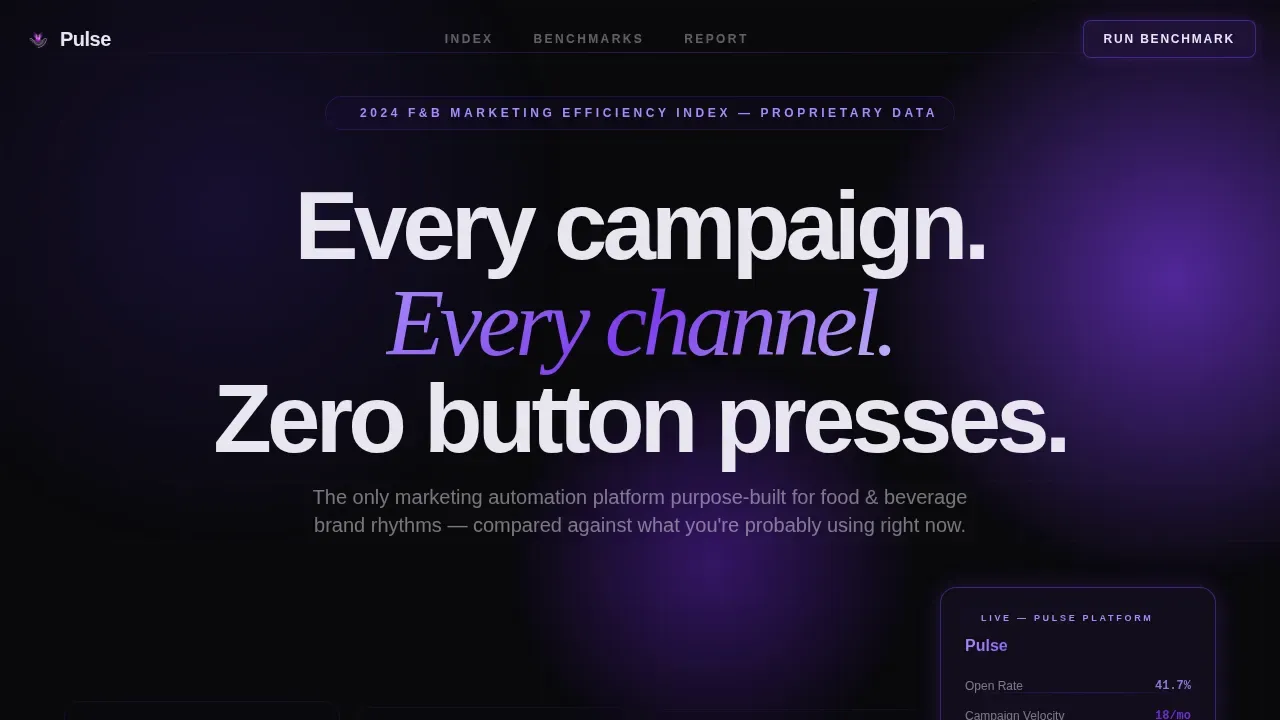
Pulse is a comparison landing page template built for food and beverage marketing automation platforms. It uses a dark Tech Glass visual system with electric violet accents, animated benchmarking tables, and a structured qualifier flow to convert CPG directors, brewery founders, and restaurant group marketers into demo-ready leads. The design reads like a proprietary industry report that makes the case before the call to action arrives.
by Rocket studio
Quick summary
Pulse is a single-page comparison landing page template designed for B2B software and SaaS platforms operating in food and beverage marketing automation. It frames your platform as the clear winner against generic automation tools, agency retainers, and manual operations, using benchmarking tables, animated data callouts, and a two-path conversion flow that captures both demo-ready buyers and report-hungry researchers.
Who this template is for
This template is built for founders and marketing leaders who sell software or SaaS solutions to food and beverage brands. It works best when your platform has a measurable performance advantage over the alternatives your buyers are currently using.
- Software teams targeting CPG marketing directors who manage twelve or more product launches per quarter and need proof before they book a demo
- Platforms selling to craft brewery founders, restaurant group CMOs, or food businesses managing campaigns across dozens of locations
- Marketers who want a Pulse automated F&B campaign benchmarking landing page template that earns the click through data before it asks for a conversion
What problem this template solves
Food marketing teams face a real credibility gap. Buyers in the food and beverage industry have seen too many vendor decks and not enough verifiable comparisons. They want to see how your platform stacks up against what they are already paying for, whether that is a retainer agency, a spreadsheet-driven workflow, or a generic automation tool. This template closes that gap by presenting the comparison as evidence, not opinion.
- CPG marketing directors and beverage industry buyers struggle to justify switching platforms without side-by-side performance data that speaks to their specific workflows
- Restaurant and brewery operators waste significant ad spend on fragmented tools that were never built for food marketing rhythms like seasonal menu changes or distributor co-op pushes
- Generic landing pages fail to showcase products and campaign metrics in a way that resonates with food industry buyers who make decisions on sales impact, not feature lists
What you get with this template
The template delivers a complete, single-page comparison experience structured around an editorial "Industry Report" creative direction. Every visual and interactive element is purpose-built for the food and beverage marketing automation market.
- A four-panel Dark Glass header with three muted competitor panels and one animated Pulse panel displaying live-style metrics including open rates, campaign velocity, and cost-per-touch
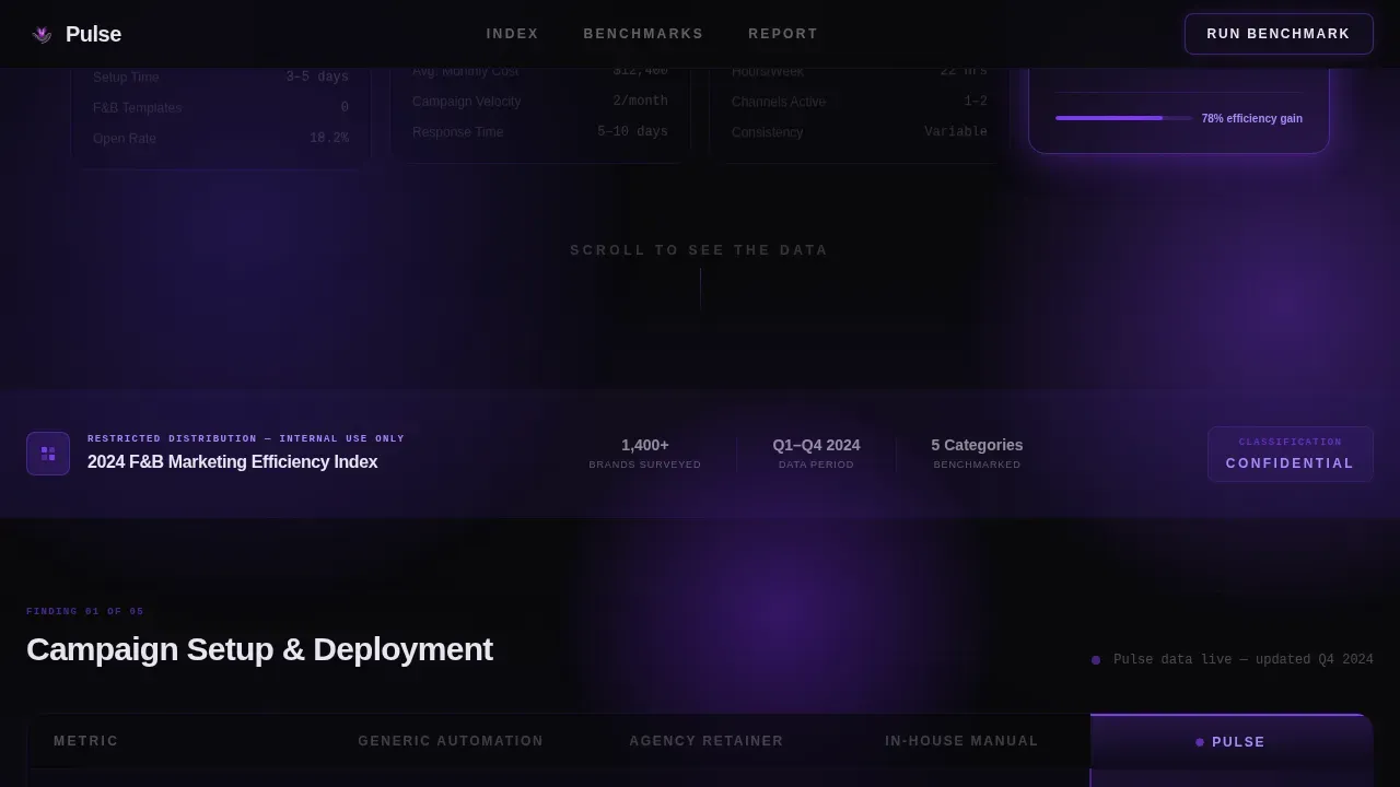
- Three structured benchmarking comparison tables covering campaign setup time, channel coverage, menu-change response speed, distributor co-op ad automation, and seasonal playbook depth, with GSAP ScrollTrigger row reveal animations
- A dual conversion flow: a primary "Run Your Free Benchmark" three-step qualifier modal and a secondary "Download the Full F&B Report" email-gated lead capture form for top-of-funnel consumers
Feature list
This section describes the built-in components and interactive capabilities included in the Pulse template. Each feature is drawn directly from the template brief.
Dark Glass Panel Header
The header presents four floating glassmorphic panels against a void black background. Three panels display competitor category labels with faint, grayed-out metrics representing generic marketing automation, agency retainers, and in-house manual operations. The fourth panel slides forward displaying animated counters for open rates, campaign velocity, and cost-per-touch, all glowing in electric violet. There is no hero image. The panels cast soft violet reflections onto the surface below, creating the feel of a darkened control room where every campaign across every channel is visible at once.
Benchmarking Comparison Tables
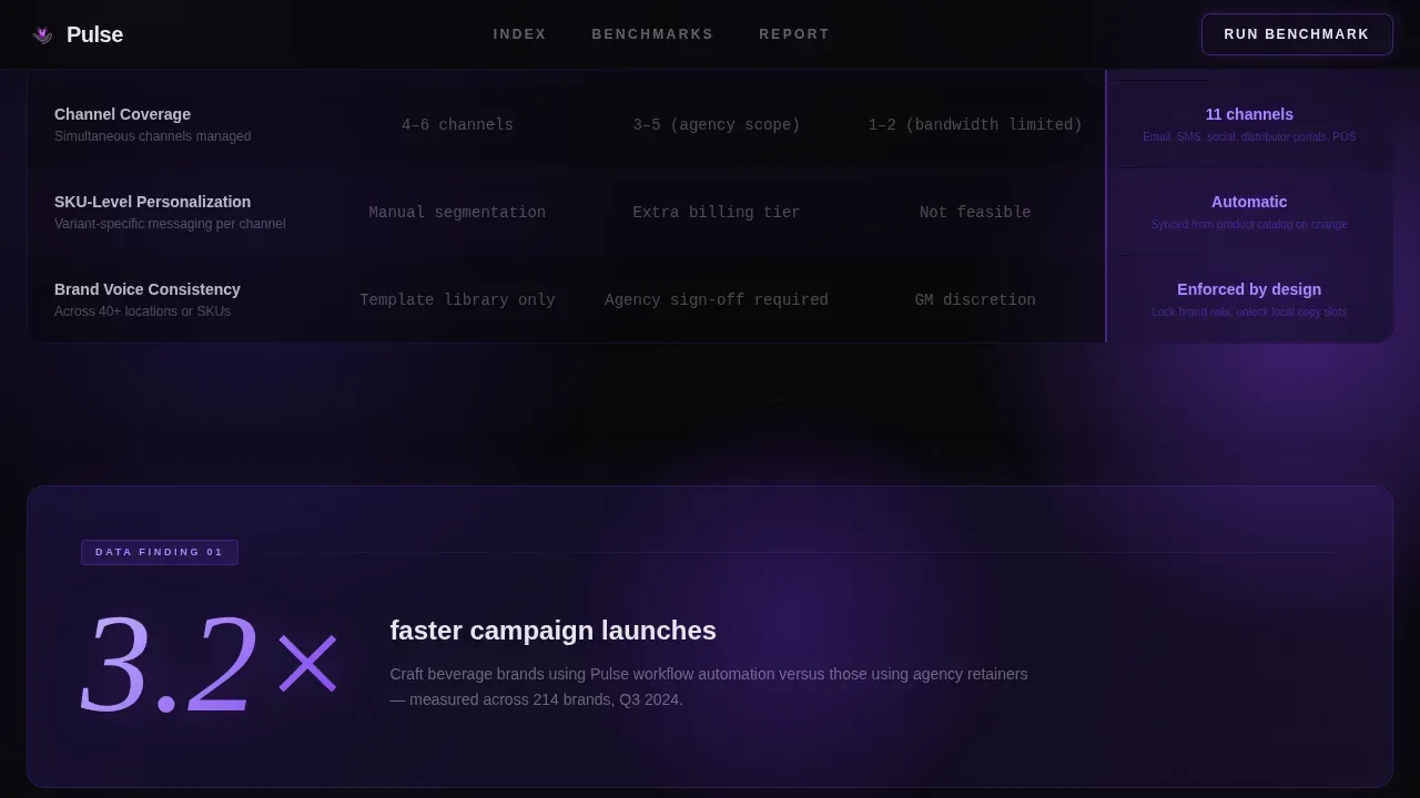
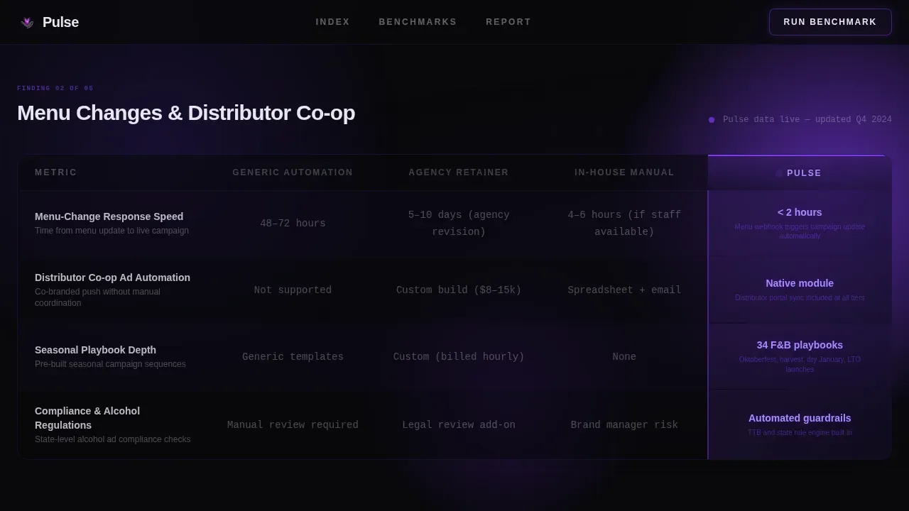
Three structured comparison tables form the editorial spine of the page. Each table row animates in like a declassified data finding using GSAP ScrollTrigger, with Pulse's column arriving last and glowing violet against competitors' muted gray. The tables cover five key food marketing performance dimensions: campaign setup time, channel coverage, menu-change response speed, distributor co-op ad automation, and seasonal playbook depth. This structure gives potential customers the side-by-side evidence they need to make confident decisions about switching platforms.
Stat Callout Cards
Between the comparison tables, single-stat callout cards present white-paper-style data findings. For example, one card states that craft beverage brands using workflow automation launch campaigns 3.2 times faster than those using agency retainers. These cards function as social proof without requiring external testimonials, lending the authority of genuine research to each scroll interaction. They help identify momentum shifts in consumer behavior and market trends that resonate with the target audience.
Three-Step Benchmark Qualifier Modal
The primary call to action opens a three-step qualifier flow inside a modal. Step one asks the visitor to identify their brand type from four options: CPG, restaurant group, brewery or distillery, and other. Step two presents a dropdown of current marketing stack options including named competitors plus manual or spreadsheets. Step three captures monthly campaign volume. This structured qualifier collects high-value data from active participants while filtering intent, making every follow-up more relevant and conversion rates measurably stronger.
Report Download Lead Capture
A secondary conversion path offers the "Download the Full F&B Report" gated behind a business email field. This path captures top-of-funnel leads who are not yet ready to demo but want the data. The footer section uses Pattern 3 in a Vercel Horizontal layout to keep the form accessible and clean. This approach supports new customer acquisition across multiple intent levels without forcing every visitor into the same funnel stage.
Floating Call to Action Bar
After a visitor reaches sixty percent scroll depth, a floating bottom bar appears with the primary "Run Your Free Benchmark" call to action. The bar remains pinned as the visitor continues reading, ensuring the conversion opportunity stays visible without interrupting the benchmarking narrative. This interactive element is built for desktop-first use, reflecting the reality that CPG marketing directors and beverage industry decision-makers typically engage during work hours on desktop screens.
Page sections overview
| Section | Purpose |
|---|---|
| Dark Glass Header | Introduces four floating panels comparing Pulse against three competitor categories with animated metrics |
| Efficiency Index Banner | Sets the editorial frame as a proprietary 2024 F&B Marketing Efficiency Index benchmarking study |
| Comparison Table One | Compares campaign setup time and channel coverage across platforms |
| Stat Callout One | Delivers a white-paper-style data finding on campaign launch speed for craft beverage brands |
| Comparison Table Two | Compares menu-change response speed and distributor co-op ad automation |
| Stat Callout Two | Presents a second benchmarking insight reinforcing platform performance advantage |
| Comparison Table Three | Compares seasonal playbook depth and cost-per-touch metrics |
| Primary call to action Block | Hosts the "Run Your Free Benchmark" button that opens the three-step qualifier modal |
| Report Download Footer | Captures email-gated top-of-funnel leads with the F&B report download offer |
Design & branding system
The Pulse template uses a Void and Violet color system that communicates authority and precision without relying on conventional food marketing warmth. The aesthetic feels like a control room, not a mood board. Typography pairs Plus Jakarta Sans for body text with Instrument Serif for accent numerals and pull quotes.
- Color palette: void black (#09090B) as the base, deep ultraviolet (#2D1B69) for layered backgrounds, electric violet (#7C3AED) for interactive highlights, table accents, and animated elements, and frosted glass white (#E8E5F0) for text and divider lines
- Glassmorphic card layers carry a subtle violet tint throughout, while comparison columns use violet gradients to draw the eye toward the platform's advantages, and all panel transitions are handled with GSAP for smooth editorial pacing
Mobile & speed optimization
The Pulse template is built desktop-first, reflecting the primary audience of CPG marketing directors and beverage industry decision-makers who engage during work hours. A mobile fallback ensures the page remains functional and readable on smaller screens.
- GSAP ScrollTrigger handles all table row reveal animations, counter animations, and panel transitions, keeping interactions smooth without layout disruption on desktop
- Server Components power the static editorial sections, while Client Components handle the interactive benchmark qualifier modal, the floating call to action bar, and the report download gate, ensuring a clean separation of rendering responsibilities
How this template helps you convert
The Pulse template is built around a Comparison and Versus conversion strategy. The page earns trust before it asks for action, using the editorial framing of a benchmarking study to make the case through data rather than claims. This approach is vital for buyers in the food and beverage industry who need evidence before they engage a vendor.
- The benchmarking table structure and animated stat callout cards build conviction across three scroll stages, so that when the "Run Your Free Benchmark" call to action appears, the visitor is already oriented toward confirmation rather than skepticism, improving completion rates on the three-step qualifier modal
- The dual conversion path captures buyers at two different intent levels: the primary qualifier flow targets high-intent users who are ready to identify their stack and volume, while the email-gated report download captures early-stage researchers who want data before committing, expanding total customer acquisition reach without splitting the page's focus
Other information about this template
The Pulse template is positioned specifically for the food and beverage industry, but the underlying comparison architecture and editorial creative direction can serve any B2B software platform that competes against established alternatives in a defined market. The structure rewards buyers who are already doing research and rewards vendors who can show their data clearly.
Food influencers, social media conversations, and organic community activity are increasingly shaping how consumers evaluate brands before purchase. The Pulse template's benchmarking format speaks directly to this shift by presenting the platform's performance advantage in language that feels researched and authoritative. For brands navigating social media marketing across multiple channels, the comparison tables make it easy to showcase the gap between manual or agency-driven approaches and an automated, purpose-built platform.
Buyers in the fast food industry, the wider food industry, and emerging food businesses all share a common challenge: too many tools, too little visibility into which strategy actually improves sales and market share. The Pulse template addresses this by framing every comparison data point as a finding from the "2024 F&B Marketing Efficiency Index," a proprietary-feeling benchmarking study that gives the visitor valuable insights before the call to action appears.
Social media marketing in the food and beverage space is shaped by emotional drivers like cultural relevance, consumer sentiment, and brand perception. The stat callout cards are designed to connect these emotional drivers to hard performance numbers, bridging the gap between brand equity conversations and operational decisions. For example, a card showing campaign velocity improvements speaks to both the social media presence a brand wants to build and the operational efficiency a marketing director needs to justify the investment.
Automated Facebook campaigns, for instance, can be benchmarked using performance metrics such as click-through rates, conversion rates, and return on ad spend. The Pulse template's qualifier modal is designed to collect exactly this kind of data during the onboarding flow, giving the platform's sales team actionable insights from the first interaction. Sentiment analysis, automated alerts on competitor moves, and real-time data on consumer behavior are all examples of the kind of intelligence that makes switching from manual ops feel urgent rather than optional.
The template also supports strategic decision making for buyers evaluating digital platforms across social media platforms. Because the comparison tables track performance across channel coverage and campaign setup time, potential customers can see in real life how the platform compares to what they are using today. This clarity is vital for companies where the existing campaign stack involves spreadsheets, agency follow ups, and manual in-store promotion coordination.
- The template is designed to track visitor scroll depth and trigger the floating call to action bar at sixty percent, ensuring the primary conversion prompt appears at the right moment without interrupting the reading flow
- Competitor analysis is built into the editorial frame: the three comparison columns represent generic marketing automation, agency retainers, and in-house manual operations, covering the most common alternatives buyers currently use
- The qualifier modal collects brand type, current marketing stack (with named competitors in a dropdown), and monthly campaign volume, giving the sales team clean data for follow ups and segmentation
- Active participants who complete the three-step flow are segmented automatically by brand type, making it easier to identify high-value CPG or restaurant group leads from brewery or distillery prospects
- The page is localized for English-language markets with United States dollar formatting and MM/DD/YYYY date conventions, and typography is set in Plus Jakarta Sans for body and Instrument Serif for numerals
Theme
Tech Glass
Creative direction
Industry Report
Color system
Void & Violet
Style
Comparison Table
Direction
Comparison/Versus
Page Sections
Dark Glass Panel Header with Animated Metrics
Three Animated Benchmarking Comparison Tables
White-paper-style Stat Callout Cards
Three-step Benchmark Qualifier Modal
Email-gated Report Download Lead Capture
Floating Scroll-triggered Call to Action Bar
Related questions
Who is this template designed for?
What conversion paths does the template include?
Can I adapt the comparison table data to my own platform's metrics?
How does the floating call to action bar work?
Does the template support top-of-funnel and bottom-of-funnel leads simultaneously?



