AI for Fitness Comparison Website Template
Pulse is a hub-and-spoke landing page template built for biometric performance analytics dashboards. It features an animated live metric wall, four versus-style comparison sections, and a zero-friction live sandbox. The dark cockpit aesthetic, anchor navigation, and contextual calls to action work together to capture leads and convert strength coaches, CrossFit owners, and serious lifters before they reach the footer.
by Rocket studio
Quick summary
Pulse is a single-page, anchor-nav landing page template designed for fitness AI analytics products. It translates raw biometric data into a compelling visual story through animated counters, head-to-head comparison bars, and a live workout sandbox. Every section is built to capture attention fast, communicate a clear value proposition, and move users toward signing up.
Who this template is for
This template suits teams and individuals who need a high-impact landing page for an analytics-driven fitness product. It is especially practical for anyone who wants to present biometric data with authority and clarity.
- Strength coaches managing D1 programs who need to track multiple athletes simultaneously
- CrossFit box owners who monitor thirty or more members and need coaching insights in real time
- Solo lifters and prosumer users who have outgrown spreadsheets and want intelligent feedback from their training data
What problem this template solves
Most fitness analytics tools suffer from the same landing page problem: they tell visitors what the product does instead of showing it. Visitors arrive, skim a feature list, and leave without ever feeling the product's value. This template flips that dynamic.
- It replaces passive description with active, animated data performance so users experience the insights immediately
- It uses head-to-head comparison sections to help visitors identify why generic tools fall short
- It removes friction at first touch by letting visitors interact with a live sandbox before any form or email is required
What you get with this template
You get a fully structured, section-led landing page ready for a fitness analytics or biometric dashboard product. Every component is scoped and purposeful, so your team can focus on customization rather than layout decisions.
- An animated hero with live-counting metric tiles, a typewriter headline, and a persistent anchor navigation bar
- Four versus-style comparison rounds with animated bars that score Pulse against spreadsheets, wearables, coaching apps, and per-athlete pricing
- A live interactive sandbox where visitors paste a sample workout and watch instant analysis complete in under three seconds
Feature list
This template ships with purpose-built interactive and visual components. Each one is designed to communicate analytics value quickly and honestly.
Animated Live Metric Wall
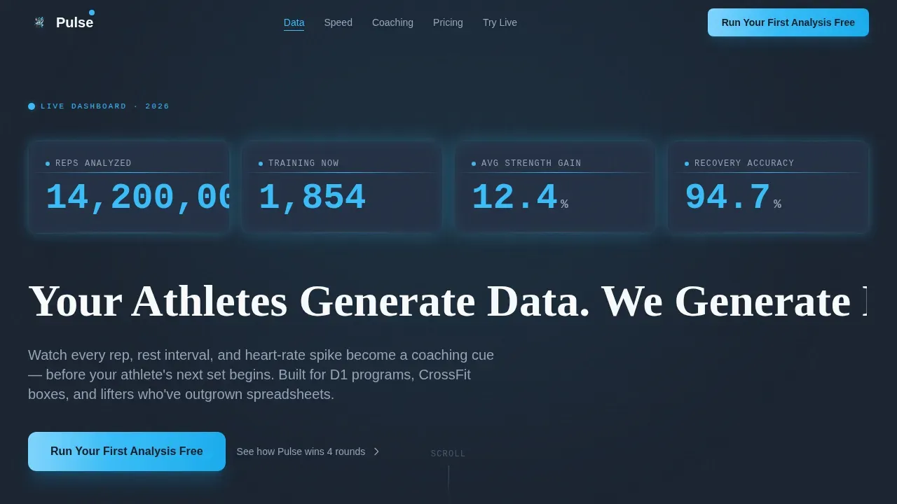
The hero section fills a full-viewport dark canvas with oversized, monospaced counters. Numbers count upward in real time, covering total reps analyzed, active users training right now, average strength gain percentage, and recovery accuracy score. This gives the landing page an immediate sense of scale and credibility without relying on stock photography.
Hub-and-Spoke Anchor Navigation
A persistent top bar carries the primary call to action and links to each spoke section via smooth anchor scroll. Users can navigate directly to the comparison round or sandbox that matters most to them. This flow reduces drop-off and keeps sessions on-page longer.
Four Versus Comparison Rounds
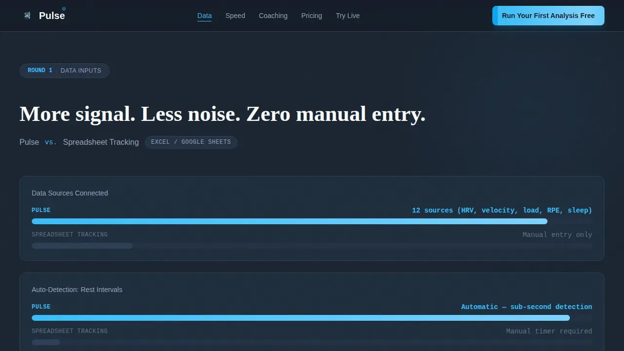
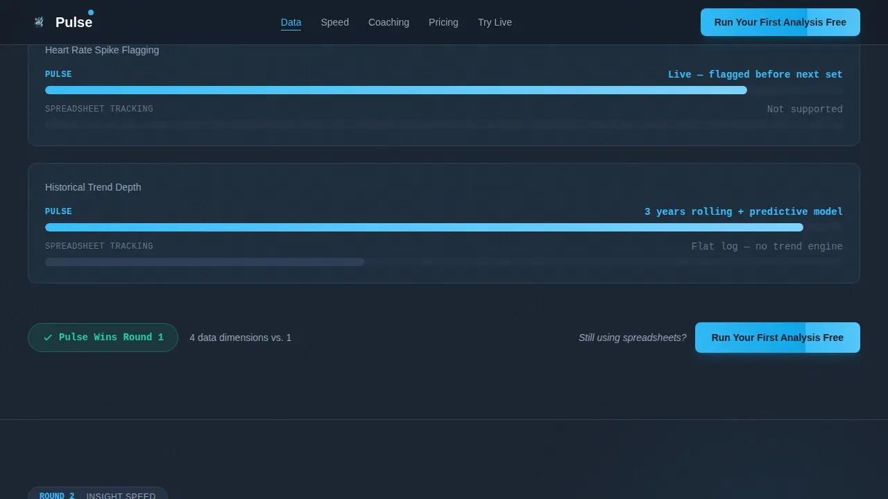
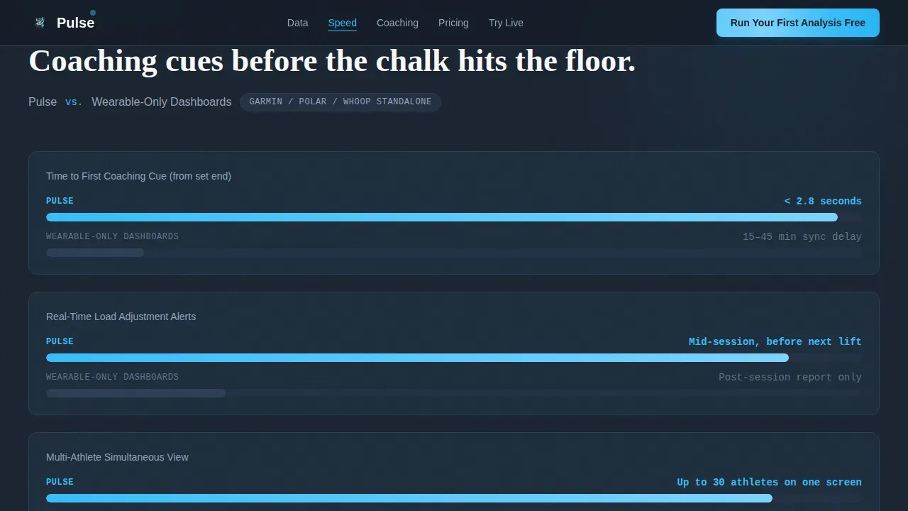
Each round places the product on the left and a competitor category on the right. Animated bars fill asymmetrically on scroll, making the comparison visual and immediate. The four rounds cover data inputs, insight speed, coaching output, and price per athlete, so visitors can assess value across every dimension they care about.
Live Workout Sandbox
Visitors paste a sample workout directly into the page and watch the system return an analysis in under three seconds. No email, no sign-up, and no friction at first touch. This is the most powerful trust-building element on the page because the product performs live before any commitment is asked.
Contextual Repeat calls to action
After each versus round, a call to action reappears with fresh microcopy tied to the round just completed. This pattern keeps the conversion path visible throughout the page without feeling repetitive, and it helps capture leads at whichever point a visitor becomes convinced.
Gated Secondary Conversion Path
A secondary call to action offers a detailed feature-by-feature comparison report. This path gates behind a work email and team size field, giving the template a second lead-capture layer for visitors who want deeper research before committing.
Page sections overview
| Section | Purpose |
|---|---|
| Hero Metric Wall | Animated live data counters and typewriter headline establish immediate credibility |
| Anchor Nav Bar | Persistent navigation and primary call to action visible above the fold throughout all sessions |
| Round 1 Versus | Compares data inputs against spreadsheet tracking with animated scoring bars |
| Round 2 Versus | Compares insight speed against wearable-only dashboards |
| Round 3 Versus | Compares coaching output against generic coaching apps |
| Round 4 Versus | Compares per-athlete pricing with animated cost bars |
| Live Sandbox | Zero-friction workout paste and instant analysis interaction |
| Footer Row | Single-row linear footer with essential links |
Design & branding system
The visual identity runs on a Slate and Sky color system that communicates precision and urgency. The design language is described as a pre-dawn airport tarmac: dark, electric, and purposeful.
- Deep gunmetal slate (#1B2431) dominates the canvas, with stratosphere blue (#38BDF8) used for live-data accents and interactive highlights, cloud-deck gray (#94A3B8) for secondary text and dividers, and pure oxygen white (#F8FAFC) for card surfaces and metric readouts
- Typography pairs Fraunces serif for headlines, DM Sans for body copy, and JetBrains Mono for all numbers and data readouts, keeping every metric sharp and cockpit-precise
- Animation levels are high throughout: counting number transitions, typewriter headline entry, scroll-triggered comparison bars, and scan-line overlays create a dashboard that feels alive and responsive
Mobile & speed optimization
The template is built desktop-first, reflecting how coaches and team staff typically review analytics dashboards on large screens. A mobile-responsive fallback ensures the landing page remains functional across devices.
- Scroll-triggered animations use IntersectionObserver so elements activate only when they enter the viewport, keeping initial load clean
- CSS-driven counter animations and comparison bar transitions avoid heavy JavaScript dependencies, supporting a target load experience under three seconds
- The single-column responsive fallback reorganizes versus rounds and the sandbox into a readable vertical flow on smaller screens
How this template helps you convert
A high-converting landing page for biometric analytics needs to earn trust before it asks for anything. This template is structured around a proof-first conversion process.
- The hero metric wall and typewriter headline communicate the value proposition in the first few seconds, before visitors scroll, placing the primary call to action above the fold and reducing bounce risk
- The four versus rounds let visitors identify exactly where competing tools fall short, building a case for the product through animated data rather than written claims
- The live sandbox closes the argument by letting visitors watch the product work, so by the time the final call to action appears, the page has already demonstrated its value and visitors are ready to respond
Other information about this template
This template draws on well-established principles for building landing pages that measure real outcomes. A few additional notes for teams planning to deploy or adapt it.
- The pulse biometric performance analytics landing page template is designed with trust and visual data representation as foundational priorities, because biometric data is sensitive and users need to feel secure before sharing anything
- The pulse dashboard layout follows established dashboard design principles to prevent cognitive overload, using line charts for time-based trends and bar graphs for direct comparisons, so visitors can easily spot patterns without feeling overwhelmed
- HR professionals and company leaders exploring workforce well-being tools will find the analytics framing and stress levels reporting familiar; the template's structure maps naturally onto employee engagement use cases where organizations need to identify trends across a team and communicate findings clearly
- The template supports a secondary gated form to gather work email and team size, giving businesses a structured way to qualify leads and develop a follow-up communication process
- Tracking user flow and analyzing visits across the page helps identify which comparison round converts best; teams can review this data to refine the page and improve retention of high-intent visitors
- The default anchor navigation order can be adjusted to match different marketing priorities without rebuilding the page structure; teams can delete or reorder sections to match their specific organization's messaging goals
- Social proof elements, such as live counter metrics and the animated win scoreboard, function as real-time feedback signals that encourage visitors and help them feel satisfied with the quality of data they see before signing up
- The secondary call to action path to a comparison report gives customers and leads a space to explore deeper research at their own pace, supporting longer decision cycles common in B2B and prosumer analytics tools
Theme
Startup Velocity
Creative direction
Launch Energy
Color system
Slate & Sky
Style
Hub & Spoke (Anchor Nav)
Direction
Comparison/Versus
Page Sections
Animated Live Metric Wall Hero
Four Versus Comparison Rounds
Zero-friction Live Sandbox
Persistent Anchor Navigation Bar
Contextual Repeat Calls to Action
Gated Secondary Lead Capture
Related questions
Who is this landing page template designed for?
Does the live sandbox require visitors to sign up first?
Can I adapt this template for employee engagement or workforce analytics?
How does the template handle the secondary conversion path?
What makes this landing page different from a generic SaaS template?



