Healthcare Software Advanced Cost Calculator Website Template
Pulse is a split-screen healthcare social media management landing page template built for teams where compliance is non-negotiable. It leads with an interactive Compliance Score Calculator, showcases an AI-powered post rewrite demo, and drives app downloads with near-zero friction. The dark Data Command visual identity and carbon fiber color system give it an authoritative, cockpit-level confidence.
by Rocket studio
Quick summary
Pulse is a single-page landing page template for a healthcare social media management app. It opens with an interactive Compliance Score Calculator, walks visitors through a live post rewrite demo, and closes with a frictionless app download call to action. Every section is built around the reality that one wrong word in a healthcare post can trigger a federal audit.
Who this template is for
This template is designed for healthcare marketing and compliance teams that cannot afford publishing mistakes. It speaks directly to people managing multiple brand accounts in regulated environments.
- Marketing directors at regional hospital networks managing twelve or more facility accounts simultaneously
- Pharma brand managers who require legal pre-approval before any social caption goes live
- Telehealth startup teams working to build audience trust in feeds crowded with health misinformation
What problem this template solves
Healthcare social media teams face a unique pressure. Every post carries regulatory risk, legal review slows down publishing cycles, and most social media tools are built for lifestyle brands, not clinical environments. This template addresses that tension head-on.
- Teams lose days waiting for legal to clear posts, stretching review cycles to 72 hours or more
- Compliance gaps in published content expose organizations to federal regulatory scrutiny
- Generic social media landing pages fail to earn trust from risk-aware healthcare decision-makers
What you get with this template
You get a fully structured, single-page landing page layout designed around healthcare social media compliance. Every section earns attention before asking for anything in return.
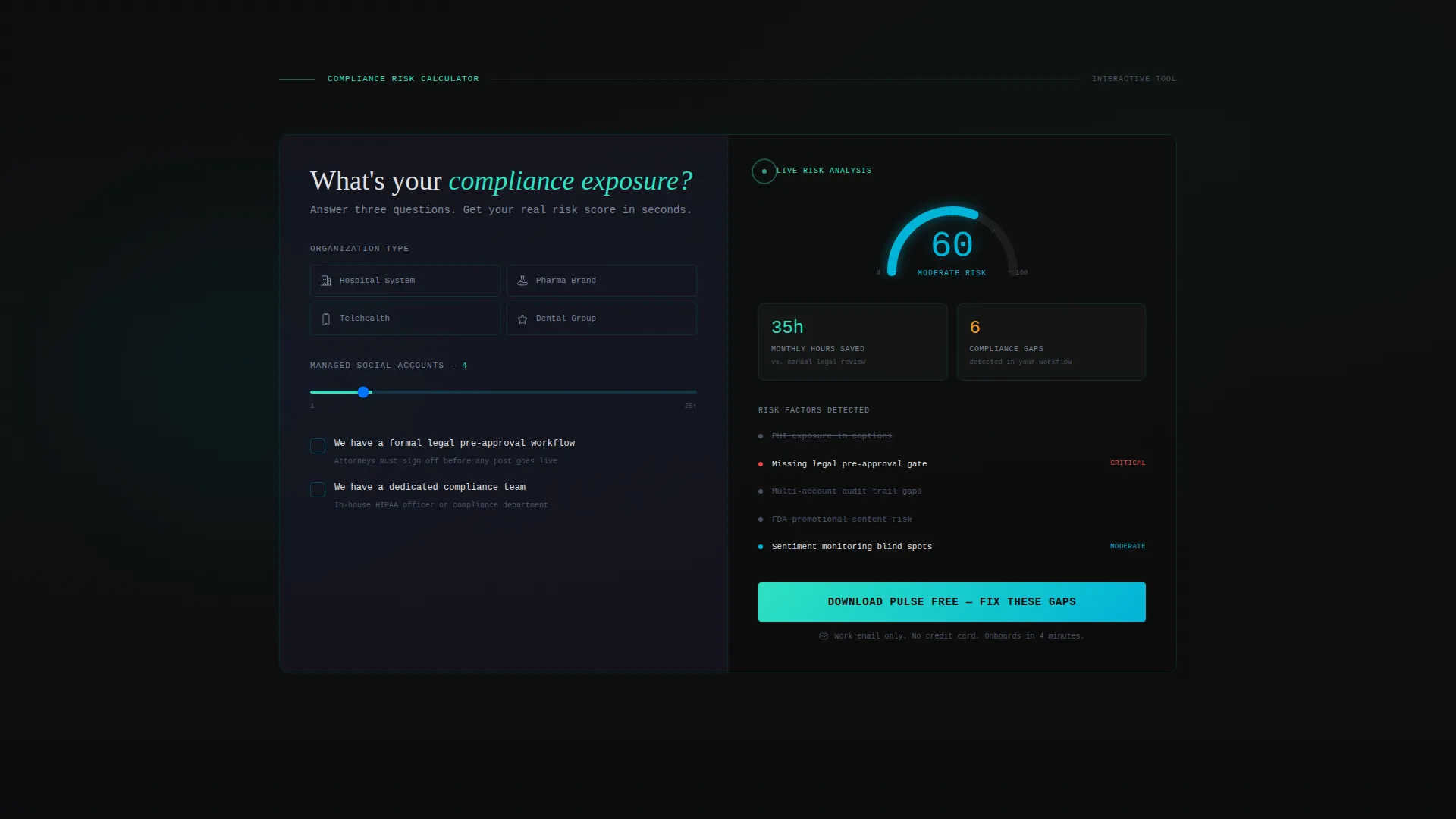
- An interactive Compliance Score Calculator with real-time radial gauge, risk score output, and estimated monthly time saved
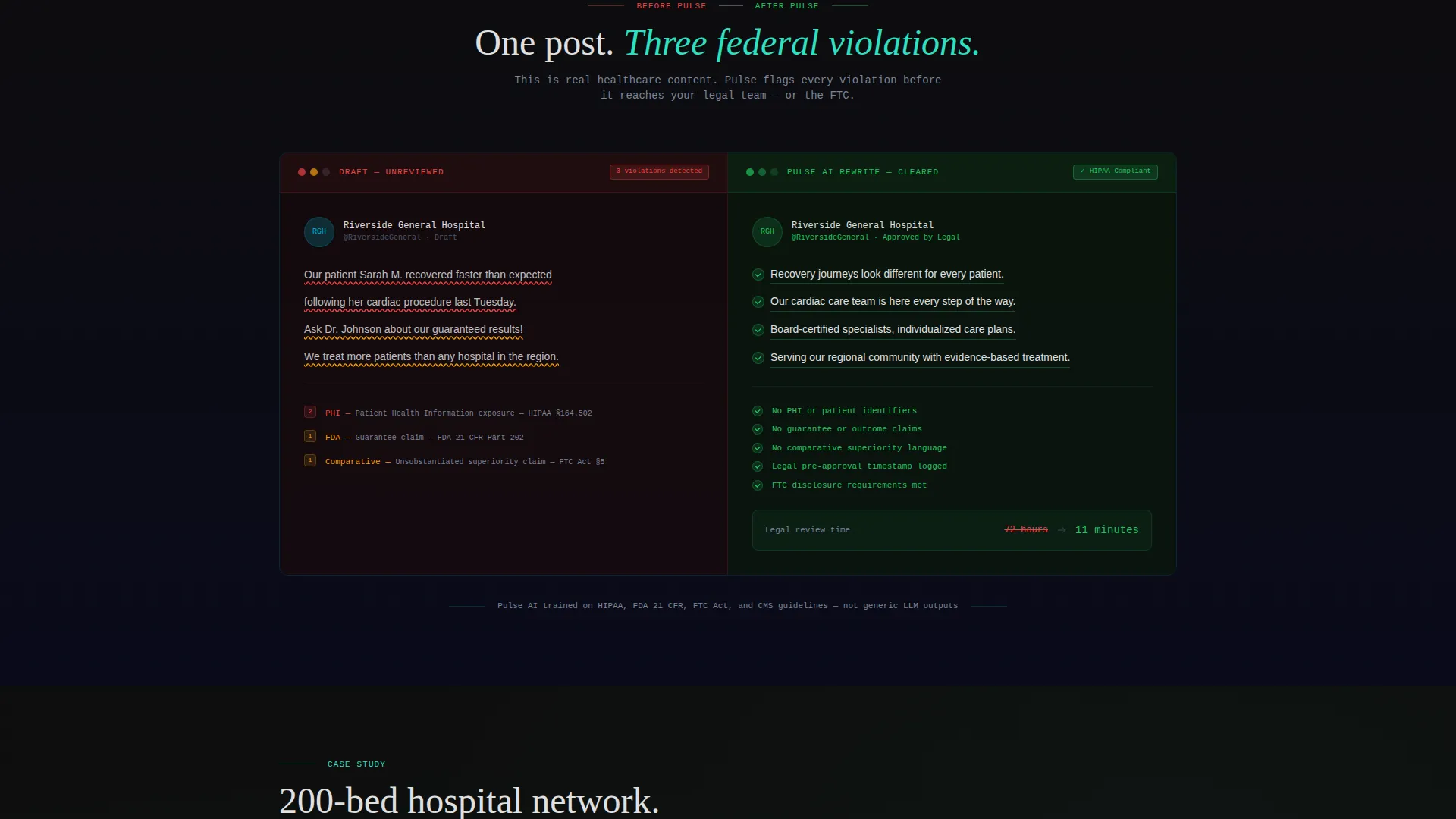
- A side-by-side post rewrite demo showing regulatory violations flagged in red and the compliant AI rewrite shown in green
- A sticky app download bar with paired App Store and Google Play badges and a work-email-only signup form
Feature list
This template includes purpose-built sections and interactive elements designed for a high-stakes healthcare audience. Each component moves visitors from problem awareness to confident action.
Interactive Compliance Score Calculator
The left panel of the calculator section lets visitors select their organization type, number of managed accounts, and whether they have a legal pre-approval workflow in place. The right panel renders a personalized risk score on an animated radial gauge alongside estimated monthly time saved and a count of detected compliance gaps. Every input change animates the gauge, making the scroll genuinely engaging.
Split-Screen Post Rewrite Demo
A before-and-after content pair sits inside a 50/50 split layout. The left side shows a raw social post with regulatory violations underlined in red. The right side shows the same post after the app's AI rewrite, marked with green compliance checkmarks. The visual contrast makes the product value immediately clear without a single word of explanation.
Product Screenshot Header with Compliance Dashboard
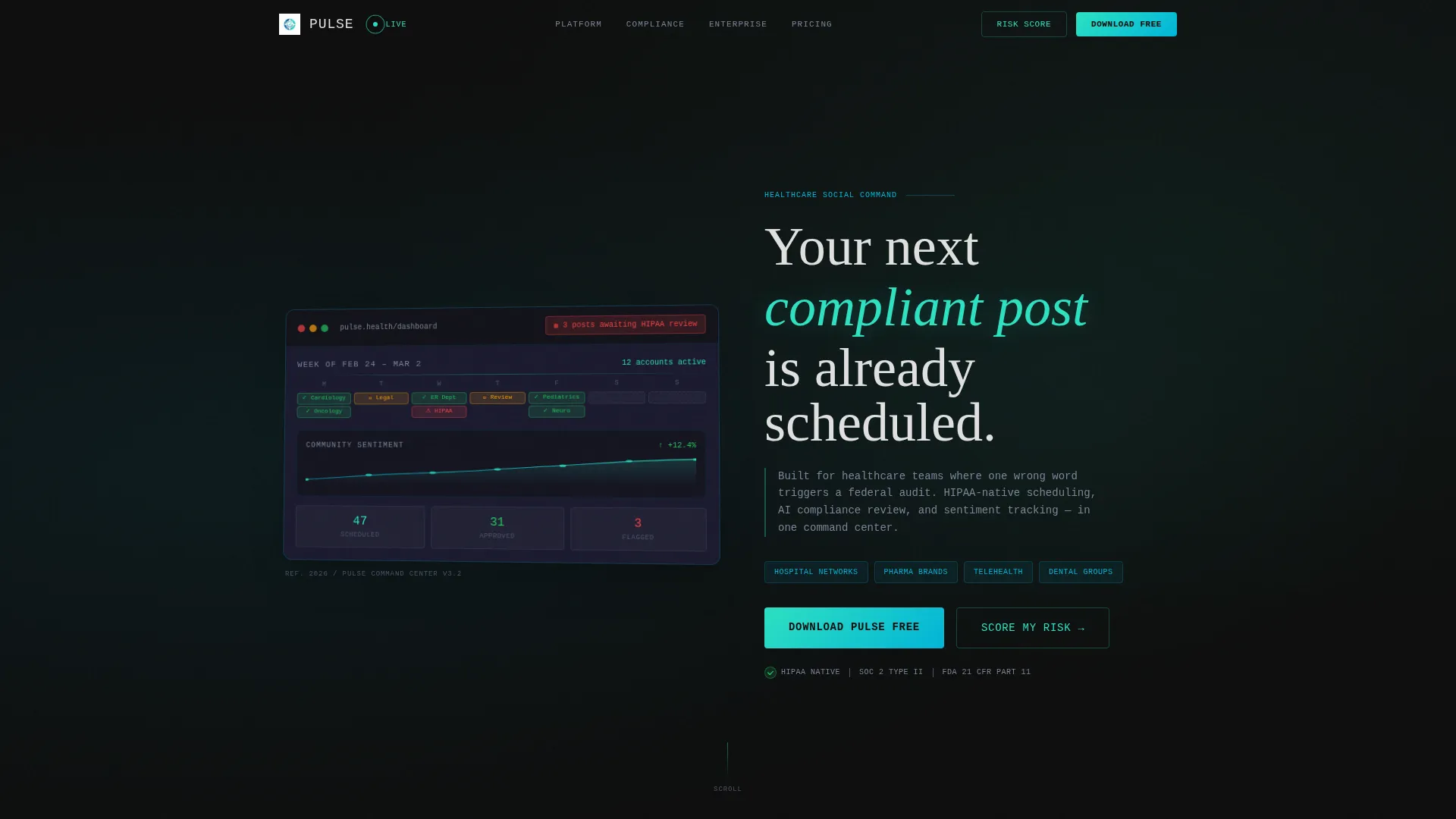
The header uses a real dashboard screenshot angled at five degrees, floating on a carbon-textured background with a faint teal glow behind the device frame. The dashboard view includes a week-view content calendar with color-coded compliance badges, a seven-day sentiment graph, and a notification chip reading "3 posts awaiting HIPAA review." It signals depth and credibility before a visitor reads a single line.
Anchored App Download Call to Action
The primary call to action is a teal download button placed directly inside the calculator results panel, inches from the visitor's personalized risk score. A sticky bottom bar reinforces the offer with App Store and Google Play badges throughout the scroll. The form field asks only for a work email, reducing friction to nearly zero.
Case Study Proof Section
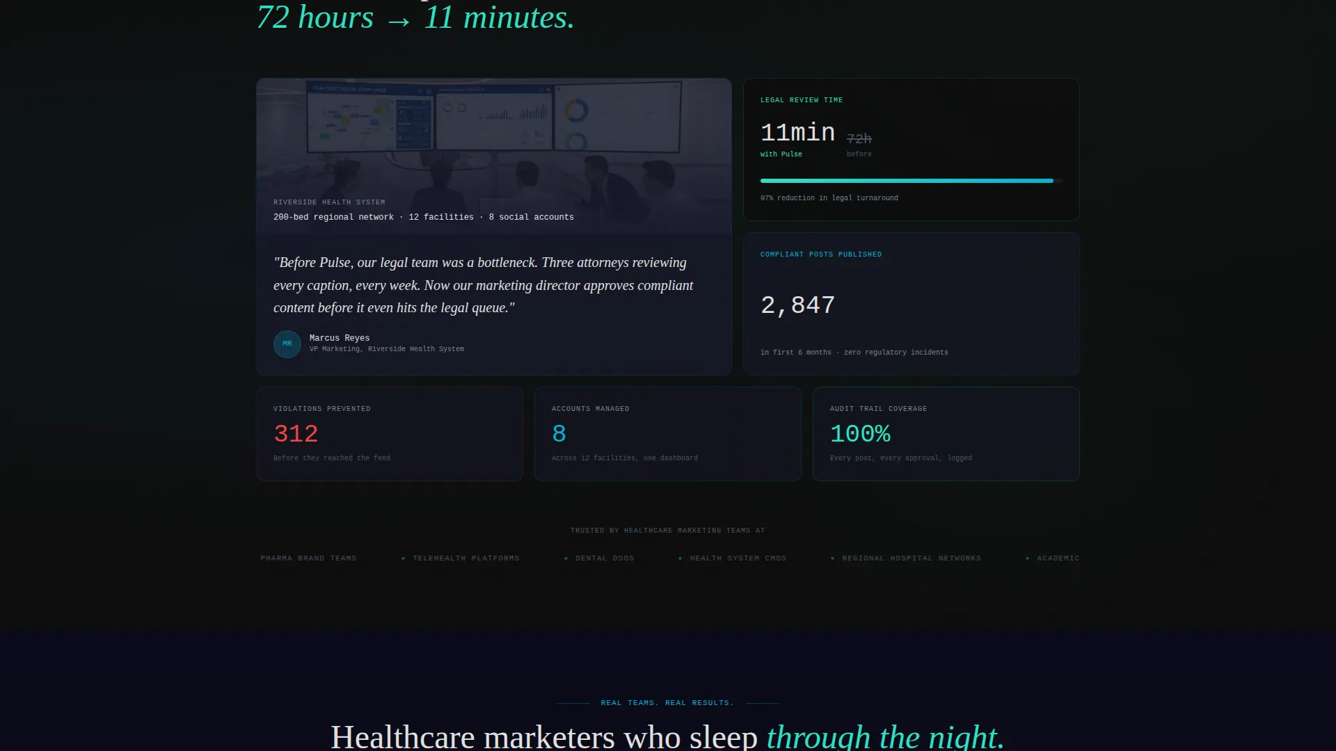
A dedicated section surfaces real-world results from a 200-bed hospital network that reduced legal review turnaround from 72 hours to 11 minutes using the app. Placing this proof after the rewrite demo follows the page's natural escalation from problem to fix to evidence.
Dark Cockpit Visual Identity
The template uses a Data Command theme built on a carbon fiber color system. Deep blacks, layered grays, surgical blue, and critical-alert teal create a dashboard aesthetic that feels engineered rather than decorative. The visual language builds trust with technically literate healthcare professionals.
Page sections overview
| Section | Purpose |
|---|---|
| Header / Hero | Anchors credibility with a live dashboard screenshot and a sharp, compliance-focused headline |
| Compliance Score Calculator | Quantifies the visitor's own risk before asking for any commitment |
| Post Rewrite Demo | Shows the product working on real healthcare content in a before-and-after split |
| Case Study Metrics | Delivers proof with a specific 200-bed hospital network turnaround result |
| Primary Download call to action | Places the app download button next to the visitor's personalized risk score |
| Sticky Download Bar | Maintains the app download offer across the full page scroll with store badges |
Design & branding system
The template follows a Data Command theme built entirely on a carbon fiber color palette. The aesthetic communicates precision and control rather than warmth or lifestyle.
- Core colors: deep cockpit black (#0D0D0D), woven carbon gray (#1A1A2E), surgical LED blue (#00B4D8), and critical-alert teal (#2DE1C2) for interactive elements and data highlights
- Typography uses thin, monospaced type for headlines to reinforce a technical instrument feel, with off-white body text at (#E0E0E0) for clinical readability against the dark background
- Decorative details include a subtle carbon-textured background, a faint teal glow bleeding from behind the hero device frame, and color-coded compliance badge states in green, amber, and red
Mobile & speed optimization
The split-screen layout is structured to adapt cleanly across screen sizes. Each panel is designed to reflow gracefully so the calculator and demo remain functional and legible on smaller displays.
- The 50/50 split panels are built to stack vertically on mobile, preserving the logical flow from calculator input to risk score output
- The sticky app download bar is positioned to remain visible and tappable across both mobile and tablet viewports without obscuring primary content
How this template helps you convert
Every section of this landing page is sequenced to build the visitor's confidence and reduce their hesitation before presenting a call to action.
- The Compliance Score Calculator personalizes the value proposition immediately, so visitors see their own risk reflected back at them before they have read past the fold.
- The post rewrite demo shifts the visitor from skepticism to belief by showing the product handling real healthcare content, not hypothetical examples.
- The case study proof section closes with a specific, credible result, and the work-email-only signup form removes the last barrier between interest and action.
Other information about this template
This template is built for the healthcare social media management category and fits comfortably within the broader healthcare software and health technology product space. It is a strong fit for teams evaluating purpose-built solutions for regulated content workflows.
- The template's creative direction is Calculator/Tool First, meaning the page earns trust through utility before making any ask
- The header concept is a Product Screenshot that shows the app mid-session, which is a well-established pattern for software landing pages targeting professional buyers
- The page direction is App Download, with the primary and secondary calls to action both pointing to mobile app store installs rather than a web signup flow
- The template style is a true Split Screen (50/50), used consistently across the calculator, rewrite demo, and header sections for visual and structural coherence
Theme
Data Command
Creative direction
Calculator/Tool First
Color system
Carbon Fiber
Style
Split Screen (50/50)
Direction
App Download
Page Sections
Interactive Compliance Score Calculator
Split-screen Post Rewrite Demo
Product Screenshot Hero Header
Anchored App Download Call to Action
Case Study Proof Section
Persistent Sticky Download Bar
Related questions
Who is this landing page template designed for?
Can I customize the compliance calculator inputs and outputs?
Does this template include the actual app functionality?
What makes this template different from a generic software landing page?
Is the sticky app download bar included in the template?



