Dynamic Stats-First Marketing Agency Landing Page Template
Pulse is a stats-first bento grid landing page built for performance marketing agencies. It leads with real-time metrics before revealing the team behind them, using animated dashboards, flip cards, and scroll-triggered counters. The page drives visitors toward an app download through a floating call to action bar, turning a team showcase into a direct acquisition channel.
by Rocket studio
Quick summary
Pulse is a dynamic landing page template designed for performance marketing agencies that want to prove results before making introductions. The page opens with an animated dashboard command center, escalates through a stats-first bento grid, and closes with a floating call to action bar that converts visitors into app users. Every section is built to move fast and earn trust quickly.
Who this template is for
This landing page is built for teams that run on data and need a page that speaks the same language. It is not a brochure template. It is a conversion surface that earns credibility through numbers first, then names.
- Startup founders searching for their first growth hire who need a landing page that signals serious capability without a long pitch
- Chief Marketing Officers at mid-market brands who are tired of agencies that talk but do not ship results
- Series B teams that need to show potential customers a war room, not another slide deck
What problem this template solves
Most agency team pages bury the proof. Visitors land, skim a grid of headshots, read a few job titles, and leave without understanding what the team actually delivers. That approach forces site visitors to take your word for it. This landing page flips the sequence entirely.
- Agencies lose visitors before reaching the value because pages lead with bios instead of results, giving the audience no reason to stay
- There is no clear call to action anchored to measurable proof, so visitors browse rather than convert leads into app users
- Standard team pages fail to engage visitors across traffic source types, whether from paid search, social media referrals, or direct link clicks
What you get with this template
You get a fully structured, single page bento grid landing page with high-motion dynamic elements baked in from the first fold. Every component is designed to create momentum and guide users toward one action: downloading the app.
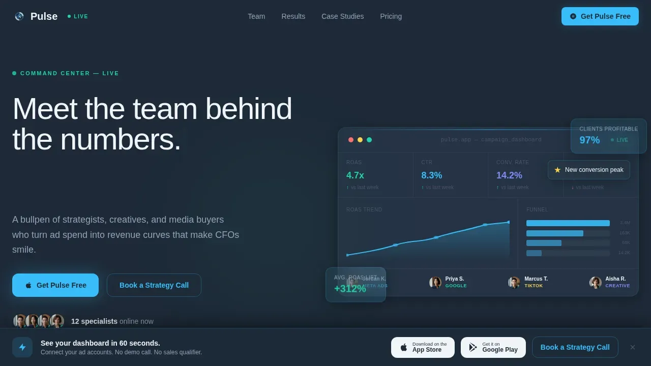
- An animated hero dashboard that fills the viewport with live campaign data ticking upward, including return on ad spend climbing in real time, a narrowing conversion funnel, and pulsing team-member status indicators
- A stats-first bento grid where each card leads with a bold metric and hover effects flip the card to reveal the team member responsible, their specialty, and their time in-platform
- A floating bottom bar that activates after the third scroll fold, holding the primary call to action and paired app store badges alongside a secondary ghost button for visitors not ready to install
Feature list
This landing page template ships with purpose-built features that create a dynamic, high-trust experience for every visitor who lands on the page.
Animated Dashboard Hero
The hero section fills the full viewport with a simulated live command center. Numbers increment as the page loads. Graphs draw themselves. Notification badges appear in sequence. The headline types itself in after the data has already started moving, so the first impression is performance, not copy. This dynamic landing approach makes visitors feel they have walked into something real, not a static brochure page.
Stats-First Flip Card Grid
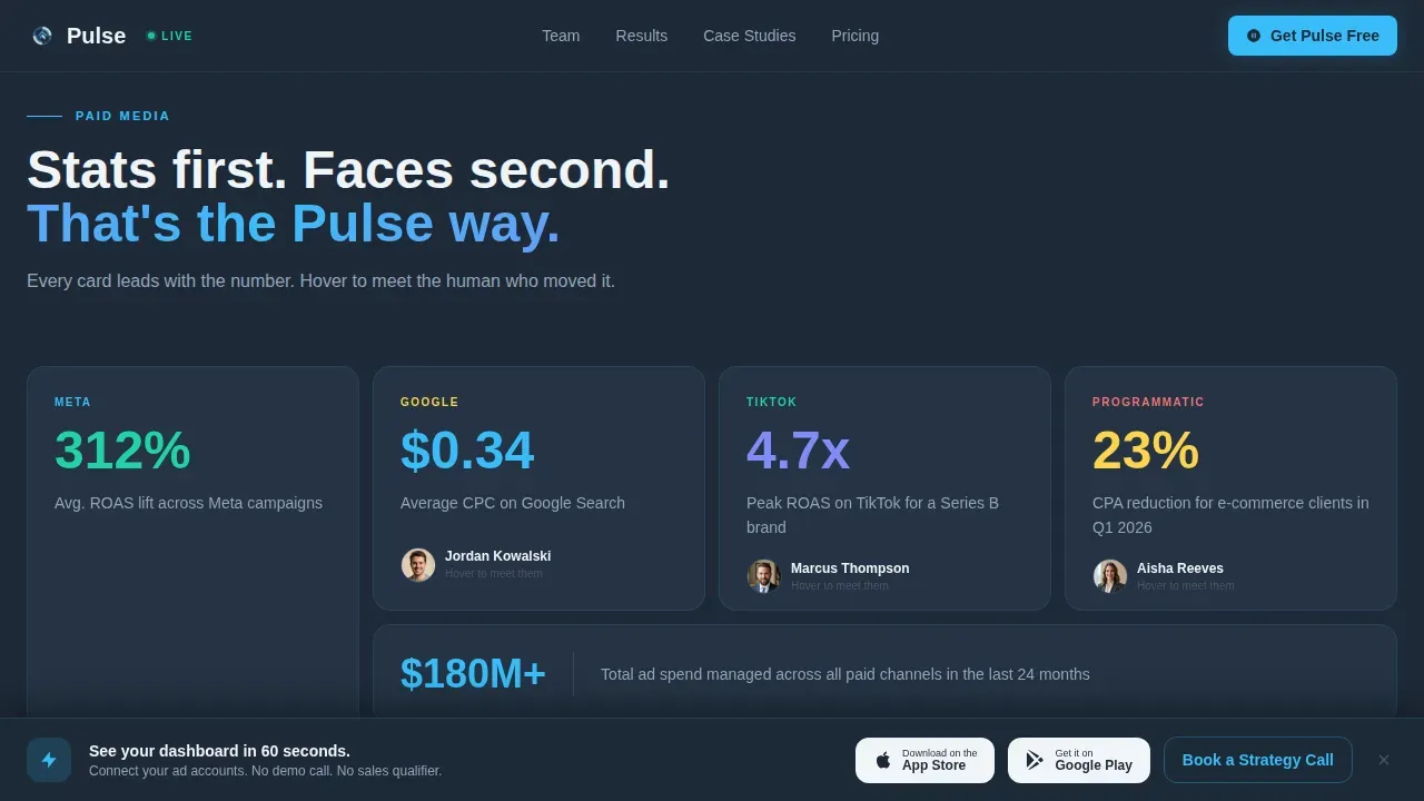
Each bento cell in the grid opens with a metric. An example card reads "312% average return on ad spend lift." When a user scrolls into view or hovers, the card flips to reveal the team member who owns that result. This form of social proof is more convincing than a testimonial block because the data speaks first. The hover effects are smooth and purposeful, guiding users to the human behind each number.
Scroll-Triggered Counter Blocks
As the user scrolls through each row of the bento grid, animated counter blocks tick upward. These represent real agency milestones. The motion is triggered by an Intersection Observer, so the animation fires only when the block enters the viewport. This keeps users engaged without slowing the page, because heavy animation libraries are not used. Animated counter blocks can feature large numbers that tick up as the user scrolls, representing milestones like total leads generated across active campaigns.
Escalating Case Study Rows
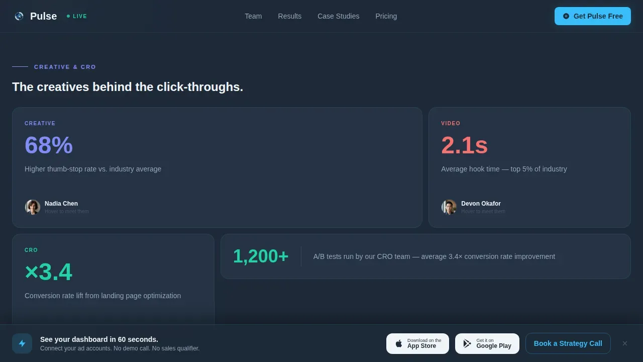
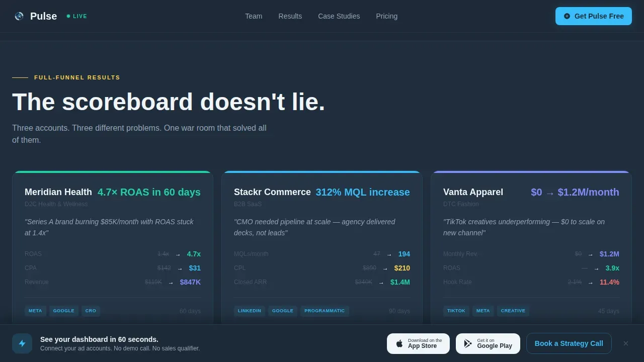
The grid is structured in three ascending rows. The first row focuses on paid media stats. The second row covers creative performance data. The third row presents full-funnel case studies with the highest-impact numbers. Each row escalates the proof, so by the time a visitor reaches the bottom, the page has made a thorough, data-backed case for the team. This structure helps convert leads by building confidence progressively.
Floating Call to Action Bar
After the third scroll fold, a pinned bottom bar appears. It carries the primary call to action with app store badges for both mobile platforms. A secondary ghost button labeled "Book a Strategy Call" gives visitors who need more context a lower-commitment path. The button text and placement follow best-practice landing page design principles: contrasting accent color, minimal surrounding distraction, and a clear value statement.
Social Proof Testimonial Section
A dedicated testimonial section carries direct quotes from named Chief Marketing Officers and founders, each paired with a company logo. These are not generic reviews. They are structured as short, metric-anchored quotes that reinforce the numbers already seen in the grid above. Using social proof in this form enhances landing page credibility and gives potential customers a recognizable reference point before they tap the call to action.
Page sections overview
| Section | Purpose |
|---|---|
| Hero Dashboard | Animated campaign command center that opens the page with live data |
| Paid Media Row | Stats-first bento cards linking metrics to media buyers on hover |
| Creative Performance Row | Creative output data revealed alongside the creative team |
| Full-Funnel Stats Row | Escalating case study numbers forming the final proof layer |
| Social Proof Section | CMO and founder quotes with logos anchoring credibility |
| Floating call to action Bar | Pinned app download bar activating after third scroll fold |
| Footer | Single-row linear footer with contact links and essential information |
Design & branding system
The visual identity follows a Dynamic Motion theme built on a Slate and Sky color system. The overall aesthetic feels like a trading floor viewed through floor-to-ceiling windows at dusk: deep graphite buildings sharpening against an electric sky. Every color choice reinforces focus and urgency without visual noise.
- Background: deep graphite slate at hex #1E2A38; card surfaces in storm cloud gray at hex #4A5568; sky blue accent at hex #38BDF8 across every interactive element and hover state; cirrus white at hex #F0F4F8 for all typography
- Typography uses Plus Jakarta Sans for headers and DM Sans for body text, both paired for high legibility in dark environments
- Glassmorphism layer effects on card surfaces create visual depth without adding layout clutter, keeping key information prominent against the dark field
Mobile & speed optimization
This landing page is built desktop-first to match the trading floor command center feel, but the responsive design ensures that dynamic elements resize and perform correctly on smaller screens. A mobile landing page visitor sees the same metric-first hierarchy with appropriately stacked bento cells and a persistent call to action bar.
- Animations are powered by CSS and an Intersection Observer so that the page avoids heavy libraries; this keeps load time low and prevents the mobile landing experience from degrading on slower connections
- Dynamic elements including flip cards, scroll-triggered counters, and pulsing status indicators are all optimized to resize cleanly, because mobile optimization is necessary to ensure dynamic elements perform well on smaller screens and do not lose visitors before they see the offer
How this template helps you convert
A landing page is designed to turn site visitors into leads by offering something relevant in exchange for their contact details or a specific action. This template is engineered around that principle from the first pixel.
- The stats-first sequence builds trust before it asks for anything. Visitors see proof at every fold, so by the time the floating call to action bar appears, the page has already done the persuasion work. Dynamic stats serve as social proof and trust signals, boosting visitor confidence and conversion rates before the call to action is even visible.
- The floating bar removes friction at the decision point. Rather than forcing the user to search for the next step, the call to action travels with the user. The primary button drives app downloads. The secondary ghost button captures visitors who want to contact the team before committing, keeping both conversion paths open at once.
Other information about this template
This section covers additional context relevant to buyers evaluating this landing page template for their agency or SaaS product.
- This is a single page template. It is not a multi-page website. Every section lives in one continuous scroll, which is a deliberate landing page design choice that keeps the audience on a guided path from proof to conversion without navigation interruptions.
- The page is built with text boxes and form fields that can be edited directly. You can replace placeholder copy, swap the stock image placeholders for real team portraits, and update every metric to reflect your actual campaign data. Maintaining accurate data is essential because inaccurate or fabricated live data destroys trust.
- Dynamic landing pages like this one show different messaging based on visitor data such as location and search keywords when integrated with compatible personalization tools. The template structure supports contextual personalization through Dynamic Text Replacement, allowing you to speak directly to visitors arriving from a specific traffic source, for example a Google Ads campaign or a social media post.
- Landing page design trends heading into 2026 point toward bold oversized typography, AI-powered personalization, and trust-first design elements. This template reflects those directions with its large metric typography, its transparent social proof layer, and its motion-forward dynamic landing approach.
- Using dynamic content on landing pages can significantly enhance user engagement and conversion rates. This template is designed around that principle, with purposeful motion that highlights key interactions rather than decorating the page arbitrarily.
- The page includes a footer following a linear single-row pattern that carries basic information: contact links, legal page links, and social media profile links. It does not clutter the footer with additional navigation that might pull visitors away from the conversion path.
- Platforms like SendPulse provide drag-and-drop landing page builders for teams who want a faster starting point, while tools like Adobe Experience Manager allow marketers and web designers to collaborate on landing page designs that can be imported and edited. This template is compatible with workflows that prioritize quick deployment.
- Tools like Mutiny, Unbounce Smart Traffic, and Intellimize enable AI-driven testing for landing pages, and this template's clean structure makes it well-suited to connect with those kinds of services for teams who want to run A/B experiments across audience segments. Personalized calls to action and dynamic value propositions are becoming standard in landing page design, and this template gives you the foundation to build toward that.
- The seo settings for the page are configurable. You can update the page title, meta description, and open graph fields to align with the keywords and search intent most relevant to your target audience.
- E-commerce and direct-response advertising teams will find the conversion-focused layout relevant beyond the agency niche. The escalating proof structure and floating call to action bar apply equally well to any brand that needs to convert site visitors into users or customers quickly.
- Live campaign tickers in the hero dashboard can display live data such as currently managed ad spend across multiple industries, giving website visitors an immediate sense of scale and credibility when they first land on the page.
Theme
Dynamic Motion
Creative direction
Stats-First Impact
Color system
Slate & Sky
Style
Bento Grid
Direction
App Download
Page Sections
Animated Dashboard Hero Section
Stats-first Flip Card Bento Grid
Scroll-triggered Counter Animations
Escalating Three-row Proof Structure
Floating App Download Call to Action Bar
Metric-anchored Social Proof Row
Related questions
Can I replace the placeholder metrics with my own agency data?
Does this template work for a SaaS app landing page, not just an agency team page?
How does the flip card interaction work on mobile?
Are the animations built with heavy JavaScript libraries?
Can I connect this page to a lead capture form or contact tool?


