Complete Retail Digital Presence Professional Website Template
Pulse is a bento grid landing page template built for retail membership platforms. It uses a dark Data Command visual theme, animated metrics, and a stats-first layout to show retail operators exactly what they gain from joining. The design guides every visitor from a headline number toward a single conversion click, with no forms on the page.
by Rocket studio
Quick summary
Pulse is a single-page bento grid template designed for retail data membership sites. It opens with an animated sky-blue metric on a deep charcoal canvas, then walks visitors through performance snapshots, a twelve-month store transformation timeline, and a persistent call-to-action bar. Every section is built to make the data feel urgent and the membership feel essential.
Who this template is for
This template is built for retail-focused membership platforms that sell access to operational data. It speaks directly to operators who make daily floor decisions and need hard numbers to back them up.
- Independent retail owners managing two to six store locations
- Category managers inside mid-market chains who handle planograms and product placement
- Direct-to-consumer brands opening their first physical stores and learning brick-and-mortar benchmarks
What problem this template solves
Most retail operators make gut-call decisions because they lack a fast, clear view of their own performance data. This template solves the problem of communicating a data membership's value before the visitor ever signs up.
- Visitors cannot quickly grasp what metrics they are missing without seeing real numbers first
- Skeptical buyers need to touch the product before they commit to a paid membership
- Operators comparing options need a page that proves value through data, not marketing language
What you get with this template
You get a fully structured, single-page bento grid layout ready to represent a retail data membership platform. The template handles the full visitor journey from first impression to conversion click.
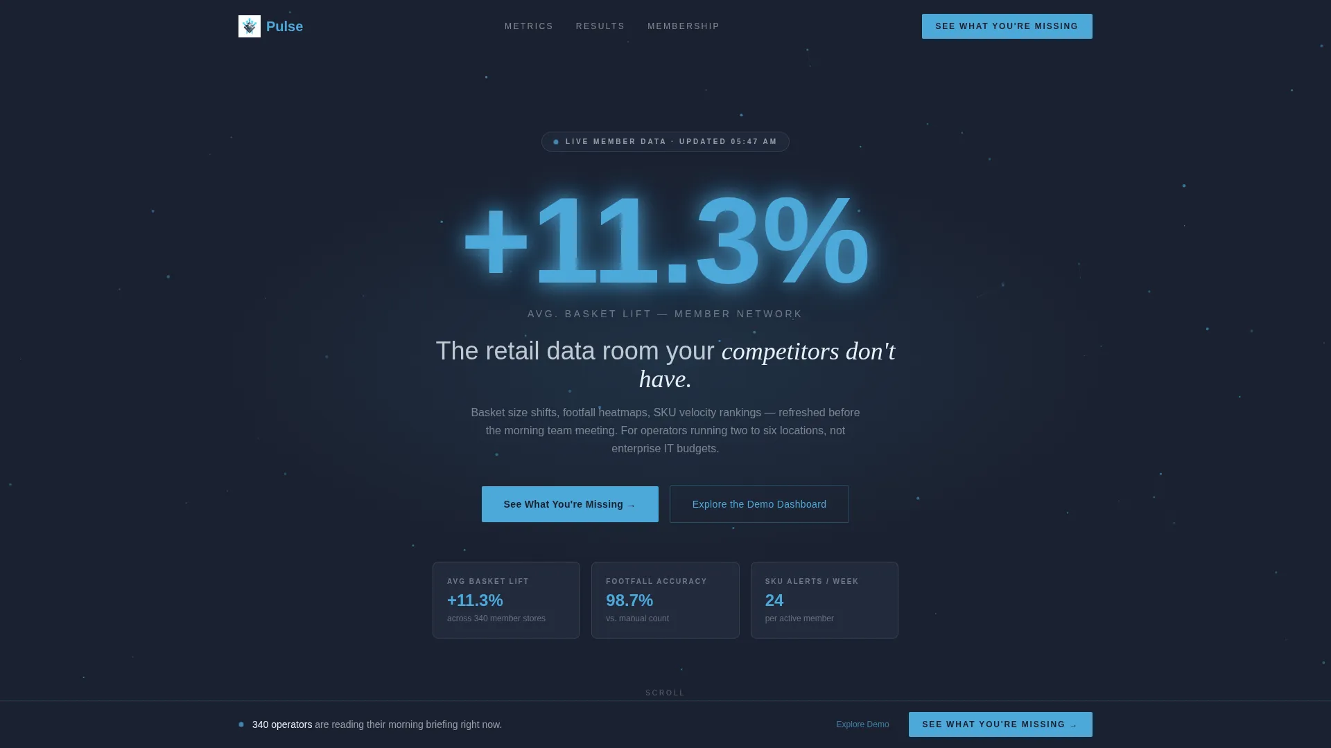
- A dark full-bleed header with a glowing animated metric and a primary call-to-action button
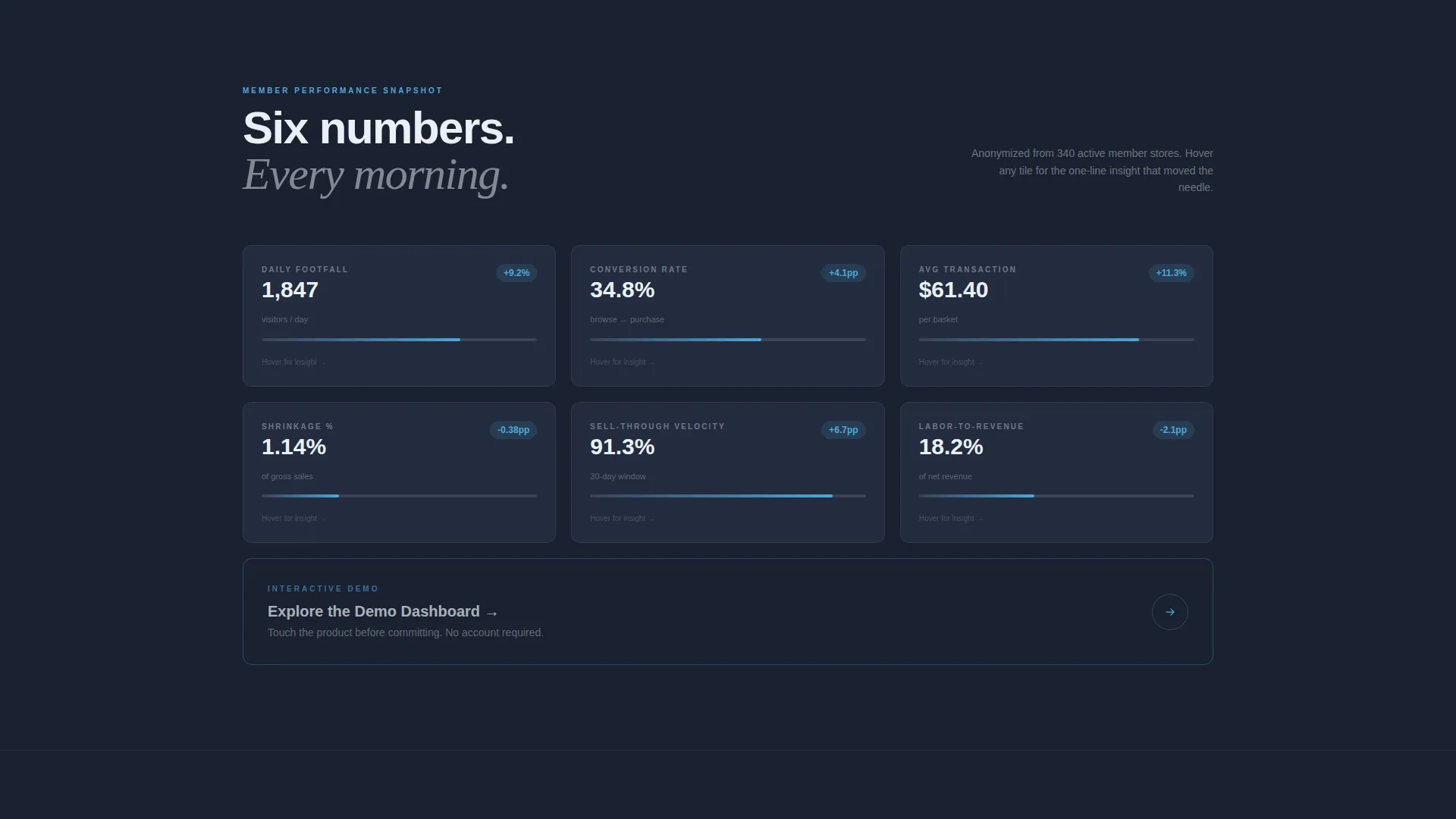
- A 3x2 bento grid of member performance snapshot tiles covering six key retail metrics
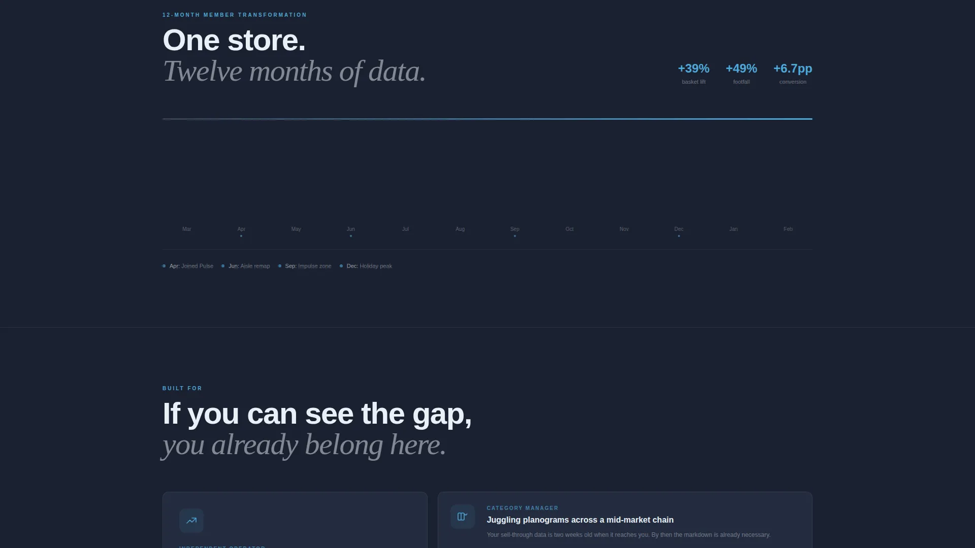
- A cinematic twelve-month store transformation timeline row and a persistent bottom conversion bar
Feature list
This template is built from tightly scoped components that reflect the Stats-First Impact creative direction described in the brief. Each piece earns its place by moving the visitor closer to clicking through.
Animated Header Metric
The header displays a single oversized metric in sky-blue glow that animates upward on load. There is no photography or illustration, just the number, large and undeniable, over a deep charcoal full-bleed background with drifting data-node parallax.
3x2 Performance Snapshot Grid
Six bento tiles display anonymized member metrics: footfall, conversion rate, average transaction value, shrinkage percentage, sell-through velocity, and labor-to-revenue ratio. Each tile glows on hover to reveal a one-line insight, giving visitors a taste of the intelligence inside the membership.
Twelve-Month Transformation Timeline
A wide cinematic row collapses the bento grid into a scrolling timeline showing one store's performance across twelve months. Month markers tick upward visually, turning abstract membership value into a concrete before-and-after story.
Persistent Bottom Conversion Bar
After the visitor passes the second scroll section, a fixed bottom bar activates with the primary call-to-action. This keeps the conversion path visible without interrupting the reading experience.
Ghost-Outlined Demo Tile
A ghost-outlined bento tile sits inside the grid as a secondary path. It invites skeptical visitors to explore the demo dashboard before committing, reducing friction for buyers who are not yet ready to click the primary call-to-action.
Stats-First Section Rhythm
Each scroll stop opens with a hard number before any explanatory copy arrives. The section order escalates from individual metrics to competitive benchmarking to predictive alerts, building a sense that the membership grows more valuable over time.
Page sections overview
| Section | Purpose |
|---|---|
| Full-Bleed Header | Anchors attention with an animated metric and primary call-to-action |
| Performance Snapshot Grid | Shows six anonymized member metrics in hover-reveal bento tiles |
| Transformation Timeline Row | Demonstrates twelve-month store improvement with ticking month markers |
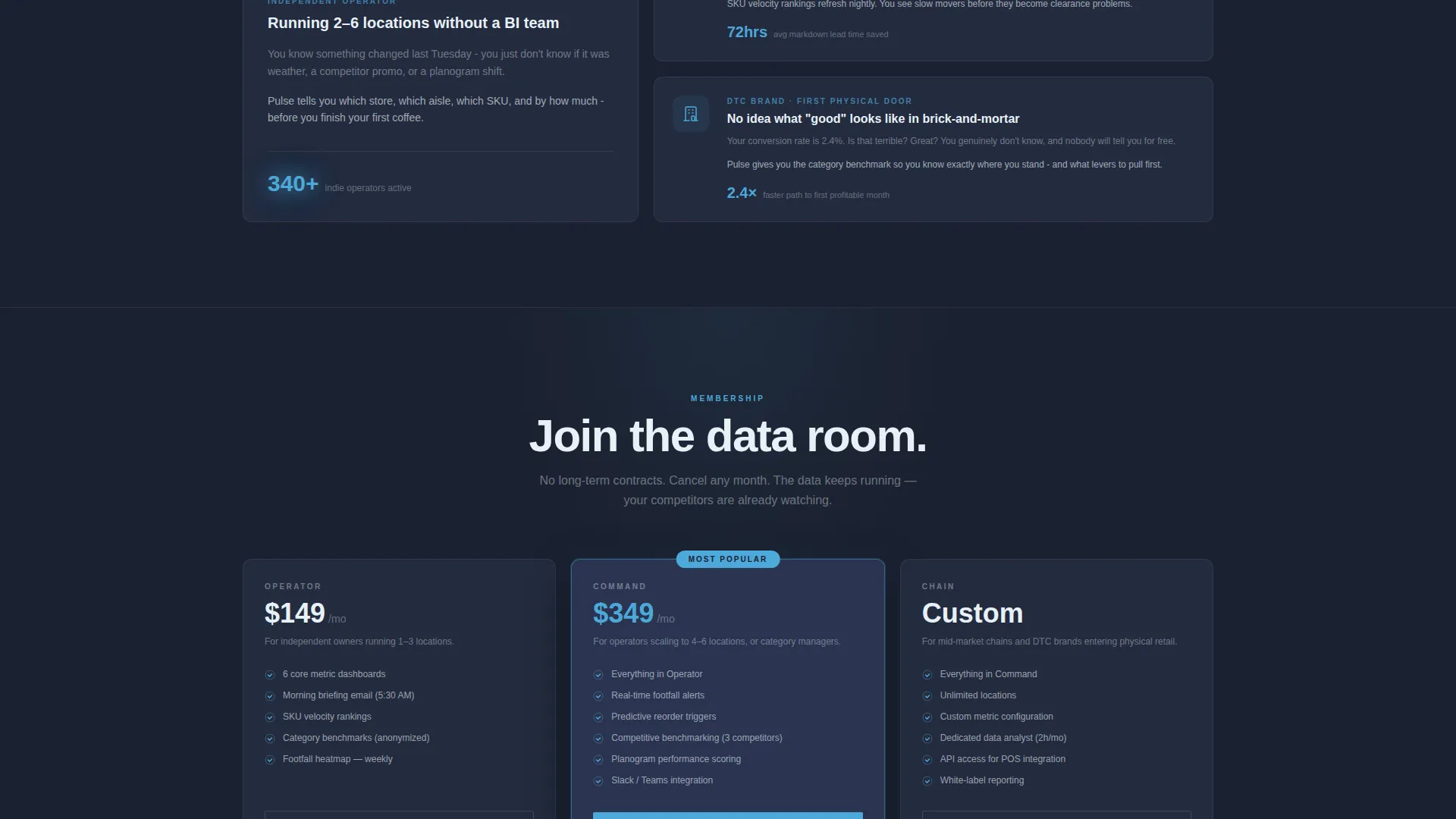
| Competitive Benchmarking Section | Escalates stakes by comparing individual performance against peer data |
| Predictive Alerts Section | Positions the membership as forward-looking, not just historical |
| Persistent Bottom Bar | Keeps the primary call-to-action visible throughout the scroll journey |
Design & branding system
The visual identity follows a Data Command theme built on a Slate and Sky color system. The palette is designed to feel like the glow of multiple monitors in a dim room before the morning shift starts, serious, focused, and quietly addictive.
- Deep operations-room charcoal (#1B2130) for full-bleed backgrounds, brushed gunmetal (#3A4255) for floating card surfaces, and high-altitude blue (#4DA8DA) for live data accents and hover states
- Faint ice-white (#E8F1F8) for typography and divider lines, ensuring every headline reads cleanly against dark surfaces
- No stock photography or product imagery, every visual element is data-driven, keeping the design language consistent and the signal-to-noise ratio high
Mobile & speed optimization
The bento grid layout is structured to reflow cleanly across screen sizes, keeping the data-dense design readable on smaller viewports. The template avoids heavy image assets by design, which supports faster initial load times.
- Bento tiles stack vertically on mobile so metric content stays legible without horizontal scrolling
- The persistent bottom bar remains functional on touch devices, keeping the call-to-action reachable throughout the scroll experience
How this template helps you convert
The entire page is built as a click-through funnel with one job: earn the visitor's trust through data, then send them to the membership signup flow. There are no forms to fill in on this page, which removes friction at the most important moment.
- The header metric creates immediate curiosity, "+11.3% avg basket lift" is a specific, credible claim that makes visitors want to know how it was achieved, pulling them into the scroll.
- The ghost-outlined demo tile gives skeptical visitors a low-commitment next step, capturing interest from buyers who are not ready to qualify but are close to converting.
Other information about this template
This template is part of the Pulse template family and is categorized under Technology, Retail Digital Presence. It was designed specifically for the retail membership site niche, where the product being sold is operational intelligence rather than a physical good.
- The page direction is Click-Through, meaning the goal is a single outbound click to a qualification page, not an on-page form submission
- The qualification page that follows asks three questions: store count, current point-of-sale system, and biggest data gap, keeping the signup flow short and relevant
- The template style is Bento Grid, a layout pattern well suited to data-rich platforms where multiple metrics need to coexist without visual clutter
- The header concept is Dark Full-Bleed with Glow, a deliberate choice to signal seriousness and make every illuminated number feel like real-time intelligence
Theme
Data Command
Creative direction
Stats-First Impact
Color system
Slate & Sky
Style
Bento Grid
Direction
Click-Through
Page Sections
Animated Header Metric with Parallax
Tile Performance Snapshot Grid
Cinematic 12-month Timeline Row
Persistent Bottom Conversion Bar
Ghost-outlined Demo Pathway Tile
Escalating Stats-first Section Flow
Related questions
Does this template include a signup form?
Can I replace the metrics shown in the bento grid tiles?
What type of retail businesses is this template written for?
How does the persistent bottom conversion bar behave?
Why is a bento grid layout a strong choice for a retail data membership page?



