Pulse - Dynamic Fitness Landing Page Template
Pulse is a Dashboard/Data Grid landing page template built for fitness mobile apps. It uses a dark Tech Glass visual system with electric violet accents to present live-feel workout metrics, nutrition tracking, and sleep data in a single high-energy scroll. The freemium conversion flow guides visitors from a cinematic dashboard preview to a frictionless, no-card-required signup.
by Rocket studio
Quick summary
Pulse is a single-page landing page template designed for fitness mobile apps. It opens with a full-viewport dashboard preview, then unrolls each core app widget as its own scroll section. The dark Void & Violet color system, glassmorphic card panels, and micro-animated metrics create the feeling of checking your stats mid-workout, urgent, personal, and alive.
Who this template is for
This template is built for founders, indie developers, and product teams launching a fitness tracking mobile app. It speaks directly to data-driven athletes and everyday users who want their training numbers front and center.
- Fitness app founders who need a high-converting freemium landing page without a custom design build
- Mobile app teams targeting active users such as early-morning gym regulars, runners, and CrossFit athletes
- Product marketers who want a visually immersive page that communicates app value before a single tap
What problem this template solves
Most fitness app landing pages feel like product brochures. They list features but never make the visitor feel the app. Pulse fixes this by putting live-data aesthetics and dashboard visuals at the center of the page experience.
- Generic templates fail to communicate real-time data energy, leaving potential users unconvinced before signup
- Long-form feature lists slow momentum and lose visitors before they reach the call to action
- Friction-heavy signup flows with credit card fields push free-tier prospects away before they convert
What you get with this template
You get a complete, section-led landing page that mirrors the actual app experience from the first scroll to the final call to action. Every section is purpose-built to carry momentum toward signup.
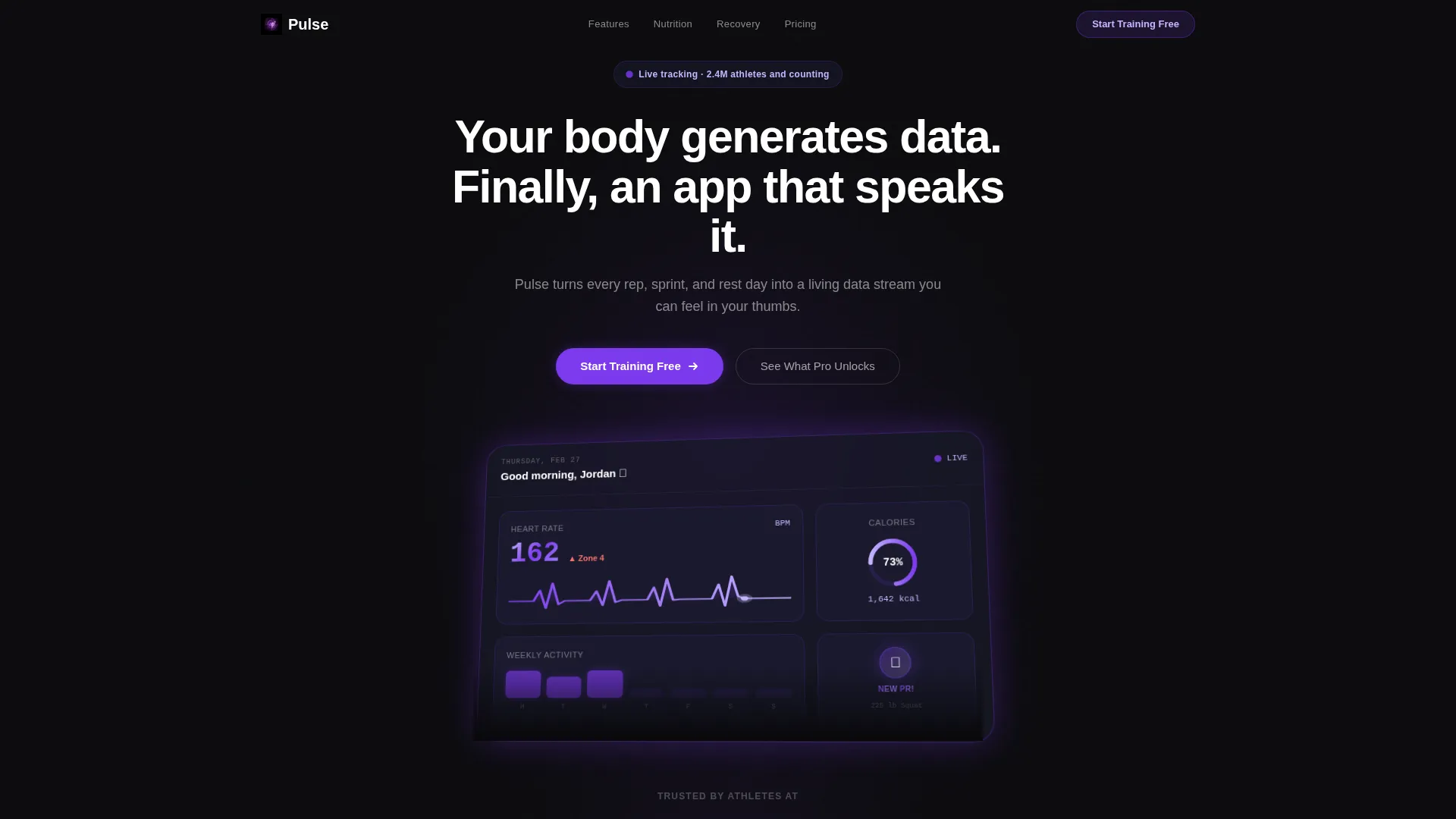
- A full-viewport isometric dashboard header with animated heart-rate graph, calorie ring, activity heat map, and strength badge
- Scroll-triggered widget sections for workout tracking, nutrition logging, and sleep data, each landing with a glass-panel entrance
- A glassmorphic feature comparison table and a sticky bottom bar with the primary "Start Training Free" call to action
Feature list
This template ships with a focused set of visual and structural components derived directly from the Pulse brief. Each one is built to serve the freemium conversion goal.
Animated Dashboard Header
The header fills the full viewport with an isometric render of the app home screen. The heart-rate line draws itself in real time, the calorie ring fills to 73%, and the strength PR badge shimmers on load. The headline types in below like a system notification.
Scroll-Expanding Widget Sections
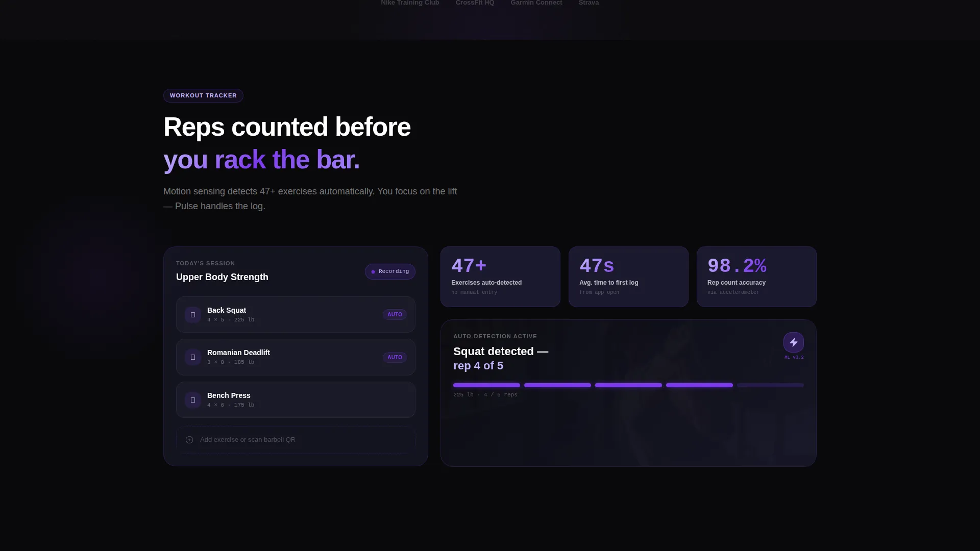
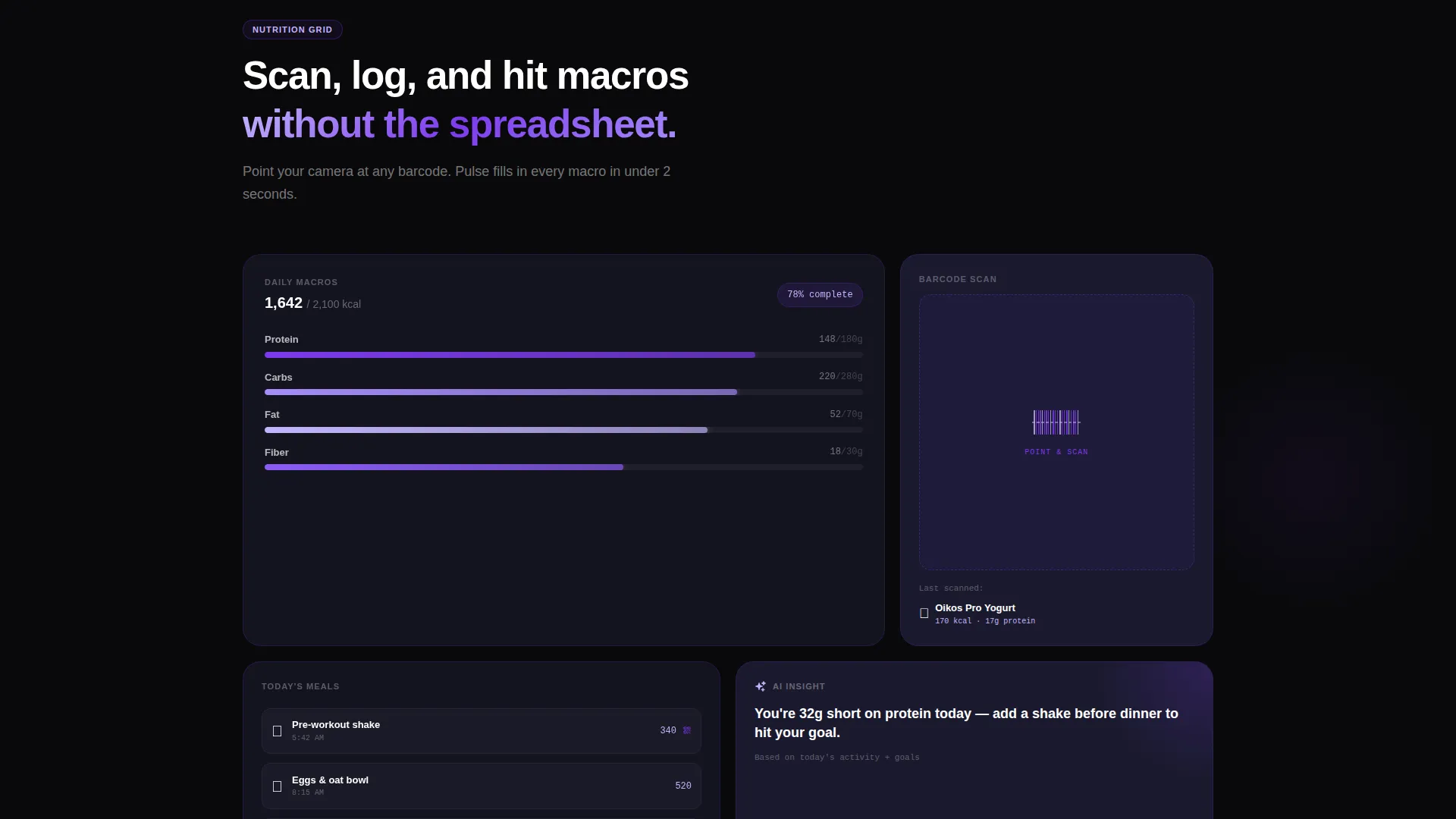
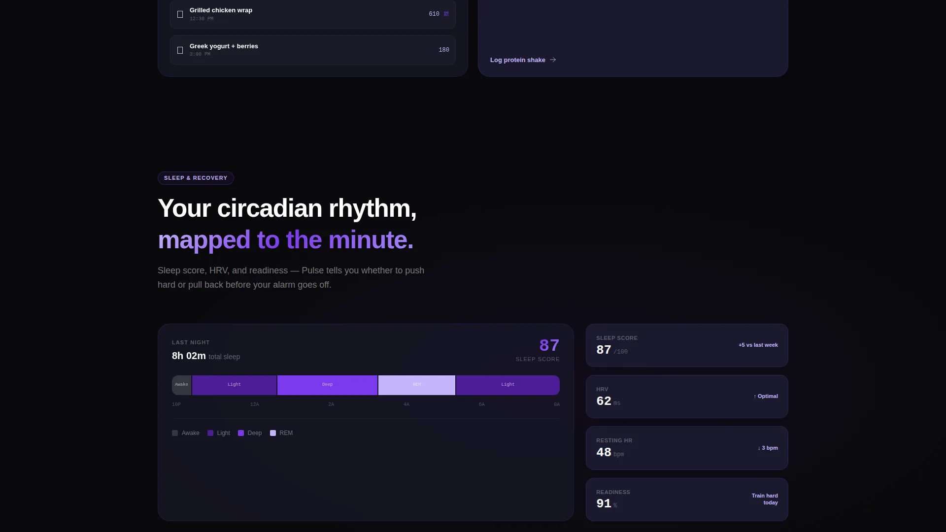
As users scroll, each app widget expands into its own full section. The workout tracker, nutrition grid, and sleep score card each take center stage with a glass-panel entrance animation and a single personal stat to reinforce credibility.
Freemium Signup Flow
The primary call to action opens a single-step signup form. Visitors enter their email, select a training style chip (strength, cardio, hybrid, or flexibility), and optionally toggle a wearable connection. No credit card is required at any point.
Sticky Conversion Bar
After the second scroll section, a sticky bottom bar appears carrying the "Start Training Free" call to action. It stays visible throughout the remainder of the page, keeping the conversion path accessible at all times.
Glassmorphic Comparison Table
A leaderboard-style feature comparison grid shows free tier value stacked against competitor paid tiers. The upgrade path shifts to "Try Pro for 14 Days," lowering commitment friction for users already on the free plan.
Void & Violet Data Visuals
Metrics, chart lines, and progress rings all use the electric violet and reactive lilac palette. Active data points pulse in violet. Line chart paths trace in lilac. The effect feels like live data glowing on a phone screen in a dark gym.
Page sections overview
| Section | Purpose |
|---|---|
| Dashboard Header | Full-viewport animated app preview anchors the hero and sets the data-driven tone |
| Headline & Primary call to action | Typed notification headline and first "Start Training Free" button drive immediate action |
| Workout Tracker Section | Expanded widget showcases exercise auto-detection and rep counting with a social proof stat |
| Nutrition Grid Section | Fanned-out panel reveals barcode scanning and meal logging inside a glass card layout |
| Sleep Score Timeline | Circadian rhythm timeline stretches from the sleep card, adding depth to the feature story |
| Feature Comparison Grid | Leaderboard-style table contrasts free and Pro tiers to surface upgrade value |
| Pro Trial call to action | "Try Pro for 14 Days" upgrade prompt reduces friction for free-tier visitors |
| Sticky Bottom Bar | Persistent "Start Training Free" bar keeps the signup path visible after scroll section two |
Design & branding system
The visual identity runs on the Void & Violet color system. Every surface, card, and data element is built on a dark foundation with luminous violet highlights that pull the eye toward what matters most.
- Core palette: absolute void black (#09090B) for backgrounds, frosted glass panel (#1A1A2E) for cards, electric violet (#7C3AED) for active metrics and primary calls to action, and reactive lilac (#C4B5FD) for hover states and chart paths
- Glassmorphic card components float above the void background with subtle border opacity, creating depth without visual noise
- Micro-animations on the header (heart-rate draw, ring fill, badge shimmer) and scroll-triggered glass-panel entrances give each section a kinetic, app-like quality
Mobile & speed optimization
The template is designed with a mobile-first mindset because its core audience checks fitness stats on their phones. Every layout decision reflects how the app feels in hand.
- Isometric dashboard visuals and widget sections are structured to reflow cleanly for smaller screens without losing the dark, data-rich aesthetic
- The single-step signup form with tap-friendly training style chips and a simple toggle is optimized for thumb navigation on mobile devices
- The sticky bottom bar is built for mobile scroll behavior, staying accessible without obstructing content on any screen size
How this template helps you convert
Pulse is engineered around the freemium model. Every design and copy decision is aimed at moving a curious visitor into the free signup funnel with as little resistance as possible.
- The no-credit-card signup form with selectable training style chips removes the two biggest friction points at once: payment hesitation and a blank onboarding form
- The scroll-accelerating structure builds investment as visitors move through the page, so by the time they reach the comparison table they already feel like users
- The "Try Pro for 14 Days" secondary path lets free users commit to the upgrade on their own terms, reducing drop-off from visitors who are not ready to pay upfront
Other information about this template
Pulse is a Tech Glass themed template sitting in the Fitness Software and Software-as-a-Service subcategory of the Technology niche. It is a strong fit for teams building in the fitness mobile app space who want a launch-ready page with a premium visual presence.
- Template style: Dashboard/Data Grid, making it well suited for apps where data visualization is the core product differentiator
- Creative direction: Launch Energy, meaning the page is paced to accelerate scroll momentum rather than present a static feature list
- The "Average users log their first workout in 47 seconds" stat is built into the workout tracker section as an inline social proof element
- The comparison table positions the free tier as already generous, which pre-handles the most common objection before visitors reach the upgrade prompt
Theme
Tech Glass
Creative direction
Launch Energy
Color system
Void & Violet
Style
Dashboard/Data Grid
Direction
Freemium/Trial
Page Sections
Animated Isometric Dashboard Header
Scroll-expanding App Widget Sections
Single-step Freemium Signup Form
Sticky Bottom Conversion Bar
Glassmorphic Feature Comparison Table
Void & Violet Data Visualization System
Related questions
Does this template require a credit card to demonstrate the signup flow?
Can I update the color palette to match a different brand?
What sections are included in this landing page template?
Is this template a good fit for a solo developer launching a fitness app?
How does the comparison table present the free versus Pro tier?



