Fitness Software & SaaS Reviews Website Template
Pulse is a bento grid fitness CRM landing page template built for gym owners and studio operators who need clarity fast. It pairs a live-style dashboard preview header with a structured feature matrix to show prospective members exactly what the platform does. The Monochrome Steel color system and signal-green accents keep every data point sharp and every call to action impossible to miss.
by Rocket studio
Quick summary
Pulse is a single-page fitness CRM landing page template designed around one idea: showing gym owners the full picture of their business at a glance. Built on a bento grid layout with a Startup Velocity theme, it combines a dashboard preview header, a feature capability matrix, and a friction-low lead capture form into one focused, conversion-ready page.
Who this template is for
This template speaks directly to fitness business operators who are outgrowing spreadsheets and sticky notes. It suits anyone managing members, schedules, and revenue across one location or many.
- Boutique studio founders juggling early-morning classes and late-night admin work
- Personal trainers scaling past their first fifty clients and needing a central view
- Franchise managers overseeing multiple gym locations from a single login
What problem this template solves
Running a fitness business means tracking members, schedules, revenue, and follow-ups at the same time. That data usually lives in five different places, and nothing talks to anything else. This template gives a fitness CRM product a landing page that mirrors that exact pain, then immediately answers it.
- Scattered class schedules and spreadsheet client lists make daily operations slow and error-prone
- Forgotten follow-up texts lead to member churn that could have been prevented
- Studio owners have no clear picture of live revenue or attendance without switching between multiple tools
What you get with this template
You get a complete, ready-to-customize landing page that leads visitors through a visual proof of concept before asking them to act. Every section is purposeful, and every design choice supports the fitness CRM use case.
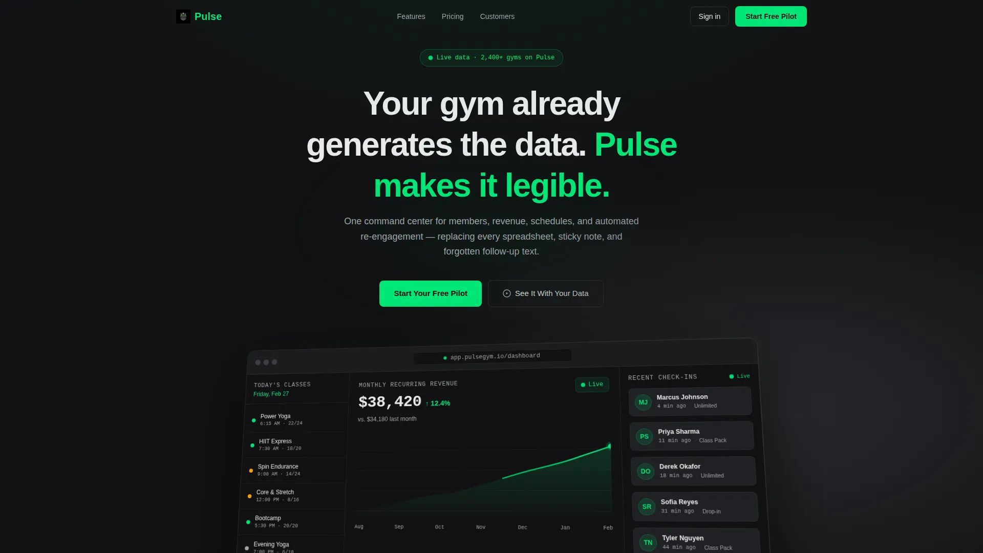
- A pixel-accurate dashboard preview header showing live-style data like member check-ins, class attendance, and monthly recurring revenue
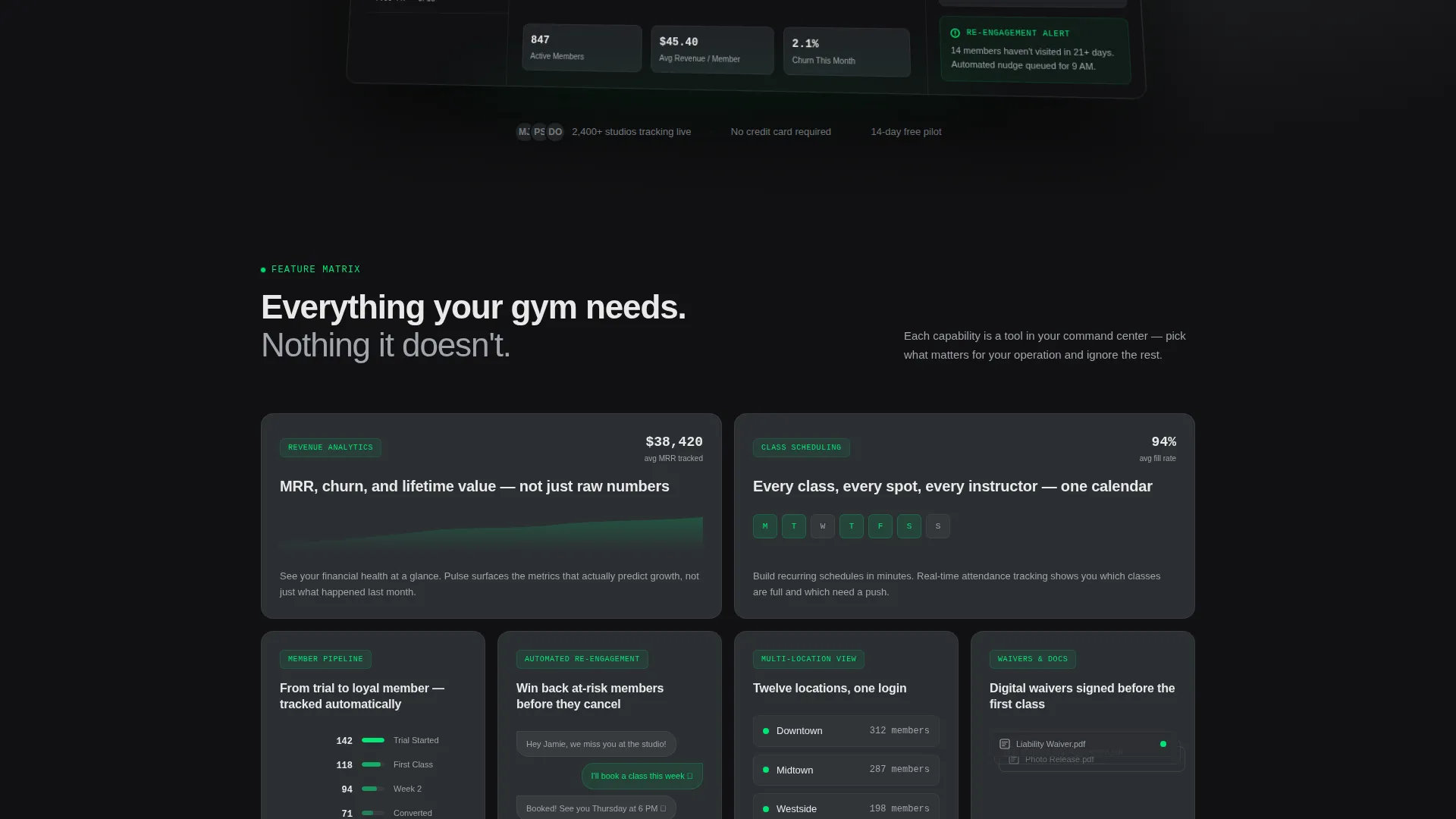
- A bento grid feature matrix with six capability cards, each with micro-illustrations and hover animation cues
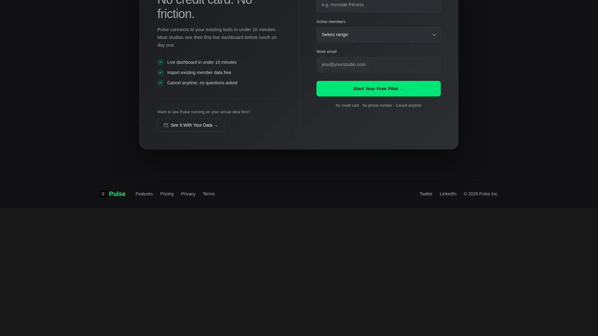
- A three-field lead capture form and a secondary demo booking path, both designed to minimize friction
Feature list
This template comes with purpose-built sections and design components grounded in the fitness CRM context. Each feature below is present in the template as described.
Dashboard Preview Header
The header centers a slightly angled browser frame showing Pulse's interface mid-session. It displays a left rail of today's classes with colored attendance dots, a center panel graphing monthly recurring revenue with an upward trendline, and a right card stack of recent member check-ins with timestamps and profile thumbnails. Data labels feel plausible and specific, including "$38,420 MRR" and "6:15 AM Power Yoga, 22/24 spots filled."
Bento Grid Feature Matrix
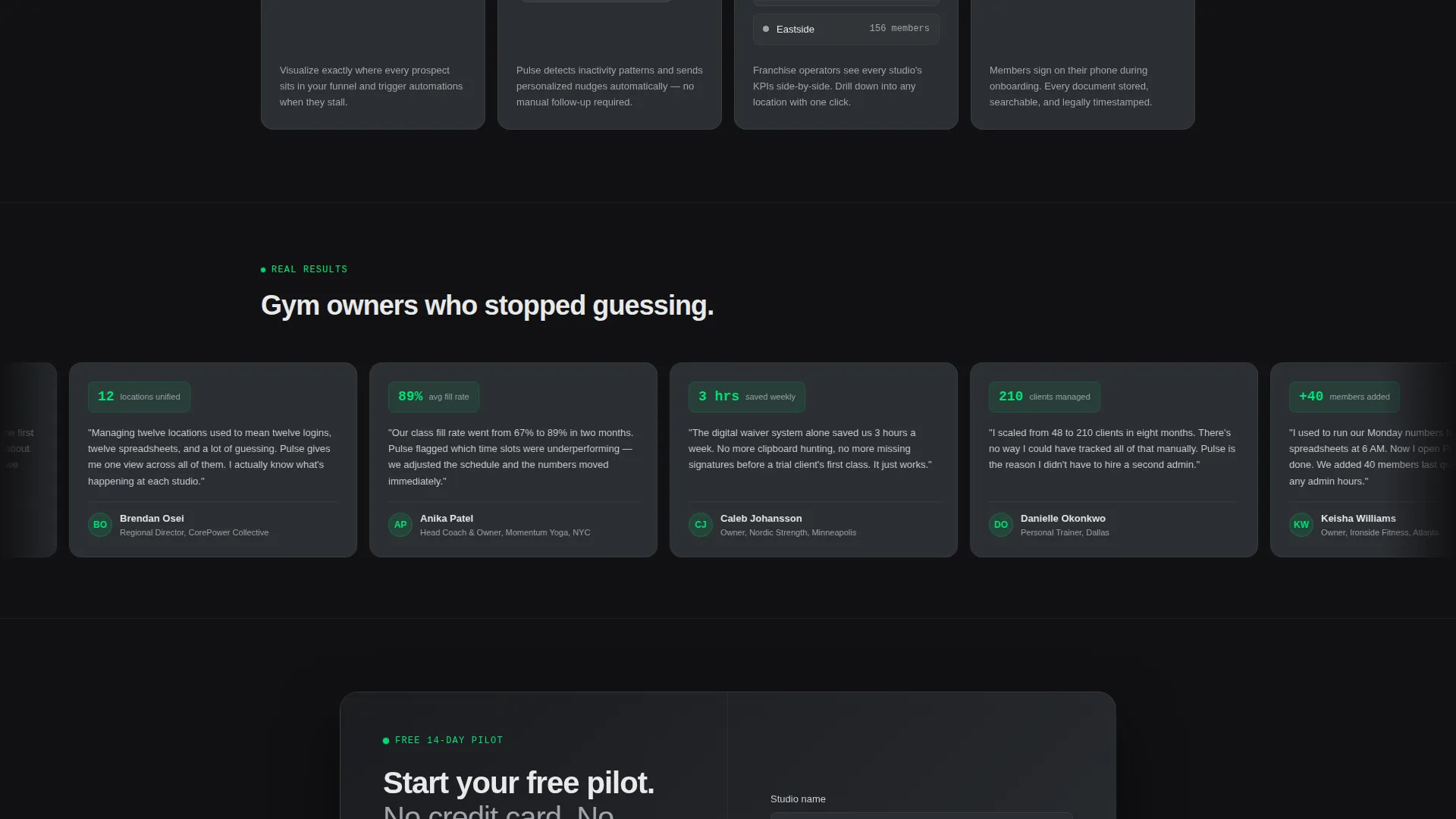
Six capability cards fill the section below the fold, each representing a distinct fitness CRM function. Cards use a uniform gunmetal surface with individual micro-illustrations that animate subtly on hover. Revenue and scheduling cards occupy double-width cells, while integrations and document cards sit in single-width squares.
Friction-Low Lead Capture Form
The primary call-to-action form collects just three fields in sequence: studio name, number of active members via dropdown, and work email address. No credit card and no phone number are required. The form appears both in the header area and again after the feature matrix.
Live-Data Visual Language
Signal green is used exclusively for live-data indicators, active state toggles, and primary call-to-action buttons. This restricted use of the accent color trains the visitor's eye to find actionable elements instantly. Static elements never compete with interactive ones.
Secondary Demo Booking Path
A secondary call to action labeled "See It With Your Data" links visitors to a live demo booking calendar. This path serves visitors who want proof before committing, giving the page two distinct conversion routes without adding visual noise.
Monochrome Steel Color System
The full palette is defined and applied consistently: forge black for backgrounds, brushed gunmetal for card surfaces, cool chrome for body text, and signal green for live indicators and primary actions. Every color has a single assigned role, keeping the visual hierarchy clean and industrial.
Page sections overview
| Section | Purpose |
|---|---|
| Dashboard Preview Header | Shows live-style CRM data to build immediate credibility |
| Headline Overlay | Frames the product value with a single clear statement |
| Feature Matrix Grid | Spreads six CRM capabilities across scannable bento cards |
| Primary call to action Form | Captures leads with three low-friction fields |
| Secondary Demo call to action | Offers a demo booking path for higher-intent visitors |
Design & branding system
The visual identity is built on Monochrome Steel, a four-color system where every tone has a fixed job. The result feels industrial and precise, like a well-maintained gym floor before the first class of the day.
- Forge black (#111113) backgrounds, brushed gunmetal (#2C2F33) card surfaces, and cool chrome (#A0A4AB) body text create a layered dark-mode depth
- Signal green (#00E676) appears only on live-data dots, active toggles, and primary call-to-action elements, making every interactive moment visually distinct
- The Startup Velocity theme drives the overall layout energy: tight grids, purposeful whitespace, and zero decorative excess
Mobile & speed optimization
The bento grid layout is structured to reflow cleanly across screen sizes. Card hierarchy adapts so that double-width cells in the feature matrix stack gracefully on narrower viewports without losing their relative importance.
- Card sizes and text hierarchy are set to remain readable and proportional on tablet and mobile views
- The three-field form is compact by design, keeping the primary conversion path usable on any device
- The dashboard preview header uses a static browser frame illustration, avoiding heavy media loads while still conveying a live data feel
How this template helps you convert
The page is structured to build confidence before it asks for anything. By the time a visitor reaches the form, they have already imagined their own gym data inside the dashboard preview.
- The dashboard header shows plausible, specific data points first, so visitors mentally place themselves inside the product before reading a single feature claim.
- The bento grid lets each visitor self-select what matters to them, whether that is member management, revenue tracking, or multi-location oversight, making the value feel personally relevant.
- Two conversion paths (the "Start Your Free Pilot" form and the "See It With Your Data" demo link) serve both ready-to-act visitors and those who need one more reason to trust the product.
Other information about this template
This template is built for the fitness software and SaaS category and sits squarely in the fitness CRM niche. It is a strong starting point for any operator positioning a gym management or studio software product to busy fitness professionals.
- The template style is bento grid, making it well suited to products with multiple distinct features that benefit from side-by-side visual comparison
- The creative direction is a feature matrix, meaning the page does not follow a linear narrative but instead spreads capabilities across a visual table for the visitor to explore
- The lead generation direction keeps the page focused on a single conversion goal with minimal distraction
- This template works well alongside fitness studio management tools, member tracking platforms, and class scheduling software products targeting independent and franchise gym operators
Theme
Startup Velocity
Creative direction
Feature Matrix
Color system
Monochrome Steel
Style
Bento Grid
Direction
Lead Generation
Page Sections
Dashboard Preview Header
Bento Grid Feature Matrix
Signal Green Live-data System
Friction-low Lead Capture Form
Secondary Demo Booking Path
Monochrome Steel Color System
Related questions
Can I customize the dashboard preview data shown in the header?
Does this template include two conversion paths?
Who is the ideal audience for a page built on this template?
Is the bento grid layout fixed at six feature cards?
What makes the Monochrome Steel color system distinctive?



