Retail Software & SaaS Reviews & Social Proof Website Template
Pulse is a dynamic retail review management landing page template built around a live-terminal header, an animated competitive comparison table, and a sticky audit call-to-action. It targets multi-location retail directors, e-commerce brand managers, and franchise owners who need to see fragmented customer feedback consolidated and acted on in one place.
by Rocket studio
Quick summary
Pulse is a single-page template designed for retail review management platforms. It opens with a live-rendered code terminal, flows into an animated feature matrix comparing your platform against three unnamed competitors, and closes with a sticky call-to-action bar that captures a business name and Google listing URL for a free audit return within sixty seconds.
Who this template is for
This template is built for software companies and platform teams that sell review management solutions to the retail and franchise sectors. If your product aggregates reviews across multiple sources and surfaces actionable sentiment data, this page gives you a credible stage to prove it.
- Multi-location retail directors who manage fragmented feedback across dozens of stores
- E-commerce brand managers watching star ratings slip without knowing which product is responsible
- Franchise owners who discover service failures from social screenshots rather than their own dashboard
What problem this template solves
Retail feedback is scattered. Reviews land on Google, Yelp, Amazon, and dozens of other channels, and most platforms offer no single place to triage them by urgency or location. Visitors arriving at a review management landing page need to feel the problem before they trust the solution.
- No unified view across all review sources, locations, and product listings
- No real-time signal for which feedback is actively costing revenue
- No structured way to compare your platform's capabilities against alternatives already in the market
What you get with this template
You get a fully structured, single-page layout that moves a qualified visitor from curiosity to conversion. Every section is purposeful: the terminal header builds instant technical credibility, the comparison table handles the objection phase, and the sticky audit bar closes the gap between interest and action.
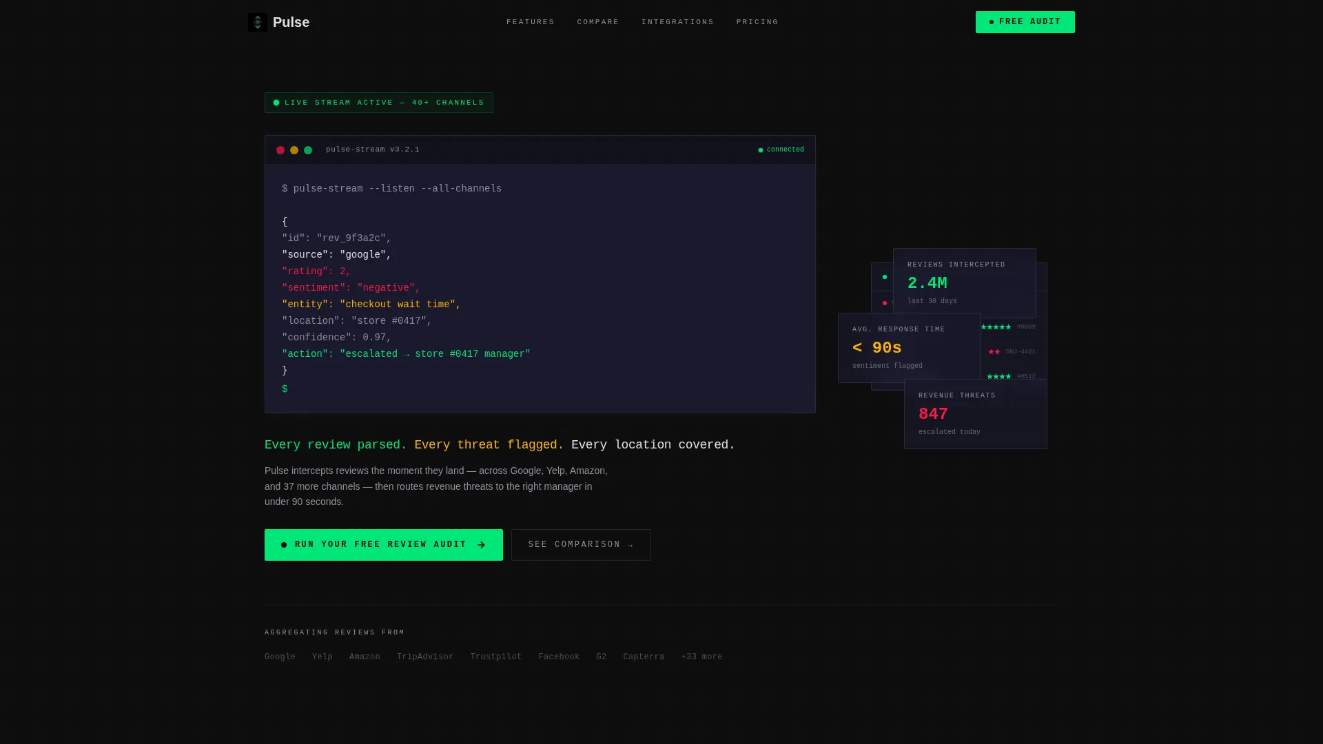
- A live-style code terminal header that streams a parsed review object character by character
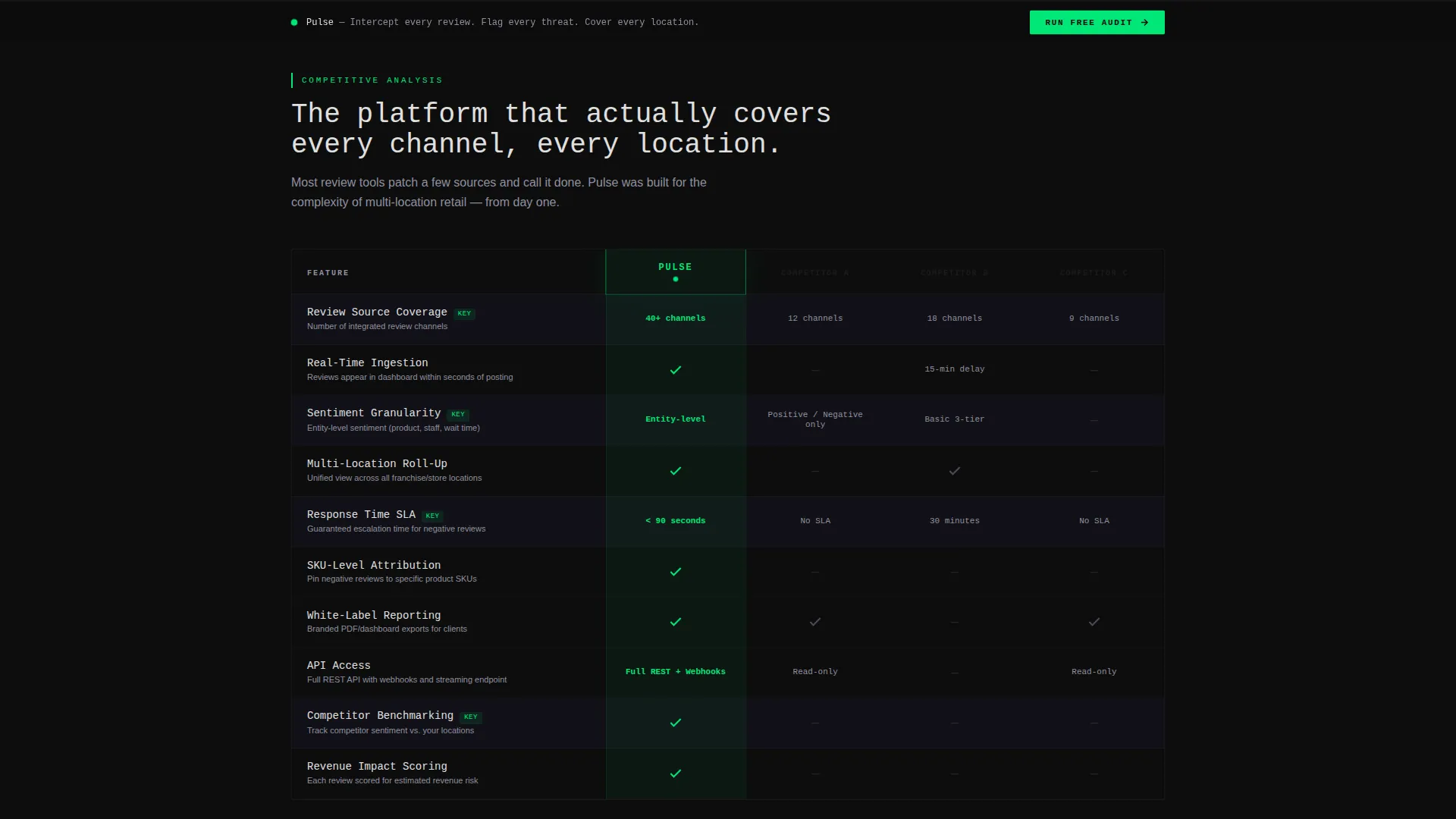
- An animated feature matrix with scroll-triggered row reveals and a glowing Pulse column
- A locked sticky call-to-action bar with a two-field audit form and a sixty-second results promise
Feature list
This template is built around a set of tightly integrated components. Each one serves a specific role in moving a visitor from skepticism to sign-up.
Live Terminal Header Block
The header renders a full-bleed black terminal that streams a JSON review object in real time. Fields include source, rating, sentiment, entity, and an escalation action line. The blinking cursor and monospace headline below it establish immediate technical credibility before the visitor reads a single marketing word.
Scroll-Triggered Comparison Matrix
The feature matrix names three unnamed competitors alongside your platform in a horizontal table. Rows animate one at a time as the visitor scrolls, with electric green checkmarks pulsing on entry and graphite dashes marking gaps. Your platform's column carries a subtle vertical glow that functions like a leaderboard highlight.
Expandable Feature Deep-Dives
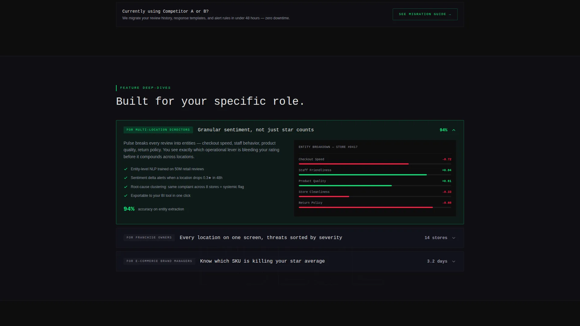
Below the comparison table, three expandable sections let visitors drill into the capabilities most relevant to their role. Each panel opens with a micro-animation of the feature in action, giving role-specific buyers a reason to stay and explore.
Sticky Audit Call-to-Action Bar
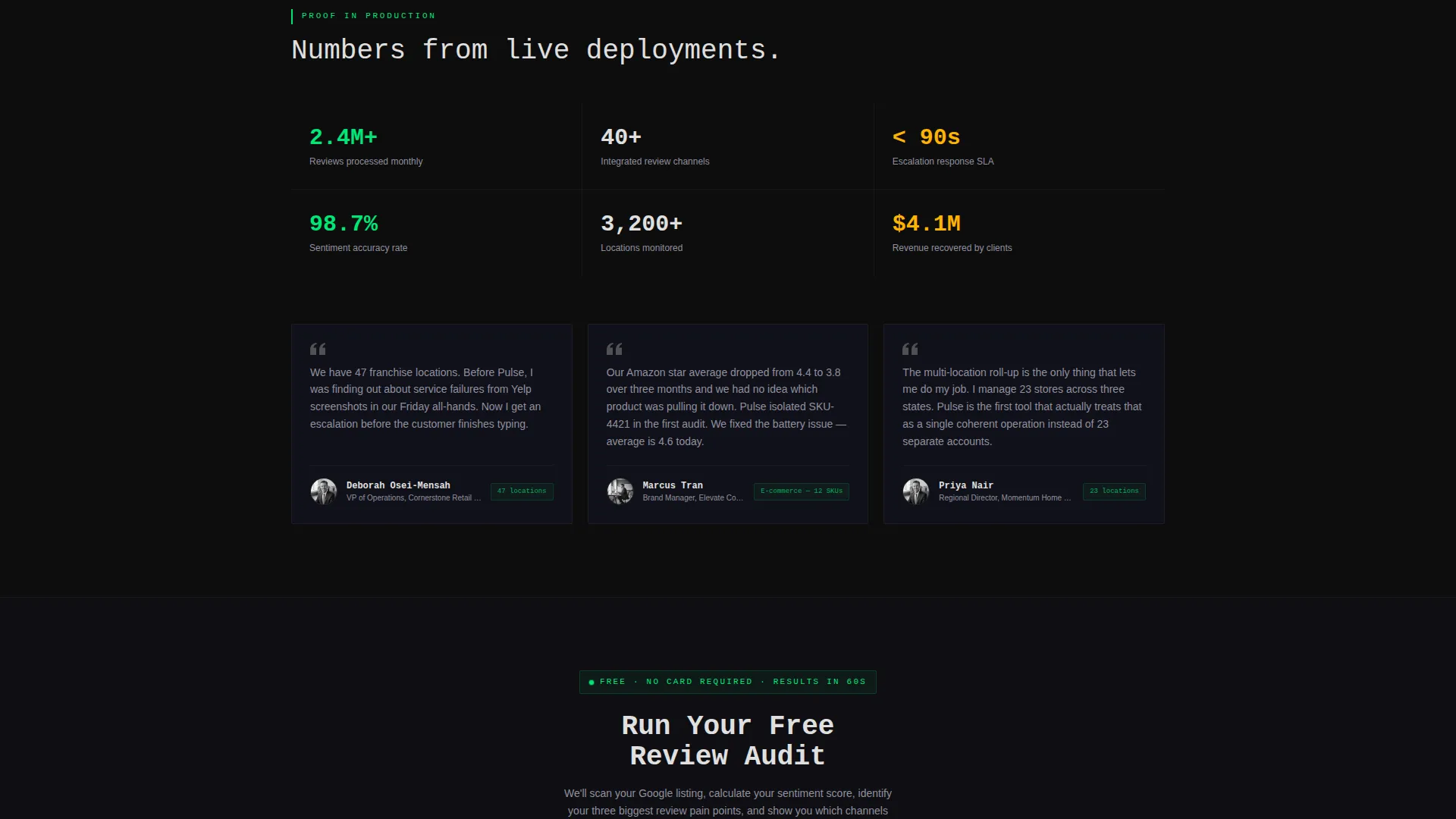
Once the visitor scrolls past the header, a slim dark bar locks to the bottom of the viewport. It carries the primary call-to-action: "Run Your Free Review Audit." Clicking opens a two-field form requesting a business name and primary Google listing URL.
Sixty-Second Audit Results Flow
After the visitor submits the form, the system returns a real audit showing total review count, average sentiment, and the three most-mentioned pain points. Results are delivered to the email provided on the results screen, turning the call-to-action into a tangible value exchange.
Competitor Migration Path
A secondary call-to-action sits beneath the comparison table: "See How We Replace [Competitor A]." This links to a dedicated migration guide, giving visitors who are already using a rival platform a clear and low-friction next step.
Page sections overview
| Section | Purpose |
|---|---|
| Terminal Header | Streams a live JSON review object to establish platform credibility immediately |
| Monospace Headline | Delivers the core value proposition below the terminal in a single readable line |
| Competitor Comparison Matrix | Compares platform features row by row against three labeled competitors with scroll animation |
| Expandable Feature Panels | Lets role-specific visitors drill into the three features most relevant to their decision |
| Migration call to action Link | Offers a secondary path for visitors already using a competitor platform |
| Sticky Audit Bar | Locks a persistent call-to-action to the viewport bottom after the header scrolls out of view |
| Audit Results Screen | Returns a real review audit with sentiment data and pain points within sixty seconds |
Design & branding system
The visual identity follows a Dynamic Motion theme built on a Carbon Fiber color system. Every surface is designed to recede so that data, alerts, and actions become the only elements demanding attention.
- Backgrounds sit in the deep cockpit black (#0D0D0D) to woven graphite (#1A1A2E) range, keeping the layout matte and focused
- Text uses titanium mid-tone (#4A4A5A) and white (#E0E0E0); electric status green (#00E676) marks positive signals and confirmed features
- Alert pulse red (#FF1744) appears exclusively on negative-sentiment indicators, making critical data impossible to miss
Mobile & speed optimization
The Dynamic Motion theme is built to translate across screen sizes without sacrificing the impact of its animations. Scroll-triggered effects and sticky elements are designed to behave predictably on both desktop and mobile viewports.
- The sticky audit bar and terminal header are structured to remain functional and readable on smaller screens
- Scroll-triggered row animations in the comparison matrix are scoped to avoid layout shifts that disrupt the reading experience
How this template helps you convert
This template is engineered around the Comparison and Versus conversion pattern. Every design and copy decision is calibrated to move a skeptical visitor toward a low-commitment first action.
- The terminal header replaces a marketing headline with working software output, earning trust before asking for anything
- The animated comparison matrix handles the "why not a competitor" objection visually and interactively, without requiring the visitor to leave the page
- The sticky audit bar and sixty-second results flow give the visitor their own data before asking for a buying commitment, making the call-to-action feel like a service rather than a sales pitch
Other information about this template
This template is categorized under Technology and specifically targets the Retail Software and Software as a Service subcategory. It is designed for teams building or marketing platforms in the retail review management niche. The intersection of a Feature Matrix creative direction, a Code Snippet header concept, and a Comparison Table template style makes it well-suited for positioning a data-driven product against established competitors.
- The template style is Comparison Table with a Feature Matrix creative direction, ideal for platforms with a clear competitive advantage to demonstrate
- The header concept is a Code Snippet, which works best for platforms with a real application programming interface (API) or live data layer to showcase
- Color customization follows the Carbon Fiber system; brand colors can be swapped while preserving the matte-surface-plus-glowing-data visual logic
- The landing page direction is Comparison and Versus, meaning the page is structured to answer the question "why this platform and not an alternative" before the visitor asks it
Theme
Dynamic Motion
Creative direction
Feature Matrix
Color system
Carbon Fiber
Style
Comparison Table
Direction
Comparison/Versus
Page Sections
Live Terminal Header Block
Scroll-triggered Comparison Matrix
Expandable Role-based Feature Panels
Sticky Viewport Audit Bar
Sixty-second Audit Results Flow
Competitor Migration Path
Related questions
Who is this landing page template built for?
What makes the terminal header different from a standard hero section?
Can I customize the competitor labels in the comparison table?
How does the sticky audit bar and results flow work?
Is this template suitable for a multi-location retail platform?



