SaaS Problem-to-Solution Trust Building Website Template
Pulse is a scroll-reveal landing page template built for SaaS companies that need to earn trust fast. It guides visitors through a Problem→Solution arc, moving from visualized chaos to calm clarity. Dark glass panels, electric indigo motion, and a narrative lead-generation flow make it ideal for technical buyers who judge software before they touch it.
by Rocket studio
Quick summary
Pulse is a single-page, scroll-driven landing page template designed for SaaS companies with a technical audience. It opens in controlled darkness, builds a story through progressive reveals, and converts through earned trust rather than hard sells. The design language is precise and energized, built around a void-black and electric indigo palette with living data panels.
Who this template is for
This template speaks directly to SaaS founders and technical operators who know their audience is skeptical and short on patience. It is built for teams that need to communicate depth and reliability without a wall of marketing copy.
- SaaS founders pitching to engineering leaders and operations teams
- Product and growth teams replacing a generic about page with a narrative-driven experience
- Operators who want lead generation built into the page structure, not bolted on afterward
What problem this template solves
Most SaaS about pages look the same: a team photo, a mission sentence, and a contact form. That approach fails with technical buyers, who read visual design as a signal of product quality. Pulse addresses the deeper problem of first-impression credibility.
- Visitors evaluate the builder before they evaluate the product, and a generic page fails that test
- CTOs and ops leads abandon pages that feel disconnected from the problem they are actually trying to solve
- Traditional static layouts cannot convey motion, precision, or the sense that a product is alive and working
What you get with this template
You get a fully structured, single-page layout that moves visitors through a deliberate narrative arc. Every section serves a purpose, and every interaction reinforces the same message: this product was built by people who understand the problem from the inside.
- A scroll-reveal page structure that progressively clears visual noise as the visitor moves down
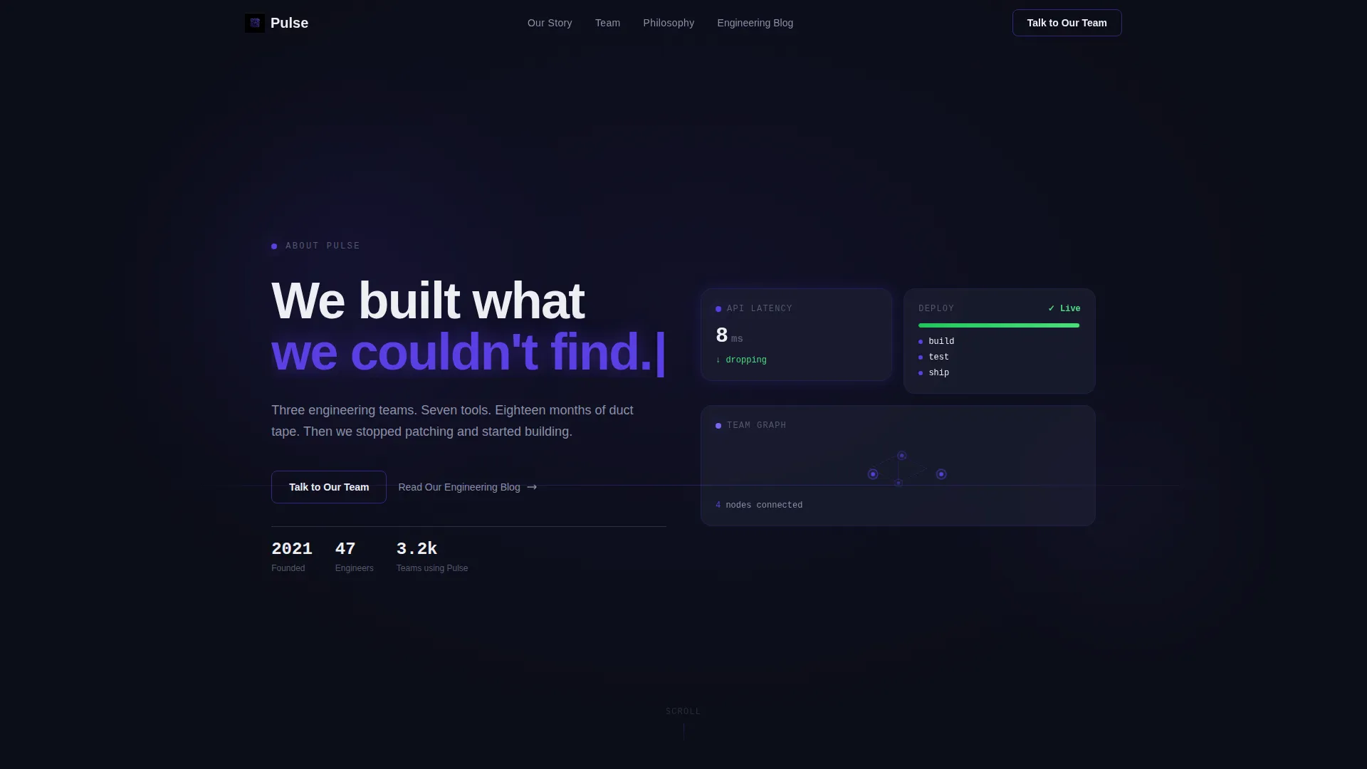
- A Dark Glass Panel header with micro-animated data displays and a self-typing headline
- A two-path conversion system with a primary contact form and a secondary content engagement route
Feature list
This template ships with a set of purposefully designed components. Each one is grounded in the source brief and serves the lead generation goal directly.
Dark Glass Panel Header
Semi-transparent, frosted-glass cards float against a void-black background. Each panel holds a single live metric or micro-animation: a latency counter dropping to single digits, a deployment bar completing, or a team graph connecting nodes. The cursor triggers a subtle parallax effect across all panels.
Self-Typing Headline Animation
The headline "We built what we couldn't find." types itself in on load. This single motion sets the tone for the entire page: deliberate, confident, and human. It signals craft without stating it.
Scroll-Reveal Problem→Solution Arc
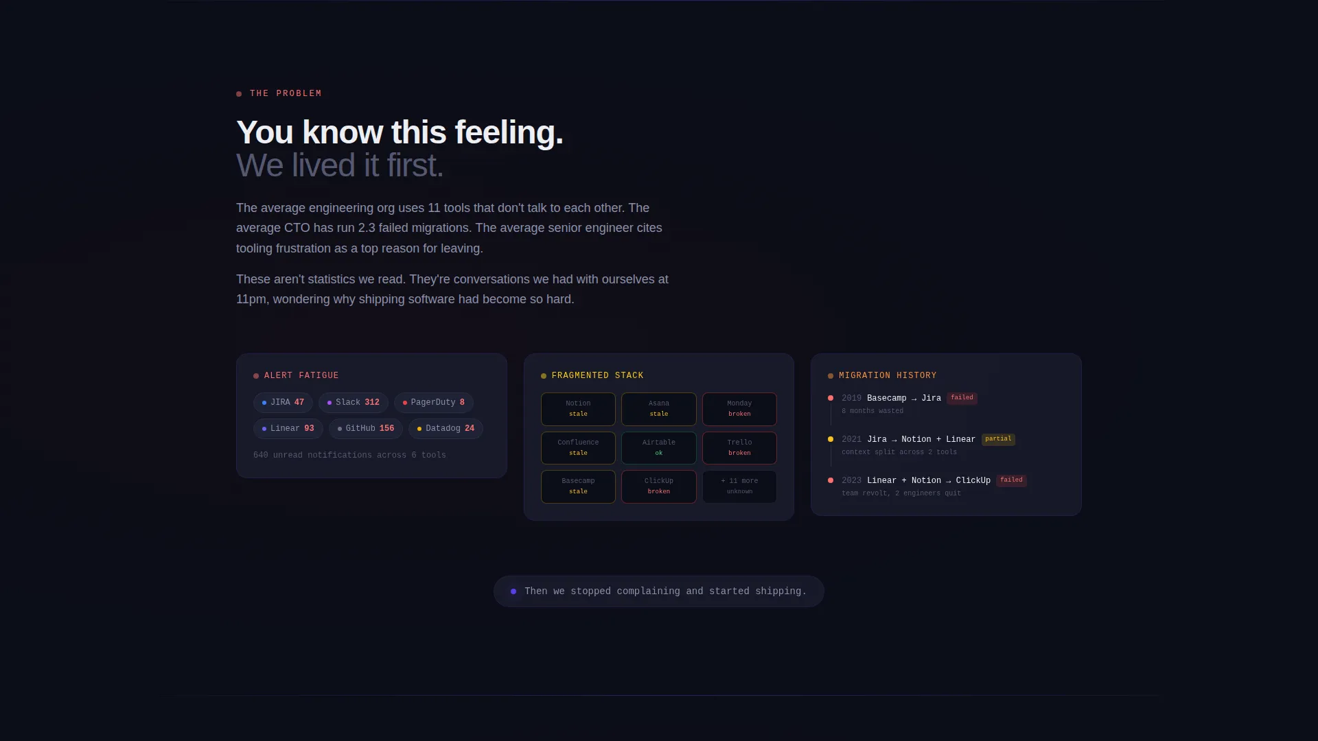
Each scroll step is a narrative beat. The first sections render the pain visually, with fragmented dashboards, stacking notification badges, and a failed migration timeline. As the visitor scrolls, panels sharpen, animations settle, and whitespace opens up. The scroll itself performs the transformation.
Progressive Lead Generation Form
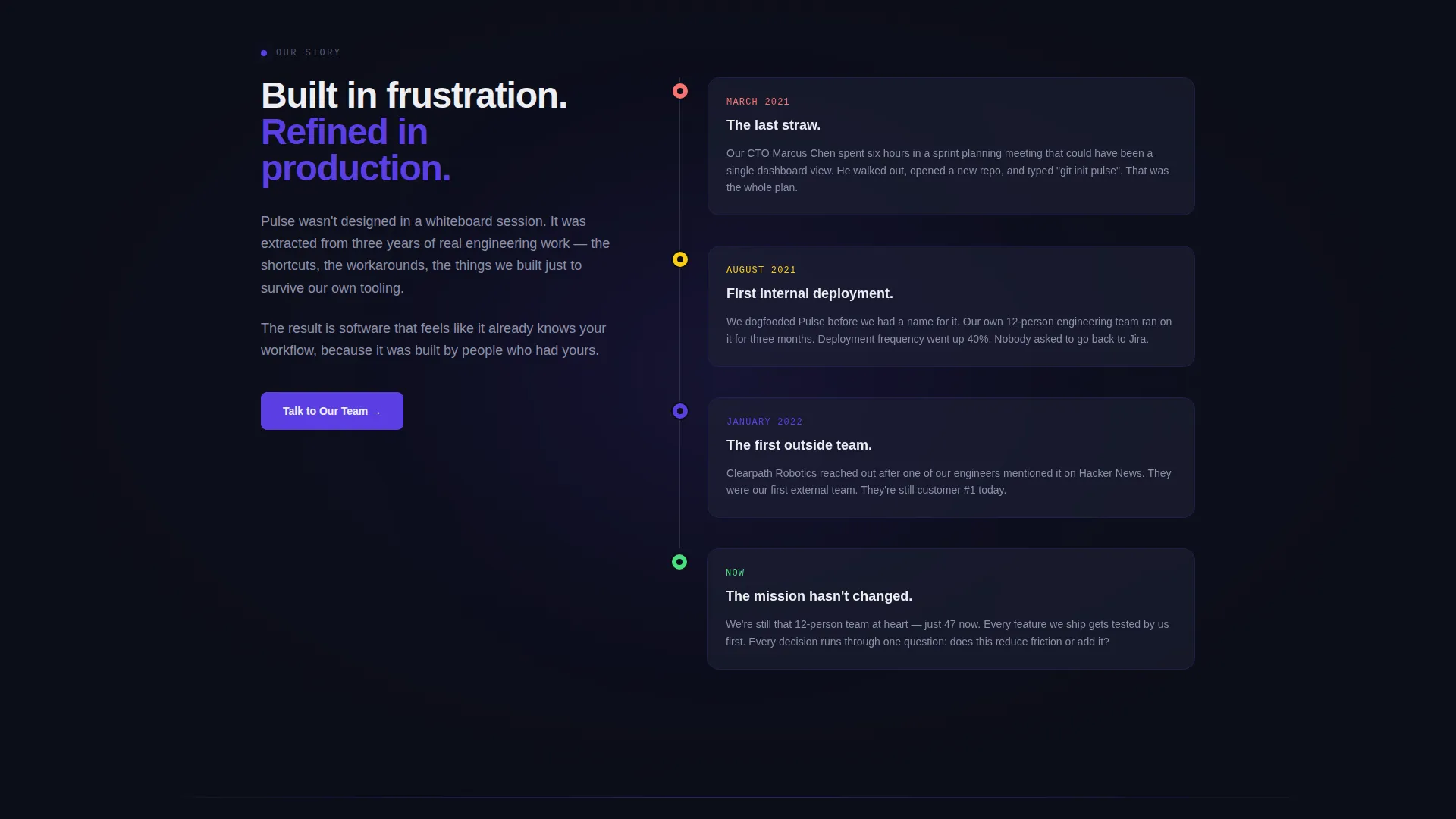
The primary call to action starts as a ghost button in the header and fills into a solid indigo button after the founding story section. The form collects a work email, a company size toggle with three ranges, and one open-field question: "What's broken right now?" This keeps friction low while surfacing high-intent signals.
Founding Story and Team Section
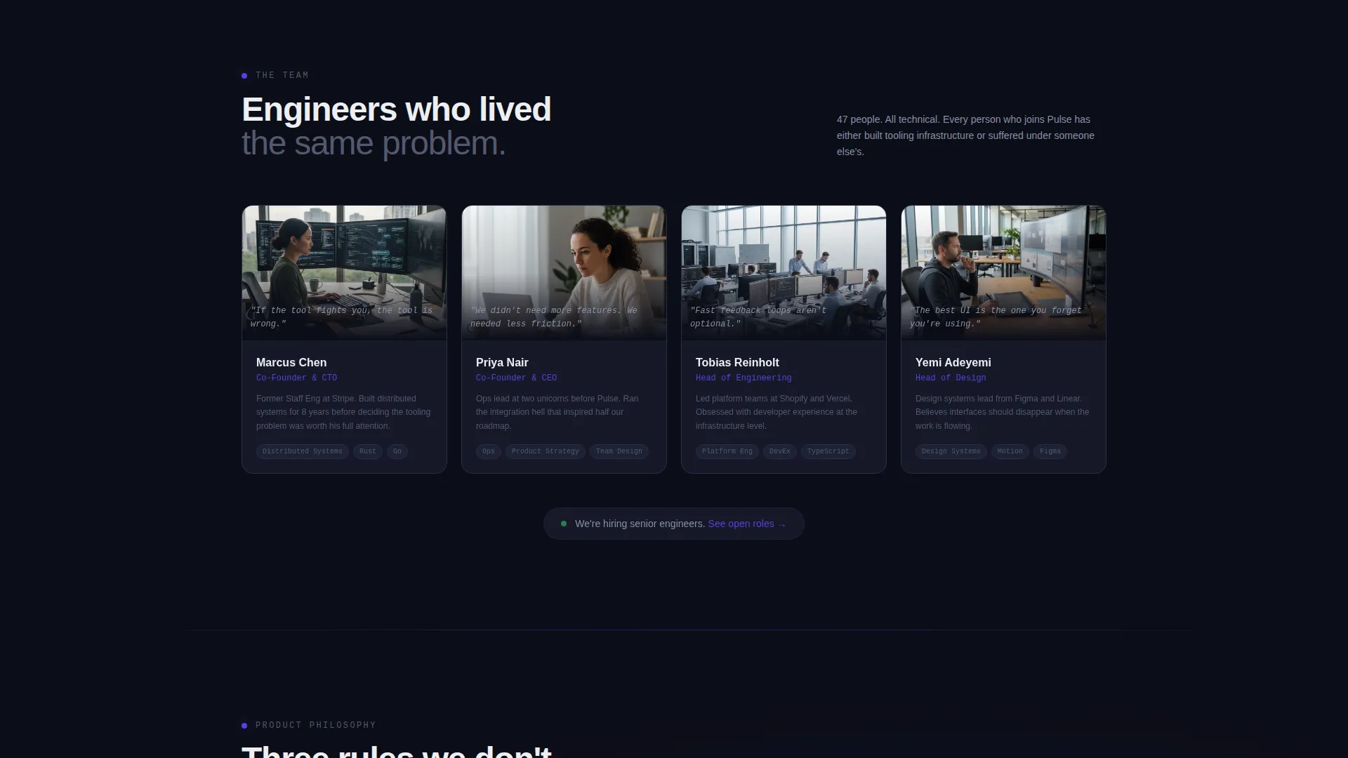
The mid-page section introduces the engineering team through short looping desk videos. The product philosophy is presented as three stated rules, not bullet points of features. This section converts passive readers into engaged prospects by making the company feel real and accountable.
Secondary Content Engagement Path
Visitors who are not ready to convert are offered a clear secondary route: "Read Our Engineering Blog." This captures intent through content rather than losing the visitor entirely, keeping them in the brand ecosystem.
Page sections overview
| Section | Purpose |
|---|---|
| Dark Glass Header | Opens with live data panels and self-typing headline |
| Pain Visualization | Renders fragmented tools and alert fatigue visually |
| Failed Migration Timeline | Shows the cost of staying with the wrong tools |
| Clearing Transition | Progressive visual calm as narrative shifts to solution |
| Founding Story | Builds credibility through honest company origin |
| Engineering Team | Short looping videos humanize the builders |
| Product Philosophy | Three uncompromising rules anchor brand trust |
| Primary call to action Form | Collects email, company size, and pain context |
| Secondary Blog Path | Captures not-yet-ready visitors through content |
Design & branding system
The visual identity runs on a Dynamic Motion theme with an Electric Indigo color system. Every color choice is intentional, and every motion element serves the narrative rather than decorating it.
- Void black (#0B0D17) covers the dominant background, keeping focus on data and motion
- Electric indigo (#5B3FE4) activates on interactive surfaces, scroll triggers, and button hovers, pulsing like a heartbeat in the interface
- Cool slate (#1E2235) fills card panels and section dividers, adding depth without distraction
- Phosphor white (#EDEEF2) carries all body and headline type for high-contrast legibility
Mobile & speed optimization
The scroll-reveal structure and animation system are designed with a progressive reveal approach, meaning motion elements load in sequence rather than all at once. This keeps the experience coherent on smaller screens.
- Animation triggers are scroll-based, so content stays readable even if motion is reduced by device settings
- The single-page structure avoids multi-page navigation overhead, keeping the visitor in one continuous experience
- The layout adapts across breakpoints to maintain the dark glass panel aesthetic on mobile viewports
How this template helps you convert
Pulse treats conversion as a byproduct of trust, not a demand made of visitors. The page structure is designed to earn the click before it asks for it.
- The ghost-to-solid call to action progression ties the call to action to narrative momentum: the button only solidifies after the founding story lands, so the ask feels earned rather than forced.
- The lead form asks three focused questions, including the open field "What's broken right now?", which surfaces buyer pain and starts a real sales conversation rather than a generic follow-up sequence.
- The secondary blog path keeps non-converting visitors engaged, giving the team a second opportunity to reach them through content rather than losing them entirely.
Other information about this template
Pulse is built specifically for the SaaS company about us page use case, where the audience is technical and the stakes of a weak first impression are high. It fits within the broader category of SaaS company website templates focused on technology brands.
- The template style is Scroll Reveal (Progressive), meaning each section appears as the visitor reaches it rather than loading all content at once
- The creative direction follows a Problem→Solution Arc, a structure proven effective with buyers who have already tried and abandoned competing tools
- The header concept, Dark Glass Panels, is a distinct visual signature that avoids stock photography entirely in favor of living data displays
- The lead generation direction is built into the template architecture, not added as an afterthought
- This template suits teams preparing for a product launch, a rebrand, or a migration pitch where the first-impression bar is especially high
Theme
Dynamic Motion
Creative direction
Problem→Solution Arc
Color system
Electric Indigo
Style
Scroll Reveal (Progressive)
Direction
Lead Generation
Page Sections
Dark Glass Panel Header
Self-typing Headline Animation
Scroll-reveal Problem and Solution Arc
Progressive Lead Generation Form
Founding Story and Team Section
Secondary Content Engagement Path
Related questions
Is this template designed for a single page or multiple pages?
Can I use this template if my product is not a project management tool?
How does the lead generation form work in this template?
What happens to visitors who are not ready to fill out the form?
Do I need video content ready to use this template?



