Directory & Marketplace Platforms Provider Directory Website Template
Pulse is a split-screen wellness practitioner directory landing page built for founders launching a searchable atlas of healers, bodyworkers, and energy practitioners. It uses an Acid Digital color system, an Interactive Explorer scroll journey, and a Comparison/Versus conversion architecture to show visitors exactly why curated practitioner discovery beats a generic search result.
by Rocket studio
Quick summary
Pulse is a high-impact, single-page directory landing page for a wellness practitioner platform. It pairs a 50/50 split-screen layout with bold Acid Digital branding and an interactive scroll journey that compares your platform against a generic search experience. The result is a page that earns visitor trust through demonstration, not description.
Who this template is for
This template is built for founders, product teams, and marketers launching or growing a wellness practitioner directory. It speaks equally to the person listing the platform and the person browsing it for the first time.
- Founders building a searchable directory of healers, bodyworkers, breathwork guides, or energy practitioners
- Product teams who need a conversion-focused landing page that showcases the search and filtering experience
- Practitioners discovering the platform organically and considering whether to list their practice
What problem this template solves
Finding a qualified wellness practitioner online is still a frustrating experience. Generic search results return outdated listings, unanswered profiles, and pages with no credential context. This template positions your platform as the credible, organized alternative.
- Visitors arrive skeptical after years of poor search results, so the page leads with a live product demonstration instead of marketing claims
- The side-by-side comparison format makes the gap between old-style search and your curated directory immediately visible
- The three-field guided search form delivers an instant result, letting visitors experience the product before they commit to signing up
What you get with this template
You get a fully structured, single-page landing page built around interactive demonstration and scroll-driven discovery. Every section serves a role in moving a visitor from skeptical to converted.
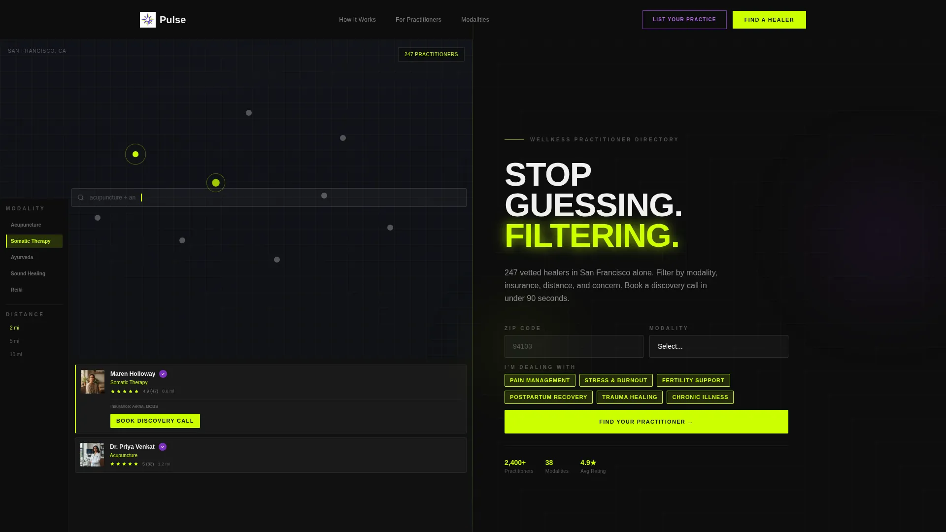
- A 50/50 split-screen header with a product screenshot on the left and a bold headline with a live search bar on the right
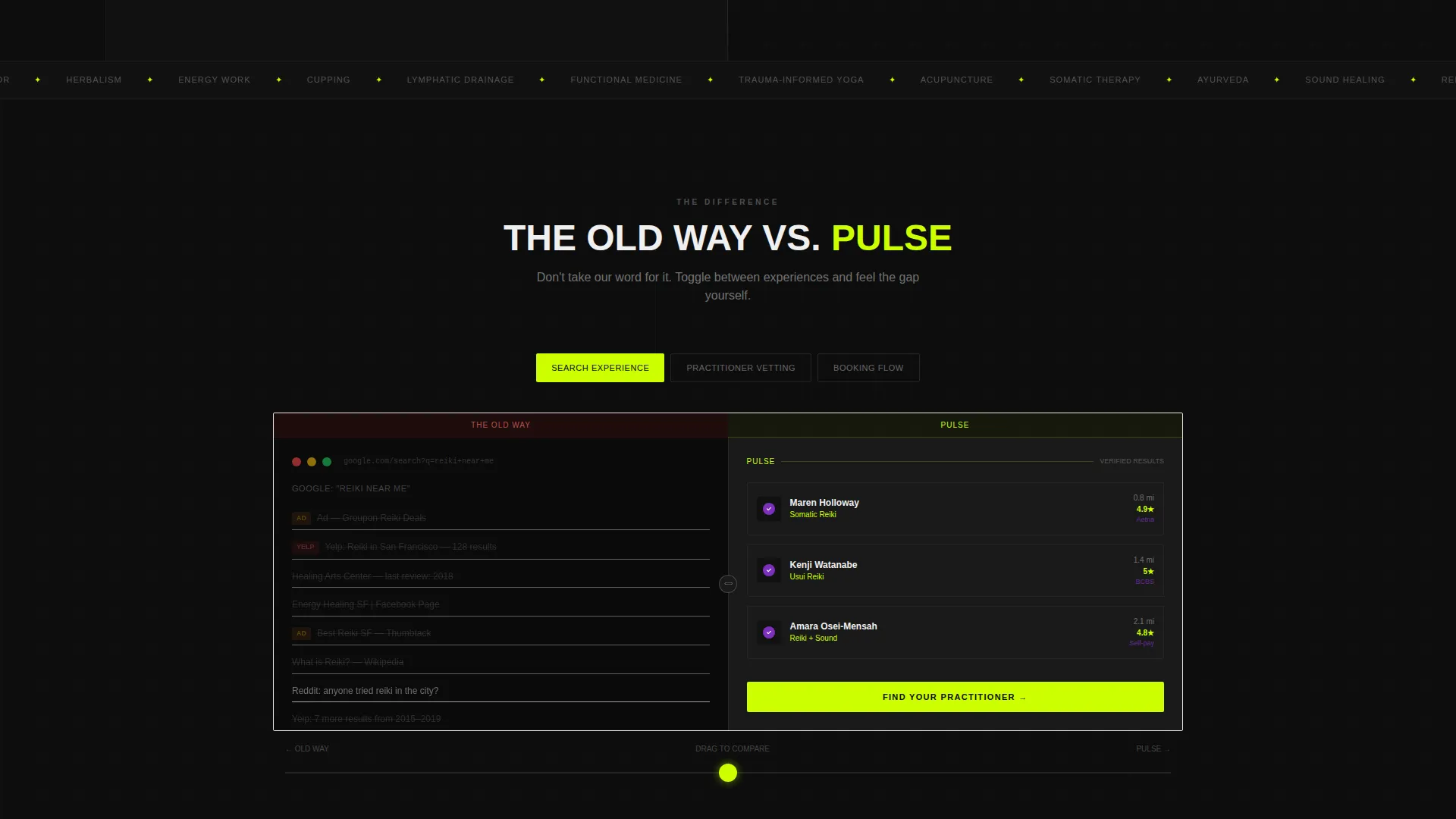
- Scroll-triggered comparison modules that let visitors toggle or drag a slider between your directory and a generic results page across four comparison axes
- A dual call-to-action system with a primary "Find Your Practitioner" path and a secondary "List Your Practice" path for organic practitioner traffic
Feature list
This section outlines the core capabilities built into the Pulse template as described in the source brief.
Split-Screen Header Layout
The header divides the viewport evenly. The left panel shows a product screenshot of the directory interface, complete with a map view, chartreuse location pins, a modality filter sidebar, and a partially open practitioner card showing a photo, star rating, distance, and a booking button. The right panel is void black with the headline "Stop Guessing. Start Filtering." and a functional search bar.
Scroll-Triggered Comparison Journey
As the visitor scrolls, the page simulates a guided search journey. Each section reveals a new comparison axis, covering search experience, vetting process, booking flow, and review authenticity. Visitors interact with sliders or tab controls to explore each contrast, discovering the platform's value through direct engagement rather than passive reading.
Interactive Versus Modules
The comparison architecture lets visitors toggle between a generic search results page and your curated directory in real time. The contrast is visual and immediate: twelve blue links and ad placements versus practitioner cards showing credentials, modalities, insurance accepted, and verified reviews.
Three-Field Guided Search Form
The primary conversion form asks for zip code, modality, and concern type. Concern categories include pain, stress, fertility, and recovery. The form is designed to return results instantly, giving visitors a real product experience before any sign-up friction appears.
Dual Call-to-Action Architecture
The primary call to action, "Find Your Practitioner," anchors the header and repeats after every comparison module. The secondary call to action, "List Your Practice," uses an ultraviolet button to capture practitioner traffic without competing with the main visitor conversion path.
Acid Digital Color System
Every interactive element, hover state, and active filter tag uses electric chartreuse. Category badges and verification icons use ultraviolet. Void black anchors all backgrounds and primary typography. Interface white opens space inside cards and modal overlays. The palette is precise, high-contrast, and deliberately unlike conventional wellness aesthetics.
Page sections overview
| Section | Purpose |
|---|---|
| Split-Screen Header | Anchors the page with a product screenshot and bold headline with live search bar |
| Comparison Toggle Module | Lets visitors switch between a generic search page and the curated directory side by side |
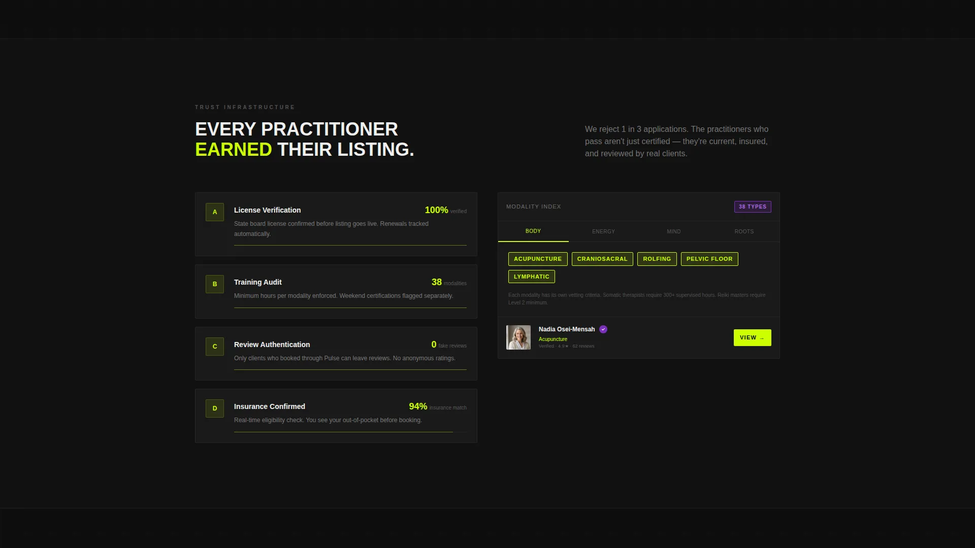
| Vetting Process Comparison | Shows the difference between unverified listings and credentialed practitioner profiles |
| Booking Flow Comparison | Contrasts a fragmented contact process with a direct "Book Discovery Call" button |
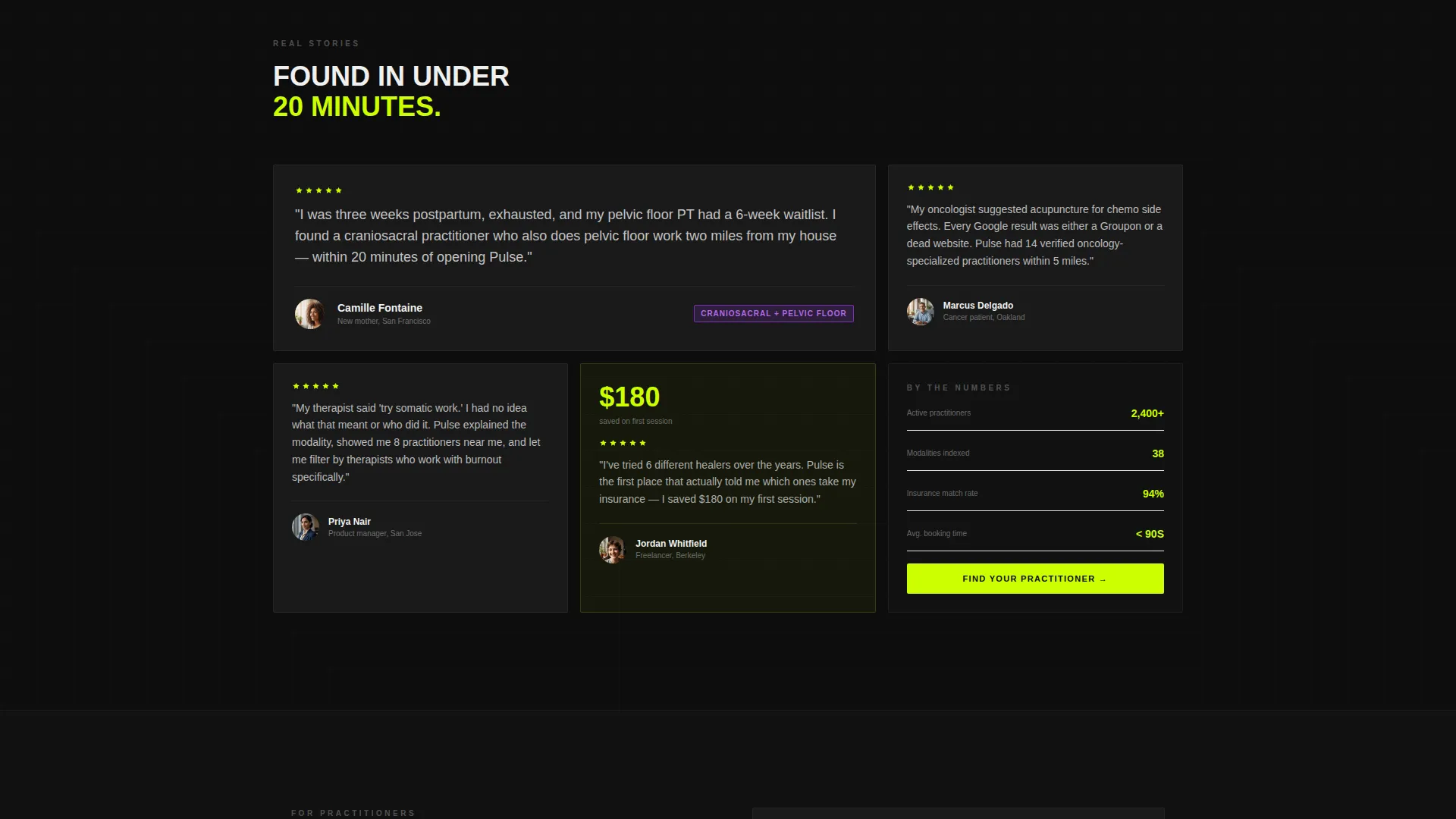
| Review Authenticity Comparison | Highlights verified reviews versus unmoderated third-party ratings |
| Three-Field Search Form | Delivers an instant directory result using zip code, modality, and concern type |
| Practitioner Listing call to action | Captures organic practitioner traffic with a secondary "List Your Practice" path |
Design & branding system
The visual identity follows a Directory and Discovery theme built on the Acid Digital color system. It is designed to feel precise, electric, and completely distinct from soft, pastel-heavy wellness aesthetics.
- Core palette: void black (#0D0D0D), electric chartreuse (#CCFF00), ultraviolet (#7B2FBE), and interface white (#F0F0F0)
- Chartreuse is reserved exclusively for interactive elements including hover states, active filter tags, location pins, and call-to-action buttons; ultraviolet marks category badges and practitioner verification icons
- The overall visual register reads like a rave flyer designed by a user experience team: dangerous energy contained inside surgical precision
Mobile & speed optimization
The split-screen layout and scroll-triggered interactions are structured to translate clearly to smaller viewports. The design system uses high-contrast color and bold typography, which maintain legibility at any size.
- The 50/50 header stacks vertically on mobile so both the product screenshot and the headline remain fully visible without horizontal scrolling
- Interactive comparison modules are designed with tap-friendly controls so slider and toggle interactions work on touch screens as naturally as on desktop
How this template helps you convert
The Pulse template converts by removing doubt through demonstration. Every design and structural decision is aimed at closing the gap between visitor skepticism and confident action.
- The live search bar in the header lets visitors type a real query immediately, making the platform feel usable before any sign-up prompt appears
- The scroll-driven comparison sequence progressively deepens the contrast between the old search experience and your directory, so by the time the final call to action appears, the visitor has already decided
- The repeated "Find Your Practitioner" call to action after each comparison module captures visitors at the exact moment their confidence peaks, reducing drop-off between intent and conversion
Other information about this template
Pulse is categorized under Technology, specifically within the Directory and Marketplace Platforms subcategory, with a niche focus on wellness practitioner discovery. It is a strong fit for teams building products in the integrative health, holistic wellness, or complementary medicine space.
- The template style is Split Screen (50/50), making it visually distinctive in a category where most landing pages use full-width hero sections
- The creative direction is Interactive Explorer, meaning the page teaches value through interaction rather than static copy
- The conversion architecture is Comparison/Versus, a format well suited to platforms replacing an inferior existing behavior like a generic web search
- The header concept is Product Screenshot, which grounds the page in real interface credibility from the first second of a visit
Theme
Directory & Discovery
Creative direction
Interactive Explorer
Color system
Acid Digital
Style
Split Screen (50/50)
Direction
Comparison/Versus
Page Sections
Split-screen Header with Product Screenshot
Scroll-triggered Comparison Modules
Three-field Guided Search Form
Dual Call-to-action System
Acid Digital Color System
Practitioner Card Design
Related questions
Can I customize the modality filter categories shown in the template?
Does the live search bar in the header require a connected backend?
Is this template suitable for a platform serving both visitors and practitioners?
What makes the Comparison/Versus layout effective for a wellness directory?
Can the concern type categories in the three-field search form be changed?



