Pulse - High-Converting Fitness Landing Page Template
Pulse is a fitness promotional email landing page template built for gym owners, studio operators, and personal trainers who want campaigns that actually perform. It showcases a comparison table layout with a Dashboard Pro visual style, animated engagement stats, and a freemium call-to-action that moves visitors from curiosity to signup in a single, focused scroll.
by Rocket studio
Quick summary
Pulse is a single-page landing page template designed for a fitness promotional email platform. It uses a dark Dashboard Pro aesthetic, a stats-first scroll structure, and a side-by-side comparison table to show visitors exactly what they gain. The freemium model gives visitors a clear, low-friction entry point backed by real campaign proof.
Who this template is for
This template speaks directly to fitness business owners and marketers who already have a member list but are not getting results from it. It is built for people who know their emails are underperforming and want a smarter tool.
- Boutique studio owners managing between 200 and 800 members who need campaigns that feel personal, not mass-produced
- Franchise marketing coordinators handling multiple locations who need one platform that scales without extra manual effort
- Personal trainers with an email list who are still sending the same generic seasonal blast every January
What problem this template solves
Most gym email campaigns fail because they treat every member the same. A powerlifter and a Pilates regular have different motivations, different schedules, and different reasons to lapse. Generic tools do not account for that. This template presents a platform that solves that gap directly and visually.
- Lapsed members are reached at the right moment, with send times calibrated to late-evening scroll behavior
- Subject lines are tested against real engagement data, not guesswork
- Member segments are built around actual membership type, so body copy feels written for the individual
What you get with this template
The template delivers a full single-page layout structured to guide a cold visitor through proof, comparison, and conversion without friction. Every section has a clear job, and nothing is filler.
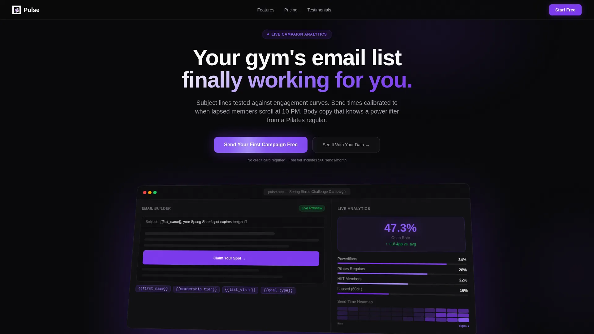
- A product screenshot header showing a live dashboard with a campaign in progress and animated open-rate metrics
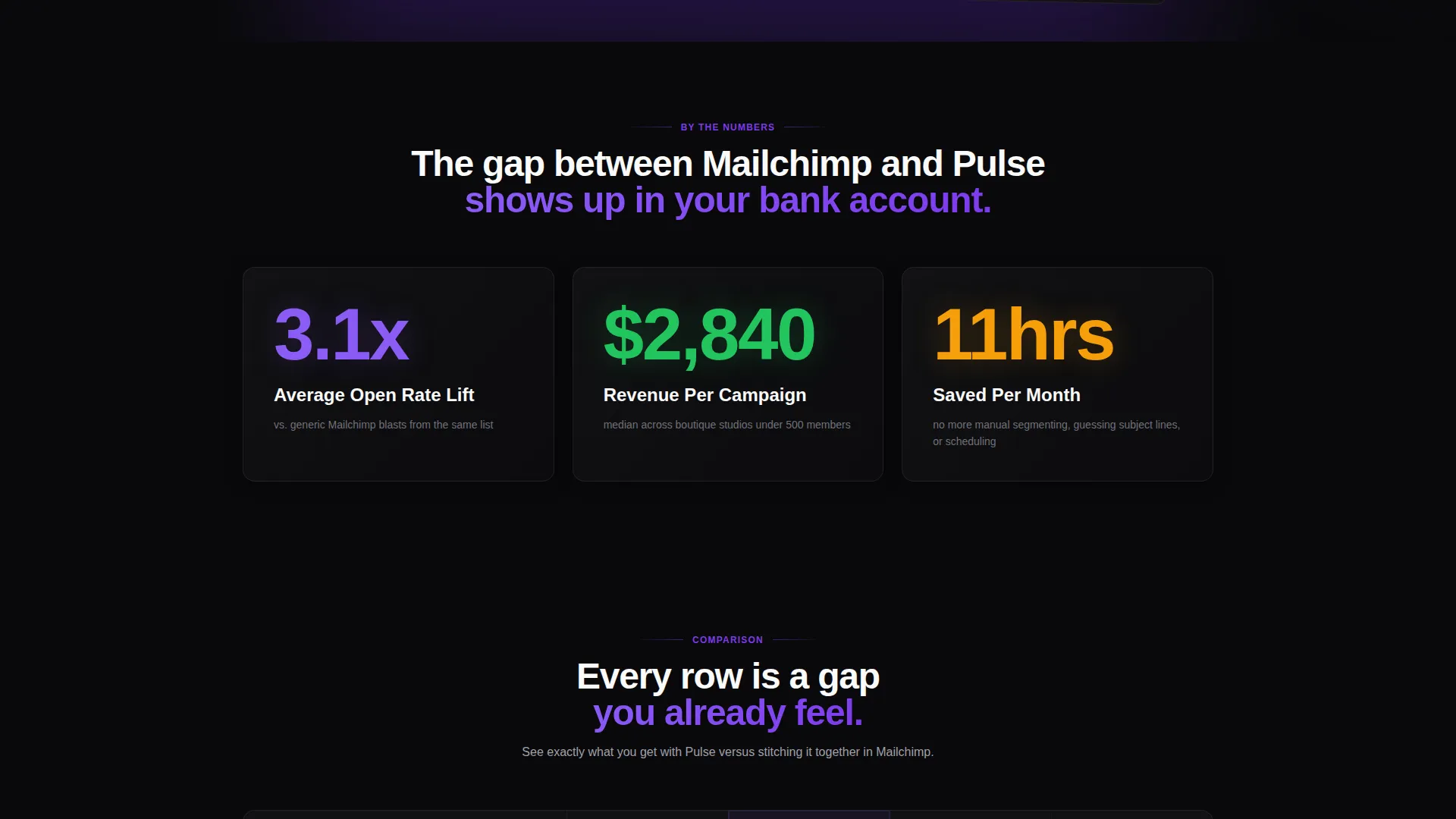
- Three animated stat blocks that count up as the visitor scrolls, presenting average open rate lift, revenue per campaign, and hours saved per month
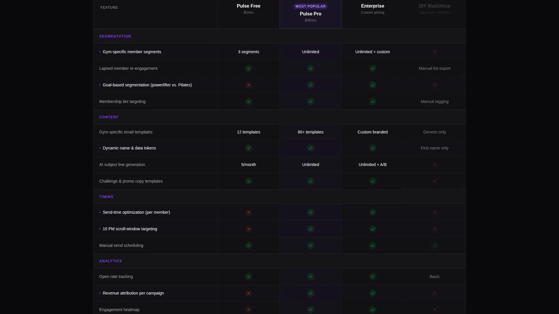
- A four-column comparison table covering free tier, pro tier, enterprise, and a ghost column representing manual effort in a generic email tool
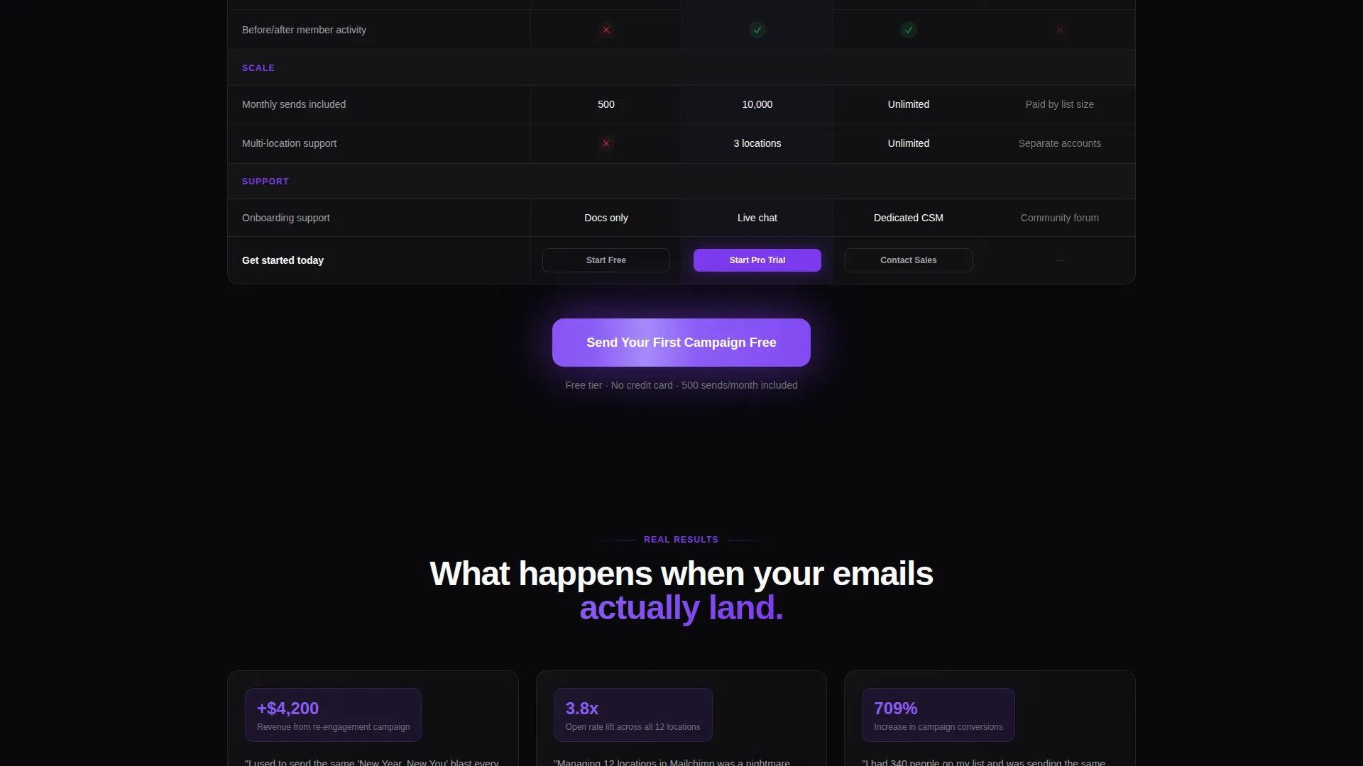
- Testimonial cards from studio owners showing before-and-after campaign numbers
- A pinned freemium call-to-action with a three-field signup form and a secondary demo path
Feature list
This template packages a specific set of designed components drawn directly from the brief. Each one serves a concrete role in the page's conversion flow.
Animated Stats Bar
Three oversized metric blocks sit directly below the header. Each number animates upward as the visitor scrolls into view, creating an immediate, visceral sense of what the platform delivers before any copy is read.
Isometric Product Screenshot Header
The header drops a pixel-rendered dashboard image into the viewport at a slight isometric tilt. It shows an email builder with dynamic member-name tokens and a live analytics panel displaying open rate, a send-time heatmap, and a segment breakdown. One metric counts upward in real time.
Four-Column Comparison Table
The core of the page is a structured comparison layout. It places the free tier, pro tier, and enterprise side by side, with a fourth ghost column representing manual effort in a non-specialized tool. Every row surfaces a gap the visitor already suspects exists.
Pinned Freemium Call-to-Action
The primary call-to-action is fixed to the bottom of the comparison table section. It glows violet against the void black background. The signup form contains exactly three fields: email address, studio name, and estimated list size, all completed in one step with no credit card required.
Secondary Demo Path
Alongside the main signup, a second conversion path labeled "See It With Your Data" offers a live demo pre-populated with sample gym member segments. This gives hesitant visitors a no-commitment way to experience the platform before signing up.
Studio Owner Testimonial Cards
The page closes with social proof from real studio owners. Each card pairs a name and studio type with before-and-after campaign metrics, grounding the platform's claims in recognizable, specific outcomes.
Page sections overview
| Section | Purpose |
|---|---|
| Dashboard screenshot header | Anchors the page with a product-in-action visual and animated open-rate metric |
| Animated stats block | Delivers three bold proof numbers as the visitor enters the scroll |
| Comparison table | Contrasts platform tiers against manual effort to surface the value gap |
| Testimonial cards | Closes the argument with studio owner results and campaign metrics |
| Pinned freemium call to action | Converts intent into action with a three-field form and demo path |
Design & branding system
The visual identity follows a Dashboard Pro theme using a Void and Violet color palette. The overall feel is a focused mission control screen: dark, data-forward, and precise. Color is used sparingly so every violet accent earns attention.
- Absolute void black (#09090B) dominates all backgrounds, pushing data and copy forward without visual noise
- Electric violet (#7C3AED) pulses on active states, hover effects, call-to-action buttons, and key metric highlights
- Muted titanium (#A1A1AA) handles secondary text and supporting information, keeping it legible but subordinate to primary content
- Reactive white (#FAFAFA) fills card surfaces to create contrast within the dark layout
Mobile & speed optimization
The template is structured with a single-page, section-led layout that keeps the visual hierarchy clean across screen sizes. The Dashboard Pro theme is designed to translate from wide desktop viewports down to narrower mobile displays without losing the dark-focused aesthetic.
- The comparison table is built to reflow logically on smaller screens, keeping tier columns readable without horizontal scrolling
- Animation triggers are tied to scroll position, so stat counters and hover states activate at the right moment regardless of device
How this template helps you convert
Every structural decision in this template is aimed at reducing the distance between a skeptical visitor and a completed signup. The flow moves from broad proof to personal relevance to direct action.
- The animated stats block and product screenshot establish credibility immediately, before the visitor reads a single line of copy, replacing doubt with curiosity
- The comparison table does the persuasion work by making the cost of doing nothing visible alongside three clear platform tiers, so the visitor self-selects the right plan
- The pinned call-to-action with no credit card requirement removes the last barrier to entry, and the secondary demo path catches visitors who need one more reason before committing
Other information about this template
This template is category-matched to the Technology vertical with a subcategory focus on fitness email templates. It is specifically built for the fitness promotional email niche, meaning the copy structure and visual proof points are calibrated for gym and studio operators, not general small business email users.
- The template style is a comparison table layout, making it well-suited for platforms that offer tiered pricing or want to position against manual alternatives
- The creative direction is Stats-First Impact, a scroll structure that leads with numbers before explaining features
- The header concept is a Product Screenshot, grounding the visitor in real interface visuals before any marketing copy appears
- The landing page direction is Freemium and Trial, meaning the conversion goal is a no-cost first action rather than a direct purchase
Theme
Dashboard Pro
Creative direction
Stats-First Impact
Color system
Void & Violet
Style
Comparison Table
Direction
Freemium/Trial
Page Sections
Isometric Product Screenshot Header
Animated Stats-first Impact Block
Four-column Comparison Table
Pinned Freemium Call-to-action
Secondary Demo Conversion Path
Studio Owner Testimonial Cards
Related questions
Who is this landing page template designed for?
Does the template include the comparison table layout?
How does the freemium call-to-action work in this template?
Can this template support a demo or trial flow alongside signup?
What makes this different from a generic email marketing landing page?



