Fitness & Gym Software Specialist Booking Website Template
Pulse is a split-screen landing page template built for fitness and gym social media management agencies. It combines a logo-bar social proof opener, an interactive content explorer, and a data-command visual identity to turn gym-owner skeptics into booked clients. Every section earns trust before asking for the click.
by Rocket studio
Quick summary
Pulse is a high-impact, single-page template designed for gym and fitness social media management agencies. It opens with a scrolling logo bar, moves into a 50/50 interactive explorer showing real-style metric dashboards and campaign examples, and closes with a conversion-focused sticky call-to-action bar. The design runs on an Acid Digital color system that feels like a neon-lit gym floor at midnight.
Who this template is for
This template is built for agencies and specialists who manage social media for fitness brands. It speaks directly to the people running those accounts and the gym owners they want to sign.
- Boutique studio founders who check their phones between sessions and want proof before they commit
- Franchise managers overseeing multiple gym locations and juggling many social feeds at once
- Personal trainers and solo fitness professionals who want to grow their audience but struggle with content strategy
What problem this template solves
Most agency landing pages describe services in vague terms and ask for trust before delivering any evidence. Gym owners are especially hard to convince because they have seen plenty of promises and few results.
- Visitors leave before the pitch lands because there is nothing interactive or specific to hold their attention
- Generic social media agency pages look identical, giving gym owners no reason to choose one over another
- The gap between "we do social media" and "here is what your feed could look like" costs agencies real sign-ups
What you get with this template
Pulse gives you a fully structured, single-page layout built around proof, interactivity, and a clear conversion path. Every section is designed to do a specific job.
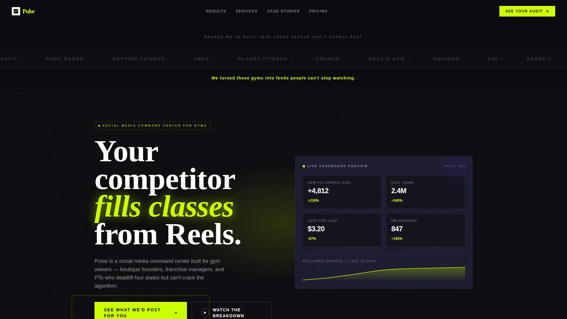
- A logo bar header that leads with social proof instead of a hero image, showing recognizable gym brand logos in monochrome against a void-black background
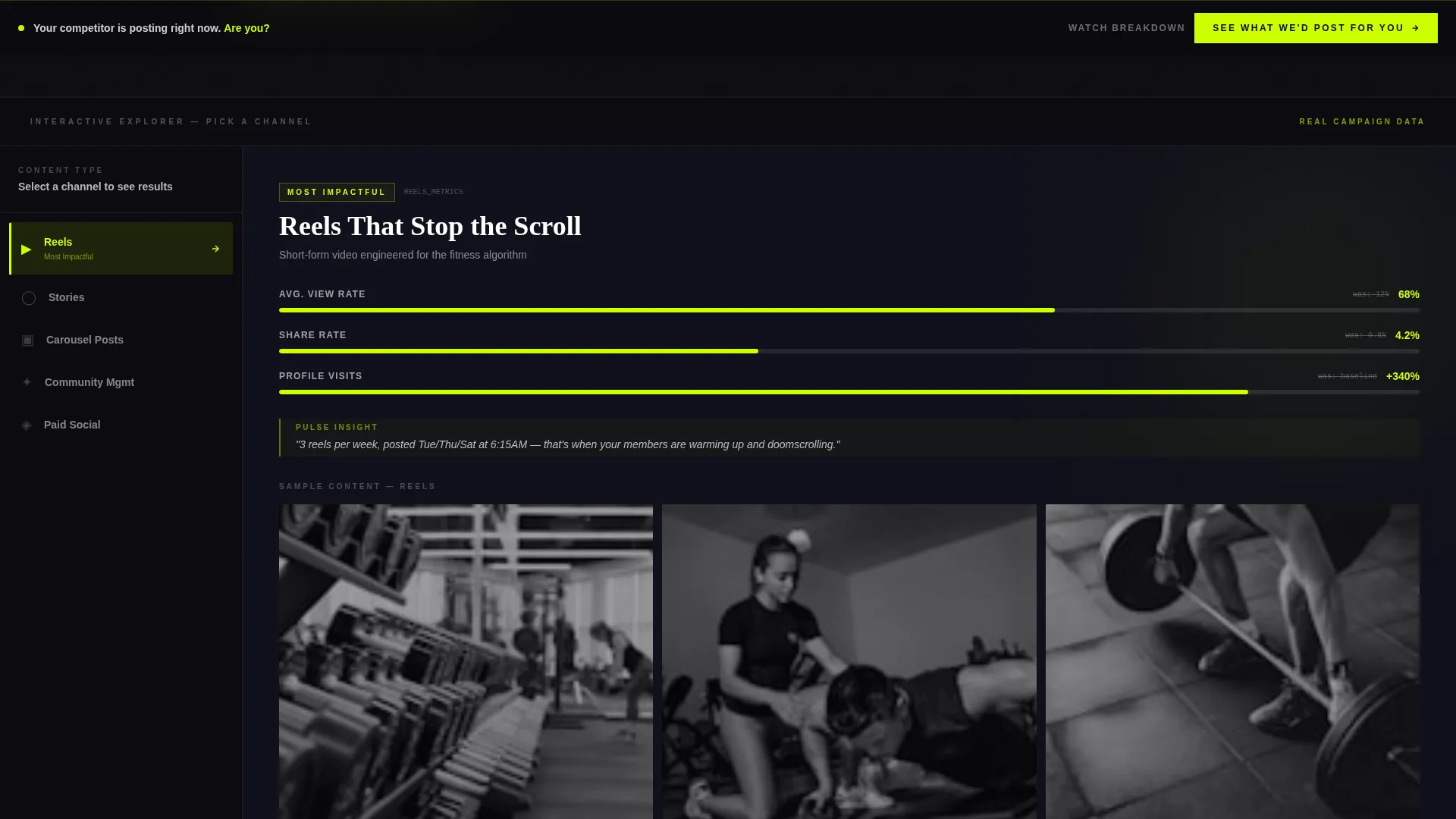
- A 50/50 split-screen interactive explorer where a persistent left-panel navigation controls what the right panel displays, including metric dashboards, engagement graphs, and swipeable campaign examples
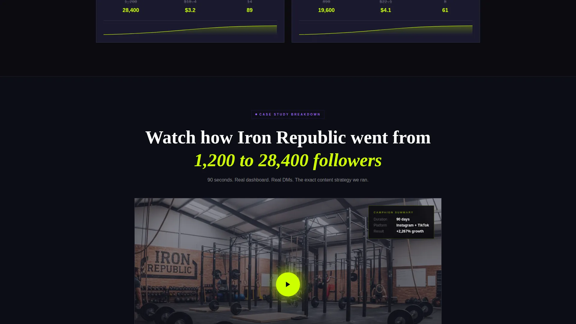
- Two strategically placed calls-to-action: a primary "See What We'd Post For You" button and a secondary "Watch the Breakdown" trigger for an embedded 90-second case-study video
Feature list
This section walks through the core built-in components that make Pulse work as a conversion tool for fitness social media agencies.
Logo Bar Social Proof Header
The page opens with a horizontal scroll of gym and fitness brand logos rendered in monochrome on a void-black background. Each logo pulses briefly in electric lime on hover. A single line of knockout type beneath the bar reads: "We turned these gyms into feeds people can't stop watching." No hero image competes for attention because the social proof is the first impression.
Split-Screen Interactive Explorer
The left panel locks a persistent navigation of content categories: Reels, Stories, Carousel Posts, Community Management, and Paid Social. The right panel transforms with each selection, displaying live-style metric dashboards, before-and-after engagement graphs, and swipeable content examples from real campaigns. Scrolling through the explorer feels like toggling through an analytics suite.
Data-Driven Metric Displays
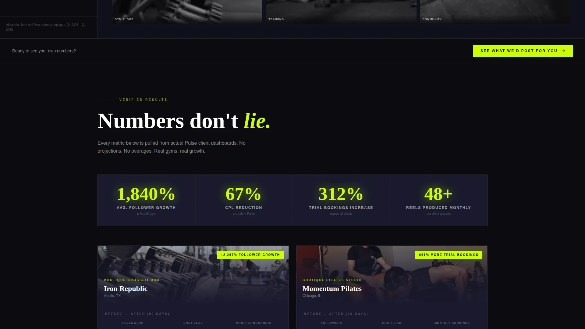
The right panel of the explorer surfaces follower growth curves, cost-per-lead drops, and screenshot direct messages from gym members who discovered the brand through social content. Each tab reveals a new proof point, with each one more specific than the last.
Sticky Conversion Bar
After the second explorer section, a sticky bottom bar keeps the primary call-to-action visible as the visitor continues scrolling. The button routes to a tailored audit landing page. This placement ensures the offer is always one tap away without interrupting the browsing experience.
Embedded Case-Study Video Trigger
A secondary call-to-action mid-scroll triggers a 90-second embedded case-study video. The "Watch the Breakdown" button lets curious visitors go deeper before committing to the primary action. It supports visitors who need one more proof point before clicking through.
Acid Digital Color System
The template runs on a four-color Acid Digital palette built for dark-mode environments. Void black, electric lime, deep graphite, and ultraviolet work together to create a visual identity that feels energetic, data-forward, and unmistakably fitness-native.
Page sections overview
| Section | Purpose |
|---|---|
| Logo Bar Header | Opens with scrolling gym brand logos as immediate social proof |
| Knockout Type Line | Delivers the agency's core promise in a single bold statement |
| Primary call to action Block | Places the first "See What We'd Post For You" button early |
| Interactive Explorer | Split-screen panel showing content categories and live-style metrics |
| Metric Dashboard Views | Displays follower growth, cost-per-lead data, and DM screenshots |
| Video Trigger Section | Mid-scroll button launches the 90-second case-study video |
| Sticky call to action Bar | Persistent bottom bar repeating the primary call-to-action |
Design & branding system
The visual identity follows a Data Command theme executed through the Acid Digital color system. The palette is built for dark environments and high-contrast readability, mimicking the look of a live analytics dashboard.
- Void black (#0B0B0F) as the base background, deep graphite (#1A1A2E) for card and panel surfaces, electric lime (#CDFF00) for primary type and interactive highlights, and ultraviolet (#7B2FFF) for hover states and data accents
- Logo bar elements render in monochrome by default and flash electric lime on hover, reinforcing the interactive, data-alive feeling throughout
- The overall aesthetic targets gym owners and fitness professionals who respond to bold, screen-native visuals rather than soft lifestyle photography
Mobile & speed optimization
The template is structured to work cleanly across screen sizes. The split-screen layout and interactive explorer panels are designed with mobile browsing in mind, given that gym owners and studio founders are often checking content on their phones between sessions.
- The sticky bottom conversion bar is built for thumb-reach interaction, keeping the primary call-to-action accessible without requiring a scroll back to the top
- Swipeable content examples in the explorer panel translate naturally to touch-based navigation on mobile devices
How this template helps you convert
Pulse earns the conversion by letting visitors interact with proof before they ever reach a sales message. The page is built around a deliberate sequence that builds confidence at every step.
- The logo bar and knockout headline establish credibility immediately, so the visitor arrives at the explorer already primed to engage rather than skeptical and scanning for exit points
- The interactive explorer lets visitors self-select into the content categories most relevant to their own gym, making the agency's work feel personally relevant before any pitch is made
- By the time the sticky call-to-action bar appears, the visitor has already seen real metrics, real campaign examples, and a case-study video, so the click to the audit page feels like a natural next step rather than a cold ask
Other information about this template
Pulse is categorized under the Technology category, specifically within the Fitness and Gym Software subcategory, targeting the Fitness and Gym Social Media Management niche. It is a strong fit for agencies that want a template matching the sophistication of the services they sell.
- The template style is Split Screen (50/50), making it visually distinct from standard full-width agency pages
- The creative direction is Interactive Explorer, meaning the page is designed to be played with, not just read
- The landing page direction is Click-Through, with every design decision pointing toward the audit page conversion
- The header concept is Logo Bar, which replaces the traditional hero image with immediate peer-level social proof
- The theme is Data Command, aligning the visual language with the analytics-focused value proposition of fitness social media management
Theme
Data Command
Creative direction
Interactive Explorer
Color system
Acid Digital
Style
Split Screen (50/50)
Direction
Click-Through
Page Sections
Logo Bar Social Proof Header
Split-screen Interactive Explorer
Live-style Metric Dashboards
Dual Call-to-action System
Acid Digital Color System
Data Command Visual Theme
Related questions
Who is the Pulse template designed for?
Can I customize the logo bar with my own client logos?
What does the interactive explorer section show visitors?
How does the sticky call-to-action bar work?
Do I need design experience to use this template?



