Healthcare Software Privacy Policy Website Template
Pulse is a high-impact healthcare email marketing landing page template built for platforms that drive patient engagement through compliant, automated outreach. Designed with a dark dashboard aesthetic, it showcases compliance metrics, open-rate stats, and a comparison table that positions your platform against generic email service providers and manual outreach methods.
by Rocket studio
Quick summary
Pulse is a single-page, stats-first landing page template for healthcare email marketing platforms. It opens with live-looking metric cards, drops immediately into a competitive comparison table, and closes with a dual conversion path. The design uses void black, holographic violet, and surgical teal to create a clinical command-center atmosphere that builds trust before asking for contact details.
Who this template is for
This template is built for teams selling or showcasing sophisticated patient communication platforms. If your audience expects compliance proof before they read a headline, Pulse speaks their language.
- Hospital marketing directors managing multiple service lines who need to justify patient outreach spend
- Specialty practice managers tracking no-show rates and needing automated appointment nudges
- Health system Chief Marketing Officers who must demonstrate return on investment to senior leadership
What problem this template solves
Healthcare marketers are often stuck choosing between generic email tools that ignore compliance requirements and manual outreach that cannot scale. Neither option produces the engagement data leadership wants to see. Pulse gives your platform a page that confronts this gap directly.
- Competitors rely on stock photography and vague benefit copy instead of hard delivery metrics
- Manual outreach workflows have no visible performance data and create compliance exposure
- Generic email service providers cannot demonstrate segmentation depth or clinical-workflow integration
What you get with this template
You get a fully structured, single-page layout that leads with proof and ends with a conversion. Every section serves a distinct persuasion role, from the header metrics to the final call to action.
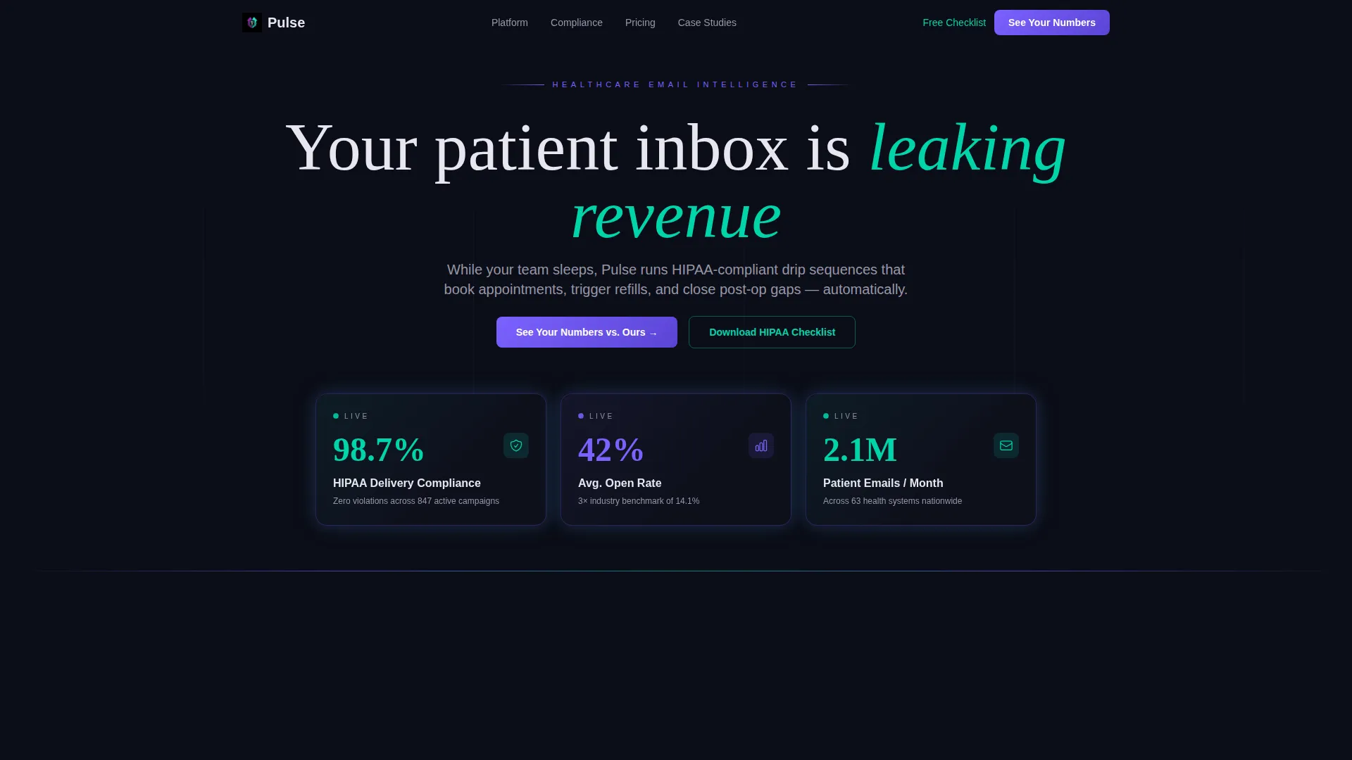
- A frosted-glass header with three live-looking metric cards showing compliance rate, open rate, and monthly volume
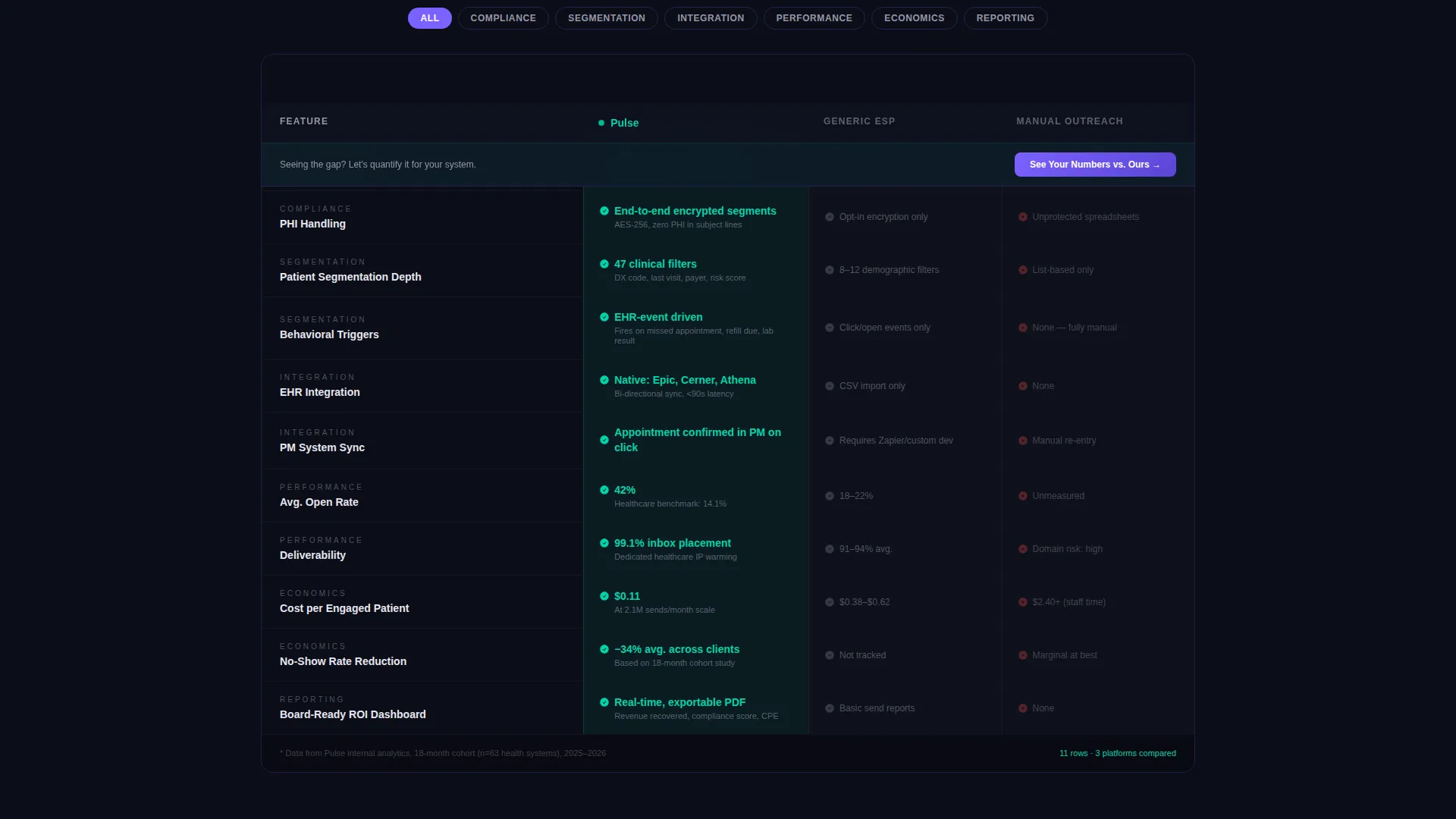
- A three-column comparison table contrasting your platform against a generic email service provider and manual outreach
- Two conversion paths: a primary "See Your Numbers versus. Ours" form and a secondary compliance checklist download
Feature list
This section covers the core functional and visual capabilities built into the Pulse template.
Stats-Forward Header Panels
Three Dark Glass Panel cards sit in the header, each showing a single sharp metric. The cards display figures such as "98.7% HIPAA Delivery Compliance," "42% Average Open Rate," and "2.1M Patient Emails Per Month." A faint violet-to-teal gradient edges each card, making the numbers feel live rather than static.
Competitive Comparison Table
The comparison table loads immediately below the header. It compares the platform across five rows: compliance automation, segmentation depth, electronic health record integration, deliverability, and cost per engaged patient. Pulse-advantage cells glow teal; competitor cells render in dim gray, making the performance gap visible at a glance.
Section-Level Proof Deepening
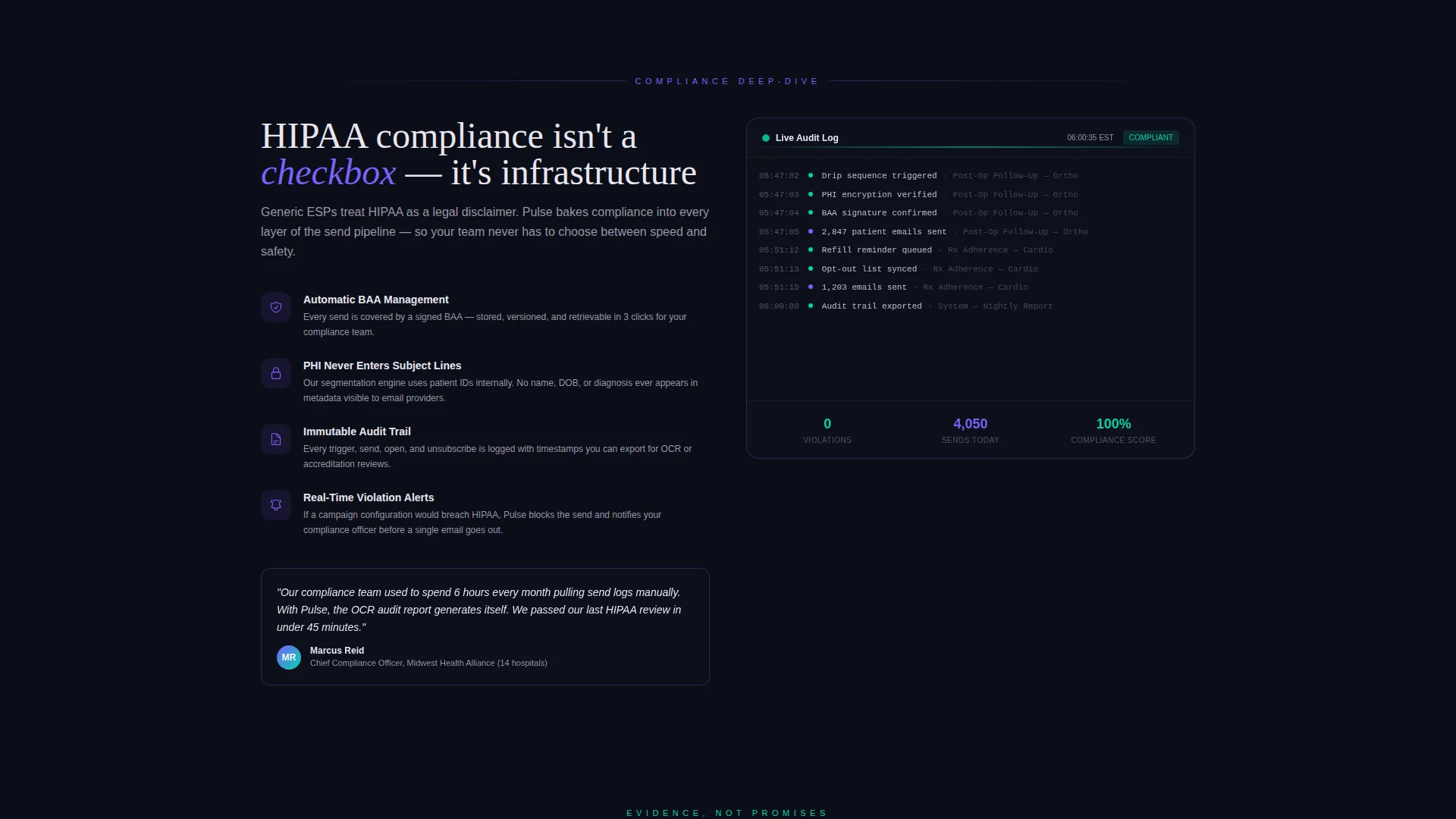
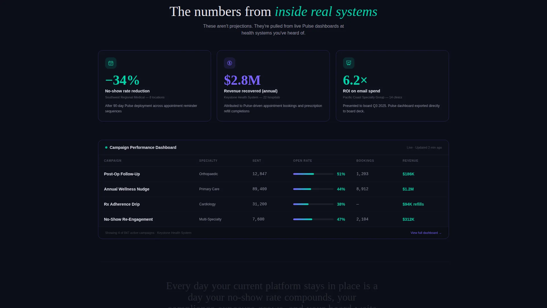
After the comparison table, each subsequent section expands one row's claim. A mini-dashboard screenshot and a single client proof point accompany each deep-dive block. This scroll structure builds conviction progressively rather than front-loading every claim.
Dual Conversion Path Design
The primary call to action, "See Your Numbers versus. Ours," is pinned at the table header and repeated after the final proof section. It opens a two-field form asking for a work email and the visitor's current email service provider name. A secondary lead magnet offers a downloadable HIPAA Email Compliance Checklist for lower-commitment visitors.
Dashboard Pro Visual System
The layout uses a Dashboard Pro theme throughout. Void black dominates backgrounds. Holographic violet and surgical teal alternate as accent and highlight colors across table cells, hover states, and card edges. Iridescent white handles all body typography, keeping text legible without looking sterile.
Page sections overview
| Section | Purpose |
|---|---|
| Dark Glass Header | Displays three live-looking compliance and engagement metric cards |
| Comparison Table | Benchmarks platform against generic ESP and manual outreach across five rows |
| Compliance Deep Dive | Expands the compliance automation row with a mini-dashboard and proof point |
| Segmentation Evidence | Supports the segmentation depth row with visual data and a client result |
| Deliverability Proof | Backs up deliverability claims with a screenshot and performance context |
| Cost Per Patient | Shows cost-per-engaged-patient advantage with supporting evidence |
| Final call to action Block | Repeats the primary form call to action and secondary checklist download |
Design & branding system
The palette and layout language work together to signal both clinical precision and technological sophistication. Nothing feels decorative; every visual choice reinforces the data story.
- Four-color AI Iridescent system: void black (#0B0D17) for backgrounds, holographic violet (#7B61FF) and surgical teal (#00D4AA) for accents and highlights, and soft iridescent white (#E8E6F0) for body text
- Frosted-glass card style with violet-to-teal edge gradients gives the header a lit-from-beneath, command-center quality
- A thin horizontal iridescent rule separates the header from the scroll area, reinforcing the sense of entering a live data environment
Mobile & speed optimization
The template is structured for fast, clean rendering across screen sizes. The dark-first color system and minimal use of imagery keep load weight low without sacrificing visual impact.
- No hero images or stock photography means the page loads without large file overhead
- Dark Glass Panel cards and the comparison table are built to reflow cleanly on smaller viewports
- The two-field conversion form is intentionally minimal, reducing friction on mobile devices
How this template helps you convert
Pulse earns the conversion before it asks for one. The page is sequenced to create visible performance gaps in the visitor's mind, then offer a clear next step to close that gap.
- The header metric cards establish credibility instantly, so visitors arrive at the comparison table already oriented to the platform's scale and compliance posture
- The comparison table makes the visitor's current tool feel measurably inadequate across five specific dimensions, creating genuine motivation to act
- The dual call to action structure meets visitors at two commitment levels: the primary form captures high-intent prospects, while the compliance checklist download captures researchers who are not yet ready to book a conversation
Other information about this template
This template is designed specifically for the healthcare email marketing software category and fits naturally within a broader healthcare software technology stack.
- The template style is a Comparison Table layout under the Dashboard Pro theme, making it well suited for platforms that need to justify their position against established or legacy alternatives
- The creative direction is Stats-First Impact, meaning every scroll-stop opens with a number before a narrative explanation
- The landing page direction is Comparison/Versus, optimized for buyers who are actively evaluating options rather than discovering a category for the first time
- The AI Iridescent color system and Dark Glass Panel header concept are cohesive enough to carry a consistent brand identity across future page extensions or campaign assets
Theme
Dashboard Pro
Creative direction
Stats-First Impact
Color system
AI Iridescent
Style
Comparison Table
Direction
Comparison/Versus
Page Sections
Stats-forward Dark Glass Header
Three-column Comparison Table
Progressive Proof Deepening
Dual Conversion Path Layout
AI Iridescent Color System
Related questions
Who is this landing page template designed for?
Does this template require a hero image or photography?
What conversion paths does this template include?
Can I adapt the comparison table rows for my platform's features?
What makes the Dashboard Pro theme suitable for healthcare software?



