Pulse - Highimpact Veterinary Landing Page Template
Pulse is a high-impact veterinary reputation landing page template built for clinics that need to turn patient checkouts into five-star reviews. The glassmorphic design, live-feeling dashboard header, and structured comparison table make the case for modern review management. It is built for practice managers, multi-location groups, and solo practitioners who are serious about growing their online rating.
by Rocket studio
Quick summary
Pulse is a single-page, comparison-table landing page template designed for veterinary review management platforms. It combines a dark glass visual identity with an industry-report scroll flow, guiding visitors from a striking data-driven header through a feature comparison and clinic case studies to a clear app download call to action.
Who this template is for
This template speaks directly to the people who feel the gap between the quality of care they provide and the rating that shows up on Google. It is built for veterinary professionals who need a credible, conversion-ready page to introduce their reputation management solution.
- Practice managers handling a backlog of unanswered online complaints
- Multi-location veterinary group leaders tracking sentiment across dozens of clinics
- Solo practitioners whose Google rating does not reflect the quality of their work
What problem this template solves
Most veterinary clinics have no structured way to capture positive feedback at checkout. The result is a review profile dominated by the rare unhappy client while the dozens of satisfied pet owners say nothing online. This template frames that problem clearly and positions the product as the fix.
- No system exists to intercept negative feedback before it becomes a public review
- Multi-location teams cannot monitor reputation across all clinics from one view
- A low star rating creates a first impression that drives potential clients to a competitor
What you get with this template
You get a fully structured, single-page layout that reads like a consultant's briefing on veterinary reputation risk. Every section is designed to move a skeptical practice manager closer to downloading the product.
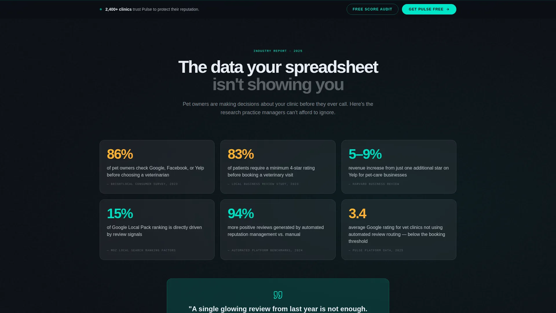
- A stat-led opening section that anchors the cost of inaction with cited data
- A frosted-glass comparison table contrasting the platform against manual management and competing tools
- Clinic case study cards with before-and-after reputation arcs and a two-stage app download call-to-action flow
Feature list
This template is built around several deliberately designed components that work together to build trust and drive downloads.
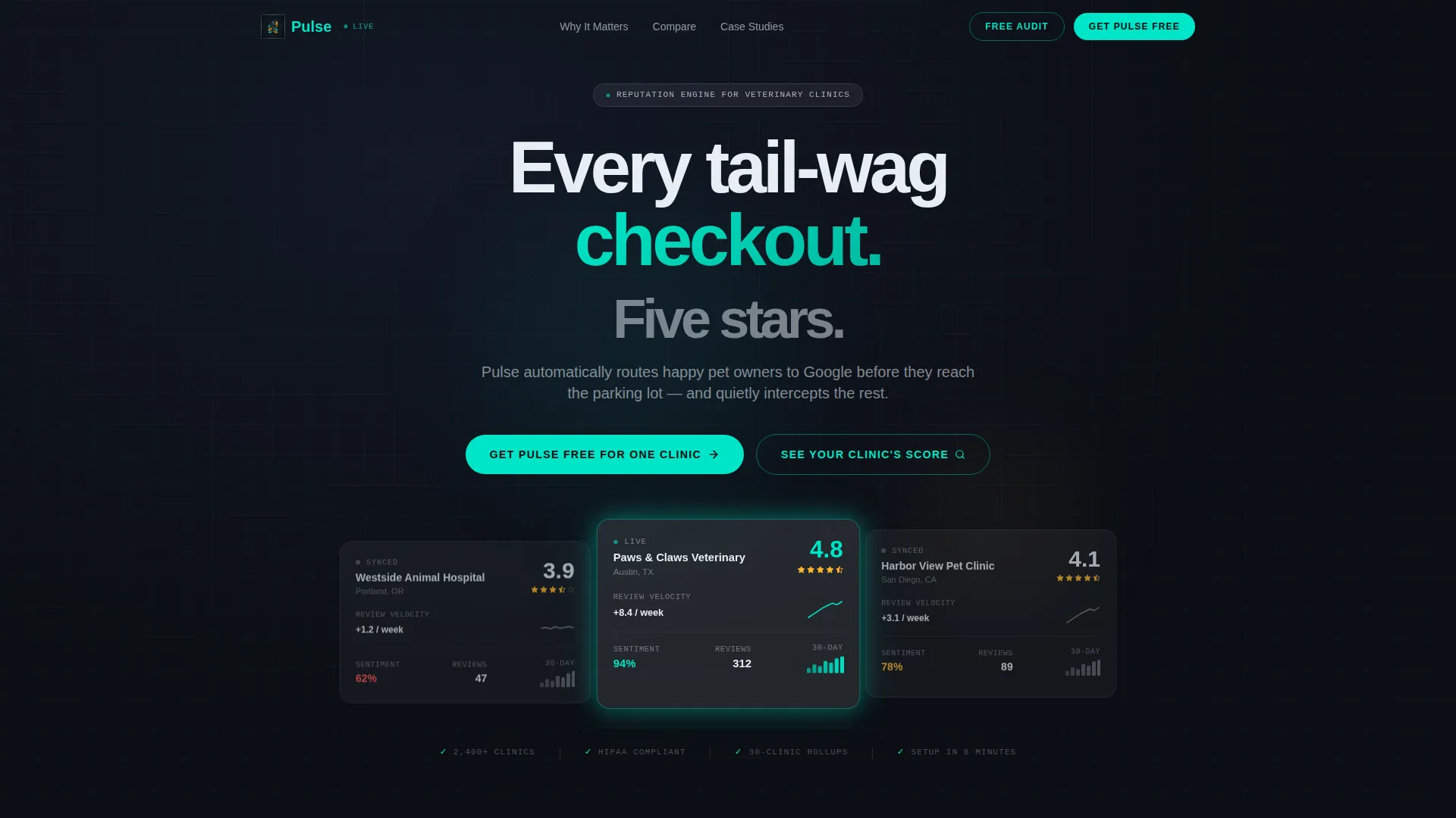
Dark Glass Panel Header
Three frosted glass rectangles are suspended against a near-black gradient, each displaying a live-feeling veterinary clinic profile. The center panel animates a star rating counting from 3.4 to 4.8, making the product's core promise visible before a single word is read.
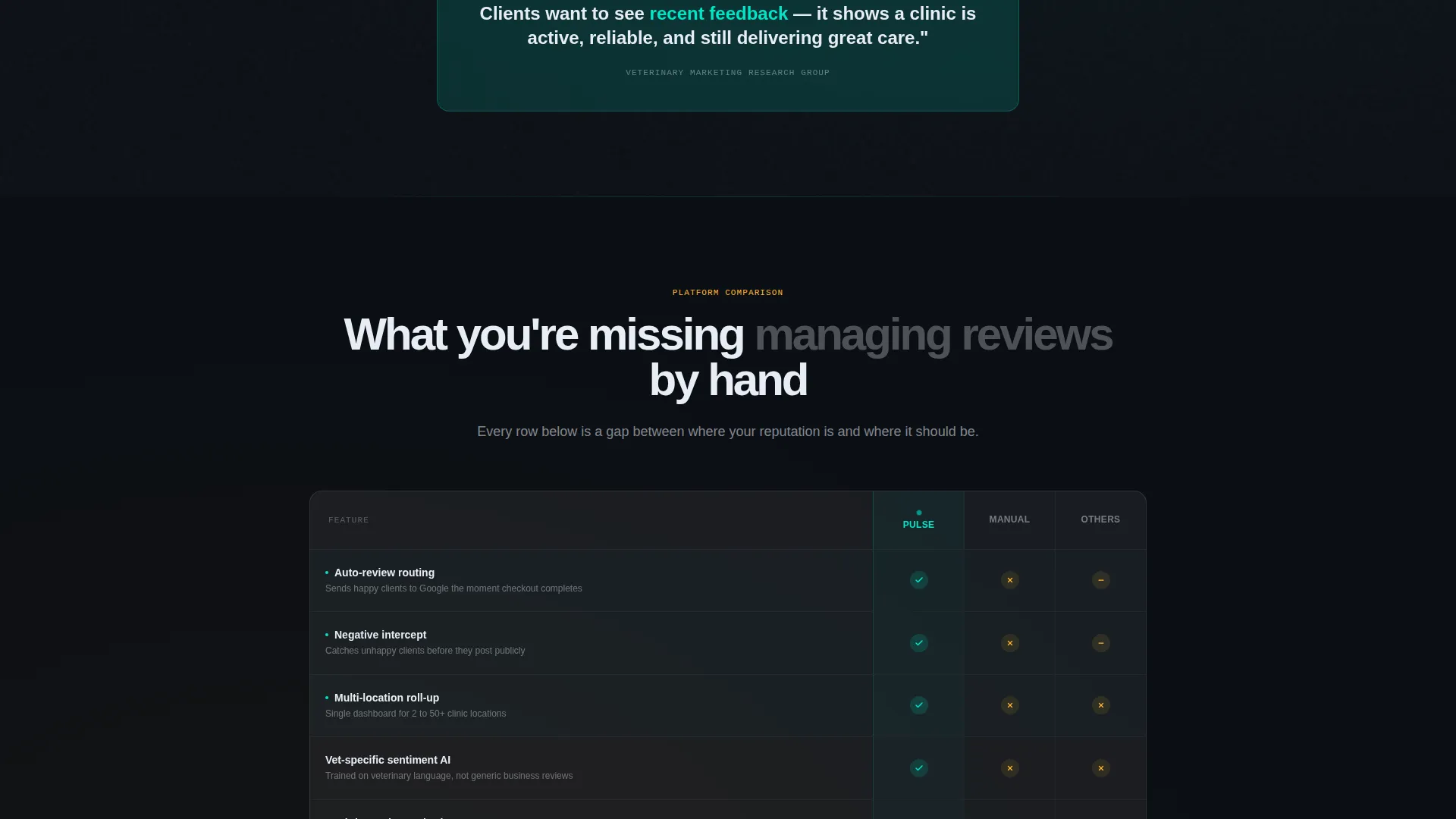
Structured Comparison Table
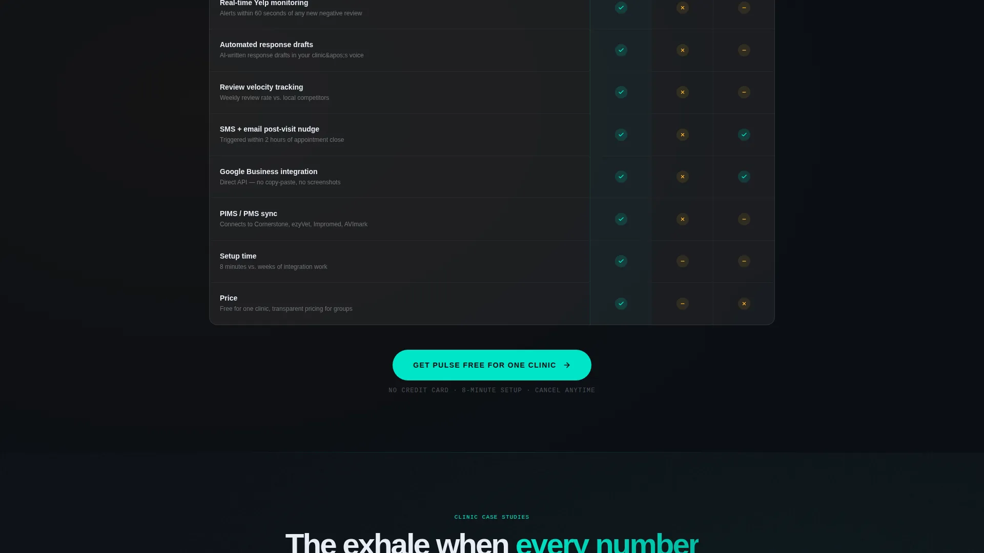
The comparison table is the page's centerpiece. Each row is a frosted glass strip covering features such as auto-review routing, negative intercept, and multi-location roll-up. Checkmarks appear in electric teal for supported features and gaps are marked in soft warning amber, making the competitive advantage immediately clear.
Case Study Glass Cards
Clinic case studies appear as tilt-on-hover glass cards, each showing a before-and-after reputation arc. They function as social proof in the language of data, giving practice managers the evidence they need to act.
Two-Stage App Download Flow
The primary call to action, "Get Pulse Free for One Clinic," appears first beneath the comparison table and then again in a sticky bottom bar. Tapping it triggers a platform selector followed by a single clinic-name field that auto-populates the setup sequence.
Free Clinic Score Audit Tool
A secondary conversion path labeled "See Your Clinic's Score" pulls a visitor's current Google rating and review velocity. It delivers enough uncomfortable data to make the primary download feel like the obvious next step.
Stat-Led Opening Section
The first content section opens with a sourced statistic on how many pet owners choose a vet based on Google reviews alone. It establishes authority, creates urgency, and frames every following section as evidence rather than marketing.
Page sections overview
| Section | Purpose |
|---|---|
| Dark Glass Header | Animate live clinic rating data to prove the product's core value instantly |
| Stat Bomb Section | Anchor visitor urgency with a sourced industry statistic on review-driven decisions |
| Comparison Table | Compare platform features against manual management and competing tools row by row |
| Case Study Cards | Show before-and-after reputation arcs from real clinic scenarios as glass card proof |
| Primary call to action Block | Drive app downloads with a platform selector and single-field clinic setup |
| Sticky Bottom Bar | Reinforce the download call to action as visitors scroll past the case studies |
| Free Audit Tool | Deliver a live Google rating and review velocity check as a secondary conversion path |
Design & branding system
The visual identity follows a Startup Velocity theme built on a glassmorphic color system. The palette feels like a glass instrument panel floating in a dark cockpit, with every element appearing to hover just above the surface.
- Core colors: deep void black (#0B0E14) for backgrounds, frosted white panels at 8% opacity with backdrop blur for cards and tables, electric clinical teal (#00E5C7) for calls to action and positive metrics, and soft warning amber (#FFB830) for highlighting gaps and problem states
- Typography and layout lean toward data visualization rather than lifestyle imagery, with no stock photography used anywhere on the page
- The scroll rhythm follows an industry report structure, building the case section by section so that each new block increases the perceived cost of inaction
Mobile & speed optimization
The glassmorphic layout is built to translate across screen sizes without losing the premium instrument-panel feel. Key interactive elements are designed for touch-first use, particularly the two-stage download flow.
- The platform selector and single-field clinic setup are optimized for one-handed mobile interaction
- The sticky bottom bar ensures the primary call to action remains reachable at every scroll depth on smaller screens
- Frosted glass cards and table rows maintain their visual hierarchy on mobile without requiring horizontal scrolling
How this template helps you convert
This template is engineered around a single question: what does a practice manager need to see before they trust a new tool? Every layout decision answers that question.
- The animated header delivers proof before the visitor reads a headline, turning the product's core claim into a visual demonstration that builds immediate credibility.
- The comparison table removes the need for the visitor to research competitors themselves, giving them a structured reason to prefer this platform over manual processes or other tools.
- The free audit tool creates a personalized urgency moment by showing the visitor their own clinic's current score, making the download feel less like a choice and more like a logical next step.
Other information about this template
This template is part of the Pulse product family and is positioned within the veterinary software and SaaS category. It is specifically designed for teams operating in the veterinary review management niche.
- The template style is a comparison table landing page, making it well-suited for any veterinary reputation software that needs to differentiate itself against both manual workflows and competing platforms
- The Startup Velocity theme and glassmorphic design language make it visually distinct from generic healthcare website templates, which tend to rely on photography and soft palettes
- The Industry Report creative direction is particularly effective for reaching CMOs and practice managers who are accustomed to evaluating data before committing to a new operational tool
- The App Download landing page direction means every design and copy decision funnels toward a frictionless first install, with no multi-page navigation to distract the visitor
Theme
Startup Velocity
Creative direction
Industry Report
Color system
Glassmorphic
Style
Comparison Table
Direction
App Download
Page Sections
Animated Dark Glass Panel Header
Frosted Glass Comparison Table
Tilt-on-hover Case Study Cards
Two-stage App Download Flow
Free Clinic Score Audit Tool
Sticky Bottom Bar Call to Action
Related questions
Who is this template designed for?
What makes the comparison table section effective?
Does the template support a multi-location clinic context?
What are the two conversion paths built into this template?
Can I use this template without a design background?



