Specialist Data & Analytics Cost Estimator Website Template
Pulse is a bold brutalist landing page template built for real-time analytics platforms. It opens with an animated dashboard preview, leads visitors straight into an interactive latency calculator, and delivers a full competitor comparison table. The design uses a carbon fiber color system to feel like a live instrument panel, built to convert technical buyers who need proof before they commit.
by Rocket studio
Quick summary
Pulse is a single-page landing page template designed for real-time analytics platforms targeting engineers, product managers, and technical executives. It combines an animated dashboard header, an interactive cost and latency calculator, and a brutal head-to-head comparison table. The entire layout is built to let numbers do the persuading before a single call to action appears.
Who this template is for
This template is built for technical products that need to earn credibility with a skeptical, data-literate audience. If your platform processes high-volume event streams and competes on speed, freshness, or cost, this layout gives you the right battlefield.
- Engineering leads and CTOs evaluating analytics infrastructure at scale
- Product managers who need to justify switching from an existing provider
- Founders and growth teams launching a real-time data or observability product
What problem this template solves
Most analytics landing pages lead with copy. Technical buyers skip copy. They want to see numbers, run comparisons, and validate claims before they trust a product. This template solves that mismatch by leading with an interactive tool and raw comparison data.
- Visitors arrive skeptical and leave with their own numbers already calculated
- Competitors are stacked side by side before any sales language appears
- The layout removes the need for a prospect to do their own research elsewhere
What you get with this template
You get a fully structured single-page layout built around a comparison and conversion flow. Every section is sequenced to move a technical buyer from curiosity to calculated confidence.
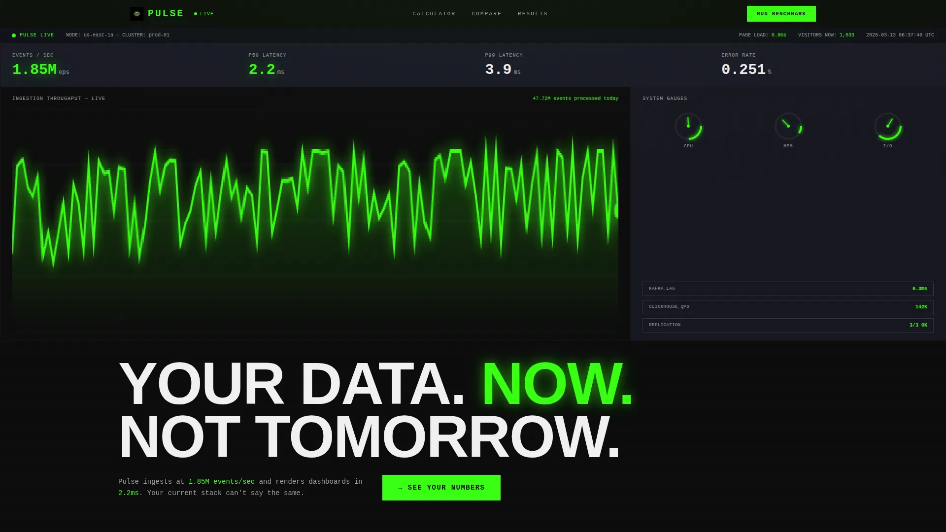
- An animated live dashboard header that simulates real-time data ingestion and ticking counters
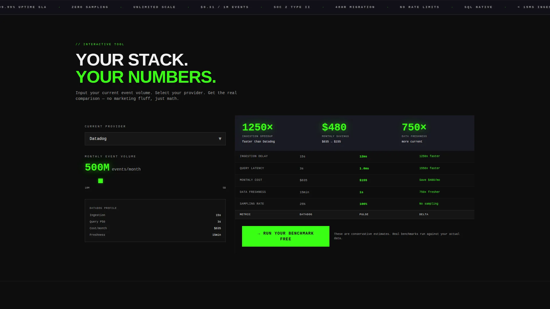
- An interactive latency and cost calculator where visitors input their own event volume and current provider
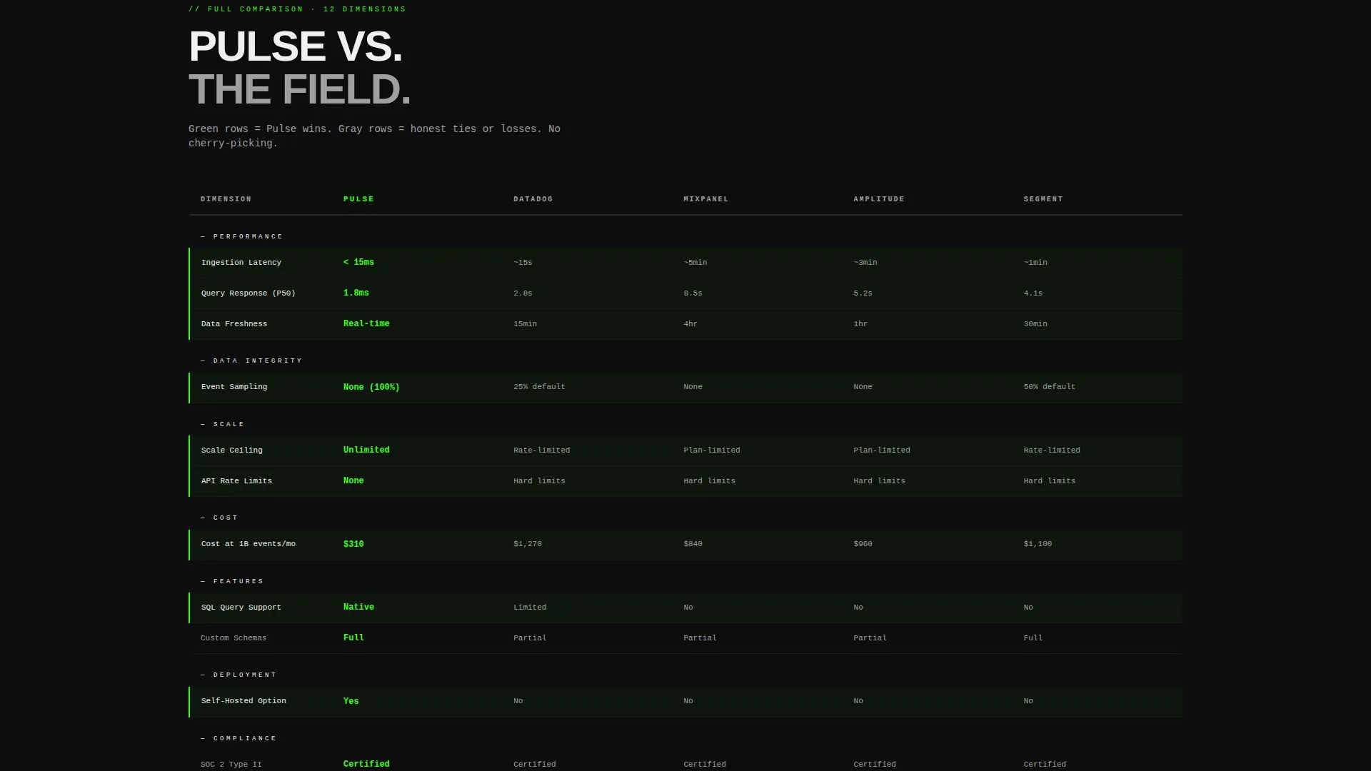
- A twelve-dimension competitor comparison table with honest win and loss indicators
- Three terminal-style case study readouts showing migration time and latency reduction
- Two distinct conversion paths: a benchmark request form and a gated performance log download
Feature list
This template is built around a set of purpose-designed interactive and visual components. Each one serves the comparison and conversion goal directly.
Animated Dashboard Header
The header renders an animated recreation of a live analytics dashboard. Counters tick upward, latency figures flicker in milliseconds, and a throughput graph draws across the full viewport in real time. It sets the tone before a visitor reads a single word.
Interactive Latency and Cost Calculator
Visitors enter their current event volume and select their existing provider from a dropdown. The tool instantly outputs a side-by-side comparison covering query speed, ingestion delay, monthly cost at that volume, and data freshness. This is the first thing visitors encounter on scroll.
Brutalist Comparison Table
A full-width grid compares the platform against four competitors across twelve performance and cost dimensions. Rows where the platform wins are highlighted in electric signal green. Rows where it does not win remain in aluminum gray, keeping the table honest and credible.
Terminal-Style Case Studies
Three case studies appear as monospaced terminal readouts. Each block shows the company name, their previous stack, the migration time, and the latency reduction percentage achieved. The format signals technical depth without requiring long-form narrative.
Dual Conversion Path calls to action
The primary call to action, "Run Your Benchmark Free," appears inside the calculator output and again pinned below the comparison table. A secondary path offers access to raw performance logs gated behind an email-only form, targeting engineers who need documented proof.
Carbon Fiber Visual Identity
The entire page is built on a four-color system: deep cockpit black, woven carbon gray, raw aluminum, and electric signal green. Signal green is reserved exclusively for live data indicators, active states, and call-to-action surfaces. Typography is oversized, monospaced where data appears, and set edge to edge with no decorative padding.
Page sections overview
| Section | Purpose |
|---|---|
| Animated Dashboard Header | Opens the page with a live-feel instrument panel and a bold 120px headline |
| Interactive Latency Calculator | Lets visitors calculate their own cost and speed comparison before reading copy |
| Competitor Comparison Table | Stacks the platform against four rivals across twelve dimensions with honest indicators |
| Terminal Case Studies | Shows real migration outcomes in monospaced readout format |
| Primary call to action Block | Captures work email, current provider, and monthly event volume in three fields |
| Secondary Conversion Gate | Offers raw performance logs to engineers gated behind email only |
Design & branding system
The visual language of this template is drawn from exposed industrial materials. Nothing is softened or decorated. Every design decision communicates precision and raw engineering confidence.
- Color system: deep cockpit black (#0D0D0D) as the base, woven carbon gray (#1A1A2E) for surface layers, raw aluminum (#A0A0A0) for neutral indicators, and electric signal green (#39FF14) reserved for live data and active call-to-action elements
- Typography is oversized and uppercase for headlines, monospaced for all data displays, and set edge to edge with zero decorative padding
- Layout uses brutalist grid lines with no rounded corners, no soft gradients, and no visual softening anywhere on the page
Mobile & speed optimization
The template is structured for fast loading and clear readability across screen sizes. The bold, minimal palette and high-contrast typography naturally support smaller displays.
- Oversized monospaced type and high-contrast color ratios maintain clarity on mobile viewports
- The brutalist grid layout adapts cleanly without relying on decorative elements that slow rendering
- The calculator and comparison table are designed as focused single-column flows on smaller screens
How this template helps you convert
The conversion logic in this template is built on a show-don't-tell principle. By the time a visitor reaches either call to action, they have already seen their own data reflected back at them.
- The interactive calculator personalizes the value immediately, using the visitor's own event volume to generate a direct comparison before any marketing copy appears.
- The comparison table provides a transparent, twelve-dimension head-to-head view that lets the product earn trust rather than claim it, with signal green marking wins and aluminum gray marking honest losses.
- The dual call-to-action structure serves two buyer types at once: decision-makers who are ready to benchmark, and engineers who need documented proof before presenting internally.
Other information about this template
This template is part of a broader set of high-performance landing page designs for technical and data-focused products. A few additional details worth noting:
- The template style is a Comparison Table layout, meaning the primary structural logic is built around side-by-side evaluation rather than feature showcasing
- The creative direction follows a Calculator First approach, placing an interactive tool ahead of all descriptive copy to match how technical buyers actually evaluate products
- The header concept is a Dashboard Preview, designed to simulate the live product experience rather than show a static screenshot
- The landing page direction is Comparison and Versus conversion, optimized for audiences actively evaluating multiple providers
- Providers commonly evaluated in this category include platforms like Datadog, Mixpanel, Amplitude, and Segment, all of which are referenced in the calculator dropdown and comparison table as framing context

Theme
Bold Brutalist
Creative direction
Calculator/Tool First
Color system
Carbon Fiber
Style
Comparison Table
Direction
Comparison/Versus
Page Sections
Animated Live Dashboard Header
Interactive Latency and Cost Calculator
Twelve-dimension Comparison Table
Terminal-style Case Study Blocks
Dual Conversion Path Structure
Carbon Fiber Visual System
Related questions
Can I customize the competitor names in the comparison table?
How does the interactive latency calculator work?
Is the animated dashboard header connected to live data?
What information does the primary conversion form collect?
Who is the secondary conversion path designed for?



