Mobile App Professional Website Template
Pulse is a high-performance fitness and health tracker landing page template built for mobile app launches. It features a dark glass panel header with live-metric displays, a tiered comparison table, and a frictionless freemium signup flow. The design follows a carbon fiber visual system with electric green accents, giving every section the feel of a precision instrument data sheet.
by Rocket studio
Quick summary
Pulse is a single-page landing page template designed for fitness and health tracker app launches. It pairs a data-forward carbon fiber aesthetic with a structured spec-sheet layout. The comparison table anchors the mid-page pitch, and a streamlined freemium signup keeps conversion friction low. It is built for apps that take performance data seriously.
Who this template is for
This template is built for founders and product teams launching a fitness or health tracker app. It speaks directly to data-driven users and positions the app as a precision tool rather than a lifestyle product.
- Mobile app teams launching a freemium or trial-based fitness tracker
- Solo founders or indie developers who need a polished, conversion-focused landing page fast
- Health tech startups targeting active users such as runners, strength athletes, and shift workers monitoring recovery
What problem this template solves
Most fitness app landing pages lean on stock photography and vague benefit statements. Pulse replaces that with data as the hero. It removes the visual noise and gives the app itself the spotlight through live-metric panels and a tight spec-sheet structure.
- Visitors leave before understanding what the app actually measures or tracks
- Free-to-paid conversion stalls because tier differences are buried in marketing copy
- Signup forms ask for too much too soon, killing momentum before a user commits
What you get with this template
You get a fully structured, single-page landing page built around three conversion pillars: show the data, prove the value, and close the signup. Every section is designed to move a visitor from curiosity to committed without friction.
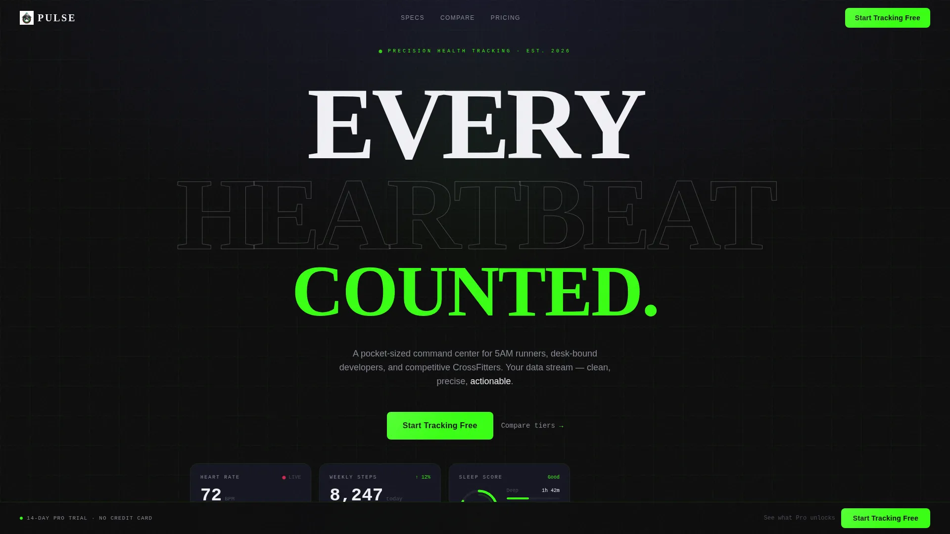
- A dark glass panel header with three animated metric cards covering heart rate, step count, and sleep score
- A mid-page comparison table pitting Free, Pro, and Elite tiers in a tight visual grid
- A single-step signup module with email input, workout-type pill selector, and a 14-day Pro trial toggle
Feature list
This template includes purposefully chosen components. Each one reflects how the app itself works: precise, readable, and built to inform decisions.
Animated Dark Glass Header
Three frosted-glass cards float on a pure black background. Each card displays a different live metric: a real-time heart rate waveform, a weekly step count spark-line, and a sleep score ring. The panels respond to mouse movement with a subtle parallax tilt, and edges catch a faint green refraction on interaction.
Tiered Comparison Table
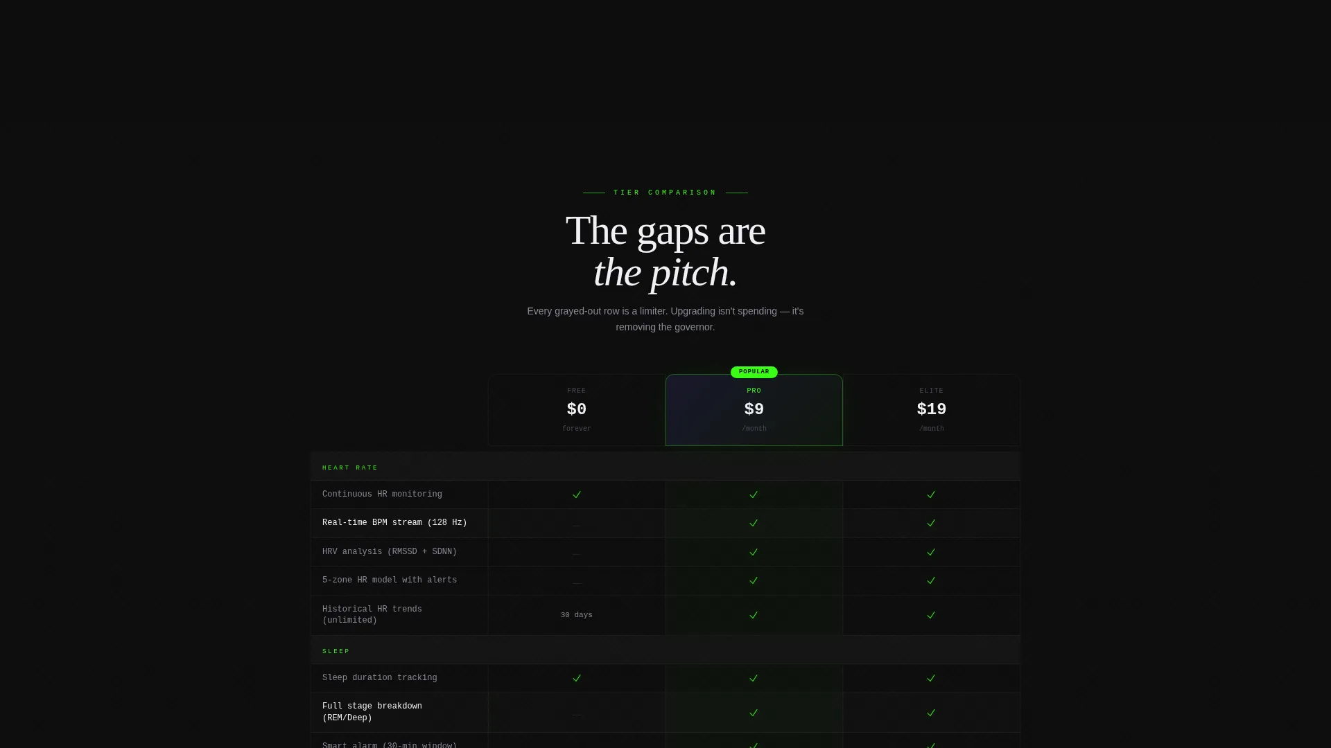
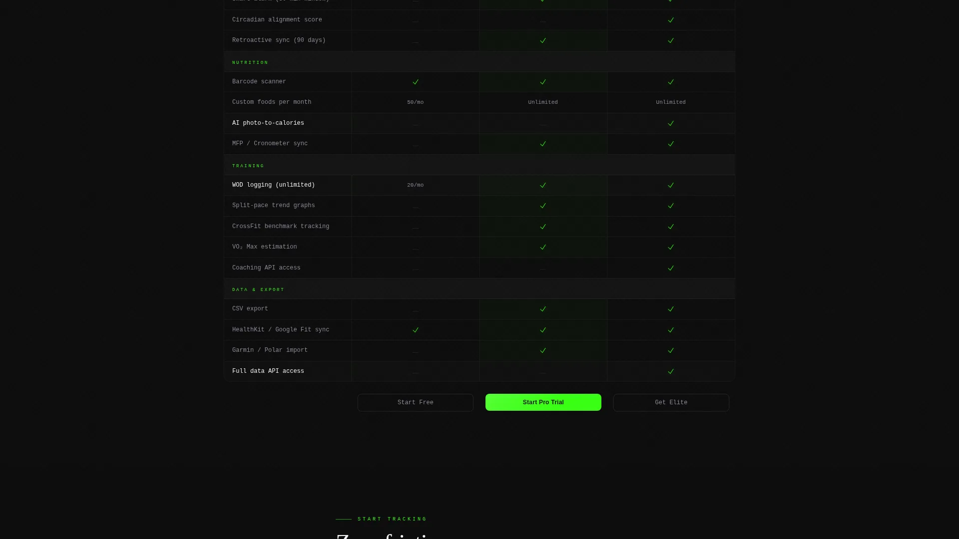
The comparison table sits at the center of the page and contrasts Free, Pro, and Elite plans row by row. Checkmarks render in electric green and absent features stay dim gray. The visual gap between tiers does the selling without a single line of persuasion copy.
Spec Sheet Section Cadence
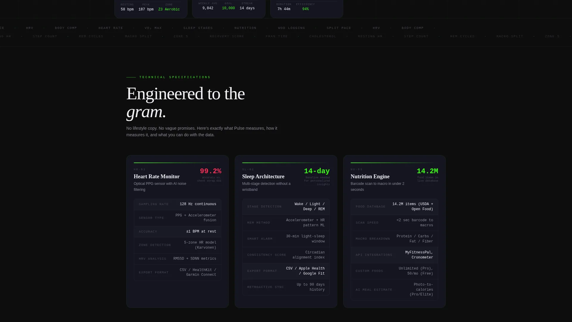
Each scroll section reads like a product data sheet. Heart rate monitoring covers sampling rate, sensor type, and accuracy. Sleep tracking covers detection method, smart alarm window, and CSV export. Nutrition logging covers barcode database size, macro breakdown speed, and available integrations. Every row feels engineered, not marketed.
Frictionless Freemium Signup
The signup module is a single step. It collects an email address, a preferred workout type via a horizontal pill selector (Run, Lift, HIIT, Yoga, Other), and a toggle for the 14-day Pro trial. No credit card field appears on screen. Friction is deferred entirely to after the user commits.
Persistent Bottom call to action Bar
After the visitor scrolls past the comparison table, a slim bar locks to the bottom of the viewport. It carries the primary call to action: "Start Tracking Free" in electric green. A secondary text link reads "See what Pro unlocks" and smooth-scrolls back to the comparison table, looping curiosity back to commitment.
Carbon Fiber Visual System
The full color palette is functional and deliberate. Deep cockpit black and woven carbon gray handle backgrounds. Titanium mid-tone and white carry all body text. Electric green fires only on interactive elements. Pulse-red is reserved exclusively for alerts and heart-rate indicators, so every color on screen carries a clear meaning.
Page sections overview
| Section | Purpose |
|---|---|
| Dark Glass Header | Display live metrics and primary call to action |
| Heart Rate Spec | Detail monitoring accuracy and sensor data |
| Sleep Tracking Spec | Cover detection method and export options |
| Nutrition Logging Spec | Show barcode database and macro tracking |
| Comparison Table | Contrast Free, Pro, and Elite plan features |
| Signup Module | Capture email, workout type, and trial opt-in |
| Sticky Bottom Bar | Re-surface call to action after comparison table scroll |
Design & branding system
The visual identity follows a Startup Velocity theme executed through a carbon fiber color system. Every design decision has a functional reason behind it. Nothing decorates for decoration's sake.
- Color palette: deep cockpit black (#0D0D0D), woven carbon gray (#1A1A2E), titanium mid-tone (#4A4A5A), electric green accent (#39FF14), and pulse-red (#FF2D55) reserved for alerts and heart-rate elements
- Typography and surfaces: text renders in titanium and white on dark backgrounds; backgrounds stay in the black-to-carbon range throughout the full page
- Interactive state logic: electric green fires only on toggles, hover states, and call-to-action buttons so it reads like a status indicator rather than decoration
Mobile & speed optimization
The template is structured with a vertical, single-column content flow that adapts cleanly to smaller screens. Metric cards, the comparison table, and the signup module are all designed to remain scannable and usable at mobile viewport widths.
- The header metric cards stack vertically on small screens, preserving legibility without collapsing the animated waveform and ring elements
- The comparison table scrolls horizontally on narrow viewports so all three tier columns remain accessible without truncation
- The sticky bottom call to action bar remains anchored on mobile, keeping the primary conversion action within thumb reach at all times
How this template helps you convert
This template is engineered around a specific conversion loop: show the product data, reveal the tier gap, and remove all friction from the signup step.
- The animated header metric cards make the app feel live and trustworthy before a visitor reads a single word, building confidence immediately on arrival
- The comparison table makes upgrading feel like removing a limiter rather than spending money, because the gaps between tiers are visible at a glance
- The single-step signup with a deferred credit card field lowers the commitment barrier to the absolute minimum, making "Start Tracking Free" an easy yes
Other information about this template
This template is a strong fit for fitness and health tracker app launches that rely on a freemium or trial-based acquisition model. It is designed to work as a standalone landing page and does not require a multi-page site structure to deliver its full pitch.
- The template suits apps in niches such as running performance, strength training logs, sleep quality monitoring, and nutrition macro tracking
- The spec-sheet creative direction works especially well for technically minded audiences such as developers, quantified-self enthusiasts, and competitive athletes who value data over lifestyle imagery
- The "See what Pro unlocks" scroll loop is a built-in retention mechanic that keeps undecided visitors cycling between the signup form and the comparison table rather than bouncing
Theme
Startup Velocity
Creative direction
Spec Sheet
Color system
Carbon Fiber
Style
Comparison Table
Direction
Freemium/Trial
Page Sections
Animated Dark Glass Header Panels
Tiered Plan Comparison Table
Spec Sheet Section Layout
Single-step Freemium Signup
Persistent Sticky Call to Action Bar
Functional Carbon Fiber Color System
Related questions
Can I customize the tier names and feature rows in the comparison table?
Does the signup module support a real backend form submission?
Can I change the color accents if my brand uses a different palette?
Is this template suitable for an app that focuses only on sleep or nutrition rather than all three metrics?
What type of visitor is this landing page designed to convert?



