Fitness Software & SaaS Specialist Professional Website Template
Pulse is a high-performance fitness client management landing page template built for personal trainers and online coaches who are done juggling spreadsheets and message threads. It combines a dark Carbon Fiber visual system, scroll-reveal interactions, and a sharp comparison layout to position your coaching platform as the obvious upgrade from scattered, manual workflows.
by Rocket studio
Quick summary
Pulse is a single-page landing page template designed for fitness client management platforms. It uses a scroll-reveal structure, dark glass panel header, and a side-by-side comparison layout to show coaches exactly what they gain by switching. The design is technical, focused, and built to qualify leads fast through a minimal two-field signup form.
Who this template is for
This template is built for independent coaches and fitness software founders who need to convert skeptical, busy trainers into paying users. It speaks directly to people who already know the pain of fragmented tools and are ready for something better.
- Independent personal trainers managing 30 or more clients from a garage gym or boutique studio
- Online coaches who have scaled past the point where memory and manual copy-pasting keep clients accountable
- Fitness software teams launching or repositioning a client management platform to a professional coaching audience
What problem this template solves
Managing a coaching business across spreadsheets, direct message threads, and screenshot-based meal plans creates constant friction. Nothing is centralized, check-ins get missed, and the mental overhead compounds every week. This template presents a clear answer to that chaos.
- Coaches waste time manually copying meal plans, chasing check-in responses, and rebuilding programming from scratch each week
- Existing tool stacks offer no unified view of client compliance, macro progress, or session history
- Landing pages for fitness software often fail to make the gap between old habits and new tools feel real and urgent
What you get with this template
You get a fully structured, scroll-reveal landing page with a strong visual identity and a conversion flow designed around a trainer's actual decision-making process. Every section builds on the last, moving the visitor from recognition to action.
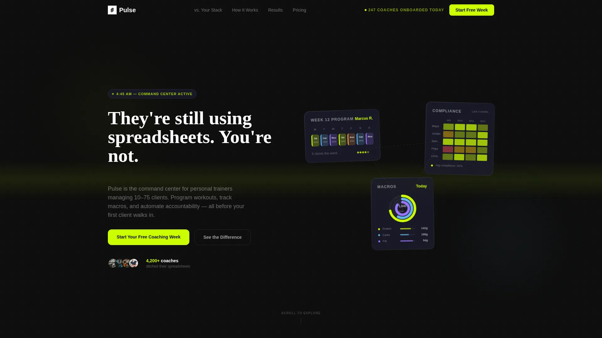
- A dark glass panel header with three floating data-view cards showing a programming calendar, a client compliance heatmap, and a macro tracking ring chart
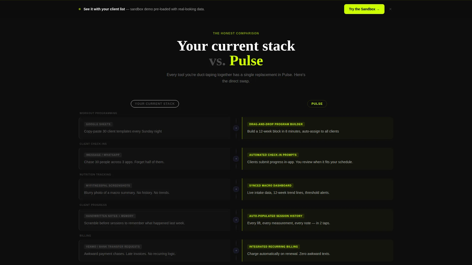
- A persistent split-column comparison section contrasting fragmented legacy tools with the unified Pulse interface
- A primary call-to-action after the comparison section and a secondary sticky bar leading to a sandbox demo, with a two-field lead form asking only for email and client count
Feature list
This template delivers a set of purpose-built layout components and interaction patterns that support a fitness software sales narrative from the first scroll to the final form submission.
Scroll-Reveal Progressive Layout
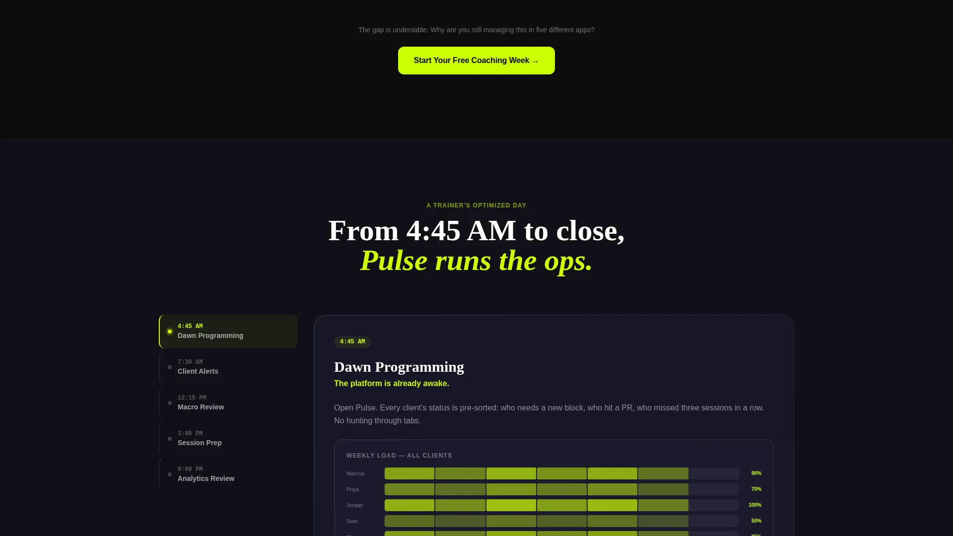
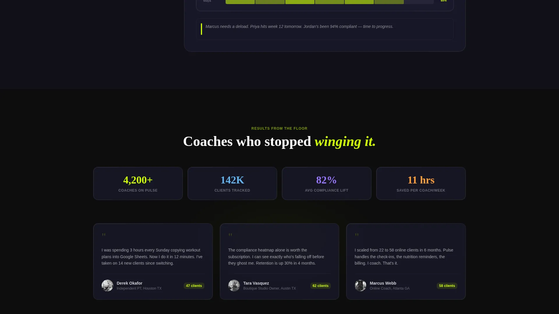
Each scroll step brings a new panel into focus. Panels expand from their glass-card state into full-width interactive demo zones. The sequence follows a trainer's real day: dawn programming, mid-morning alerts, afternoon check-ins, and evening analytics review.
Dark Glass Panel Header
Three frosted, semi-transparent cards float over a pitch-black background. Each card surfaces a different live data view: a weekly programming calendar, a client compliance heatmap, and a macro tracking ring chart. Edge lighting gives each panel the feel of a smartphone screen in a dark room.
Comparison Section Layout
A persistent vertical split runs through the middle third of the page. The left column, labeled "Your Current Stack," displays fragmented tools in muted carbon gray. The right column, labeled "Pulse," shows each tool replaced by a unified interface in electric volt green.
Animated Headline Block
The hero headline types itself in as the page loads. The single line reads: "They're still using spreadsheets. You're not." It sets the competitive tone immediately, before the visitor reads a single feature description.
Qualified Lead Capture Form
The signup form asks only for email and client count. The client count field uses a dropdown with four ranges: 1 to 10, 11 to 30, 31 to 75, and 75 plus. This qualifies lead size without adding friction or requiring extra personal information.
Sticky Secondary call to action Bar
A persistent bar sits across the page as visitors scroll. It invites visitors to explore a sandbox demo pre-loaded with fake client data. This gives hesitant visitors a low-commitment way to experience the product before signing up.
Page sections overview
| Section | Purpose |
|---|---|
| Dark Glass Header | Introduces the platform through live data panel visuals and a self-typing headline |
| Animated Hero Headline | Sets competitive positioning instantly with a single typewriter-effect statement |
| Scroll-Reveal Feature Panels | Walks visitors through a trainer's full workday using expanding interactive demo zones |
| Comparison Split Section | Contrasts legacy tool fragmentation with the unified platform side by side |
| Primary call to action Block | Prompts signup with "Start Your Free Coaching Week" after the comparison lands |
| Sticky Demo Bar | Keeps a secondary sandbox demo entry point visible throughout the scroll |
| Lead Capture Form | Collects email and client count to qualify and convert interested visitors |
Design & branding system
The visual identity is built around the Carbon Fiber color system, which draws from deep industrial materials to create a tone that feels technical, precise, and built for serious practitioners. Every color choice reinforces control and focus.
- Core palette: deep cockpit black (#0D0D0D) and woven carbon gray (#1A1A2E) form the background and panel surfaces, with titanium mid-tone (#3D3D5C) used for secondary user interface elements
- Electric volt (#CCFF00) is reserved exclusively for calls to action, progress bars, and data highlights to create high-contrast focal points without visual noise
- The overall aesthetic channels Startup Velocity: sharp, minimal, and obsessive, like a well-equipped training environment under strip lighting
Mobile & speed optimization
The template is structured for a responsive layout that keeps the scroll-reveal narrative intact on smaller screens. Interactive panels and the comparison split adapt to single-column stacking without losing their storytelling sequence.
- Glass panel cards in the header reflow vertically on mobile, preserving each data view as a distinct visual element
- The sticky secondary call to action bar remains accessible across screen sizes, keeping the sandbox demo entry point within reach at all times
- The two-field lead form is touch-friendly by design, with a dropdown input that works cleanly on both desktop and mobile devices
How this template helps you convert
The conversion logic in this template follows the natural decision arc of a skeptical, experienced coach. Every layout choice reduces hesitation and builds the case for action before the form appears.
- The self-typing headline and dark glass panels create immediate intrigue, framing the platform as something categorically different from what the visitor currently uses.
- The scroll-reveal demo sequence lets visitors experience a simulated workday inside the product, building familiarity and trust before any commitment is asked.
- The comparison section makes the cost of staying with fragmented tools feel concrete, and the primary call to action appears at exactly the moment the gap feels undeniable.
Other information about this template
This template sits at the intersection of fitness software and coaching technology, designed specifically for the fitness client management niche. It works for both early-stage platform launches and repositioning campaigns aimed at professional coaching audiences.
- The template style is Scroll Reveal (Progressive), meaning sections load in sequence rather than all at once, creating a narrative pacing that holds attention through the full page
- The header concept (Dark Glass Panels) and creative direction (Interactive Explorer) are fully coordinated within the Carbon Fiber color system and Startup Velocity theme
- The Comparison/Versus landing page direction is particularly effective for fitness software competing against manual tool stacks, as it makes the value gap visible rather than just described
- The sandbox demo flow, pre-loaded with fake client data, is a low-friction product discovery path built directly into the page structure
Theme
Startup Velocity
Creative direction
Interactive Explorer
Color system
Carbon Fiber
Style
Scroll Reveal (Progressive)
Direction
Comparison/Versus
Page Sections
Scroll-reveal Progressive Layout
Dark Glass Panel Header
Comparison Split Section
Animated Typewriter Headline
Qualified Two-field Lead Form
Sticky Secondary Call to Action Bar
Related questions
Who is the primary audience for this landing page template?
Can I edit the comparison section to match my own tool stack?
What does the lead capture form collect?
Does the template include the sandbox demo or just the entry point?
Is the scroll-reveal animation sequence customizable?



