Spa & Wellness Center Team Landing Page Template
Pulse is a high-performance wellness landing page template built for spa and recovery centers that want to lead with evidence, not atmosphere. A filterable practitioner card grid, animated tab switcher, KPI-style session metrics, and a fixed app-download call to action combine to turn first-time visitors into booked clients before they reach the footer.
by Rocket studio
Quick summary
Pulse is a single-page wellness center team landing page template built around a modular card grid. It filters practitioners by recovery goal, surfaces performance metrics like session counts and years of specialization, and closes with a fixed app-download call to action. The design fuses biohacking-lab energy with deep-stillness aesthetics, making every scroll feel intentional and urgent.
Who this template is for
Pulse is built for wellness and spa businesses that want to earn trust through data rather than mood photography. It works best when the team is the product and every practitioner has a story worth quantifying.
- Spa and wellness center owners who serve performance-driven clients such as tech workers, athletes, and postpartum mothers
- Recovery brands that want a practitioner roster page that reads more like a performance report than a service menu
- Studio operators preparing an app-download launch and needing a single destination that proves team depth first
What problem this template solves
Most spa team pages list names and headshots. They do nothing to convince a skeptical, data-oriented visitor that the practitioner is worth booking. Pulse solves the credibility gap by reframing each practitioner as a measurable asset.
- Visitors leave standard team pages without a clear reason to act, because nothing quantifies the team's actual experience
- Filtered browsing is missing, so high-intent visitors cannot self-sort by goal such as recovery, transformation, or performance
- The app-download path is typically buried, reducing conversion for mobile-first recovery brands
What you get with this template
Pulse ships as a fully structured, single-page landing page. Every section is pre-built and ready to populate with real practitioner data, metrics, and branding assets.
- A hero section with an animated three-tab switcher, a filterable practitioner card mosaic, and a dark full-bleed infographic section
- Expandable practitioner cards with credential timelines and modality bar charts, plus a fixed app-download call to action modal with store badges
- A cohesive Acid Digital color system, DM Sans and JetBrains Mono typography pairing, and high-interactivity CSS animations throughout
Feature list
This template is built around specific interactive and visual components drawn directly from the Pulse brief. Each feature below reflects a real, implemented element.
Animated Tab Switcher Header
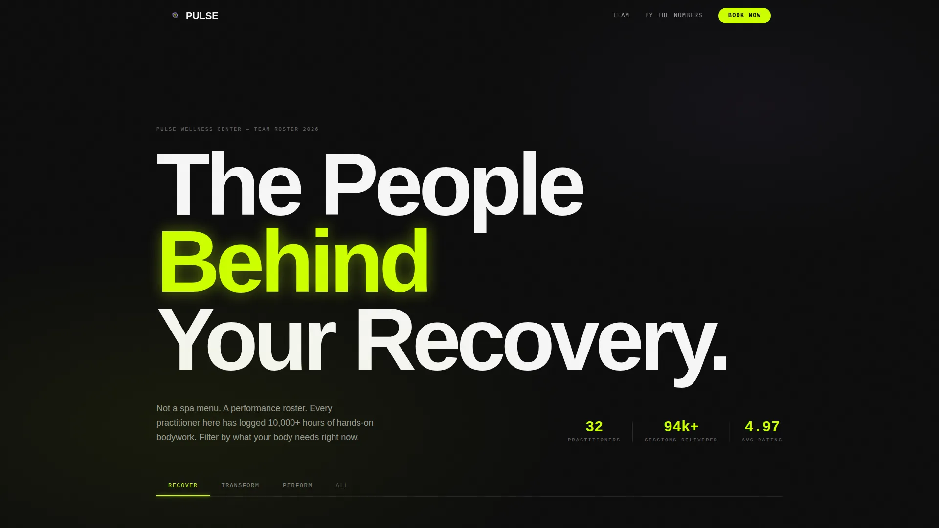
The header features a three-tab rail labeled RECOVER, TRANSFORM, and PERFORM. Each tab filters the practitioner grid below it. A sliding animated underline moves between tabs in 200-millisecond CSS transitions, giving the interaction a precise, data-dashboard feel.
Filterable Practitioner Card Grid
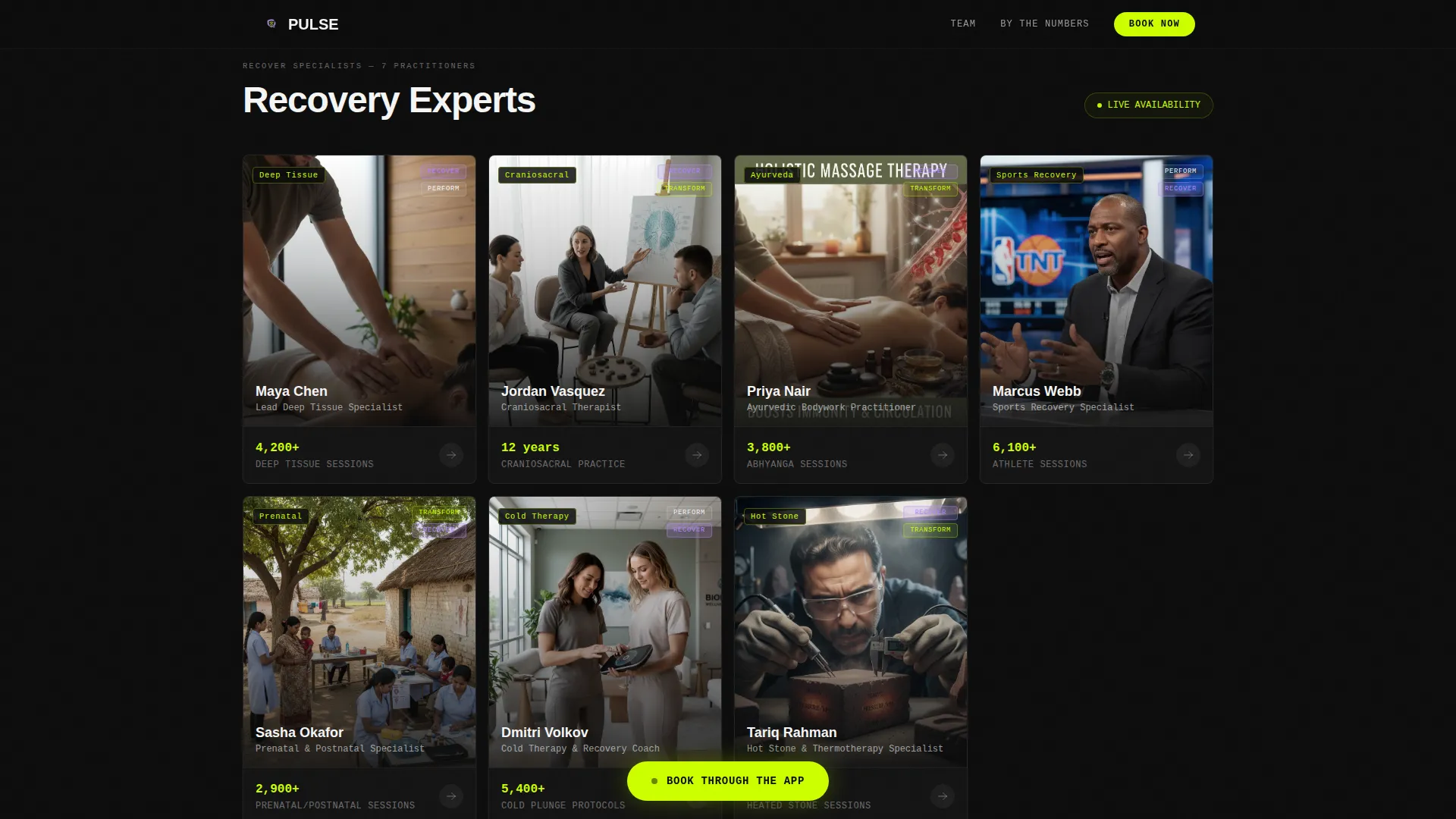
Practitioners are displayed in a modular card mosaic. Each card shows a face shot against a void-black background, the practitioner's specialty rendered in electric chartreuse type, and one signature metric displayed as a KPI widget. Clicking a tab reorganizes the grid with smooth, snappy transitions.
Expandable Credential Modals
Tapping any practitioner card opens an expanded view. This modal reveals a credential timeline, a modality breakdown shown as horizontal bar charts in UV lavender and chartreuse, and client outcome statistics drawn from anonymized session data.
Team by the Numbers Infographic
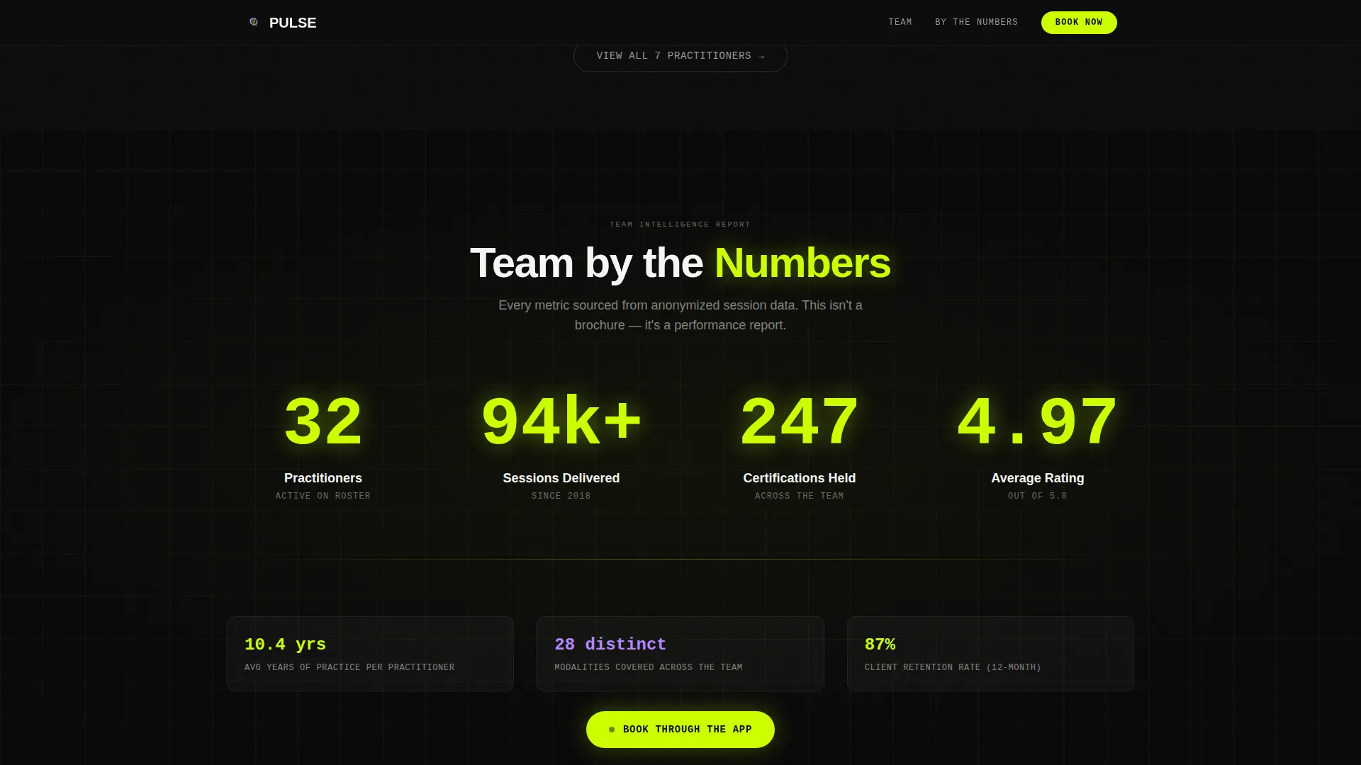
A dark, full-bleed section midpage presents combined team statistics in oversized chartreuse numerals. Combined years of practice, total sessions delivered, and certifications held all count upward as the visitor scrolls into view, using Intersection Observer triggering.
Fixed App-Download Call to Action
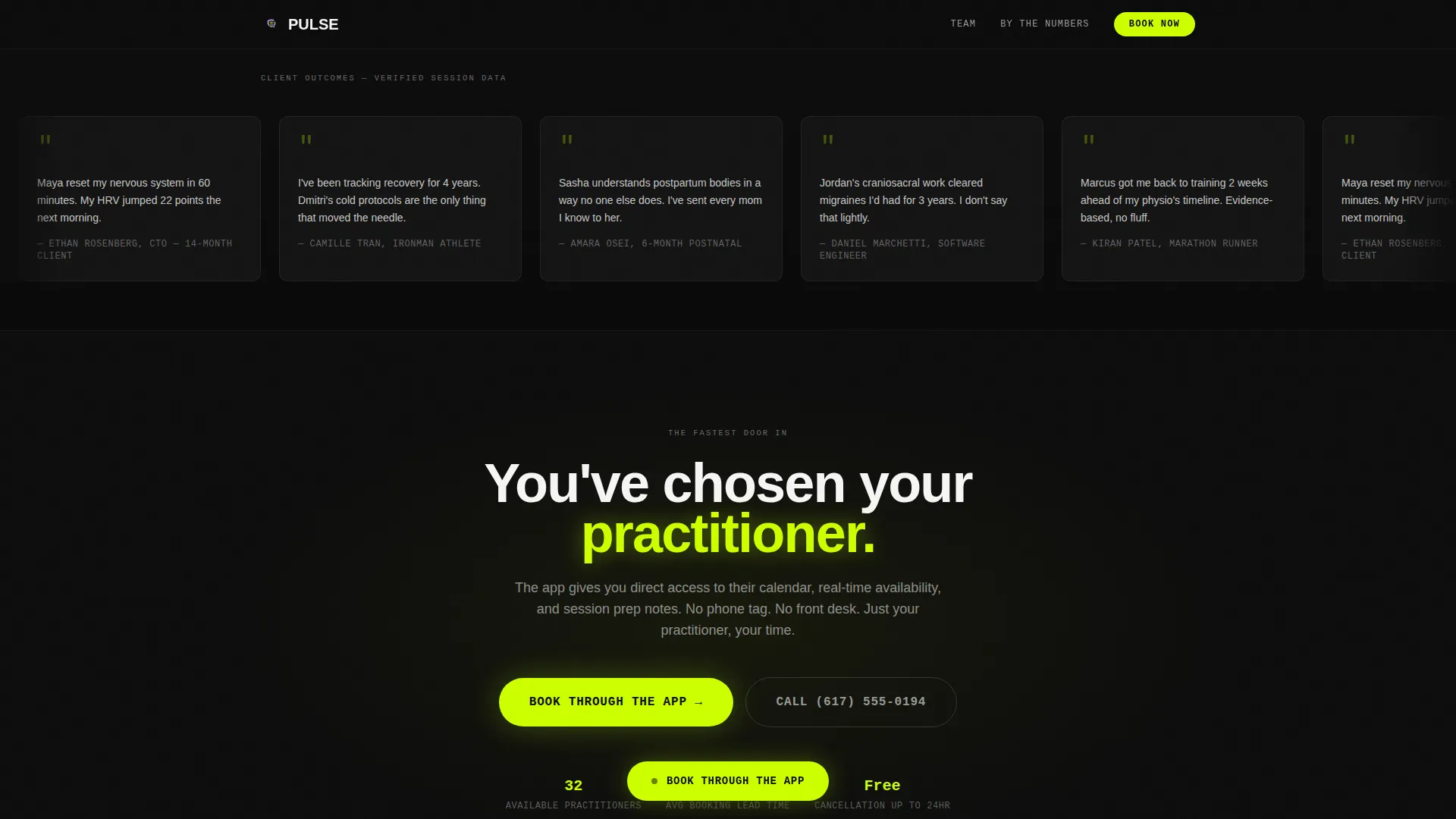
A chartreuse pill button appears fixed at the bottom of the viewport after the first scroll. Tapping it opens a slim modal with iOS and Android store badges alongside a phone number field for a direct SMS download link.
Deep-Link Practitioner Booking
Every practitioner card includes a secondary tap action. Visitors can tap directly into that therapist's booking calendar inside the app, shortening the path from discovery to confirmed appointment.
Page sections overview
| Section | Purpose |
|---|---|
| Hero Tab Switcher | Introduces brand and filters practitioners by goal |
| Practitioner Card Grid | Displays filterable modular team mosaic |
| Team by Numbers | Builds credibility with scroll-triggered team statistics |
| Practitioner Deep Dive | Expands credentials, timelines, and modality charts |
| App Download call to action | Converts visitors with fixed pill button and modal |
| Footer | Provides linear single-row navigation and links |
Design & branding system
Pulse uses an Acid Digital color system layered over a Startup Velocity theme. The result feels like a biohacking lab built inside a float tank, where neon data readouts sit beside matte dark surfaces and the typography carries the authority of a performance dashboard.
- Colors: void black (#0D0D0D) for header and footer zones, electric chartreuse (#CCFF00) for accents and hover states, clinical UV lavender (#B388FF) for secondary highlights, and sterile white (#F5F5F5) for card surfaces and body text
- Typography: DM Sans for headings and display text, JetBrains Mono for all metrics and KPI labels, creating a sharp contrast between editorial warmth and clinical precision
- Card borders activate in chartreuse on interaction, while the black background dominates non-card zones to keep the grid the clear focal point
Mobile & speed optimization
Pulse is built mobile-first, which directly supports its primary conversion goal of driving app downloads from a smartphone audience. Every interactive element is touch-optimized and layout decisions prioritize the small-screen experience.
- The fixed pill call to action is sized and positioned for one-thumb reach on mobile viewports, and the SMS download link option reduces friction for users who prefer not to navigate to a store
- Intersection Observer powers the count-up numerals in the infographic section, keeping scroll performance smooth by triggering animation only when the section enters the viewport
- CSS transitions handle all tab switching and card expand behavior, avoiding heavy JavaScript payload for core interactive states
How this template helps you convert
Pulse is designed as a persuasion sequence. By the time a visitor reaches the call to action, they have already reviewed the team's credentials, chosen a practitioner they trust, and absorbed the team's combined performance statistics. The download is the natural next step, not a cold ask.
- The tab switcher lets visitors self-select by recovery goal immediately, reducing decision fatigue and moving high-intent users to the right practitioners faster
- KPI-style session metrics and expandable credential modals replace vague bios with verifiable depth, turning skeptical data-driven visitors into believers before the midpoint of the page
- The fixed app-download call to action stays visible throughout the scroll journey, so the moment a visitor decides they want to book, the path is already one tap away
Other information about this template
Pulse is part of a broader template ecosystem suited to performance-driven service brands. A few additional details are worth noting before you get started.
- The template is localized for United States markets, using English copy and USD context throughout
- Animation intensity is set to high by default, covering tab transitions at 200 milliseconds, count-up scroll effects, card expand modals, and the sliding tab underline
- The footer uses a Pattern 1 linear single-row layout, keeping the bottom of the page clean and uncluttered
- The Industry Report creative direction shapes the overall scroll narrative, framing the team as evidence and the page as a case built section by section
Theme
Startup Velocity
Creative direction
Industry Report
Color system
Acid Digital
Style
Card Grid (Modular)
Direction
App Download
Page Sections
Animated Three-tab Header Switcher
Filterable Modular Card Grid
Expandable Credential Modals
Scroll-triggered Team Infographic
Fixed App-download Call to Action
Practitioner Deep-link Booking
Related questions
Can I change the tab labels from RECOVER, TRANSFORM, and PERFORM?
Does the fixed app-download button support both iOS and Android?
Can I add or remove practitioner cards from the grid?
Is this template suitable for a wellness center without a mobile app?
What fonts does this template use?



