Cloud-Native Enterprise Software Professional Website Template
Pulse is a high-velocity cloud-native CRM landing page template built for fast-moving sales teams. It uses a split-screen layout, animated stat counters, and a comparison-driven conversion flow to make the product's speed advantage impossible to ignore. Dark carbon styling, electric lime accents, and a persistent demo call to action keep visitors focused and moving toward action.
by Rocket studio
Quick summary
Pulse is a single-page, split-screen CRM landing page template designed for teams that move fast and close faster. Animated counters, live product visuals, and a side-by-side comparison tool build a compelling, evidence-first argument. The Carbon Fiber color system and mono typography give it the focused intensity of a late-night deployment terminal.
Who this template is for
This template is built for growth-stage software teams who need to convince technical buyers quickly. It speaks directly to people who have already felt the pain of slow, over-engineered tools.
- Series A founders closing their first enterprise deals and tracking pipeline in real time
- Revenue operations leads replacing patched-together tool stacks with a single, fast system
- Sales development representative managers who need reps logging activity in seconds, not minutes
What problem this template solves
Most CRM landing pages bury the value inside feature lists and marketing copy. Visitors leave before they feel the difference. This template flips that by leading with hard numbers and putting legacy tool weaknesses on display right next to the better alternative.
- Legacy CRM pages fail to show speed or adoption advantages in a concrete, side-by-side way
- Generic landing page layouts do not match the fast, technical energy that cloud-native buyers expect
- Conversion flows that ask for email upfront lose visitors before they see why the product wins
What you get with this template
You get a fully structured, single-page landing page template with every section and interaction pattern already designed. The layout, color system, and conversion logic are all ready to customize.
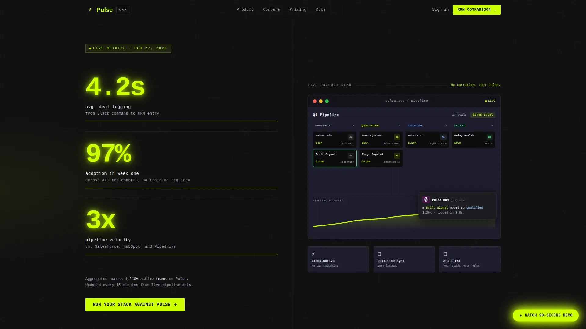
- A split-screen header with three animated stat counters and a live product demo panel
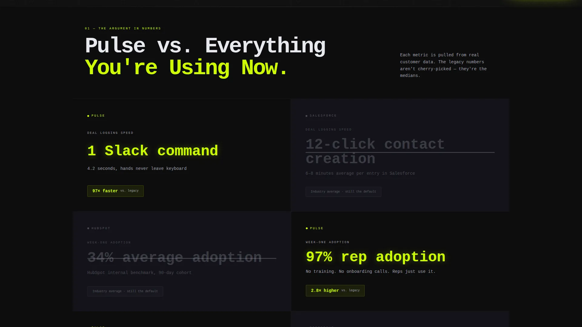
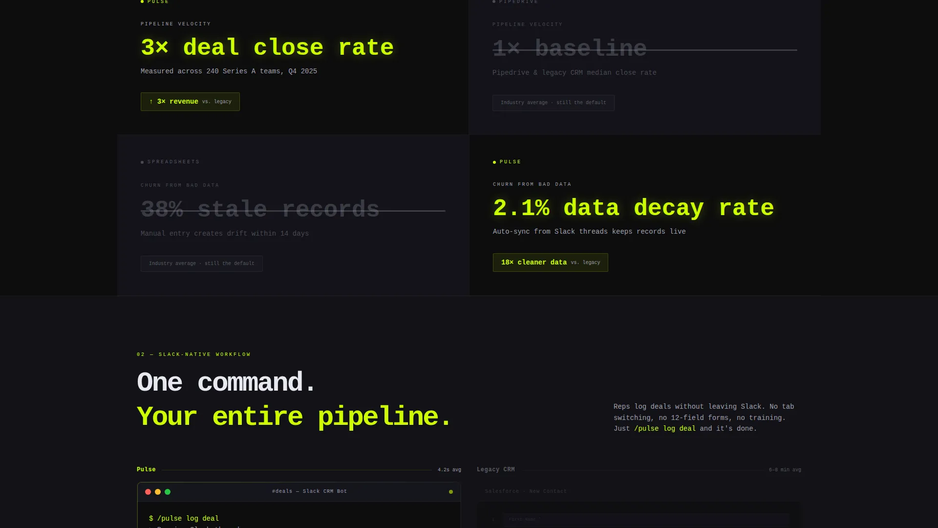
- A scrolling comparison section that pairs Pulse metrics against legacy CRM equivalents
- A primary comparison tool call to action and a persistent floating secondary call to action for the 90-second demo
Feature list
This template is built around one idea: let the evidence do the selling. Every feature below serves that goal directly.
Animated Stat Counter Header
Three oversized, real-time stat counters sit on the left half of the header. Each number ticks upward in monospaced type against pure black, with a faint electric lime glow pulsing on each increment. The counters display deal logging speed, week-one adoption rate, and pipeline velocity improvement.
Live Product Demo Panel
The right half of the header shows a screen recording of the CRM in action. A deal card drags across a Kanban board, a Slack notification fires, and a revenue chart climbs. No narration is needed. The product speaks at the speed the stat counters promise.
Split-Screen Comparison Sections
Each scroll section below the header pairs one Pulse metric against a legacy CRM equivalent. The legacy stat is grayed out and struck through. The contrast is deliberate and escalating, moving from speed to adoption to revenue impact to churn reduction.
Interactive Stack Comparison Tool
The primary call to action sends visitors to a comparison tool embedded in the page flow. Visitors pick their current tool from a dropdown and enter their team size. They see a personalized, side-by-side stat breakdown before any email is requested.
Persistent Floating Demo call to action
A lime-colored pill button floats in the bottom-right corner of every section. It links to the 90-second demo and stays visible throughout the entire scroll, giving visitors a low-commitment way to engage at any point.
Carbon Fiber Visual System
The full color palette uses deep chassis black, machined graphite, brushed aluminum, and electric lime. Every interactive surface uses lime. Backgrounds stay black or graphite. Body text uses aluminum. The result is a focused, high-contrast visual hierarchy with no distracting noise.
Page sections overview
| Section | Purpose |
|---|---|
| Split-screen header | Display animated stats and live product demo side by side |
| Speed comparison block | Contrast deal-logging speed against legacy tool averages |
| Adoption comparison block | Show week-one adoption rate versus industry norms |
| Revenue impact block | Demonstrate pipeline velocity gain with product screenshot |
| Churn reduction block | Close the scroll argument with retention metric evidence |
| Comparison tool call to action | Let visitors benchmark their current stack against Pulse |
| Floating demo pill | Provide persistent, low-friction access to the 90-second demo |
Design & branding system
The visual identity follows a Startup Velocity theme built entirely on the Carbon Fiber color system. Every design decision reinforces focus, speed, and technical credibility.
- Background layers use deep chassis black (#0D0D0D) and machined graphite (#1E1E2E) to separate sections without breaking the dark, terminal-like atmosphere
- Body text renders in brushed aluminum (#A0A0B0) for readability without competing with the electric lime (#CCFF00) accents on buttons, counters, and hover states
- Monospaced typography carries the stat counters and code-style labels, reinforcing the engineering culture of the target audience
Mobile & speed optimization
The split-screen layout is designed to reflow cleanly on smaller viewports. The 50/50 desktop split stacks vertically on mobile so the stat counters always appear before the product demo panel.
- The floating demo pill repositions to stay accessible on touch screens without covering key content
- Animated counter elements are built to perform without sacrificing the visual impact on mid-range devices
- Section contrast and type sizing are set to remain legible at mobile scale without layout adjustments
How this template helps you convert
Every structural decision in this template is built to reduce friction and increase the visitor's confidence before any commitment is asked of them.
- The stat counters in the header establish numerical credibility within the first three seconds of the visit, before a single word of marketing copy is read.
- The escalating comparison scroll compounds trust section by section, so by the time the comparison tool appears, the visitor already believes the numbers.
- The email capture is intentionally delayed until after the visitor has used the comparison tool and seen a personalized result, turning a cold form into a warm handoff.
Other information about this template
This template was designed specifically for the cloud-native CRM category, where buyers are technically fluent and skeptical of traditional enterprise software marketing. A few additional points worth knowing before you customize it.
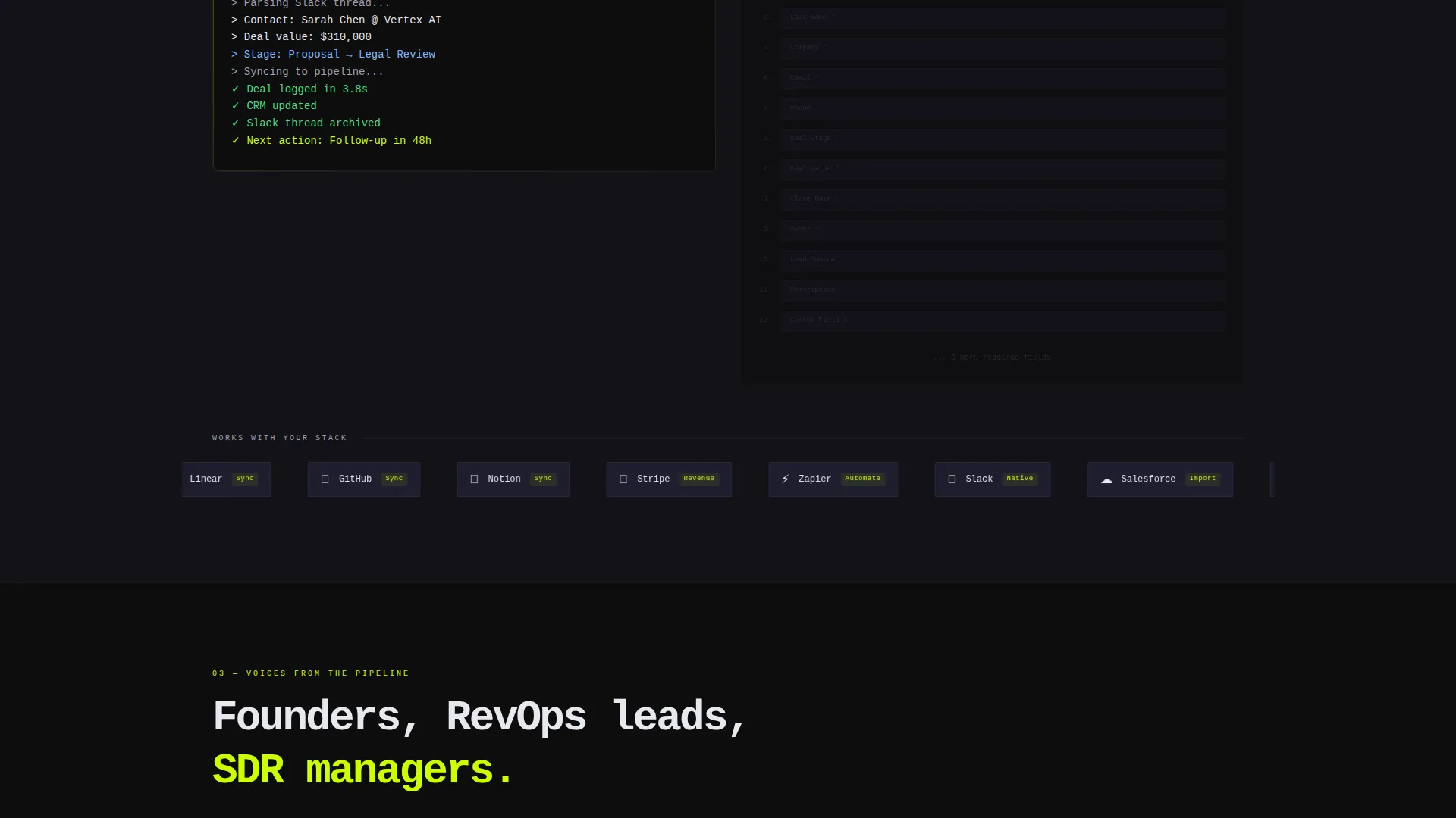
- The comparison tool dropdown includes Salesforce, HubSpot, Pipedrive, and spreadsheet as pre-set legacy options for visitors to select from
- The template is built as a single landing page, not a multi-page site, so all conversion flows stay within one focused scroll
- The Startup Velocity theme and Carbon Fiber palette are consistent design systems that can be adapted to other high-velocity software products beyond CRM
- The template is designed with Series A-stage go-to-market positioning in mind, where speed of adoption and pipeline transparency are the most persuasive proof points
Theme
Startup Velocity
Creative direction
Stats-First Impact
Color system
Carbon Fiber
Style
Split Screen (50/50)
Direction
Comparison/Versus
Page Sections
Animated Stat Counter Header
Live Product Demo Panel
Escalating Comparison Scroll
Interactive Stack Comparison Tool
Persistent Floating Demo Call to Action
Carbon Fiber Color System
Related questions
Can I change the stat counter values to match my own product metrics?
Does the comparison tool require backend development to work?
Is this template suitable for a product that is not a CRM?
How does the email capture flow work?
What does the floating demo call to action link to?



