Fitness Digital Presence Professional Website Template
Pulse is a bento grid landing page template built for fitness client portals. It targets personal trainers, boutique studio owners, and online coaches who need to move clients off scattered tools and into one dashboard. The dark, electric-indigo user interface and data-led scroll make the value feel immediate and the decision to sign up feel obvious.
by Rocket studio
Quick summary
Pulse is a single-page bento grid template designed for fitness client portal businesses. It opens with a live-stats dashboard header, escalates through industry-report-style sections, and closes with a full-width call-to-action card. The layout is built to make independent trainers and online coaches feel the product before they ever sign up.
Who this template is for
This template is built for fitness professionals who manage clients digitally and need a landing page that speaks directly to the pain of scattered tools. It works equally well for solo operators and small teams ready to scale.
- Independent personal trainers managing 30 to 80 clients from a gym floor or studio
- Boutique studio owners growing past their first hire and needing a polished digital presence
- Online coaches juggling multiple time zones who lose hours each week to copy-pasting content into direct messages
What problem this template solves
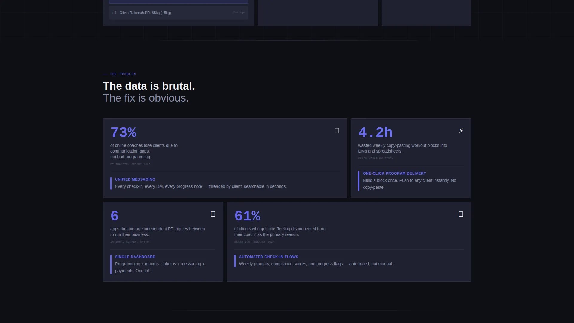
Most fitness professionals run their business across six or more apps: spreadsheets for programming, messaging apps for check-ins, PDF files for meal plans, and separate tools for photos and payments. The problem is not the workload; it is the mental cost of switching between all of them. This template gives that pain a name and immediately answers it with a single dashboard promise.
- Scattered tools create communication gaps that push clients to leave, not bad programming
- Coaches waste hours each week copy-pasting workout blocks and chasing check-ins manually
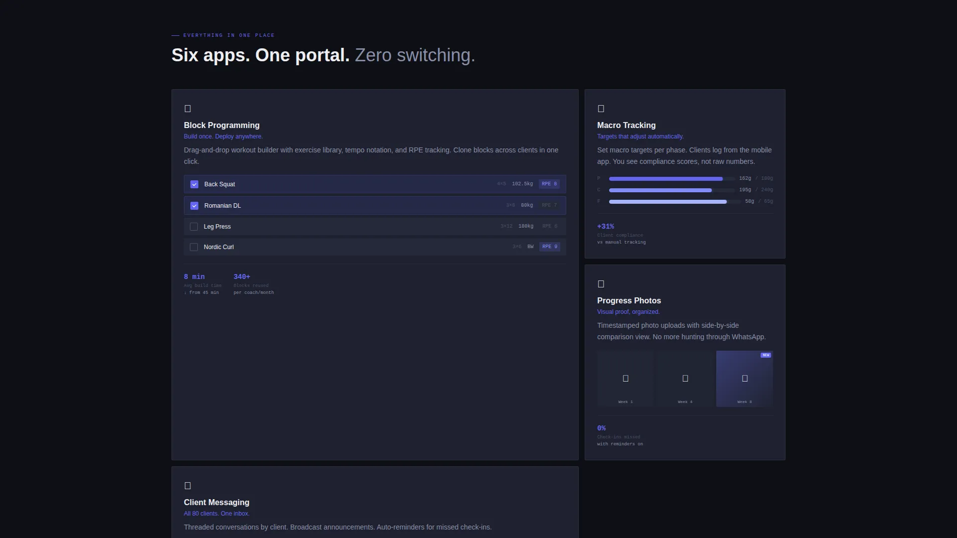
- There is no single place that shows programming, macros, progress photos, and messaging together
What you get with this template
You get a fully structured bento grid landing page ready to represent a fitness client portal product. Every section is purpose-built to stack evidence and move visitors toward a signup click. The layout ships with clearly defined content zones, two call-to-action placements, and a visual system that feels native to a dark productivity app.
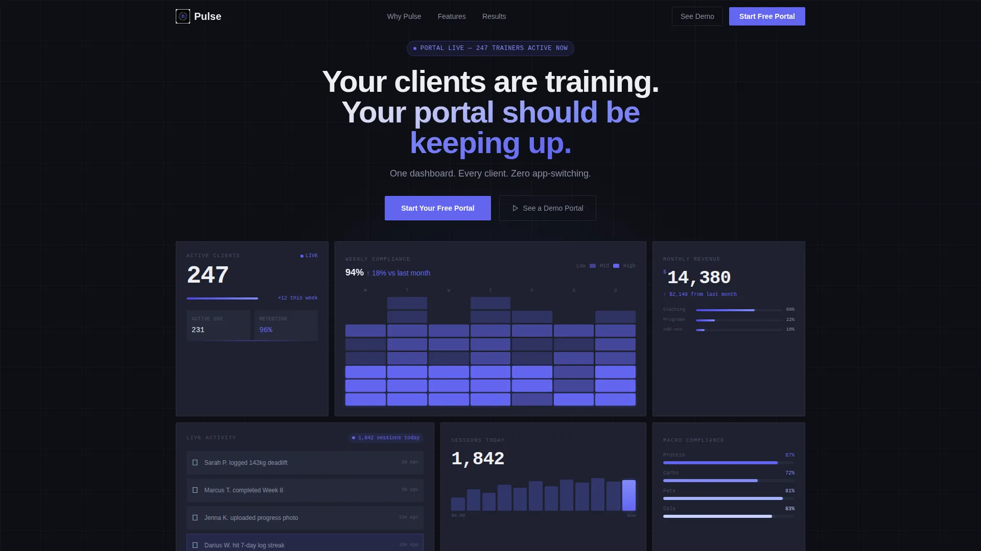
- A live-stats header section with metric tiles, a compliance heat map, a revenue ticker, and a notification stack
- An industry-report scroll narrative that pairs hard statistics with direct product feature answers
- A floating primary call-to-action button and a full-width closing call-to-action card, with no form on the page
Feature list
This template is built around a set of purposeful design and layout decisions that make a fitness client portal landing page convert. Each feature below reflects a direct detail from the template brief.
Live Stats Dashboard Header
The header renders a bento arrangement of metric tiles frozen mid-update. Tiles show active client count, a weekly compliance heat map, a monthly revenue figure, and a real-time notification stack with sample client activity. No stock photography is used; the data tiles are the hero.
Industry Report Scroll Narrative
Each bento section pairs a hard industry statistic with the product feature that answers it directly. The grid reshuffles section to section, so wide tiles split into narrow pairs and metric cards expand into feature walkthroughs. This keeps the reader scanning forward rather than skimming past.
Bento Grid Layout System
The page uses a true bento grid where tile proportions shift deliberately across sections. The visual rhythm prevents monotony and signals that the product itself is dynamic and data-rich. Every tile placement is intentional, not decorative.
Dual Call-to-Action Architecture
The primary call-to-action, labeled "Start Your Free Portal," is pinned as a floating button after the first scroll and repeated inside the final bento tile as a full-width card. A secondary call-to-action, "See a Demo Portal," opens an interactive preview. There is no form on the page; both actions route visitors forward cleanly.
Anonymized Case Study Section
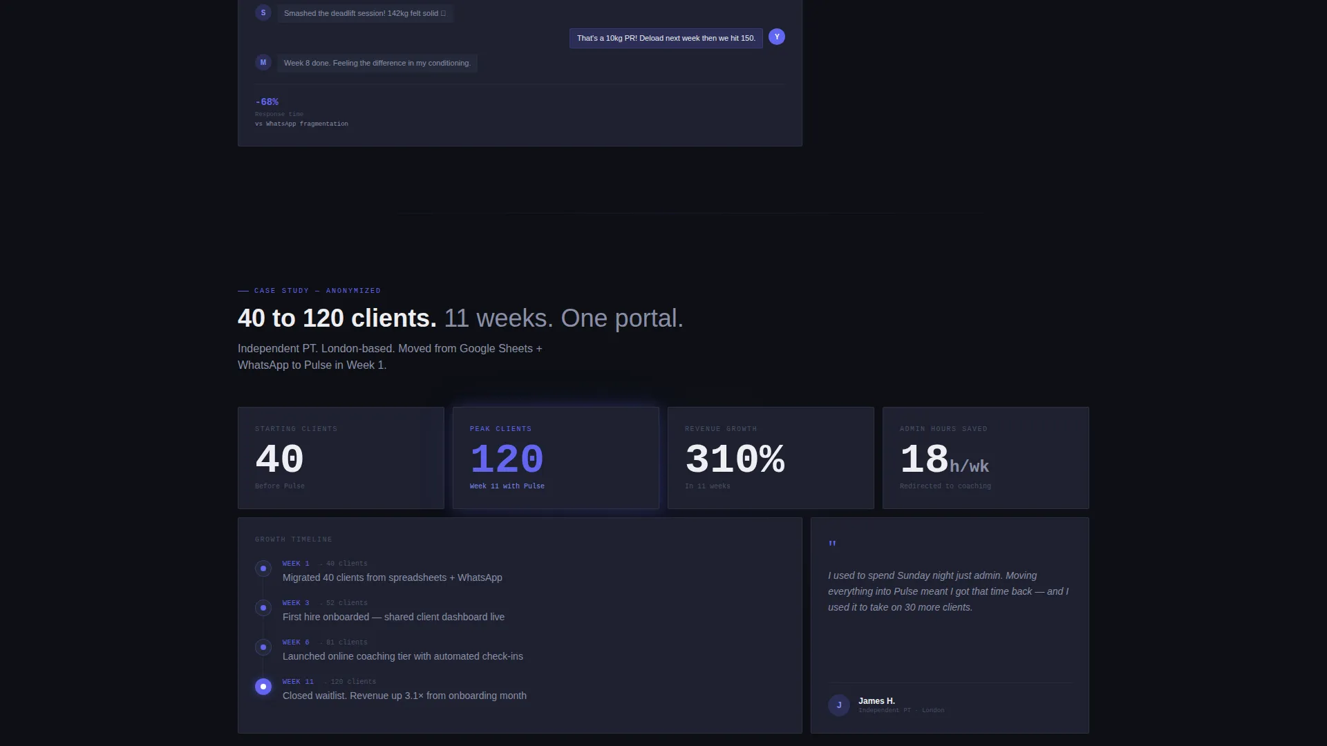
One section presents a before-and-after workflow comparison using an anonymized coach case study. It shows a scaling story from 40 to 120 clients in 11 weeks, grounding the value claim in a concrete, believable outcome rather than abstract promises.
Problem-to-Proof Narrative Arc
The page follows a deliberate three-act structure: scattered tools as the problem, product features as the answer, and anonymized proof as the closer. Each section adds another metric, screenshot reference, or workflow comparison so that not clicking feels like choosing to stay inefficient.
Page sections overview
| Section | Purpose |
|---|---|
| Stats Dashboard Header | Opens with live metric tiles to create instant product credibility |
| Headline Fade-In | Delivers the primary value statement over the data grid |
| Problem Stat Block | Pairs an industry statistic with the scattered-tools pain point |
| Feature Answer Tiles | Responds to each problem stat with a direct product feature |
| Workflow Comparison | Shows a before-and-after view of the coach's daily tool switching |
| Case Study Section | Presents anonymized scaling proof from 40 to 120 clients |
| Floating call to action Button | Pins the primary action after the first scroll throughout the page |
| Closing call to action Card | Full-width bento tile repeating the primary call to action |
Design & branding system
The visual identity follows a Startup Velocity theme centered on an Electric Indigo color system. The palette is deliberately dark and focused, built to feel like a professional data application rather than a lifestyle brand.
- Deep app-shell black (#0D0F14) as the page background, cool slate (#1E2130) for card surfaces, and reactive white (#EEEEF2) for all primary typography
- Electric indigo (#6366F1) used on every button, progress bar, and heat map glow to signal action and momentum
- No lifestyle photography or decorative imagery; the visual language relies entirely on data tiles, metrics, and user interface screenshots
Mobile & speed optimization
The bento grid is designed to reflow gracefully across screen sizes. Tile proportions adjust so the layout stays readable on smaller viewports without losing the dashboard feel.
- Wide tiles stack vertically on mobile so no content is hidden or truncated
- The floating call-to-action button remains accessible at all scroll depths on touch screens
- Typography sizing uses the reactive white palette at weights that stay legible against the dark card surfaces
How this template helps you convert
Every design and content decision in this template is aimed at reducing friction between a visitor landing on the page and clicking through to sign up. The evidence stacks deliberately, section by section.
- The header dashboard drops visitors directly into the product experience with real-looking metrics, so trust is established before a single word of copy is read.
- The industry-report narrative pairs statistics with features, making the product feel like an answer to a documented industry problem rather than a sales pitch.
- The dual call-to-action placement, floating button plus full-width closing card, keeps the signup path visible at every point in the scroll without requiring a form fill on this page.
Other information about this template
This template was built with a specific niche intersection in mind: technology products serving the fitness digital presence market. The layout language borrows from modern productivity and trading app interfaces, giving a fitness client portal the same visual authority as a serious software product.
- The template style is a bento grid, which is well suited to data-rich products where multiple metrics need to coexist on screen without visual clutter
- The creative direction follows an industry report format, which tends to perform well for software products targeting professionals who respond to data over lifestyle messaging
- The Startup Velocity theme and Electric Indigo color system were matched specifically to this niche intersection, making the template a strong fit for fitness portal products competing in the online coaching and personal training software space
Theme
Startup Velocity
Creative direction
Industry Report
Color system
Electric Indigo
Style
Bento Grid
Direction
Click-Through
Page Sections
Live Stats Dashboard Header
Industry Report Scroll Narrative
Bento Grid Layout System
Dual Call-to-action Architecture
Anonymized Case Study Block
Problem-to-proof Narrative Arc
Related questions
Who is this landing page template built for?
Does this template include a signup form on the page?
Can I edit the metric tiles and case study numbers?
What makes the bento grid layout effective for a fitness portal product?
Is this template suitable for a product that is still in early launch?



