Fitness & Gym Software Advanced Reviews Website Template
Pulse is a hub-and-spoke landing page template built for fitness and gym patient management platforms. It opens with a live micro-dashboard preview, flows into an interactive ROI calculator, and routes visitors through detailed comparison sections. The Dynamic Motion design uses a Void and Violet color system to keep attention exactly where effort is happening.
by Rocket studio
Quick summary
Pulse is a single-page, anchor-nav landing page template for fitness and gym patient management software. It leads with a functioning micro-dashboard embedded in the header, feeds visitors into an ROI calculator that uses their own numbers, then dismantles every common alternative through detailed comparison sections. The result is a high-conviction page that earns the click before asking for contact details.
Who this template is for
This template is built for software teams selling gym and fitness management platforms to operators who are ready to switch tools. It works best when the product handles member tracking, injury management, or physio workflows.
- Boutique studio owners managing around 200 active members with a small front-desk team
- Physiotherapists embedded inside CrossFit boxes who need clinical notes connected to a booking system
- Multi-site franchise managers who need visibility across locations from a single dashboard
What problem this template solves
Gym and fitness software buyers arrive skeptical. They are already using something, even if that something is a spreadsheet. A generic features page does not break that inertia. Pulse solves the conversion problem by making the visitor's own numbers do the selling.
- Visitors calculate their own time savings before they are asked for anything
- Comparison sections address specific frustrations with existing tools rather than making abstract claims
- The migration timeline promise removes the "switching is too hard" objection directly on the page
What you get with this template
Pulse delivers a fully structured, section-led landing page with interactive components, a conversion-focused layout, and a precise visual identity. Every section serves a specific persuasion role in the buyer journey.
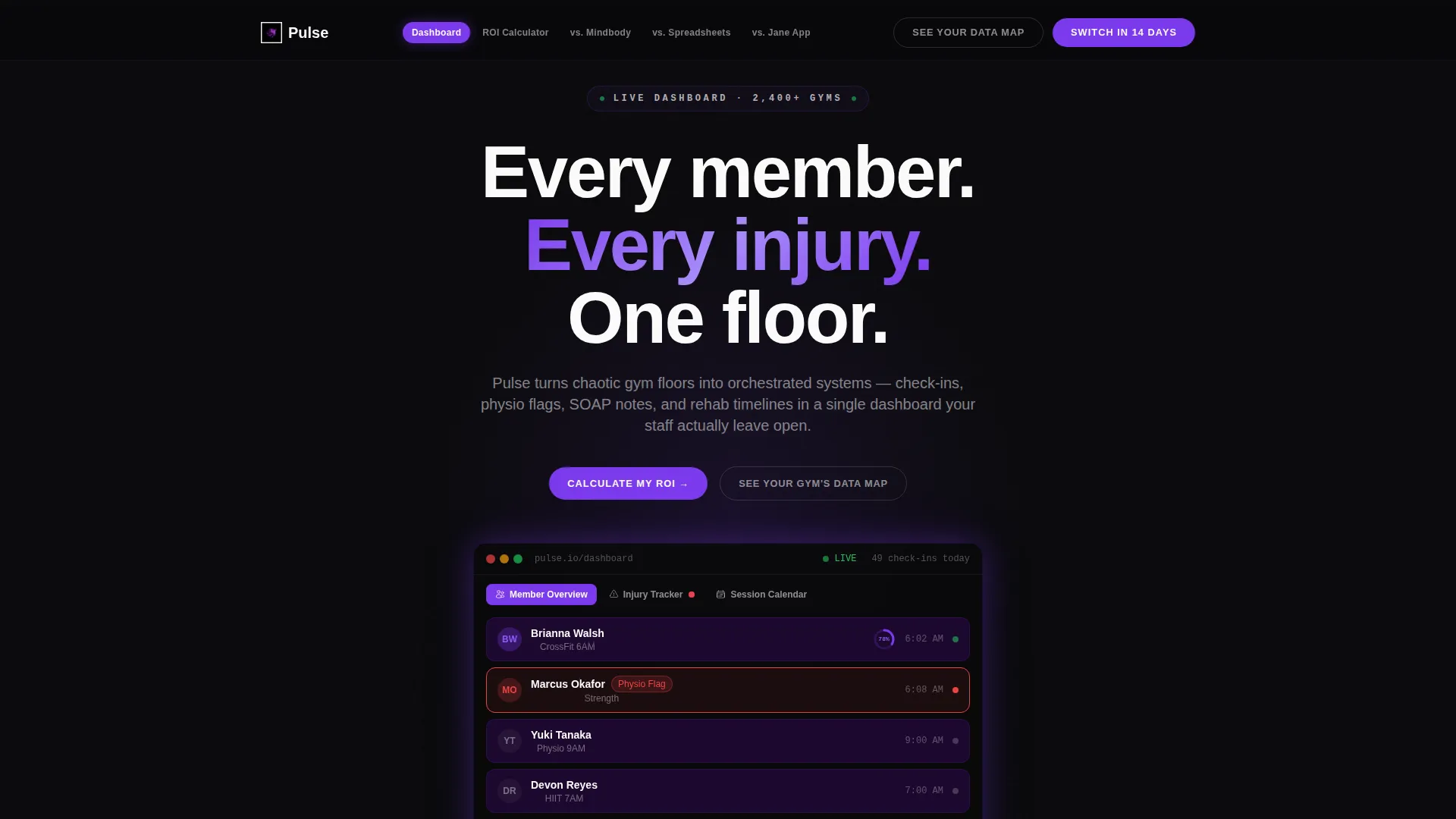
- An interactive micro-dashboard header with three clickable tabs: Member Overview, Injury Tracker, and Session Calendar
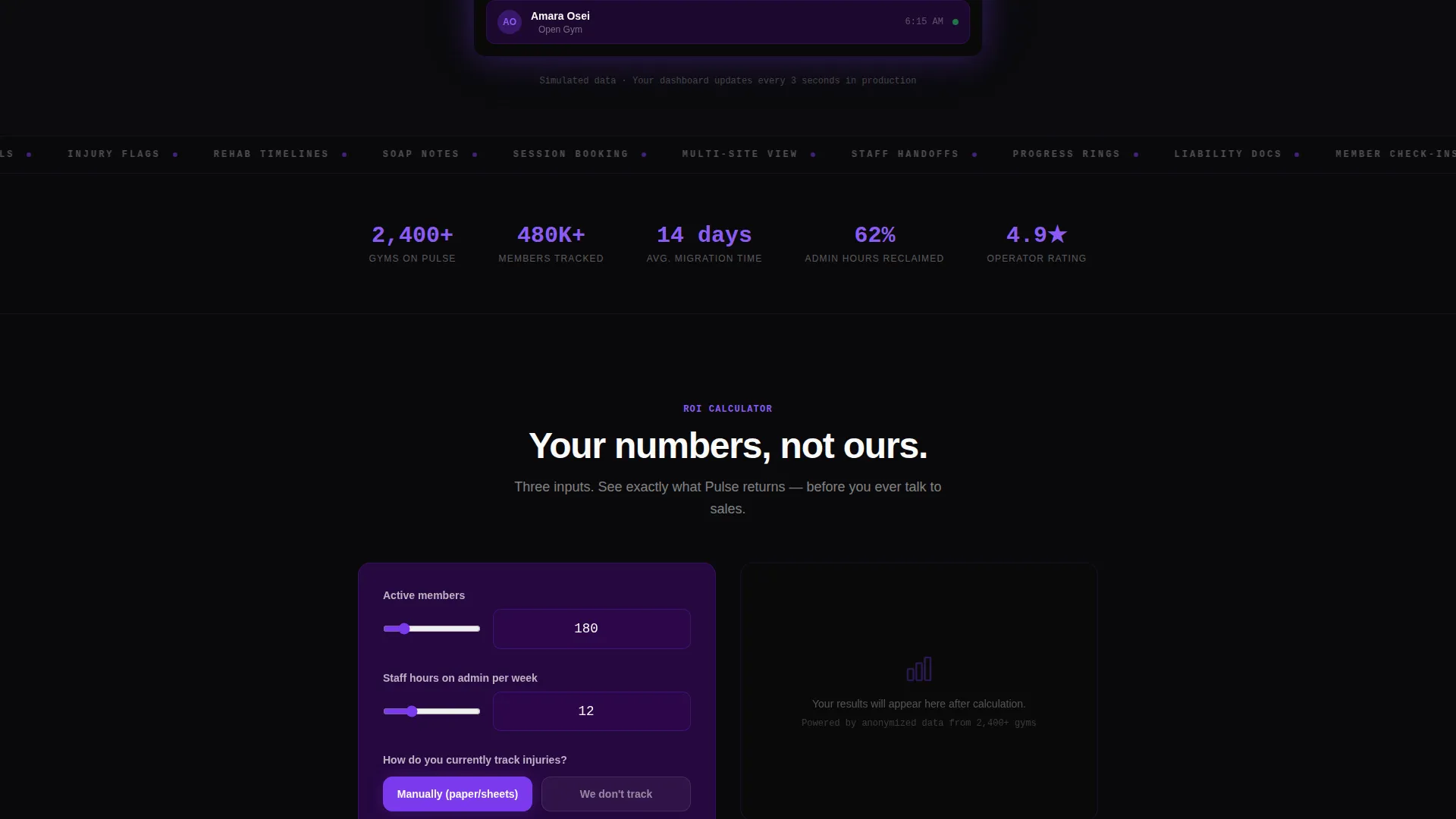
- An ROI calculator with three inputs and animated output counters showing time saved and member retention lift
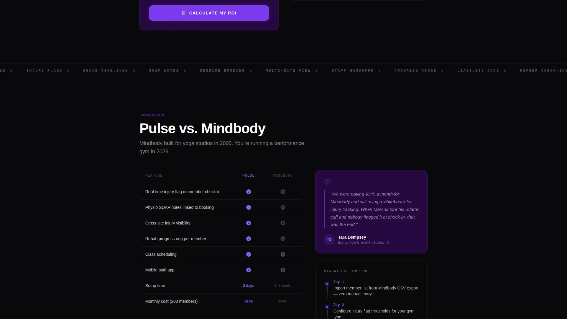
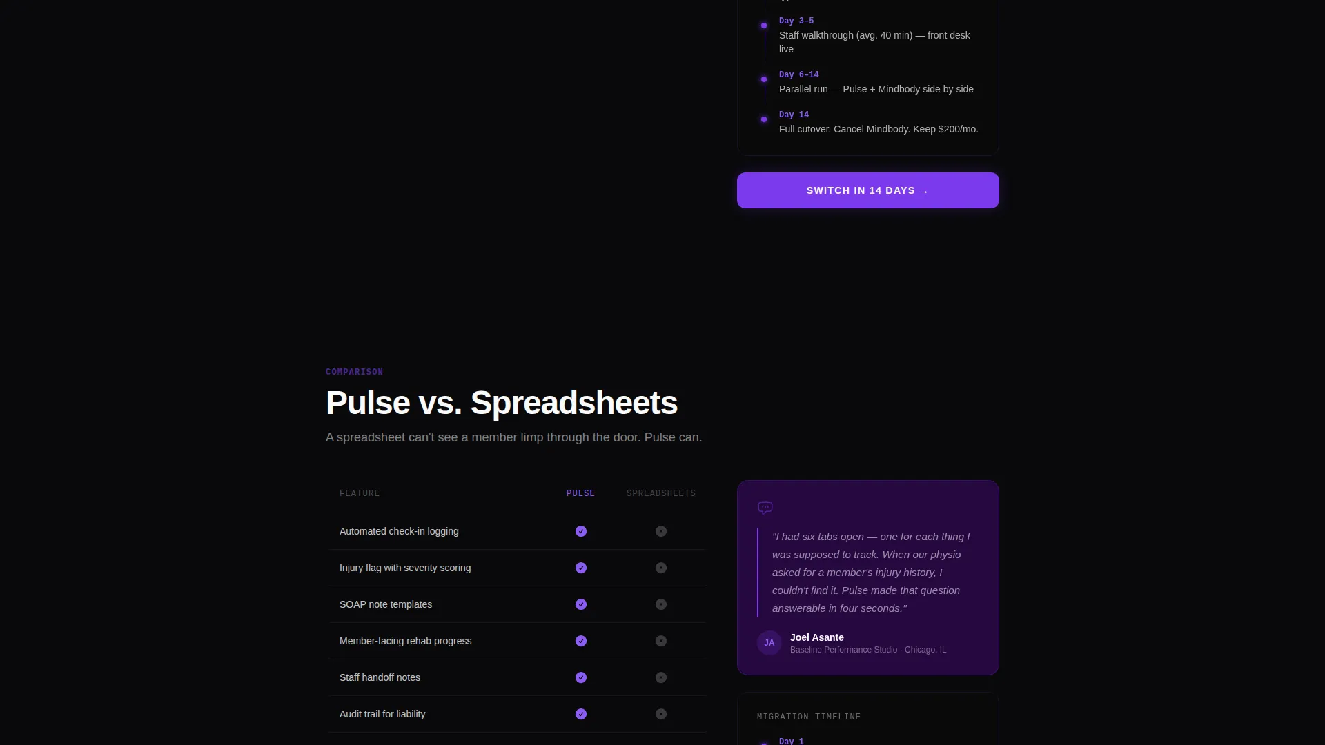
- Three detailed versus comparison sections, each with feature grids, operator quotes, and a migration timeline
Feature list
This template ships with a tightly scoped set of interactive and layout components, each engineered for a specific conversion job on the page.
Live Micro-Dashboard Header
The header embeds a functioning preview of the product directly in the viewport. Check-ins tick upward, a physio flag appears on a member card in real time, and a rehab progress ring completes its arc. Visitors see the product moving before they scroll a single pixel.
Three-Tab Dashboard Navigation
Inside the header preview, visitors can click between Member Overview, Injury Tracker, and Session Calendar. Each tab animates data into place using physics-based easing that mirrors the feel of weight settling under load. No static screenshots, no abstract illustrations.
ROI Calculator with Animated Outputs
The calculator sits directly below the header and takes three inputs: active member count, weekly staff hours spent on admin, and whether injury tracking is manual or absent. Results render instantly as animated violet counters showing time recovered, liability reduction context, and projected retention lift.
Hub-and-Spoke Anchor Navigation
A sticky anchor nav ties every section together. Each spoke links to a named comparison section, and the primary call to action appears both inside the nav bar and at the close of every versus section. The layout keeps visitors oriented and always one click from converting.
Versus Comparison Sections
Each comparison section uses void-black rows with violet checkmarks against gray competitor markers. Real operator quotes name specific frustrations with each alternative. A migration timeline inside each section shows exactly how many days the switch takes.
Dual Conversion Path Design
The primary call to action targets switchers ready to commit. A secondary path offers a short qualification form asking gym type, current software, and member count. The two paths serve different decision stages without competing with each other.
Page sections overview
| Section | Purpose |
|---|---|
| Interactive Dashboard Header | Show the product live before the visitor scrolls |
| ROI Calculator | Let visitors prove value with their own numbers |
| Anchor Navigation Bar | Link all spokes and surface the primary call to action persistently |
| First Versus Section | Compare against alternative one with grid and quotes |
| Second Versus Section | Compare against alternative two with grid and quotes |
| Third Versus Section | Compare against alternative three with grid and quotes |
| Qualification Form Close | Capture gym type, software, and member count |
Design & branding system
The visual identity follows a Dynamic Motion theme built on the Void and Violet color system. The palette is designed to feel like a UV-lit training floor at 6 AM: dark enough to eliminate distraction, lit only where effort is happening.
- Core colors: absolute void black (#09090B) for backgrounds, electric violet (#7C3AED) for interactive elements and data highlights, deep ultraviolet (#3B0764) for card surfaces, and sharp bone white (#FAFAF9) for all typography and chart lines
- Violet pulses on hover states and active anchor nav indicators, behaving like a heart rate spiking under load
- No stock photography and no hero illustrations; the product interface is the only visual hero on the page
Mobile & speed optimization
The template is built with a layout hierarchy that scales from wide desktop viewports down to mobile without losing the interactive components that drive conversion. The micro-dashboard preview and calculator are central to the experience on every screen size.
- Sticky anchor navigation collapses cleanly on smaller screens so the primary call to action stays reachable at all times
- Physics-based tab animations are scoped to stay smooth without relying on heavy animation libraries
- Void-black backgrounds reduce visual noise on mobile, keeping focus on violet-highlighted data and white typography
How this template helps you convert
Pulse is structured around a specific conversion philosophy: prove value before asking for anything. Every layout decision serves that sequence.
- The micro-dashboard header creates immediate product credibility the moment the page loads, before any marketing copy is read.
- The ROI calculator replaces abstract benefit claims with the visitor's own projected numbers, making the decision personal and concrete.
- The versus comparison sections remove the final objection by showing migration as a defined, time-bound process rather than an open-ended risk.
Other information about this template
Pulse is designed specifically for fitness and gym patient management platforms operating in competitive software categories where buyers are actively comparing tools before switching. The template style is Hub and Spoke with anchor navigation, making it suitable for long-form comparison pages that need to stay organized and skimmable. The creative direction is Calculator First, which is a proven approach for software tools where quantified outcomes matter to the buyer. The header concept is Interactive Preview, meaning no external demo link is needed to show the product in motion. This template is well suited for teams positioning against established fitness software alternatives where feature differentiation and migration ease are the two primary objections to address.
- Template style: Hub and Spoke with anchor navigation
- Creative direction: Calculator First with an interactive ROI tool
- Header concept: Interactive Preview with a live simulated member feed
- Color system: Void and Violet with electric violet (#7C3AED) as the accent
- Theme: Dynamic Motion with physics-based animation easing throughout
Theme
Dynamic Motion
Creative direction
Calculator/Tool First
Color system
Void & Violet
Style
Hub & Spoke (Anchor Nav)
Direction
Comparison/Versus
Page Sections
Live Micro-dashboard Header
Three-tab Interactive Preview
ROI Calculator with Animated Counters
Hub-and-spoke Anchor Navigation
Versus Comparison Sections
Dual Conversion Path Layout
Related questions
Can I replace the simulated dashboard data with my own product data?
Is the ROI calculator connected to any external system?
How many versus comparison sections does the template include?
What are the two conversion paths built into this landing page?
Who is this landing page template designed to convert?



