Feedback Intelligence Dashboard Landing Page Template
The Pulse Real-Time Feedback Intelligence Dashboard landing page template is a dark-glass, data-first single-page layout built for post-purchase feedback intelligence tools. It turns raw customer signals into a compelling visual story, with animated metric panels, benchmark charts, a case-study data card, and a progressive lead-capture form, all designed to convert DTC brand operators and CX leads into qualified prospects.
by Rocket studio
Quick summary
Pulse is a dark-dashboard landing page template built for feedback intelligence platforms that target eCommerce operators. It leads with three animated glassmorphic metric panels, scrolls through industry benchmarks and a skincare brand case study, breaks down email anatomy with real data, and closes with a sticky lead-capture flow that asks for store URL, order volume, and email in three low-friction steps.
Who this template is for
This template is purpose-built for B2B SaaS founders and product marketers who need to sell a post-purchase feedback service to busy eCommerce operators. It speaks directly to people who understand that raw feedback is gold and that most merchants never mine it.
- Direct-to-consumer brand operators who run automated email flows and need proof that a smarter feedback trigger outperforms generic alternatives.
- Shopify merchants and customer experience leads who want to identify patterns in customer sentiment and act on signals before they become critical issues.
- Product teams and sales professionals who need a polished, data-rich page that communicates the business case for structured feedback capture without a live demo.
What problem this template solves
Most brands collect customer feedback but fail to use it effectively. Open-ended responses are time consuming to analyze, support tickets pile up without revealing root cause patterns, and five-star defaults drown out the three-star reviews that contain the most relevant signals. Teams end up guessing at priorities instead of acting on data collected from real customers.
- Feedback volume stays low because the timing is wrong and the prompt feels generic, which means key metrics like net promoter system (NPS) scores stay flat.
- Customer issues go unresolved because there is no single source of structured insight that stakeholders can review together and act on quickly.
- Brands miss emerging trends in product performance because raw feedback never gets organized into a format that sales, CX, and product teams can actually use.
What you get with this template
This template gives you a complete, conversion-focused landing page layout that makes your feedback intelligence platform look as credible and precise as the data it generates. Every section is designed to move a skeptical visitor from awareness to a booked audit or a downloaded benchmark report.
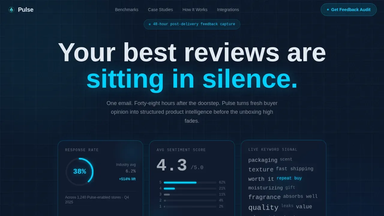
- A dark-glass hero section with three animated metric panels displaying response rate, average sentiment score, and a live keyword heatmap, so users can view data in motion the moment they land.
- An industry benchmark chart section, a before-and-after case-study data card, and an email anatomy breakdown with subject-line A/B stats, a send-window graph, and a tap-zone heatmap.
- A three-step glassmorphic modal lead-capture form plus a sticky bottom bar call to action, and a secondary PDF benchmark report gate for visitors not ready to commit.
Feature list
This template includes a focused set of purpose-built components. Each one is designed to communicate clarity, move visitors through the page, and generate qualified leads from an audience that reads data before they read copy.
Animated Dark-Glass Hero Panels
Three translucent, frosted glassmorphic panels float over a deep navy void and display live-feel metrics: a response rate climbing at 38%, an average sentiment score pulsing at 4.3, and a micro-heatmap of review keywords shifting like a living word cloud. Pulsating indicators visually imply that the data is updating in real time, which signals to users that Pulse provides fresh, relevant insights rather than static snapshots. The hero answers what the product is and why it matters in under five seconds.
Industry Benchmark Chart Section
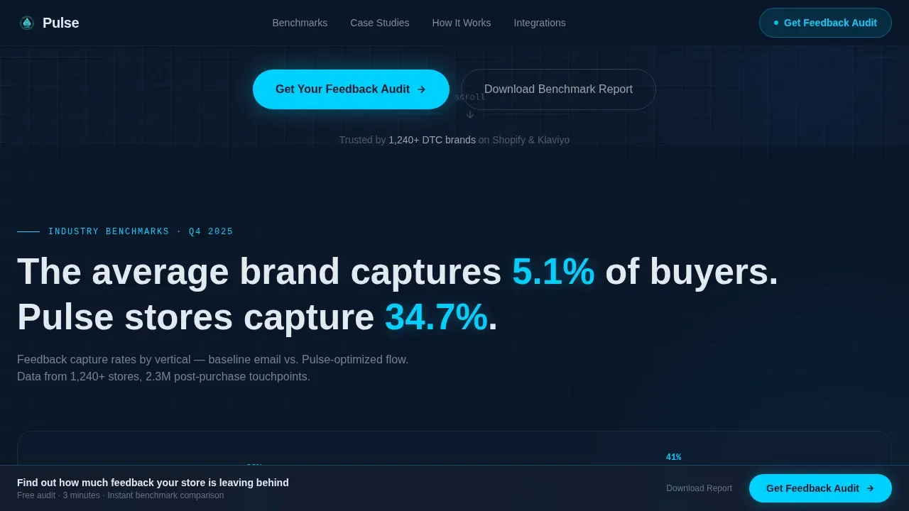
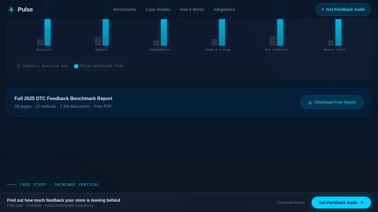
A scrollable section presents bar charts comparing average feedback capture rates across verticals. This gives prospects the broader context they need to determine how their own performance stacks up. Teams can reference these benchmarks in internal presentations to build the business case for adopting a smarter feedback system.
Case-Study Data Card
A dedicated data card shows a skincare brand's review volume tripling in sixty days, formatted as a before-and-after comparison. The card is designed to function like a page from a proprietary research deck, moving the visitor from broad industry truth to granular tactical proof. This kind of concrete example helps prospects visualize the direct revenue impact of a well-timed feedback email.
Email Anatomy Breakdown Section
This section dissects the feedback email itself using subject-line A/B test stats, an optimal send-window graph, and a call to action button tap-zone heatmap. Visitors can analyze the mechanics behind the 48-hour post-delivery trigger and understand why timing and structure matter. It communicates that Pulse turns raw feedback collection into an engineered process, not a guesswork exercise.
Progressive Glassmorphic Lead Capture
The primary call to action, labeled "Get Your Feedback Audit," appears in both a sticky bottom bar and at the close of the final data section. Clicking it opens a three-step glassmorphic modal that collects store URL first, then monthly order volume via a slider, then email. This progressive disclosure approach reduces friction, keeps conversion rates positive, and respects the user's role in the buying journey.
Secondary PDF Benchmark Gate
A secondary conversion path offers a downloadable PDF benchmark report gated behind email-only capture. This gives visitors who are not yet ready to request an audit a low-commitment way to engage with Pulse, stay in the funnel, and receive deeper insights over time.
Page sections overview
| Section | Purpose |
|---|---|
| Hero Metric Panels | Display live-feel feedback signals |
| Industry Benchmarks | Contextualize capture rate data |
| Skincare Case Study | Show before-and-after proof |
| Email Anatomy Breakdown | Explain timing and structure |
| Integration Trust Bar | Display partner logos and specs |
| Sticky call to action Bar | Maintain persistent lead access |
| Glassmorphic Lead Modal | Capture leads in three steps |
| PDF Benchmark Gate | Convert early-stage visitors |
| Linear Single-Row Footer | Close page with minimal noise |
Design & branding system
The visual identity is built on a Tech Glass theme using a Midnight Blue color system. The aesthetic feels like the bridge of a starship at cruise speed: dark panels, soft luminance bleeding through translucent layers, and every glow purposeful and earned. Typography uses DM Sans for headings and JetBrains Mono for data and metrics, which reinforces the dashboard intelligence character of the layout.
- Color palette: deep terminal navy (#0A1628) as the background, polished obsidian (#141C2E) for card surfaces, frosted glass white (#E2E8F0) for readable text on dark panels, and electric cyan (#00D1FF) for hover states, progress rings, and live data highlights.
- Animation and interactivity: GSAP ScrollTrigger drives animated chart reveals, a pulsing ring system marks active metrics, and a marquee element keeps the page feeling alive between scroll stops.
- Visual language: no hero image and no stock photography; the data collected from real feedback flows is the visual, and it is designed to breathe.
Mobile & speed optimization
This template is built mobile-first, which directly reflects the reality that most feedback email recipients check landing pages on their phones. The layout stacks cleanly from desktop to tablet to mobile, and interactive elements scale without breaking the dark-glass visual system. Performance is approached through a server-and-client component split: static sections use server components for fast initial paint, while the animated hero and glassmorphic modal run as client components.
- Fully optimized for mobile, desktop, and tablet devices with a responsive stacking structure that preserves the dashboard aesthetic at every breakpoint.
- Client-side animation is scoped to the hero and modal so that the majority of the page loads fast, keeping the experience consistent and smooth for users arriving from email links.
- The sticky call to action bar remains accessible on all screen sizes, giving users a persistent and visible path to the lead form regardless of scroll position.
How this template helps you convert
A landing page template for a feedback intelligence platform has to do more than look impressive. It has to move a skeptical, data-literate buyer from scroll to action. This template is engineered around that specific challenge, balancing technical sophistication with a simplified user experience so that prospects feel confident rather than overwhelmed.
- The data-as-visual hero immediately establishes credibility by showing real metrics in motion, which signals to visitors that the platform generates live insights rather than static reports. Users who see concrete numbers, like a 38% response rate and a 4.3 sentiment score, are more likely to trust the value proposition and continue scrolling.
- The industry benchmark and case-study sections create a narrative arc that moves from broad market context to specific brand-level proof, giving prospects the information they need to build internal consensus. Teams can reference the skincare brand example when presenting the business case to stakeholders who control budget decisions.
- The three-step progressive modal and the secondary PDF gate work together to capture leads at two different commitment levels, which means the page generates pipeline from both decision-ready prospects and earlier-stage visitors without forcing a single conversion path.
Other information about this template
This template is designed to support a wide range of feedback intelligence use cases beyond its core DTC context. The layout can accommodate placeholders for AI-powered summaries, anomaly detection callouts, and alert systems that notify managers when a Pulse Score drops below a defined threshold. The section structure supports dynamic, interactive visualizations including line charts for trends, heatmaps for sentiment, and bar charts for comparison across a selected time period.
- Pulse saves organizations significant manual review hours by organizing raw feedback into structured signals, with some feedback intelligence deployments reporting savings of 55,000+ hours annually.
- The template includes placeholder areas for app reviews, NPS scores, and support ticket volume so teams can monitor multiple feedback channels from a single source and filter by relevant segment.
- Pulse saves time otherwise spent manually reading through unstructured text by using an AI-powered sentiment engine that categorizes open-ended responses into sentiment categories in natural language, making it easier to identify root cause patterns and spot emerging trends before they escalate to critical issues.
- The page structure supports a free plan entry point displayed alongside full access upgrade options, which lets users self-select into the right tier based on order volume and team size.
- Brand logos of companies currently using the dashboard can be placed in the integration trust bar section for credibility, following the principle that social proof adjacent to a call to action lifts engagement and positive conversion signals.
- Pulse enables teams to analyze and act on open text feedback faster than traditional methods, which aligns business priorities with the customer experience signals that matter most to sales, product, and CX stakeholders.
- Tableau Pulse and similar feedback intelligence platforms share the goal of providing a unified view of customer feedback to drive business impact, and this template's design language and data hierarchy reflect best practices seen across top-tier feedback intelligence tools.

Theme
Tech Glass
Creative direction
Industry Report
Color system
Midnight Blue
Style
Dashboard/Data Grid
Direction
Lead Generation
Page Sections
Animated Dark-glass Hero Metric Panels
Industry Benchmark Chart Section
Before-and-after Case Study Card
Email Anatomy Breakdown Section
Three-step Progressive Lead Modal
Secondary PDF Benchmark Gate
Related questions
What type of business is this template built for?
Does the template include the animated metric panels and modal form?
Can I customize the benchmark data and the case-study card?
Does this template support a secondary conversion path for visitors not ready to commit?
Is a free plan available for accessing this template?



