Pulse - Instant Telehealth Landing Page Template
Pulse is a split-screen telehealth landing page template built for telemedicine apps that need to convert first-time visitors fast. It pairs an interactive app prototype with data-driven persuasion, a minimal three-field signup form, and a Void and Violet visual system that feels urgent yet calm. Designed for freemium and free-trial conversion flows.
by Rocket studio
Quick summary
Pulse is a single-page telehealth landing page template designed around one goal: turning a skeptical visitor into a free-visit signup in under a minute. The layout is a 50/50 split screen throughout. Every section pairs a hard industry statistic on one side with real counter-evidence on the other, building a case that makes inaction feel unreasonable.
Who this template is for
This template is built for founders, product teams, and marketers launching or promoting a telehealth or telemedicine app. It works best when your audience needs care outside of standard clinic hours and your conversion model is freemium or free-trial.
- Telehealth startups launching a consumer-facing app to underserved or rural audiences
- Healthcare product teams running a free-visit offer for on-demand primary care
- Healthcare administrators evaluating enterprise plans who need a secondary gated-content path
What problem this template solves
Most healthcare landing pages feel clinical and slow. They ask too much too soon, bury the value proposition, and do nothing to overcome the trust gap between a stranger and a digital doctor. Pulse solves that.
- Visitors leave before signing up because the page fails to explain why speed and access matter to them personally
- Complex signup flows asking for insurance or credit card details kill conversion before the free offer registers
- Pages with no proof feel like marketing; this template leads with hard data and lets the evidence close the deal
What you get with this template
You get a fully structured split-screen landing page template with every section and component mapped to a specific conversion moment. Nothing is decorative without purpose.
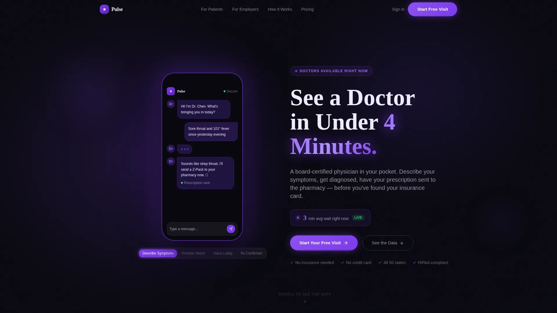
- An interactive header with a floating phone frame showing a live app prototype visitors can tap through
- A data-driven scrolling body with animated bar charts, a map visualization, and real-time satisfaction counters
- A three-field freemium signup form and a secondary gated PDF path for enterprise-level visitors
Feature list
This template delivers a focused set of high-intent components. Each one is grounded in the source brief and serves the freemium conversion flow directly.
Interactive App Prototype Header
The left panel of the header holds an embedded, tappable phone frame. Visitors can scroll through four app screens: symptom input, provider match, video lobby, and prescription confirmation. It lets people experience the product before they sign up.
Real-Time Wait-Time Counter
The right panel of the header displays a bold headline alongside a live counter pulling anonymized wait-time data. Showing "See a Doctor in Under 4 Minutes" next to a ticking number makes the speed claim feel earned, not marketed.
Industry Report Scroll Sequence
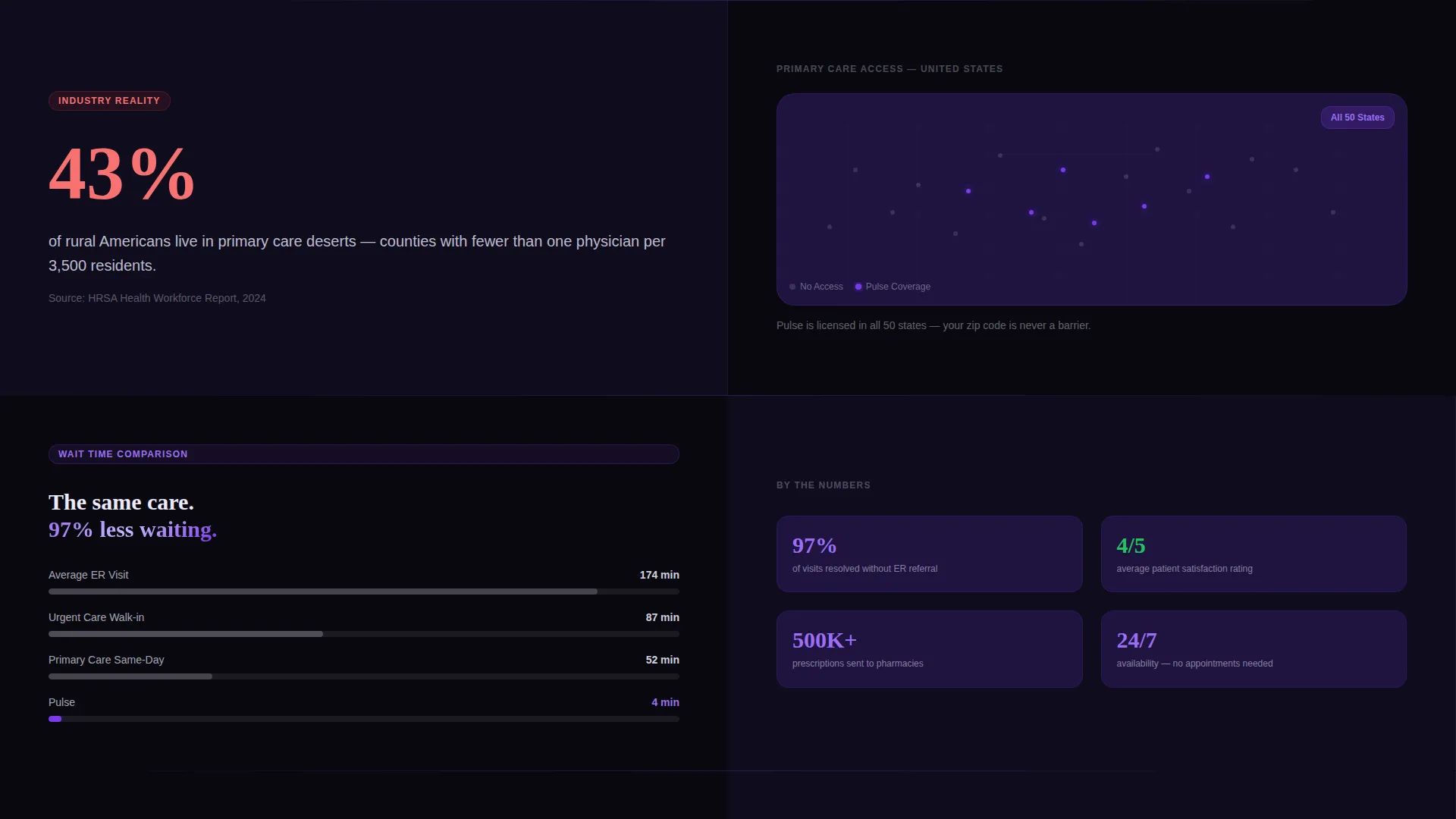
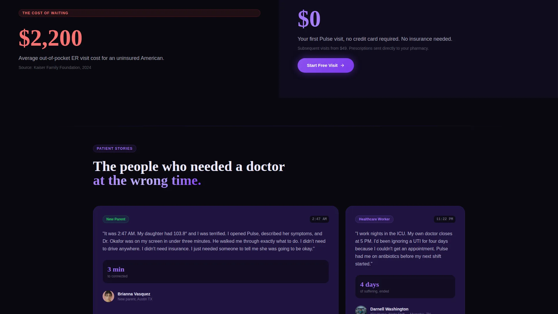
Each scroll section pairs a damning industry statistic on the left with Pulse's counter-evidence on the right. The sequence includes a rural care desert split with a map visualization, animated ER versus Pulse wait-time bar charts, and patient satisfaction percentages.
Pinned Freemium Call to Action
The primary call to action, "Start Your Free Visit," pins into view after the second scroll and stays visible. It glows electric violet against the void background so it never disappears from the visitor's peripheral vision while they read.
Three-Field Signup Form
The signup form asks only for first name, state of residence for licensing compliance, and phone number. No insurance details. No credit card. Reducing friction at this step is the single biggest driver of free-visit conversion.
Gated Enterprise Report Path
A secondary call to action offers a downloadable PDF report for healthcare administrators evaluating enterprise plans. It is gated behind a work email address, creating a lightweight lead-capture path for high-value institutional buyers.
Page sections overview
| Section | Purpose |
|---|---|
| Interactive split header | Introduce the app with a tappable prototype and a live wait-time counter |
| Rural care desert split | Pair a damning statistic about primary care access with a map visualization |
| Wait-time comparison | Show animated bar charts of average ER times versus Pulse times |
| Satisfaction counter section | Display patient satisfaction percentages rising in real time |
| Pinned free-visit call to action | Anchor the primary freemium signup form after the second scroll |
| Enterprise report gate | Offer a gated PDF download for administrators via a work email form |
Design & branding system
The visual identity is built on a Void and Violet color system designed to feel like a phone glowing in a dark room. It is intimate, immediate, and entirely intentional for a midnight-care use case.
- Absolute void black (#09090F) anchors every background surface; deep space indigo (#1E1340) lifts card surfaces and section breaks above it
- Electric violet (#7C3AED) drives every button, data highlight, and call-to-action glow against the dark palette
- Clinical frost (#EDEAFF) handles all body text and whitespace, keeping reading comfortable at low ambient light
Mobile & speed optimization
The template is structured for visitors who arrive on a phone in a stressful moment, not at a desktop during office hours. Every layout decision reflects that context.
- The 50/50 split-screen layout stacks vertically on smaller screens so the prototype and headline each get full-width attention
- The pinned call-to-action button remains accessible during scroll on mobile without covering critical content
- The three-field form is thumb-friendly by design, reducing the effort required to complete signup on a small screen
How this template helps you convert
The conversion architecture follows a deliberate sequence. It earns the click by building a case before asking for anything.
- The interactive header creates immediate product familiarity. Visitors tap through real app screens before reading a single marketing claim, so trust is established through experience rather than copy.
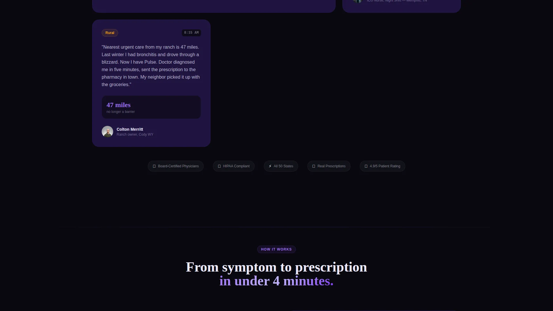
- The Industry Report scroll sequence makes inaction feel costly. By the time a visitor reaches the pinned call to action, they have absorbed statistics about care deserts, ER wait times, and patient outcomes that make the free visit feel like the obvious rational response.
- The frictionless three-field form removes the last barrier. First name, state, and phone number take under thirty seconds to fill in. No insurance card needed. No credit card required. The path from "I should try this" to "I signed up" is as short as the template can make it.
Other information about this template
This template is part of the Startup Velocity theme family, which is designed for fast-moving digital health and technology products that need to establish credibility quickly with a non-technical audience.
- The template style is Split Screen (50/50), consistent throughout every section from the header to the form
- The creative direction follows an Industry Report cadence, making it well-suited to telehealth and telemedicine app marketing that needs to overcome user skepticism with data
- The header concept is an Interactive Preview, which is a distinct differentiator from static screenshot-style headers common in healthcare app marketing
- The landing page direction is Freemium and Trial conversion, with a dual-path structure serving both consumer signups and enterprise lead capture in the same scroll
Theme
Startup Velocity
Creative direction
Industry Report
Color system
Void & Violet
Style
Split Screen (50/50)
Direction
Freemium/Trial
Page Sections
Interactive Tappable App Prototype
Live Wait-time Counter Display
Industry Report Scroll Sequence
Pinned Freemium Call to Action
Three-field Conversion Form
Gated Enterprise PDF Path
Related questions
Who is this landing page template designed for?
Do I need design or coding skills to use this template?
Can I use this template for a different healthcare niche?
What makes the signup form different from a typical lead form?
Is the app prototype in the header functional or a visual mockup?



