Healthcare Software & SaaS Specialist Professional Website Template
Pulse is a healthcare marketing automation landing page template built for teams that need to see every patient touchpoint, referral pipeline, and campaign metric in one place. It combines an interactive hub-and-spoke layout, a feature tab switcher, and a live stack comparison engine to help healthcare marketers make a confident case for switching platforms.
by Rocket studio
Quick summary
Pulse is a single-page healthcare marketing automation template designed around a mission-control aesthetic. It uses a hub-and-spoke anchor navigation structure, an animated feature tab switcher, and a dynamic competitor comparison panel. The template targets healthcare marketers who need to demonstrate platform value quickly and clearly to executive stakeholders.
Who this template is for
This template is built for healthcare marketing and growth professionals who operate at a strategic level. It speaks directly to people managing complex, multi-channel patient acquisition programs where accountability matters at every step.
- Hospital system Chief Marketing Officers overseeing HIPAA-compliant email sequences and multi-channel campaigns
- Specialty practice growth directors tracking physician referral attribution across regions
- Digital health startup marketers proving patient acquisition return on investment to boards and investors
What problem this template solves
Healthcare marketing teams often rely on disconnected tools stitched together across patient journey tracking, referral management, and campaign reporting. That fragmentation makes it nearly impossible to show leadership a clear, unified picture of performance. Pulse is designed to expose that gap visually and position a better alternative.
- Visitors cannot see how their current stack compares feature by feature without a structured side-by-side view
- No single entry point typically connects patient journeys, referral pipelines, and campaign analytics in one dashboard view
- Marketing leaders lack a self-guided discovery path that builds trust before asking them to book a demo
What you get with this template
You get a fully structured, single-page landing page layout that guides sophisticated buyers through every key proof point at their own pace. Each section is purpose-built for healthcare marketing context and conversion.
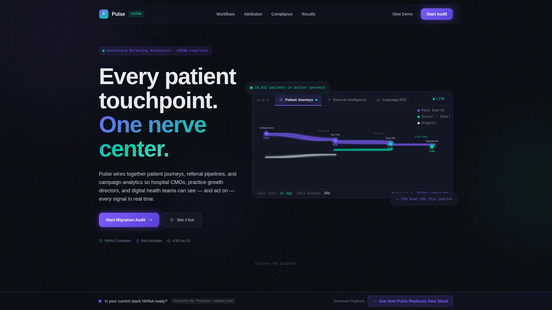
- A Feature Tab Switcher header with three animated dashboard states covering patient journeys, referral intelligence, and campaign return on investment
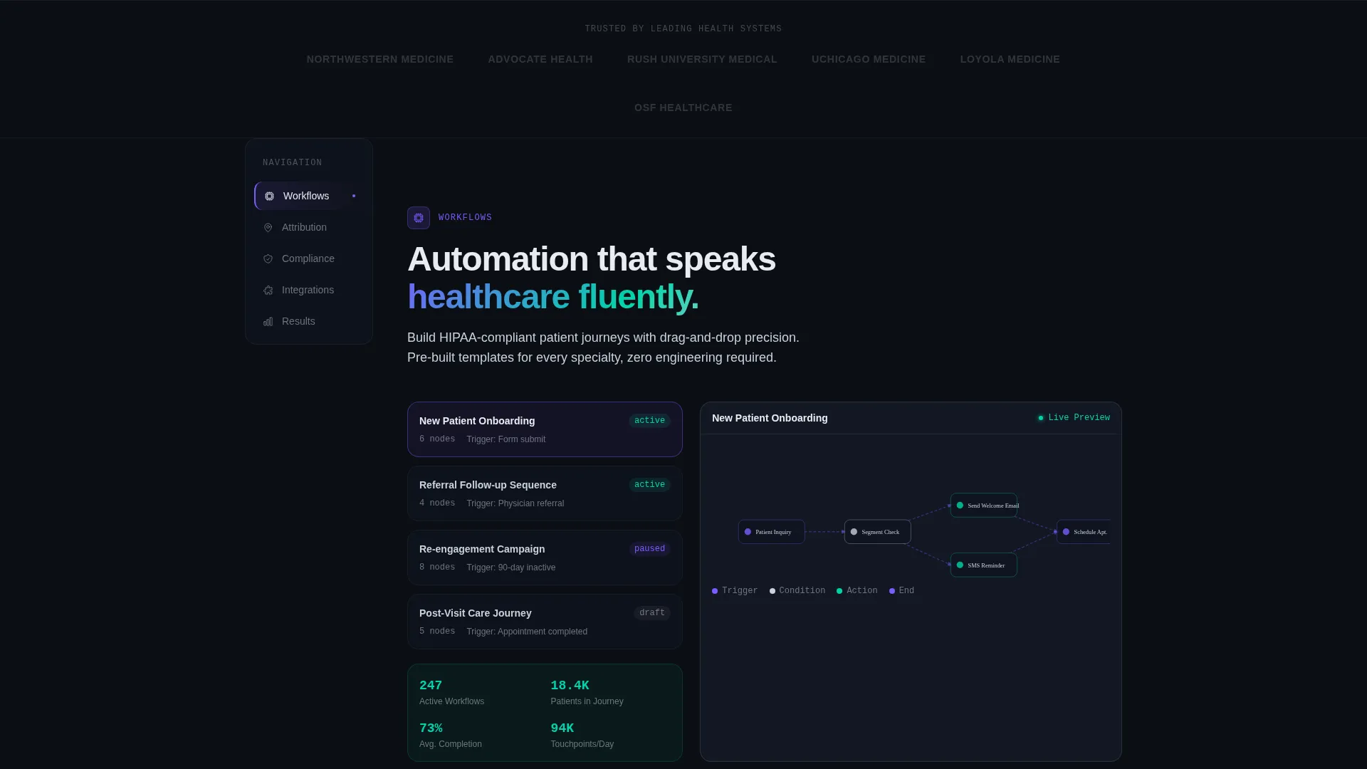
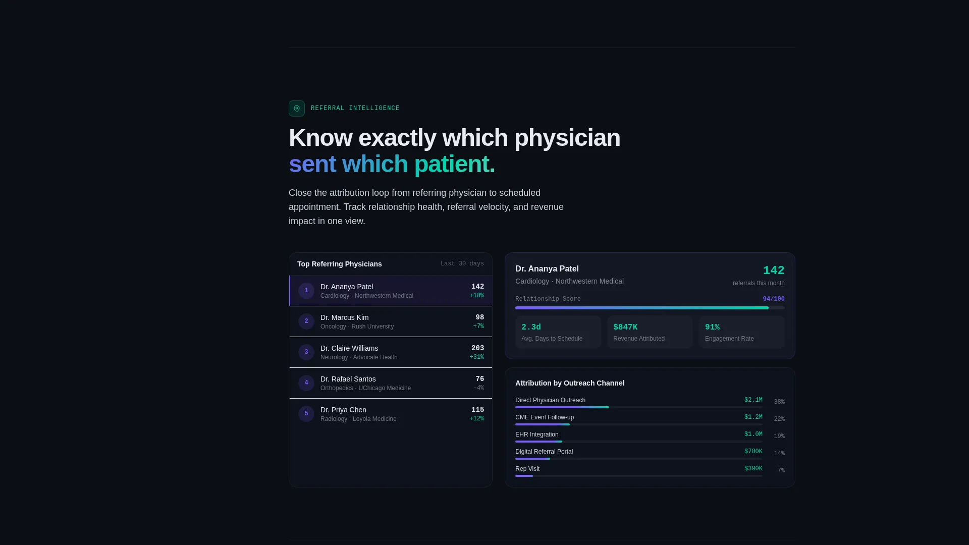
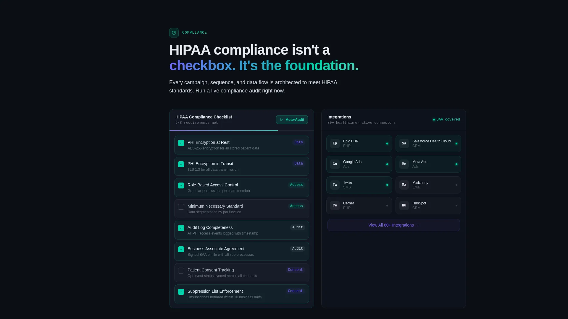
- A hub-and-spoke anchor navigation with five interactive spoke sections: Workflows, Attribution, Compliance, Integrations, and Results
- A persistent sticky comparison bar and slide-up panel where visitors benchmark their current tools against the platform's feature set
Feature list
This template packages several distinct interactive components, each serving a specific role in the buyer journey.
Animated Feature Tab Switcher
Three labeled tabs sit across a dark floating dashboard mockup at the top of the page. Clicking each tab transforms the visualization beneath it: a Sankey diagram for patient touchpoints, a geographic heat map for referring physicians, and a waterfall chart for cost-per-acquisition by channel. The active tab pulses in holographic violet to signal the system is responsive.
Hub-and-Spoke Anchor Navigation
A persistent left-rail navigation anchors the page and lets visitors jump between five spoke sections in any order. Each spoke section includes an interactive element: dragging nodes to build automation sequences, toggling competitor comparison overlays, and clicking through a compliance checklist that responds in real time.
Dynamic Stack Comparison Engine
A sticky bar at the bottom of the page reads "See How Pulse Replaces Your Stack" and opens a slide-up comparison panel. Visitors select their current tools from a logo grid, and the panel populates a feature-by-feature column view with platform advantages highlighted in clinical teal against competitor gray dashes.
Dual Conversion Path Design
After the comparison panel, two distinct calls to action are presented. The primary path is "Start Your Migration Audit," a short intake form asking for organization type, current platform, and monthly patient volume. The secondary path offers a downloadable resource for visitors who are not yet ready to speak with someone, capturing email and role title instead.
Data Command Visual System
The template uses a dark, data-forward design language built on void black backgrounds with holographic violet for active states and clinical teal for positive metrics. Every visual element is designed to feel like a live operational dashboard rather than a static marketing page.
Page sections overview
| Section | Purpose |
|---|---|
| Header Tab Switcher | Showcase platform capabilities through three animated dashboard states |
| Hub Navigation Rail | Let visitors self-navigate to their highest-priority spoke section |
| Workflows Spoke | Demonstrate automation sequence building with draggable node interactions |
| Attribution Spoke | Show referral and campaign attribution with competitor toggle overlays |
| Compliance Spoke | Walk visitors through a self-checking HIPAA compliance checklist interaction |
| Integrations Spoke | Present platform connectivity context within the hub layout |
| Results Spoke | Anchor outcome-focused proof points within the spoke structure |
| Sticky Comparison Bar | Maintain a persistent comparison entry point throughout the scroll |
| Comparison Slide Panel | Deliver feature-by-feature stack replacement evidence on demand |
| Migration Audit Form | Capture qualified leads by organization type, platform, and patient volume |
| Secondary Download Path | Collect email and role title from visitors not yet ready to request a demo |
Design & branding system
The visual identity follows a Data Command theme powered by an AI Iridescent color system. The palette is built to feel like cold intelligence made visible, where every glow on screen implies a decision in progress.
- Core colors: void black (#0B0E14) as the primary background, holographic violet (#7B5CFF) for active states and data highlights, clinical teal (#00D4AA) for success metrics and positive trend indicators, and soft iridescent silver (#C9D1DC) for body text and secondary interface elements
- The aesthetic direction is Interactive Explorer: the layout rewards non-linear browsing, with animated transitions that make the system feel alive and responsive to the visitor's curiosity
Mobile & speed optimization
The template is structured so that its interactive components and dark-themed visuals translate cleanly across screen sizes. The hub-and-spoke navigation and tab switcher are designed with mobile interaction patterns in mind.
- The left-rail anchor navigation adapts to a compact navigation pattern on smaller screens so spoke sections remain accessible without scrolling through unrelated content
- The sticky comparison bar and slide-up panel are built to function as usable interactive layers on touch devices, keeping the comparison flow intact on mobile
How this template helps you convert
The template is engineered around a discovery-first conversion philosophy. Visitors build their own conviction before they ever see a form.
- The interactive Feature Tab Switcher lets visitors self-select the capability most relevant to their role, creating immediate personal relevance before any scroll happens.
- The hub-and-spoke layout gives buyers control over their own evaluation path, so they arrive at the comparison panel already primed by the spoke content most relevant to their current pain.
- The dual conversion path captures both ready-to-act buyers through the Migration Audit form and research-phase visitors through the downloadable resource, reducing the number of people who leave without providing contact information.
Other information about this template
This template is well suited for teams evaluating healthcare marketing automation platforms and looking for a high-trust, self-service evaluation experience to present to procurement or leadership.
- The comparison panel is designed to accommodate logo-grid selection for tools commonly found in healthcare marketing stacks, making the evaluation feel familiar and credible to buyers who have already shortlisted options
- The HIPAA compliance checklist spoke is included as an interactive user interface component within the template layout, giving compliance-conscious buyers a structured way to assess readiness
- The template works particularly well for teams running account-based marketing motions targeting health systems, practice groups, or digital health companies, where multiple stakeholders may review the same page independently
- The "Download the HIPAA Marketing Playbook" secondary path is a built-in lead capture mechanism for nurture-stage visitors, making the template useful beyond the initial demand generation moment
Theme
Data Command
Creative direction
Interactive Explorer
Color system
AI Iridescent
Style
Hub & Spoke (Anchor Nav)
Direction
Comparison/Versus
Page Sections
Animated Feature Tab Switcher
Hub-and-spoke Anchor Navigation
Dynamic Stack Comparison Panel
Dual Conversion Path Design
Data Command Visual Identity
Related questions
Who is this template designed for?
What interactive components does the template include?
Can this template support a stack comparison evaluation flow?
What conversion paths does this template include?
Is the color system customizable for an existing brand?


