Specialist Retail Software & SaaS Professional Website Template
Pulse is a split-screen retail CRM landing page template built for SaaS platforms that unify shopper data across channels. It pairs a dark, violet-charged visual identity with kinetic scroll transitions and a focused click-through flow. Designed for retail directors, e-commerce managers, and franchise operators, it moves visitors from fragmented-data frustration to a single, confident call to action.
by Rocket studio
Quick summary
Pulse is a single-page, split-screen landing page template for retail customer relationship management platforms. It uses a Void and Violet color system, Dynamic Motion transitions, and a Dark Glass Panels header to create an immersive, data-forward first impression. Every section builds toward one violet call-to-action button, guiding retail decision-makers to connect their data and see results.
Who this template is for
This template is built for SaaS founders, product marketers, and growth teams launching or repositioning a retail CRM platform. It speaks directly to the buyers who feel the pain of fragmented customer data every day.
- Multi-location retail directors who manage inconsistent data across point-of-sale systems and digital channels
- E-commerce managers watching repeat buyers slip through retargeting gaps despite loyalty programs
- Franchise operators who need one unified dashboard view across dozens of storefronts
What problem this template solves
Retail software platforms often struggle to show complex data products in a way that feels immediate and credible. Prospects need to feel the value before they commit to a demo. This template solves the gap between "we explain our product" and "you already see it working."
- Fragmented messaging that fails to connect raw data capabilities to real business outcomes
- Landing pages that bury the call to action behind long feature lists and vague benefit claims
- Visual layouts that feel too corporate or too generic for a modern, data-driven retail tool
What you get with this template
You get a fully structured, single-page layout that mirrors the experience of using the platform itself. The design is kinetic, purposeful, and built to move a skeptical retail buyer toward one clear next step.
- A 50/50 split-screen layout with three progressive content splits that escalate from data visibility to action to revenue
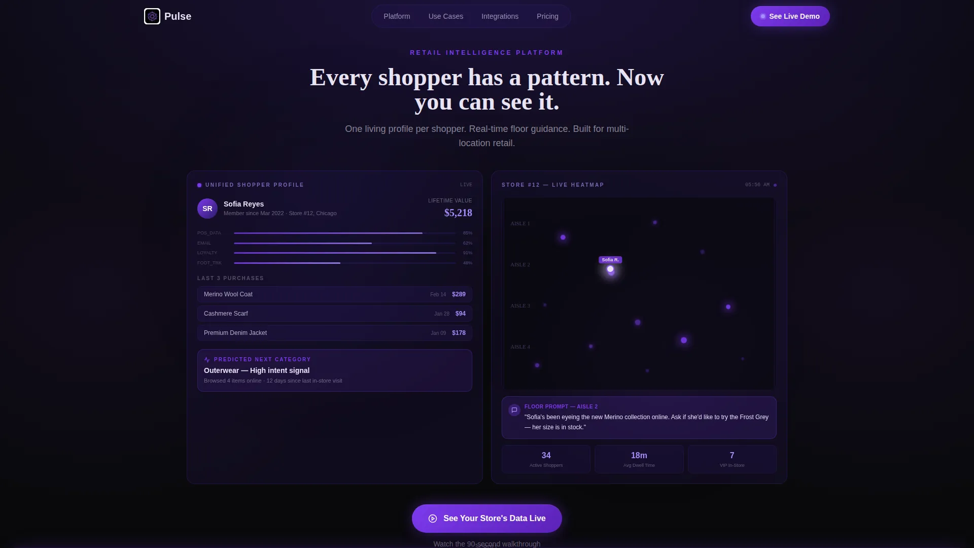
- A Dark Glass Panels header with a live-typing headline, a shopper profile panel, and a real-time store heatmap panel
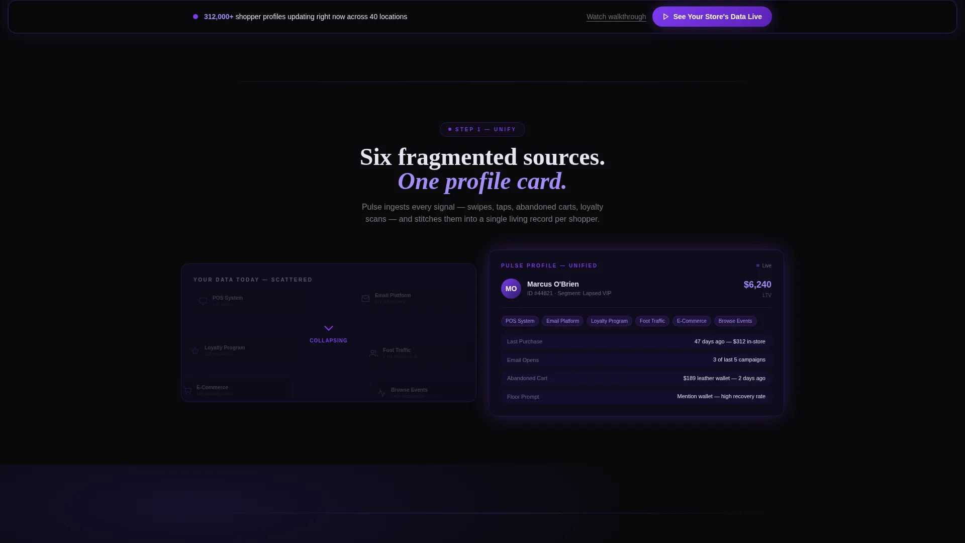
- A sticky violet call-to-action bar that reappears after the second scroll section, keeping the conversion path visible at all times
Feature list
This section describes the core design and structural capabilities built into this template.
Split-Screen Header with Dual Data Panels
The header divides the viewport into two frosted-glass panels. The left panel shows a unified shopper profile with a lifetime value ticker, recent purchases, and a predicted next category. The right panel displays a real-time store heatmap with glowing aisle dots. Both panels respond to mouse movement with a subtle parallax tilt.
Kinetic Scroll Transitions
Each section enters the viewport with a kinetic slide-and-fade animation that mimics data flowing into a live system. The pacing keeps momentum constant, moving the visitor from awareness to intent without a drop in energy.
Three Progressive Split Sections
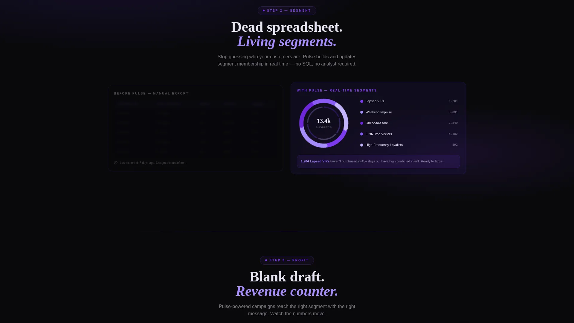
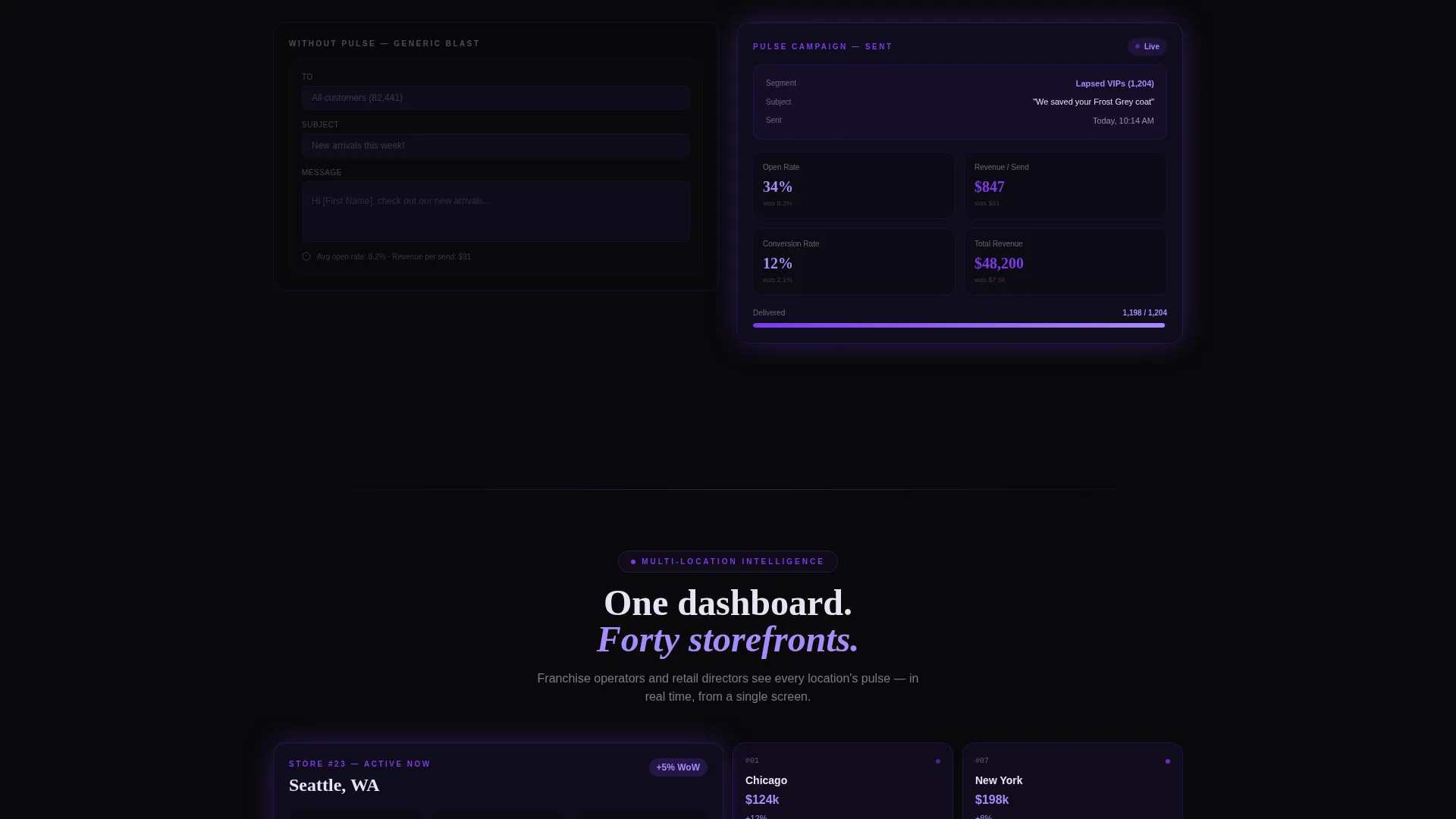
The three content splits follow a deliberate narrative arc. The first shows fragmented sources collapsing into a single profile. The second shows a static spreadsheet dissolving into a spinning segmentation wheel. The third shows a blank message draft transforming into a live campaign with open-rate and revenue counters.
Persistent Call-to-Action Architecture
A single violet button reading "See Your Store's Data Live" first appears at the base of the header. It then reappears as a sticky bar after the second scroll section. A secondary text link, "Watch the 90-second walkthrough," sits beneath the primary button for visitors who want more context first.
Void and Violet Color System
Absolute void black dominates backgrounds and negative space. Deep ultraviolet anchors section dividers and card surfaces. Electric violet activates on every hover state, button, and data-point highlight. Phantom white floats across headlines and metric labels, lending a luminous quality without harshness.
No-Form Click-Through Flow
This template carries no contact form. The primary call to action routes visitors directly to a personalized demo environment where they connect one data source and watch their own customer profiles appear. This removes friction and replaces it with immediate, curiosity-driven engagement.
Page sections overview
| Section | Purpose |
|---|---|
| Dark Glass Header | Introduce the platform through dual live-data panels and a self-typing headline |
| Data Sources Split | Show fragmented inputs collapsing into a single unified shopper profile |
| Segmentation Wheel Split | Contrast a static spreadsheet with a living, spinning customer segment view |
| Campaign Live Split | Transform a blank message draft into a sent campaign with performance counters |
| Sticky call to action Bar | Maintain a persistent conversion path across the lower half of the page |
Design & branding system
The visual identity is built around the idea of a phone screen glowing in a dark store after closing hours. It feels digital, intimate, and purposeful without being aggressive.
- Four-color Void and Violet palette: void black (#09090B), deep ultraviolet (#2D1B69), electric violet (#7C3AED), and phantom white (#E8E3F3) applied in a strict hierarchy across backgrounds, surfaces, interactive states, and text
- Dynamic Motion theme with kinetic slide-and-fade transitions on every scroll section, parallax tilt on header panels, and a letter-by-letter headline typing effect
- Electric violet reserved for all interactive states including hover, button fills, and data-point highlights, while phantom white handles all headline and label typography at a luminous, non-harsh weight
Mobile & speed optimization
The template is designed with responsive layout behavior in mind. The split-screen structure adapts cleanly to narrower viewports so the visual hierarchy and conversion path remain intact on mobile devices.
- The 50/50 split panels reflow to a stacked single-column layout on smaller screens, preserving the narrative progression from data chaos to unified insight
- Kinetic transitions are scoped to scroll-triggered events, keeping animation purposeful and tied to content reveal rather than idle looping
How this template helps you convert
The entire page is architected around a single conversion action. Every design and content decision reduces hesitation and increases the pull toward that one click.
- The header immediately demonstrates the platform's output with visible data panels, so the visitor understands the product before reading a single feature bullet
- Each of the three scroll splits raises the stakes progressively, moving the emotional arc from recognition of pain to desire for the solution
- The sticky call-to-action bar ensures the primary button is never more than a glance away, and the secondary walkthrough link provides a lower-commitment path for visitors who need one more reassurance before clicking
Other information about this template
Pulse is categorized under Technology, within the Retail Software and SaaS subcategory, and targets the Retail CRM niche specifically. The template style is Split Screen at a 50/50 ratio, with a Dynamic Motion theme and a Click-Through landing page direction.
- The template is suited to platforms that unify point-of-sale data, e-commerce behavior, loyalty program activity, and foot traffic signals into a single customer record
- The no-form call to action flow is intentional: it is designed for platforms that offer a self-serve or guided demo environment where a prospect can connect real data immediately
- The intersection match score of 13 reflects a tightly aligned pairing of visual style, creative direction, and niche audience intent across all matched context fields
Theme
Dynamic Motion
Creative direction
Launch Energy
Color system
Void & Violet
Style
Split Screen (50/50)
Direction
Click-Through
Page Sections
Split-screen Header with Dual Data Panels
Kinetic Scroll Transitions
Three Progressive Split Sections
Persistent Call-to-action Architecture
Void and Violet Color System
No-form Click-through Flow
Related questions
Who is this landing page template designed for?
Does this template include any forms or lead capture fields?
Can I adapt the split-screen sections for a different retail software product?
What makes the header different from a standard hero section?
When does the sticky call-to-action bar appear on the page?



