Pulse - Live Portfolio Tracking Landing Page Template
Pulse is a single-page, dashboard-style landing page template built for energy client management platforms. It combines animated metric counters, live-wire data visualizations, and a modular spec-sheet layout to showcase portfolio tracking capabilities. Designed for competitive energy suppliers, retail account managers, and commercial brokers, the template drives demo sign-ups with a command-room aesthetic rooted in the Electric Indigo color system.
by Rocket studio
Quick summary
Pulse is a landing page template designed for energy client management software. It opens with a full-viewport stats wall of animated counters, then walks visitors through four capability modules: client onboarding, consumption analytics, contract lifecycle management, and billing reconciliation. The Electric Indigo color system and Dynamic Motion theme give every section the feel of a live SCADA control room.
Who this template is for
This template is built for teams and businesses operating in competitive energy markets where portfolio complexity is the daily reality. It speaks directly to the people managing hundreds or thousands of commercial and industrial meters.
- Energy retail account managers overseeing large books of commercial and industrial client meters
- Operations directors at competitive energy suppliers who need to move away from spreadsheet reconciliation workflows
- Commercial and industrial brokers requiring real-time consumption visibility ahead of renewal season
What problem this template solves
Managing a large energy portfolio without clear visibility creates costly errors and missed opportunities. Account teams lose track of renewal windows, billing disputes pile up, and at-risk accounts go unnoticed until it is too late. This template presents a platform that addresses those exact operational gaps with quantified evidence.
- Renewal windows missed due to scattered contract data and no automated countdown visibility
- Billing disputes that accumulate because reconciliation is manual and error-prone
- At-risk client accounts that are not flagged early enough to act before churn occurs
What you get with this template
The template delivers a fully structured, single-page landing experience built around a dashboard narrative. Every section is a discrete, data-rich module that builds the case for the platform before the visitor reaches the call to action.
- A full-viewport animated header with live metric counters, sparklines, and a geographic heat map
- Four scrollable capability modules styled as data cards with micro-visualizations and benchmarked statistics
- Two conversion points: a primary demo call to action and a secondary integration spec sheet download
Feature list
This template includes a tightly defined set of interactive and visual components. Each one is grounded in the source brief and contributes to the command-room feel of the page.
Animated Stats Header Wall
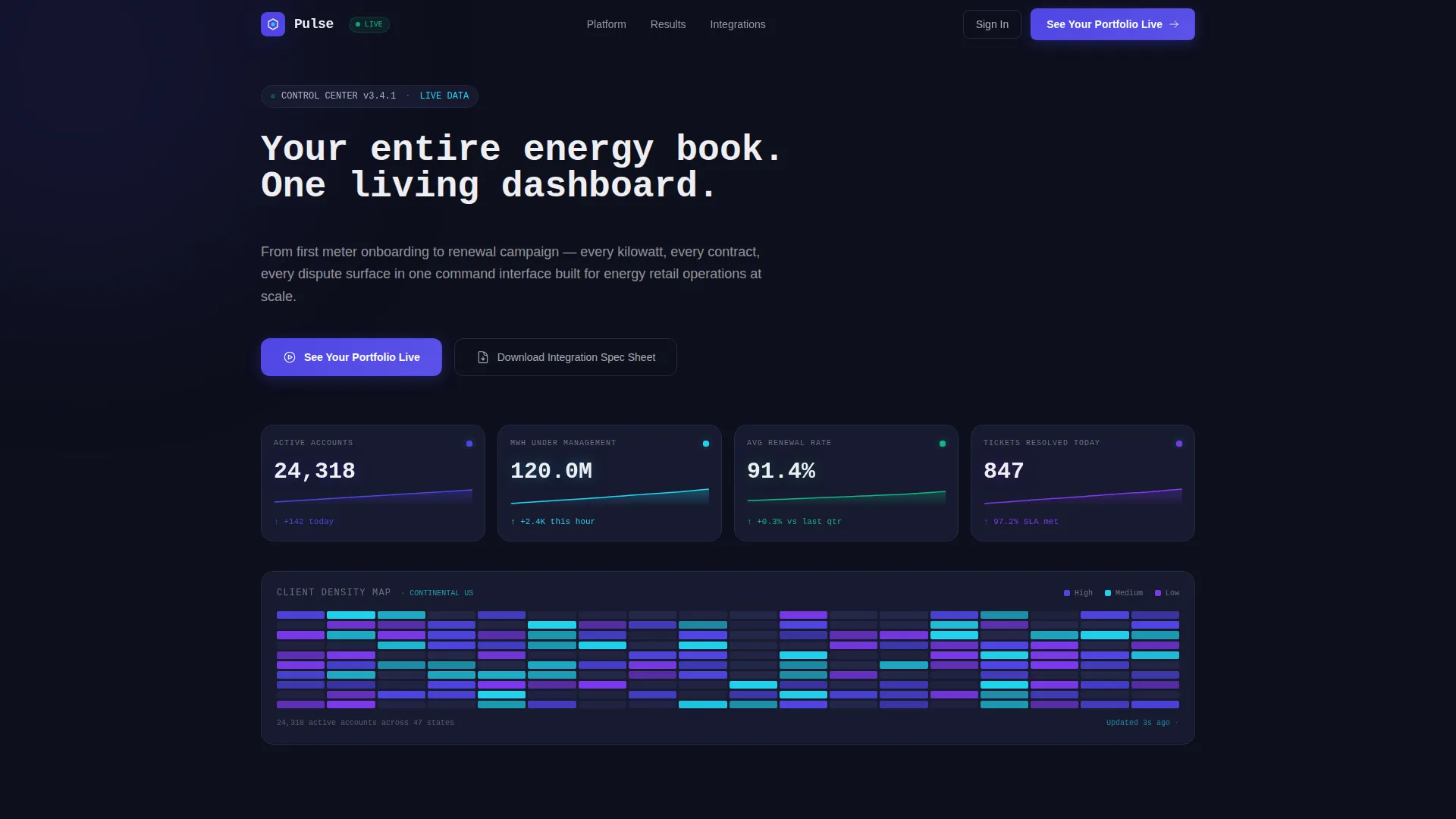
The header occupies the full viewport and displays four ticking metric counters: 24,318 active client accounts, 1.2 million MWh under management, a 91.4 percent average renewal rate, and 847 open tickets resolved today. Numbers increment with subtle easing. Sparklines ripple across the screen, and a geographic heat map of client density breathes softly with color shifts.
Terminal Headline Animation
The headline types itself onto the screen like a terminal command, reading "Your entire energy book. One living dashboard." This animation sets the tone immediately and reinforces the control-room identity before the visitor scrolls.
Modular Capability Data Cards
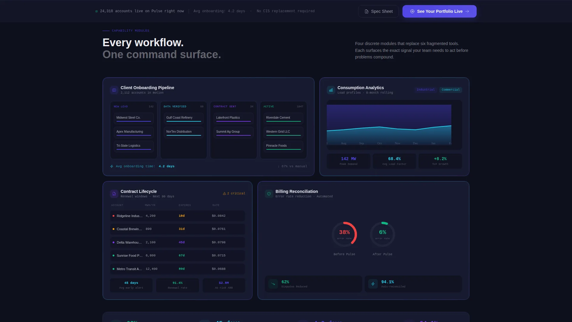
Four scrollable data cards cover the platform's core capabilities. Each card slides in with a slight overshoot-and-settle momentum animation. The cards cover client onboarding, consumption analytics, contract lifecycle management, and automated billing reconciliation.
Micro-Visualization Per Module
Each capability card includes its own embedded visualization. The onboarding card shows a Kanban-style pipeline flow. The analytics card uses stacked area charts for load profiles. The contract card displays countdown timers to renewal windows. The billing card presents before-and-after error-rate gauges.
Persistent Bottom Bar Call to Action
After the second scroll module, a persistent bottom bar appears carrying the primary call to action, "See Your Portfolio Live." It stays visible as the visitor continues scrolling, reducing friction at the moment of decision.
Dual Conversion Path Design
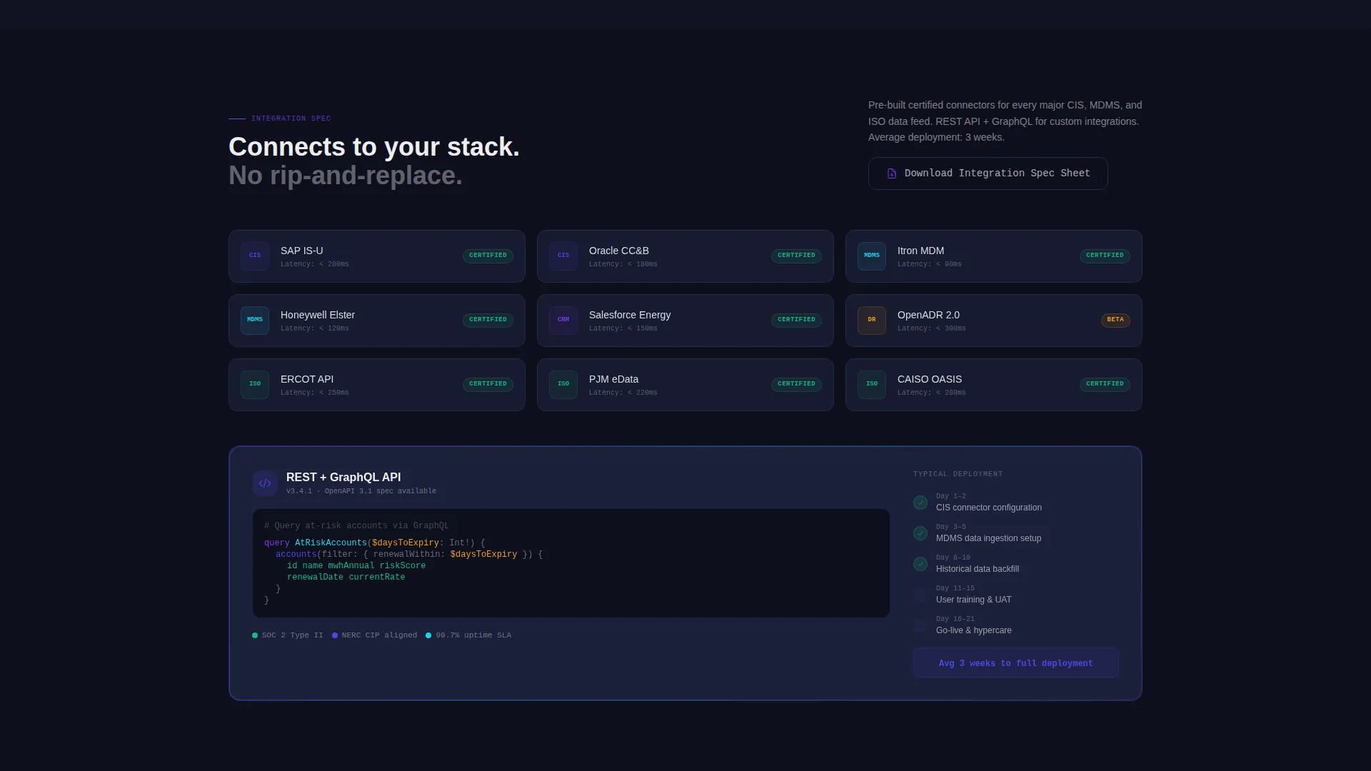
The template supports two conversion goals simultaneously. The primary path routes visitors to a guided demo environment pre-loaded with sample energy data. The secondary path offers an integration spec sheet download aimed at technical buyers validating compatibility before committing to a demo.
Page sections overview
| Section | Purpose |
|---|---|
| Animated Metrics Header | Displays live-ticking KPIs and geographic heat map to anchor platform credibility immediately |
| Client Onboarding Card | Shows Kanban pipeline flow to visualize the onboarding process from first contact to active account |
| Consumption Analytics Card | Presents stacked area charts of load profiles to demonstrate real-time usage insight |
| Contract Lifecycle Card | Features renewal countdown timers to highlight proactive contract management capabilities |
| Billing Reconciliation Card | Uses before-and-after error-rate gauges to quantify dispute reduction outcomes |
| Persistent call to action Bar | Anchors the primary demo call to action after the second module to sustain conversion pressure |
Design & branding system
The visual identity uses the Electric Indigo color system against a deep navy foundation, creating the look of a SCADA screen in a dimly lit dispatch room. Every color choice has a functional role in the interface hierarchy.
- Deep control-room navy (#0D0F1C) dominates backgrounds; live-wire indigo (#4F46E5) carries primary buttons and active-state indicators; arc-flash violet (#7C3AED) pulses on hover states and loading animations
- Reactor-core cyan (#22D3EE) marks real-time data points and positive deltas; readout white (#EEEEF2) handles typography and card surfaces with enough warmth to stay legible at low light
- The Dynamic Motion theme drives all animations: card entries use an overshoot-and-settle spring mechanic, counters increment with easing, and the heat map breathes continuously
Mobile & speed optimization
The template is structured to maintain its dashboard feel across screen sizes. The modular card layout adapts cleanly without losing the data-forward visual identity.
- Each capability module is a self-contained card, making it straightforward to reflow content for narrower viewports without breaking the visual hierarchy
- The persistent bottom bar is designed to remain visible and usable on mobile screens, keeping the primary call to action accessible throughout the scroll
How this template helps you convert
The page is engineered so that visitors feel informed and confident before they ever reach a call to action. Conversion is earned through progressive evidence, not early pressure.
- The header presents real, specific numbers immediately, establishing platform credibility before the visitor reads a single sentence of body copy
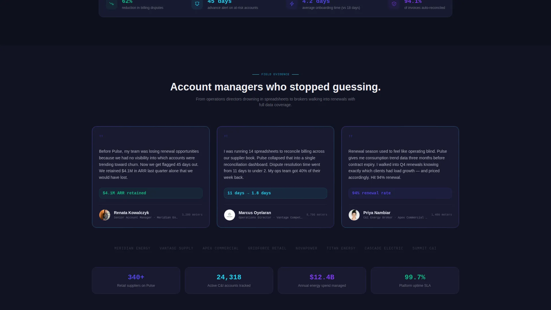
- Each capability card adds a quantified outcome, such as reducing billing disputes by 62 percent and surfacing at-risk accounts 45 days before churn, so the case for switching builds organically with every scroll
- The dual call-to-action structure captures both action-ready buyers with the demo path and research-phase buyers with the spec sheet download, widening the conversion funnel without diluting the primary message
Other information about this template
Pulse sits inside the Technology category under the Energy Software and SaaS subcategory, making it purpose-built for the competitive energy retail market. The template style is classified as Dashboard and Data Grid, and the creative direction follows a Spec Sheet cadence where each module is a standalone capability proof point.
- The template is designed for a Click-Through landing page direction, meaning every design and copy decision points toward a single next step
- The header concept follows a Stats and Metrics pattern, a format well suited to platforms where data credibility is the primary sales asset
- The Intersection Match Score for this template's category, subcategory, and niche alignment is 13, reflecting a high degree of intent specificity for energy client management buyers
- The template can support use cases across customer information systems (CIS) and meter data management systems (MDMS) compatibility discussions, as the secondary call to action is explicitly designed for technical buyers validating integration requirements
Theme
Dynamic Motion
Creative direction
Spec Sheet
Color system
Electric Indigo
Style
Dashboard/Data Grid
Direction
Click-Through
Page Sections
Animated Live Metrics Header
Terminal Headline Typewriter Effect
Four Modular Capability Cards
Embedded Micro-visualizations
Persistent Conversion Bar
Dual Call-to-action Architecture
Related questions
Who is the primary audience for this landing page template?
Can I customize the metric numbers shown in the animated header?
What are the two calls to action included in this template?
Does the template include live dashboard software or real data feeds?
How does the scrolling layout build toward conversion?



