Micro-SaaS & Developer Tools Professional Website Template
Pulse is a dark-themed, card-grid landing page template built for reporting and business intelligence tools. It pairs a void-black and electric-violet color system with a Problem→Solution scroll arc, animated glass-panel header, and a friction-free app download flow. Designed for startup ops leads, Series A founders, and growth product managers who need to show their product working before asking for a click.
by Rocket studio
Quick summary
Pulse is a single-page, modular card-grid template for reporting and business intelligence products. It opens with six animated dark glass panels showing live data visualizations, walks visitors through a Problem→Solution Arc, and closes with a direct download call to action. The design runs on a Void & Violet palette built to feel focused, fast, and ready for a startup audience.
Who this template is for
This template is purpose-built for founders and operators who need a landing page that earns trust through product evidence rather than marketing language. If your tool handles data, dashboards, or automated reporting, Pulse speaks directly to your buyer's daily frustration.
- Startup ops leads who manage reporting across too many disconnected tools
- Series A founders who need a polished, conversion-ready page for investor and user outreach
- Growth product managers who need to demonstrate return on investment from shipped features
What problem this template solves
Most reporting and business intelligence tools are powerful but hard to sell on a landing page. Visitors arrive skeptical. They want proof before they commit. Generic hero banners and feature bullet lists do not close that gap. Pulse is structured to make the visitor feel the problem before showing the solution, which builds emotional momentum toward the download.
- Scattered data workflows make it hard to show a clean product story in one scroll
- Friction-heavy signup flows lose buyers before they ever see the product working
- Visually generic templates fail to communicate the focus and precision that data tools demand
What you get with this template
Pulse delivers a fully structured, single-page layout built around modular card components. Every section is designed to carry a specific job in the conversion flow, from the animated header through to the final download card. You are not starting from a blank canvas; the narrative arc is already built in.
- A six-panel animated header with distinct data visualization cards and a centered headline reveal
- A full Problem→Solution scroll sequence with stress-accented chaos cards and solution replacements
- A friction-free app download section with platform toggle, desktop and mobile mockup, and optional post-install email capture
Feature list
A paragraph introduces the core capability set. Each feature below maps directly to a built-in component or structural decision in the template.
Animated Dark Glass Header
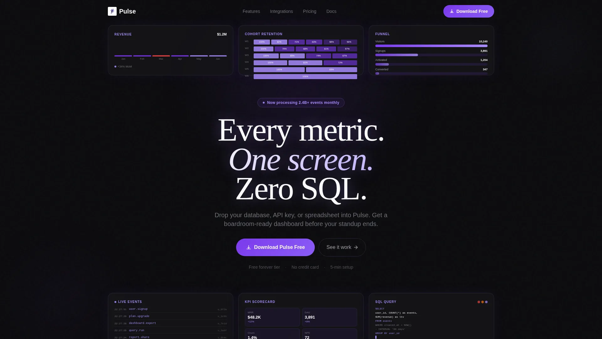
Six translucent, frosted-glass cards float on a void-black background, each displaying a different data visualization. Cards animate in with a staggered entrance, and the headline lands in the center gap after the panels settle. Edge blur and violet light refraction give the header genuine visual depth.
Problem→Solution Scroll Arc
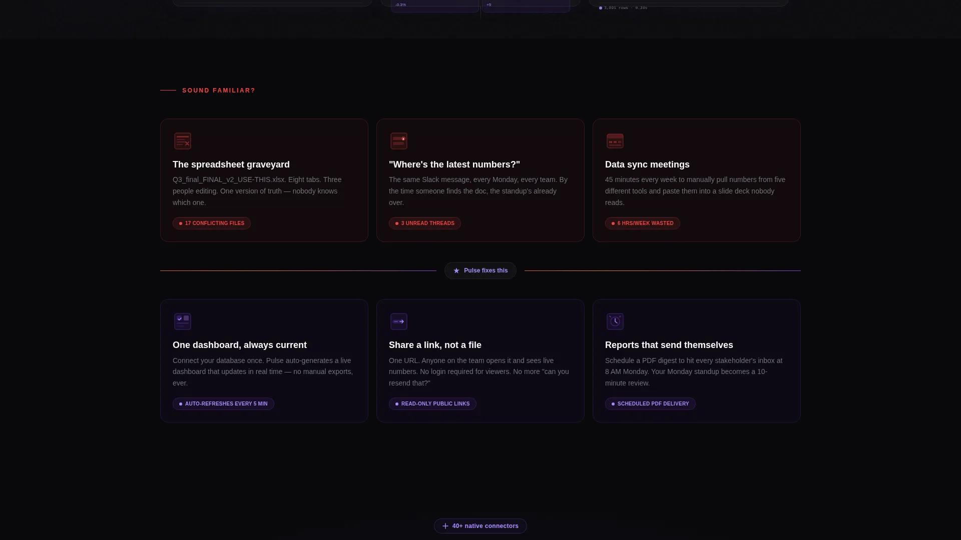
The first scroll section shows three chaos cards with red-orange stress accents, depicting tangled spreadsheets, lost Slack threads, and bloated meeting calendars. A pulsing divider line transitions from red to violet, and the same three scenarios reappear below as resolved solution cards. The arc makes the product's value feel inevitable rather than claimed.
Modular Card Grid Layout
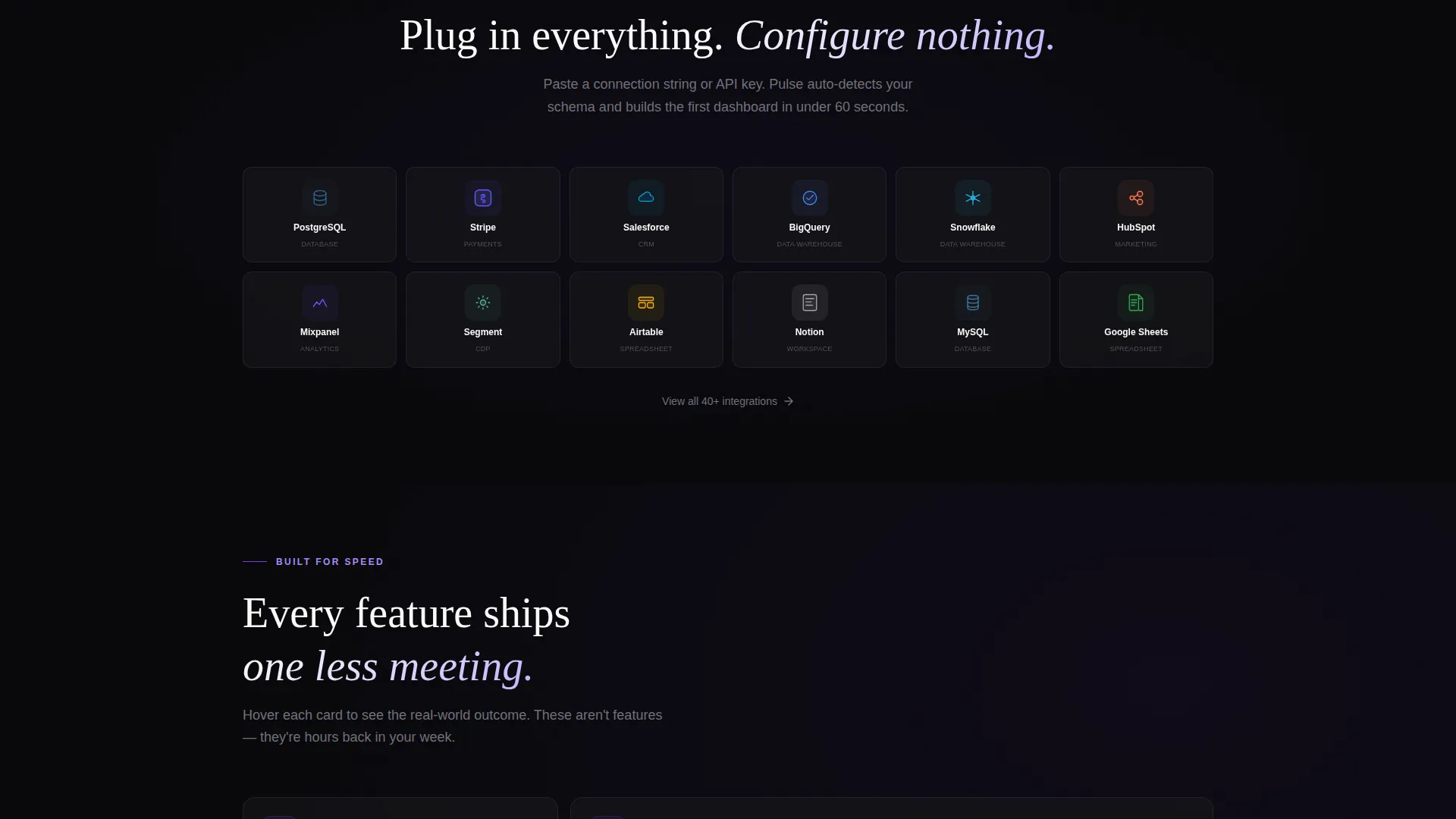
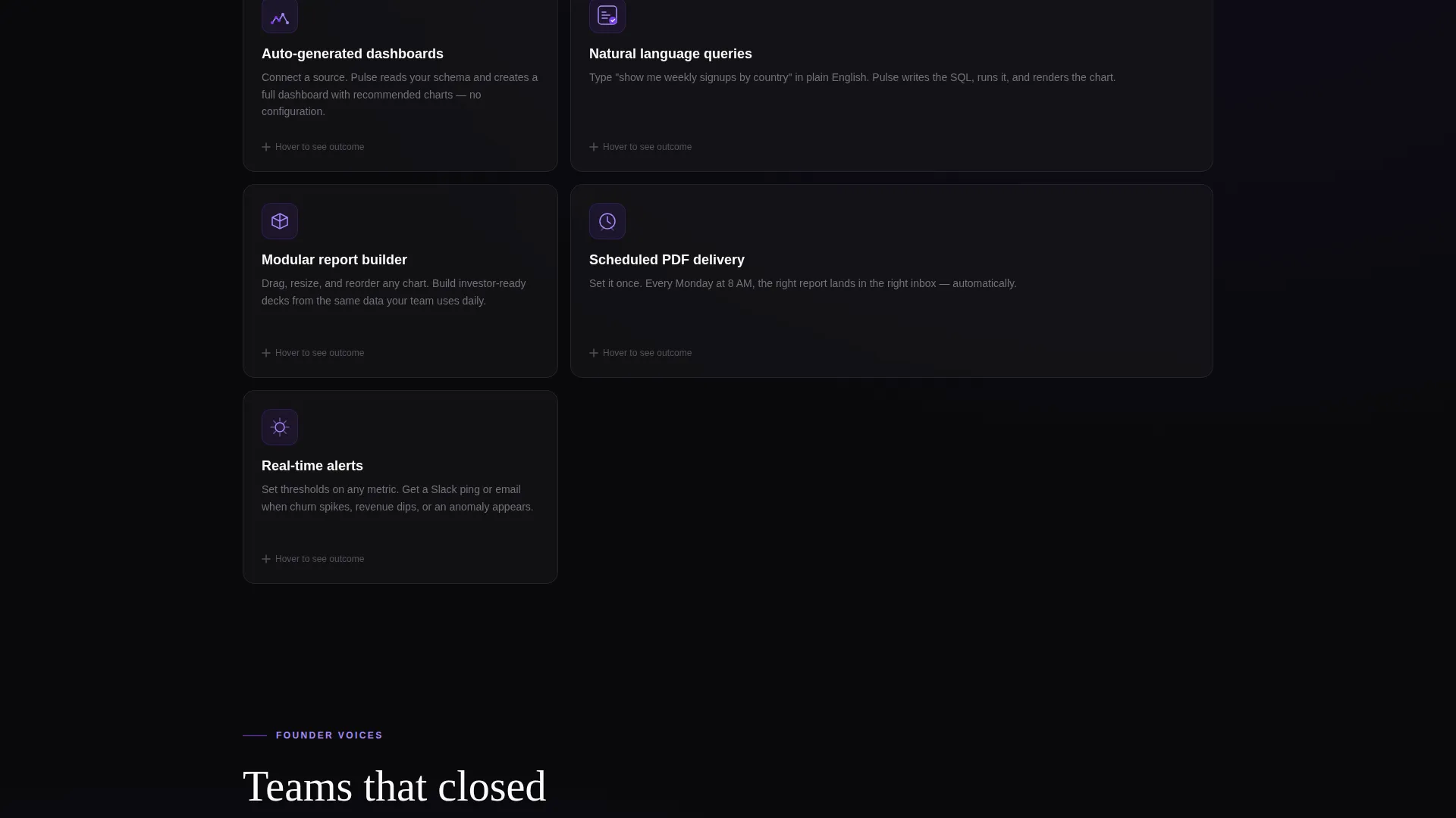
The template is built on a card-grid system where each card is an independent module. Integration logo cards, flip-on-hover feature cards, and testimonial cards with founder headshots and one-line quotes all slot into the same grid rhythm. You can reorder or swap cards without breaking the layout.
Floating Pill Call to Action
A pill-shaped download button appears after the header and floats as the visitor scrolls. It anchors again inside the final dark-glass card alongside a desktop and mobile mockup. The button reads "Download Pulse Free" and links directly to the download, with no form fields on the page.
Platform Toggle and Secondary Links
Below the primary download button, two smaller links offer a web app option and a platform selector for macOS, Windows, and Linux. This lets visitors choose their preferred entry point without leaving the page or filling out a form.
Testimonial Row with Social Proof Cards
A dedicated row of founder headshots, one-line quotes, and annual recurring revenue figures gives the page a grounded credibility layer. Each testimonial card sits inside the same modular grid, keeping the social proof visually consistent with the rest of the layout.
Page sections overview
| Section | Purpose |
|---|---|
| Animated Glass Header | Opens with six live data visualization panels and a staggered headline reveal |
| Floating Pill Button | Anchors the primary download call to action immediately after the header |
| Chaos Problem Cards | Three red-accented cards showing the fragmented data workflow visitors already live with |
| Red-to-Violet Divider | A pulsing transition line that marks the shift from problem to solution |
| Solution Reveal Cards | The same three scenarios reimagined as clean, automated outcomes |
| Integration Logo Grid | Cards showing the tools and data sources that plug into the product |
| Flip Feature Grid | Modular cards that flip on hover to reveal feature outcomes |
| Testimonial Row | Founder headshots, one-line quotes, and revenue figures for social proof |
| Final Download Card | Dark-glass card with desktop and mobile mockup, primary call to action, and platform toggle |
Design & branding system
The visual identity is built around the Void & Violet color system. Void black dominates every background, keeping attention on the data. Electric violet fires on calls to action and data highlights, while reactive lilac traces hover states and active card interactions. Off-white type floats above the dark like terminal output on a late-night build session.
- Core palette: void black (#09090B), deep space gray (#18181B), electric violet (#7C3AED), reactive lilac (#A78BFA), and off-white (#FAFAF9)
- Typography sits in off-white against dark backgrounds for strong contrast without harshness
- Stress-accent red-orange (#EF4444) appears exclusively on the problem cards to signal friction before the violet solution reveal
Mobile & speed optimization
The card-grid layout is built to reflow cleanly across screen sizes. Individual cards stack vertically on smaller viewports without losing the visual hierarchy that makes the Problem→Solution Arc readable. The modular structure means no section depends on another to render correctly.
- The grid columns collapse gracefully from multi-column desktop layouts to single-column mobile stacks
- The floating pill button remains accessible and tappable throughout the mobile scroll experience
- The platform toggle and secondary download links stay visible and functional at all viewport sizes
How this template helps you convert
Pulse earns the download click rather than demanding it. Every structural decision in the page is oriented toward reducing doubt and increasing confidence before the visitor reaches the call to action.
- The animated glass header shows the product working with real data visualization types before any copy makes a claim, establishing immediate credibility through demonstration.
- The Problem→Solution Arc mirrors the visitor's daily frustration in the chaos cards, then resolves it visually in the solution cards, so the product benefit lands as a felt experience rather than a stated feature.
- The zero-form download flow removes every commitment barrier from the page itself, moving email capture to the post-install welcome screen where the visitor is already motivated.
Other information about this template
Pulse is categorized under Technology, within the Micro-SaaS and Developer Tools subcategory, with a specific focus on the reporting and business intelligence niche. The template style is Card Grid (Modular), and the theme is Startup Velocity.
- The template is designed for the App Download landing page direction, meaning the primary goal is a direct binary installer or app download rather than a lead capture form
- The header concept is Dark Glass Panels, a design pattern that layers frosted-glass card surfaces over a deep void background with violet light refraction
- The creative direction is the Problem→Solution Arc, a scroll-driven narrative structure where the visitor experiences the pain state before the resolution
- This template fits products in the business intelligence and dashboard space that benefit from showing data in motion rather than describing it in static copy
Theme
Startup Velocity
Creative direction
Problem→Solution Arc
Color system
Void & Violet
Style
Card Grid (Modular)
Direction
App Download
Page Sections
Animated Dark Glass Header Panels
Problem to Solution Scroll Arc
Modular Card Grid System
Friction-free Download Call to Action
Platform Toggle with Secondary Links
Testimonial Row with Founder Social Proof
Related questions
Can I change the color palette to match my own brand?
Does the template include the data visualizations shown in the header?
Is the download button pre-connected to a delivery service?
Who is this landing page template designed for?
Can I add or remove cards from the modular grid?



