Industry Mobile Apps Professional Website Template
Pulse is a hub-and-spoke event ticketing landing page template built for promoters, festival managers, and venue owners who need total visibility. It pairs a Data Command visual identity with a Problem-to-Solution scroll arc, animated live-metric panels, and a persistent app-download call to action that turns every pain point into a reason to act.
by Rocket studio
Quick summary
Pulse is a single-page, anchor-nav event ticketing app landing page template. It uses a dark, data-forward design to walk visitors through four core industry pain points, then resolves each one with a focused product moment. The page drives toward app download with persistent calls to action and a secondary demo-request path for enterprise users.
Who this template is for
This template is built for people who run live events at a professional level. They understand the cost of every empty seat and every fraudulent transaction.
- Independent promoters managing multiple venues on the same night
- Festival operations managers tracking real-time capacity and revenue
- Venue owners who need protection against scalpers and no-shows
What problem this template solves
Most event professionals rely on several disconnected tools to manage ticketing, capacity, and fraud. That fragmentation costs time, money, and visibility. This template gives you a page that speaks directly to those frustrations before presenting a unified solution.
- Scalpers and ticket siphoning that drain legitimate revenue
- No-shows that leave seat inventory unrecovered and revenue on the table
- Data blind spots that leave promoters reacting instead of anticipating
What you get with this template
You get a fully structured, single-page landing page template designed for an event ticketing app. Every section is purposeful, ordered, and conversion-oriented.
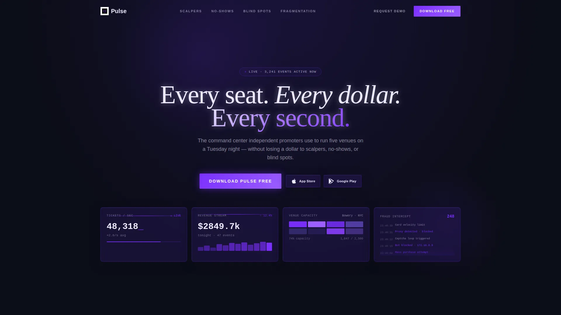
- A dark glass header with four live-metric panels and a bold opening headline
- Four Problem-to-Solution spoke sections, each anchored by sticky navigation
- A persistent app-download bar, dual call to action paths, and a lightweight demo-request form
Feature list
This template includes a focused set of design and layout features drawn directly from the brief. Each one is built to serve the event ticketing audience specifically.
Dark Glass Panel Header
The header displays four translucent, frosted-glass rectangles floating on a void-black background. Each panel shows a different live metric: tickets sold per second, a real-time revenue stream, a heat-mapped venue layout, and a fraud-intercept log. A subtle parallax depth effect shifts the panels as the cursor moves, creating the feel of a live operations dashboard.
Sticky Hub-and-Spoke Navigation
A persistent anchor navigation bar keeps four spoke links visible as the visitor scrolls. Each link jumps directly to its matching problem section: Scalpers, No-Shows, Blind Spots, and Fragmentation. This structure lets visitors move freely through the page without losing their place.
Problem-to-Solution Scroll Arc
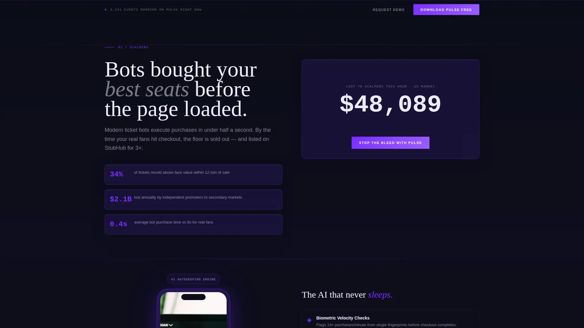
Each spoke section opens with a stark, uncomfortable statistic that makes the cost of inaction visible. A product screen recording playing inside a phone mockup then resolves the tension. Every problem section ends with a lost-dollar counter that stops only when the visitor taps the call to action.
Persistent App Download Bar
After the visitor passes the second spoke section, a slim bottom bar locks into view. It carries the primary call to action, "Download Pulse Free," paired with App Store and Google Play badges. This keeps the conversion path in sight without interrupting the scroll.
Demo Request Form
A secondary conversion path targets enterprise promoters who need more than a self-serve download. Tapping "Request a Demo" slides out a lightweight form asking for venue count, average event capacity, and a work email. The form stays minimal to reduce friction.
Heat-Mapped Venue Layout Display
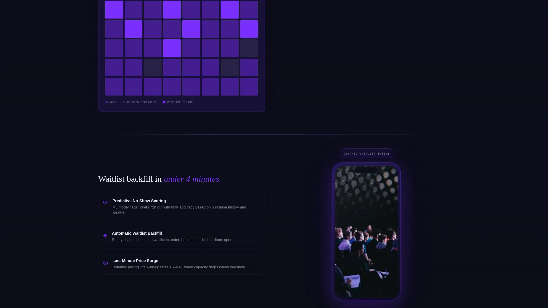
The header panel and subsequent product mockups include a visual venue layout where sections fill in color as ticket sales progress. This communicates real-time seat map functionality at a glance and immediately signals product depth to a professional audience.
Page sections overview
| Section | Purpose |
|---|---|
| Dark Glass Header | Anchors the page with four live-metric panels and the opening headline |
| Sticky Spoke Nav | Provides persistent anchor links to each problem-solution section |
| Scalpers Section | Shows ticket-siphoning stats then introduces the fraud-detection engine |
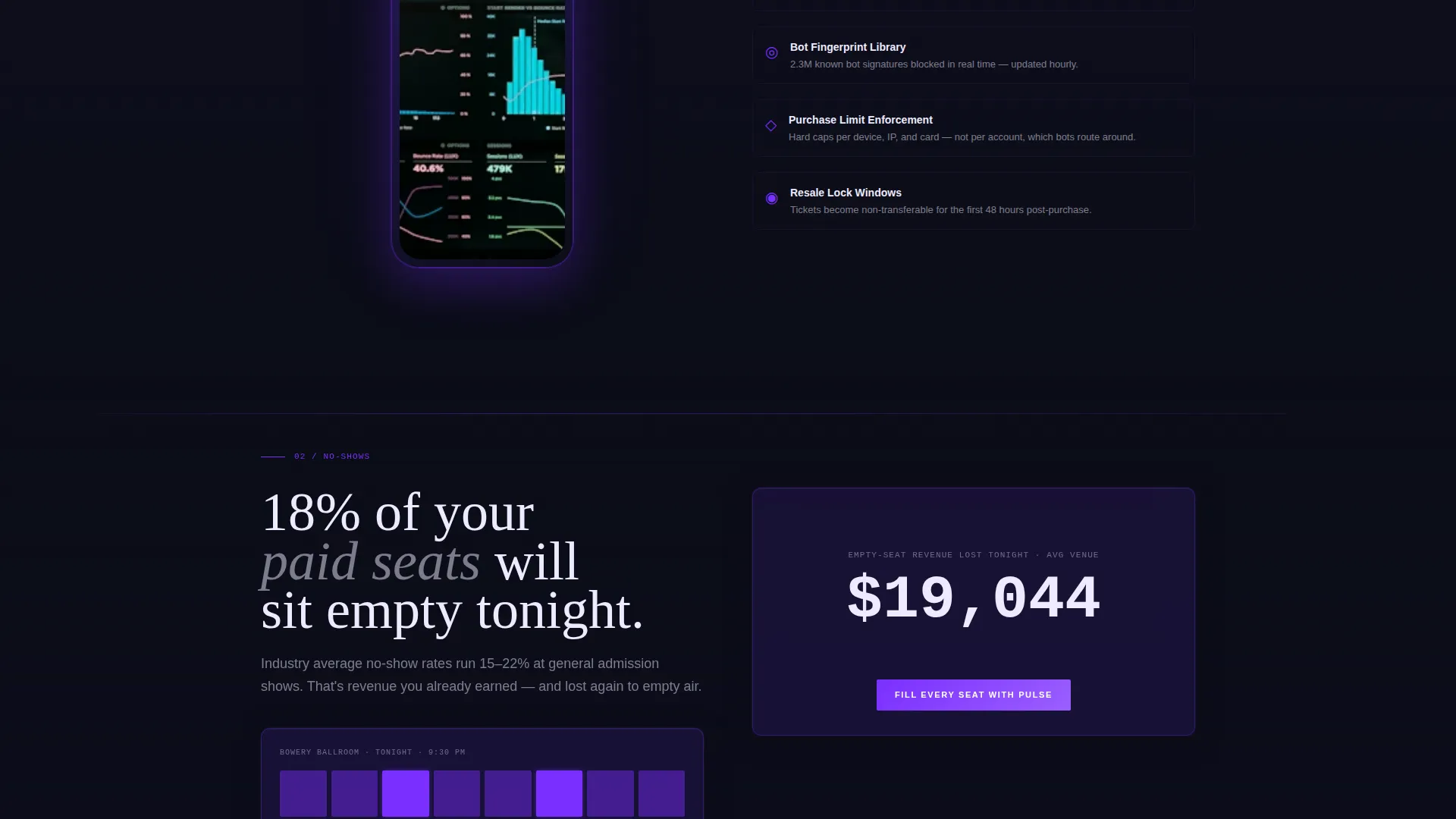
| No-Shows Section | Visualizes empty-seat revenue loss then presents dynamic waitlist backfill |
| Blind Spots Section | Exposes data gaps then reveals the real-time analytics suite |
| Fragmentation Section | Shows the multi-app problem then collapses it into the unified dashboard |
| App Download call to action | Delivers the primary download call to action with store badges |
| Demo Request Form | Offers an enterprise path with a lightweight slide-out inquiry form |
| Persistent Bottom Bar | Keeps the download call to action visible after the second spoke section |
Design & branding system
The visual identity follows a Data Command theme built around an Electric Indigo color system. Every color choice is purposeful: backgrounds recede so that data signals and interactive elements hold full attention.
- Void black (#0B0D17) as the dominant background, deep indigo (#2D1B69) for section dividers and card surfaces
- Electric violet (#7B2FFF) on every interactive element and data highlight, phosphor white (#EDEAFF) for body text
- Translucent frosted-glass panel surfaces with parallax depth on the header, evoking a live mixing desk in a dark venue
Mobile & speed optimization
The template is structured for a mobile-first audience. The primary call to action targets app downloads, so the layout must perform on the devices where that conversion happens.
- Phone mockup components display product screen recordings inline, sized and positioned for small screens
- The persistent bottom bar and App Store and Google Play badge pairing are laid out for thumb-reach tap zones
- Section widths, font scaling, and panel layouts are designed to adapt cleanly across screen sizes
How this template helps you convert
The page is built around a single conversion loop that runs from first scroll to final tap. Every layout decision supports that loop without adding noise.
- The header panels show real-time event data immediately, establishing product credibility before a single word is read.
- Each problem section ends with a live lost-dollar counter that creates visible urgency, then releases it the moment the visitor engages the call to action.
- The dual-path conversion structure serves both the self-serve promoter ready to download and the enterprise operator who needs a conversation first.
Other information about this template
This template is part of the Technology category under the Industry Mobile Apps subcategory. It is purpose-built for the event ticketing app niche and is designed to work as a standalone promotional landing page for a mobile product.
- The template style is Hub and Spoke with anchor navigation, making it straightforward to adapt the spoke sections to different product messaging priorities
- The creative direction follows a Problem-to-Solution Arc, a structure well suited to audiences who already feel the pain being described
- The header concept, Dark Glass Panels, is a defining visual element that can support still images or looping video content in the metric display areas
Theme
Data Command
Creative direction
Problem→Solution Arc
Color system
Electric Indigo
Style
Hub & Spoke (Anchor Nav)
Direction
App Download
Page Sections
Dark Glass Panel Header
Sticky Hub-and-spoke Navigation
Problem-to-solution Scroll Arc
Persistent App Download Bar
Demo Request Slide-out Form
Heat-mapped Venue Layout Display
Related questions
What type of page is this template?
Can I use this template without development experience?
Does the template include real ticketing or payment functionality?
How does the lost-dollar counter work?
Who is the demo request form intended for?



