Fitness Software & SaaS Professional Website Template
Pulse is a hub-and-spoke fitness analytics landing page template built for high-performance athletes and coaches. It opens with a stats-first layout, cycles through live dashboard mockups, and drives visitors toward an app download. The dark Acid Digital color system and monospaced type give every metric a command-center urgency that matches the audience's intensity.
by Rocket studio
Quick summary
Pulse is a single-page fitness analytics landing page template that converts raw training data into a compelling product story. It uses a hub-and-anchor navigation structure, a void-black and electric-chartreuse color system, and a stats-first creative direction to pull competitive athletes and coaches from curiosity straight to the download button.
Who this template is for
This template is built for fitness software creators and teams who serve serious, data-driven athletes. If your product tracks performance metrics and you need a landing page that matches the ambition of the people using it, Pulse delivers that energy from the first scroll.
- Competitive CrossFit athletes who log open workout benchmarks and need benchmark visibility at a glance
- Endurance runners tracking negative splits and progressive overload across multi-week training blocks
- Strength coaches managing rosters of twenty or more athletes who need compliance and volume data fast
What problem this template solves
Most fitness app landing pages lead with lifestyle photography and vague benefit statements. That approach fails with performance-driven users. Serious athletes and coaches want to see the data before they trust the product. Pulse flips the script entirely.
- Visitors have no immediate proof that the dashboard handles their specific training metrics
- Generic landing pages bury the feature depth that power users actually care about
- There is no clear path from first impression to confident download without showing real data patterns first
What you get with this template
You get a fully structured hub-and-spoke landing page with four named spokes: Track, Analyze, Recover, and Program. Each spoke leads with a hero stat, then unpacks the feature beneath it. The template is ready to fill with your product's real numbers and asset library.
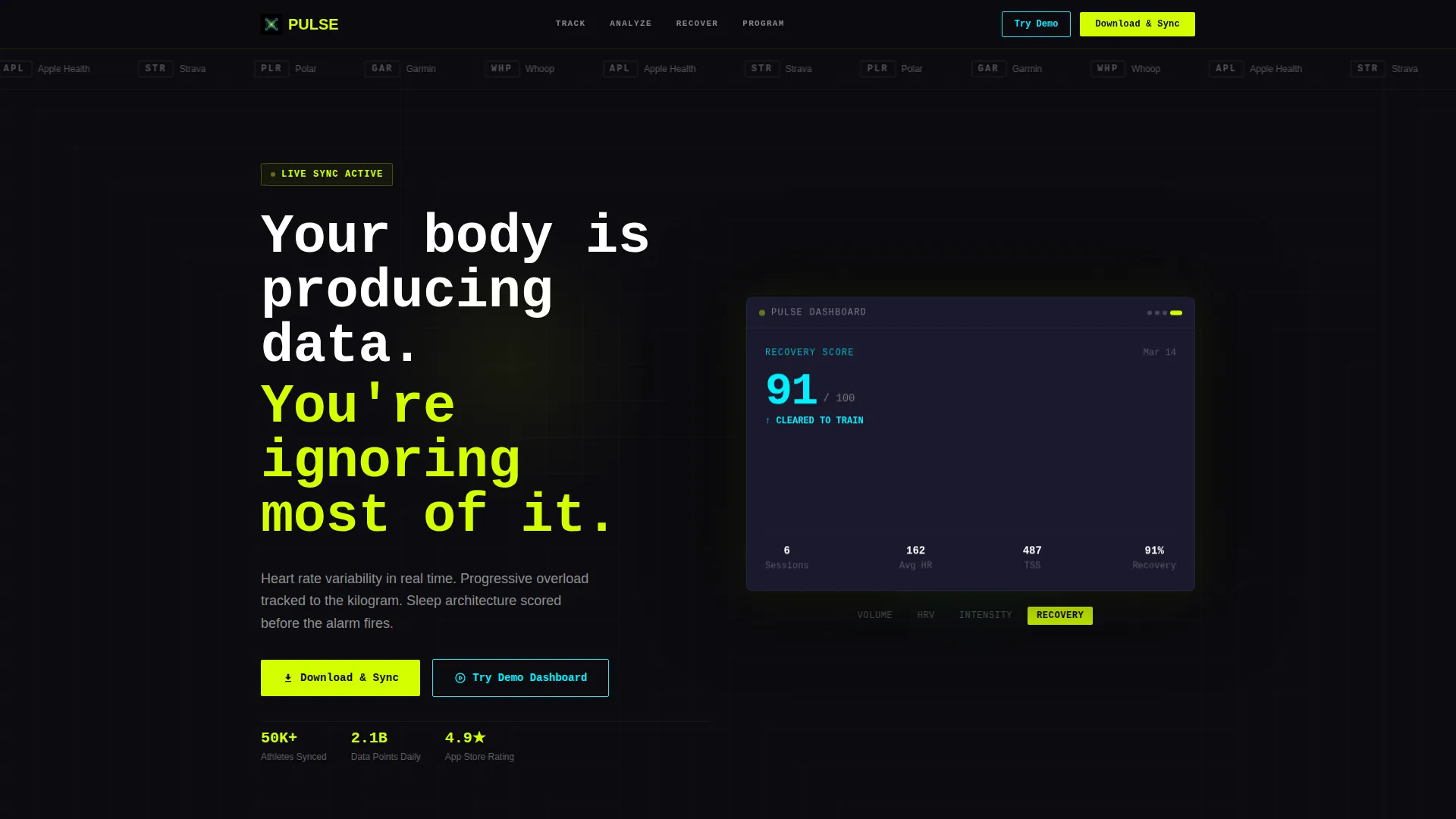
- A slim logo bar header with a headline set in monospaced type and an animated dashboard mockup cycling through four data views
- Anchor navigation linking the hub to each spoke section, with a primary "Download and Sync" call to action paired with App Store and Google Play badge placements
- A secondary demo path offering a "Try the Demo Dashboard" option that links to a live interactive preview populated with sample athlete data
Feature list
This template is built around a focused set of layout and interaction features grounded in the source brief.
Stats-First Section Openers
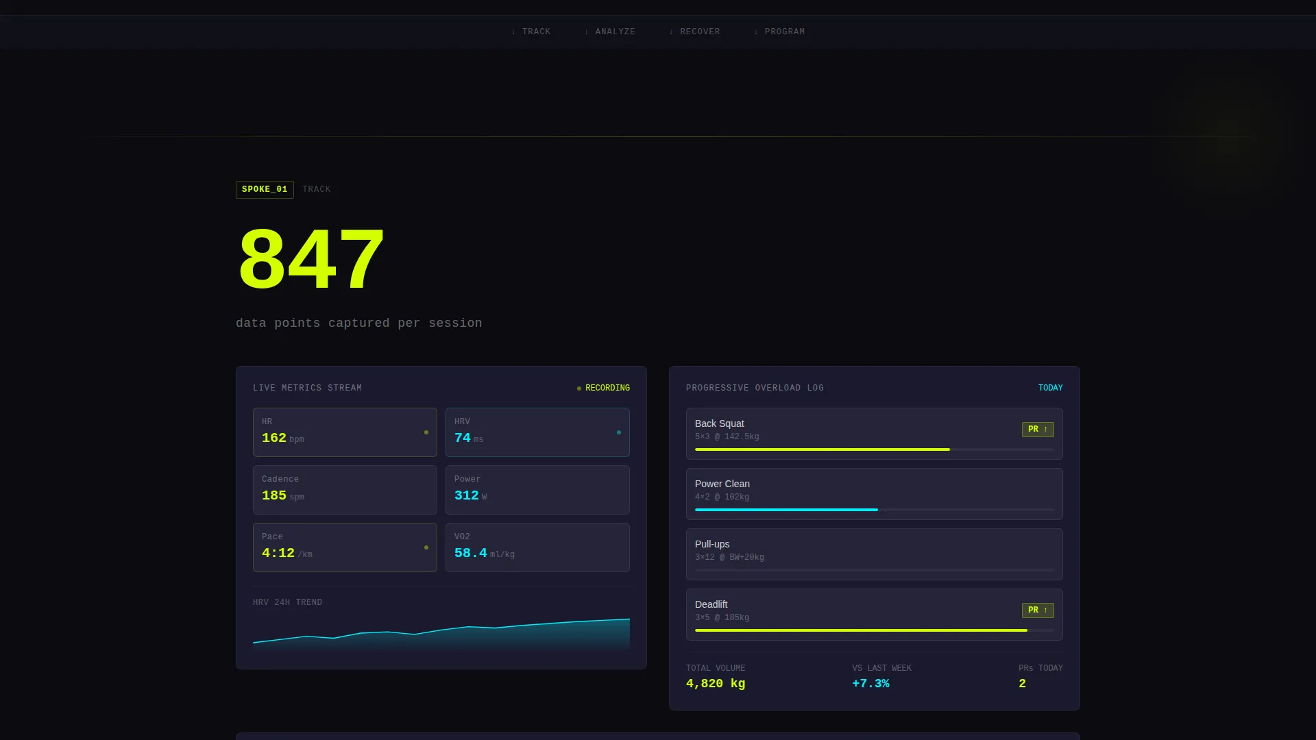
Each spoke section opens with a large, unavoidable hero number before any descriptive copy appears. The stat lands first, then the explanation follows. This structure builds trust by showing proof before making a claim.
Animated Dashboard Mockup Carousel
The header includes a single dashboard mockup that auto-cycles through four data views: weekly volume load, heart rate variability trend, session intensity heatmap, and recovery score. Each transition uses a sharp data-wipe with no easing, creating a hard-cut rhythm that mirrors live data refreshes.
Hub-and-Spoke Anchor Navigation
Four named anchor links, Track, Analyze, Recover, and Program, let visitors jump directly to the section most relevant to their training role. The navigation keeps the page from feeling long while preserving full feature depth for those who explore every spoke.
Dual Call-to-Action Architecture
The primary call to action, "Download and Sync," appears at the hub center and at the close of every spoke section. A secondary path, "Try the Demo Dashboard," sits alongside it, offering a low-commitment entry point for visitors who want to explore before downloading.
Integration Partner Logo Bar
A slim, confidence-building logo strip above the headline displays integration partner marks. This positions the dashboard as a connected platform from the very first moment a visitor loads the page.
Progressive Depth Scroll Experience
The page is designed so that scrolling feels like drilling into a dataset. Metrics become more granular and personal as the visitor moves down. By the time the call to action appears, the visitor has already been reading charts and recognizing gaps in their own training.
Page sections overview
| Section | Purpose |
|---|---|
| Logo Bar Header | Establish integration credibility and deliver the core headline |
| Animated Mockup Strip | Show four live dashboard views before any copy begins |
| Anchor Navigation Hub | Orient visitors and link to each of the four spoke sections |
| Track Spoke | Present real-time heart rate variability and progressive overload tracking |
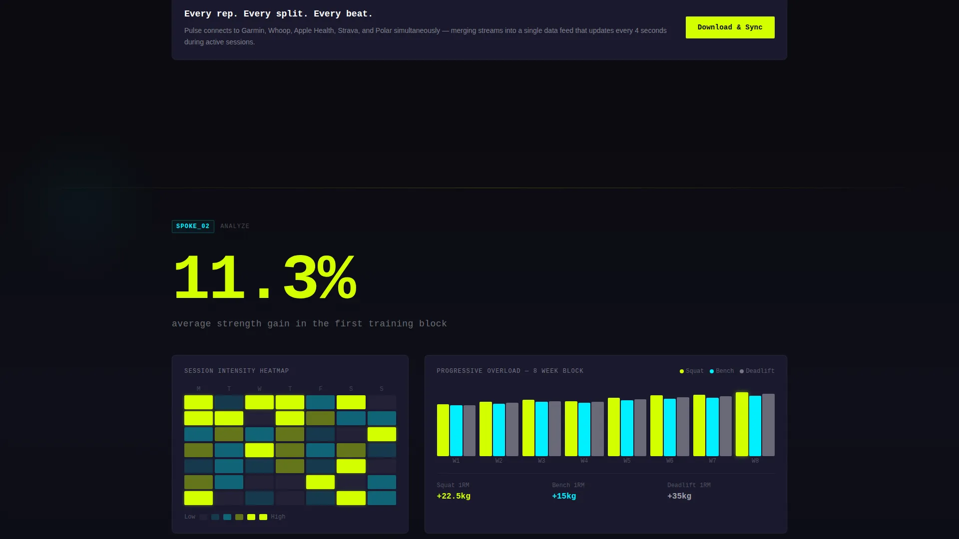
| Analyze Spoke | Surface session intensity heatmaps and volume load trends |
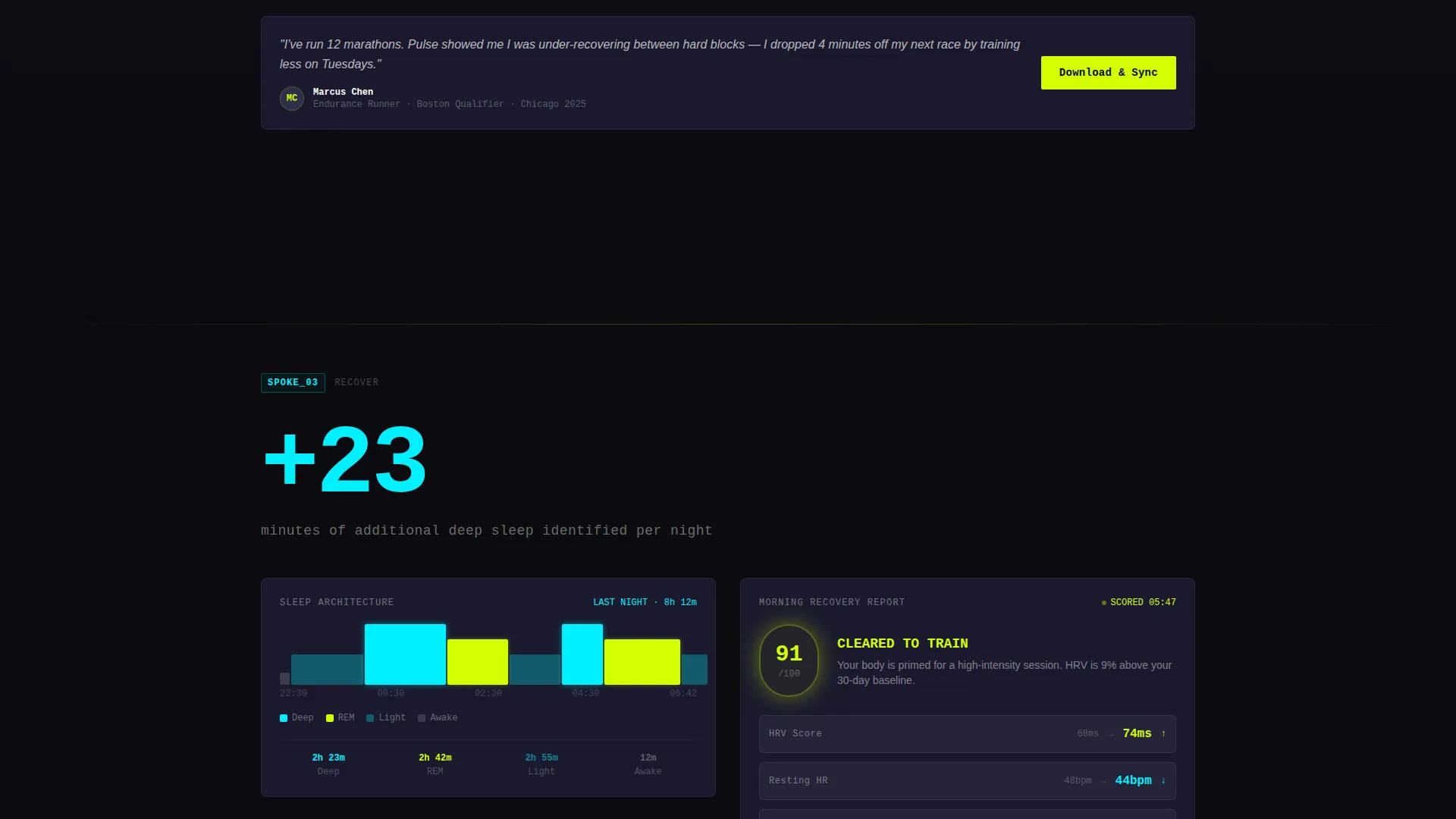
| Recover Spoke | Display sleep architecture scores and recovery window data |
| Program Spoke | Show compliance and roster data for coaches managing multiple athletes |
| Demo Dashboard call to action | Invite visitors to interact with sample athlete data before downloading |
| App Download Close | Deliver the final "Download and Sync" call to action with store badge placements |
Design & branding system
The visual identity follows a Data Command theme built entirely on the Acid Digital color system. Color is the hierarchy. There are no decorative gradients or lifestyle images pulling attention away from the numbers.
- Void black (#0B0B0F) as the base canvas, electric chartreuse (#D4FF00) for every live metric and active-state element, terminal cyan (#00F0FF) for secondary data lines and navigation highlights, and deep graphite (#1A1A2E) for floating card surfaces
- Monospaced typeface for all headline and metric text, giving the page the feel of a terminal or a wrist-mounted display mid-interval
- White text is reserved for labels only, letting the chartreuse and cyan carry the visual hierarchy across every section
Mobile & speed optimization
The template is structured to perform clearly on smaller screens without sacrificing the data-rich layout that makes it compelling. Each spoke section stacks cleanly, and the anchor navigation remains accessible throughout the scroll.
- Card surfaces and dashboard mockup panels are sized to read well on mobile viewports without requiring horizontal scrolling
- The stats-first layout means the most important information appears above the fold on every device, keeping the value proposition immediate
How this template helps you convert
The conversion strategy is built directly into the scroll experience. Every structural decision moves the visitor closer to the download with less resistance.
- The animated mockup carousel and hero stats establish product credibility before any marketing copy appears, so visitors arrive at the call to action already engaged with the data.
- The dual call-to-action structure removes the all-or-nothing decision: visitors who are not ready to download can try the demo dashboard first, reducing drop-off at the conversion point.
Other information about this template
This template is categorized under Technology, specifically Fitness Software and Software as a Service (SaaS). It is designed for the fitness analytics dashboard niche and is a strong fit for teams building connected training tools that pull data from wearable platforms.
- The integration logo bar is designed to accommodate partner marks from platforms commonly used by competitive athletes, including Garmin, Whoop, Apple Health, Strava, and Polar
- The template style is Hub and Spoke with Anchor Navigation, making it straightforward to expand with additional spokes if your product has more feature areas to showcase
- The App Download landing page direction means every layout decision, from the header to the final section, is oriented toward driving installs rather than lead capture
Theme
Data Command
Creative direction
Stats-First Impact
Color system
Acid Digital
Style
Hub & Spoke (Anchor Nav)
Direction
App Download
Page Sections
Stats-first Section Openers
Animated Dashboard Mockup Carousel
Hub-and-spoke Anchor Navigation
Dual Call-to-action Architecture
Integration Partner Logo Bar
Progressive Depth Scroll Layout
Related questions
Who is the Pulse template designed for?
Can I customize the spoke sections for a different set of features?
Does the template include the animated dashboard mockup assets?
How does the demo dashboard link work?
Is this template suitable for a product that serves both individual athletes and coaching teams?



