Pulse - Powerful Fitness App Landing Page Template
Pulse is a fitness workout app landing page template built around a hub and spoke anchor navigation structure. It uses a Feature Matrix layout to stack side-by-side comparisons across five key sections. The Data Command visual theme, deep charcoal backgrounds, and sky blue highlights create a dashboard-style experience that guides serious athletes straight to a free trial sign-up.
by Rocket studio
Quick summary
Pulse is a single-page fitness workout app landing page template designed to convert serious athletes through structured comparison evidence. The anchor navigation pins five feature spokes to the top, each backed by a comparison table and contextual app screenshot. The Slate and Sky color system keeps every metric readable at a glance, and the primary call to action stays visible throughout the entire scroll.
Who this template is for
This template is built for fitness app founders, indie developers, and product teams who need to turn skeptical visitors into trial sign-ups. It works especially well when your product competes against established tools and you want to let the feature evidence do the persuading.
- Strength and conditioning app developers targeting intermediate lifters who have outgrown basic logging tools
- Endurance and hybrid training app teams whose product consolidates split tracking, recovery data, and body composition trends
- Fitness tech marketers who want a comparison-first page that removes objections before the visitor reaches the sign-up form
What problem this template solves
Many fitness apps have genuinely strong features but weak landing pages that bury the proof. Visitors arrive already comparing options, and a generic hero section with vague benefit headlines sends them straight back to the search results. This template is structured to intercept that exit by making the comparison visible and immediate.
- Athletes researching fitness workout apps often duct-tape multiple tools together; this page shows exactly why they no longer need to
- Feature tables across five dedicated sections replace abstract claims with specific capability comparisons, removing the need for a visitor to go elsewhere to verify
- A permanently visible free trial call to action keeps the conversion path open at every scroll depth, so no evidence section ends without an obvious next step
What you get with this template
You get a fully structured, single-page hub and spoke landing page organized around five anchor navigation spokes: Tracking, Programming, Analytics, Recovery, and Integrations. Every section is self-contained but connected through the pinned navigation bar.
- A Logo Bar header featuring integration and media recognition logos above a bold single headline and a static hero dashboard screenshot
- Five Feature Matrix sections, each with a two-column comparison table and one contextual app screenshot per section
- A full-page competitive breakdown grid, a streamlined two-field sign-up form, and a sky blue primary call to action pinned permanently in the anchor nav bar
Feature list
This template includes the following core components, each designed to serve a specific role in the conversion flow.
Pinned Anchor Navigation Bar
The navigation bar locks to the top of the viewport after scroll and labels all five feature spokes. The primary "Start Your Free 14-Day Trial" button stays sky blue and always visible, so the conversion path is never more than one click away regardless of where the visitor is on the page.
Logo Bar Header
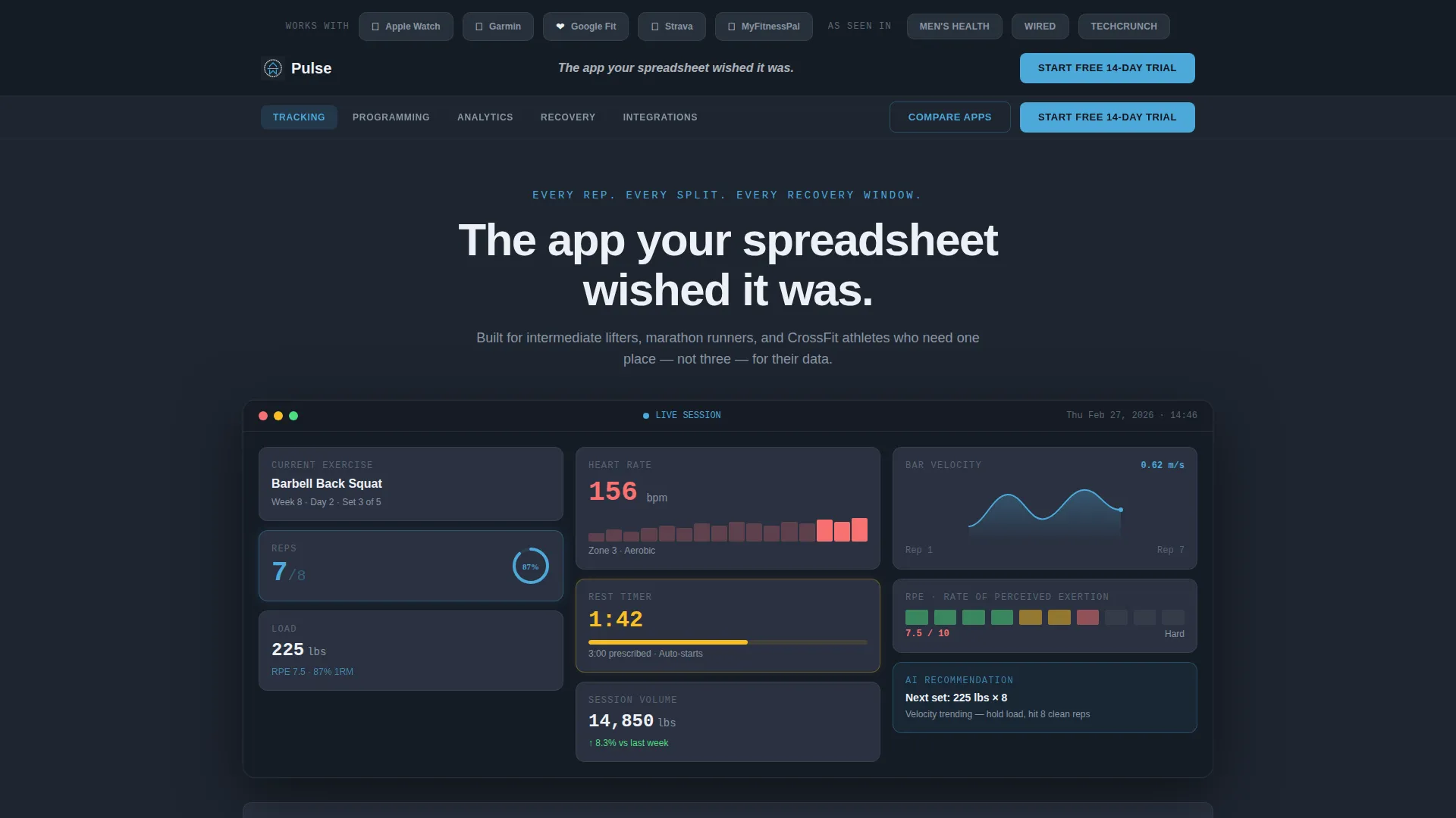
A horizontal strip of integration and media recognition logos sits above the hero headline. The static hero frame below shows the app dashboard mid-workout, including a live rep counter, heart rate readout, rest timer, and velocity curve. One screenshot replaces a paragraph of feature claims.
Feature Matrix Comparison Tables
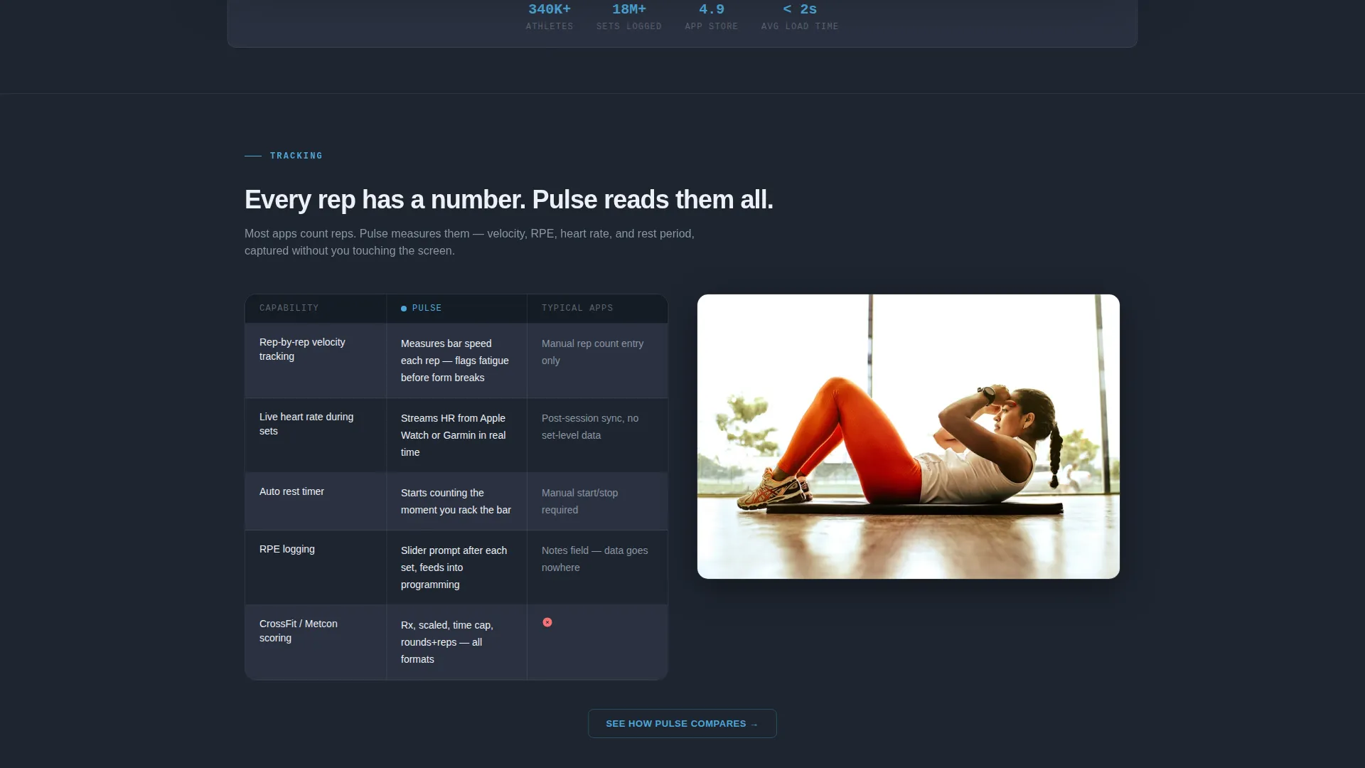
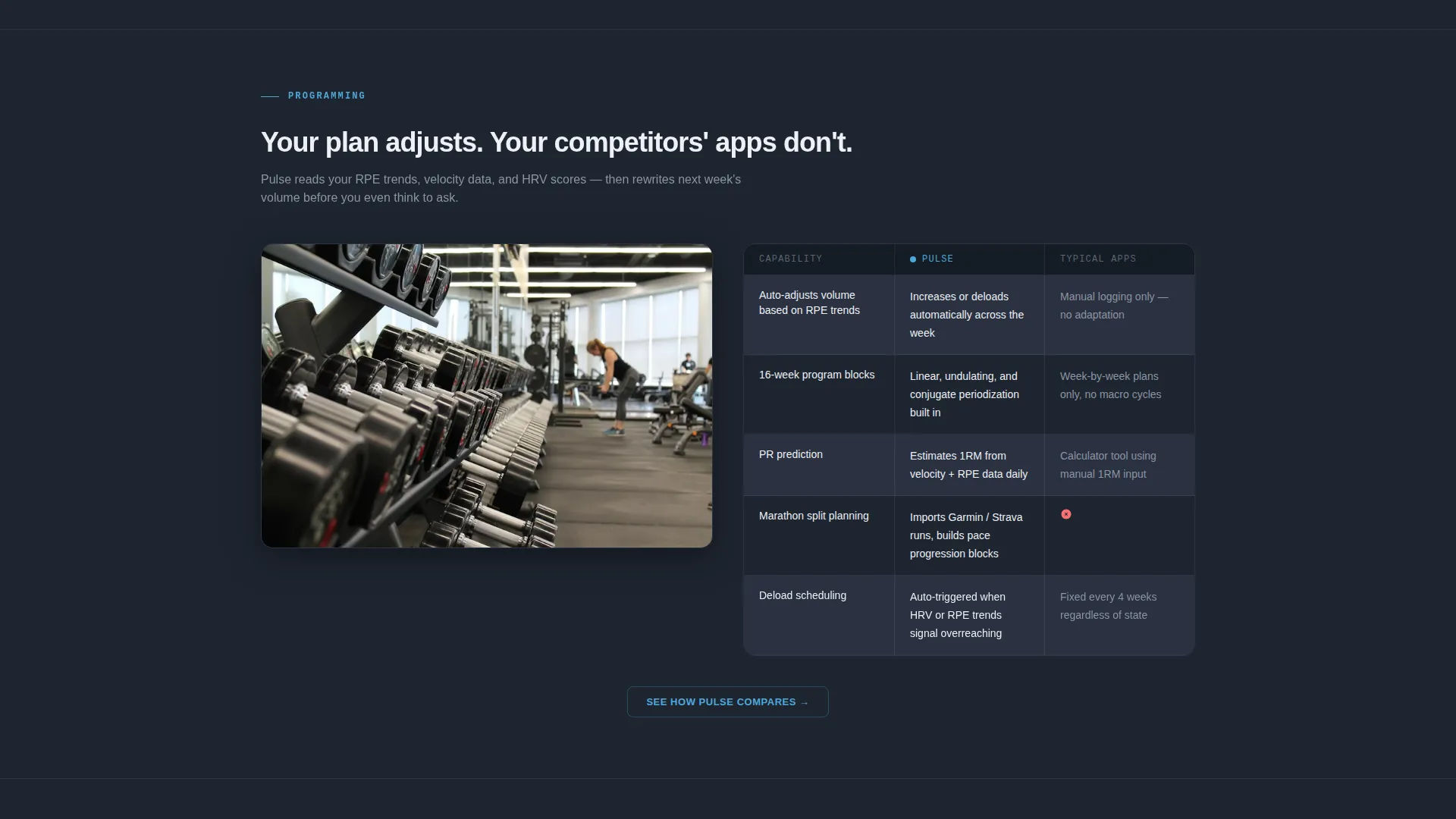
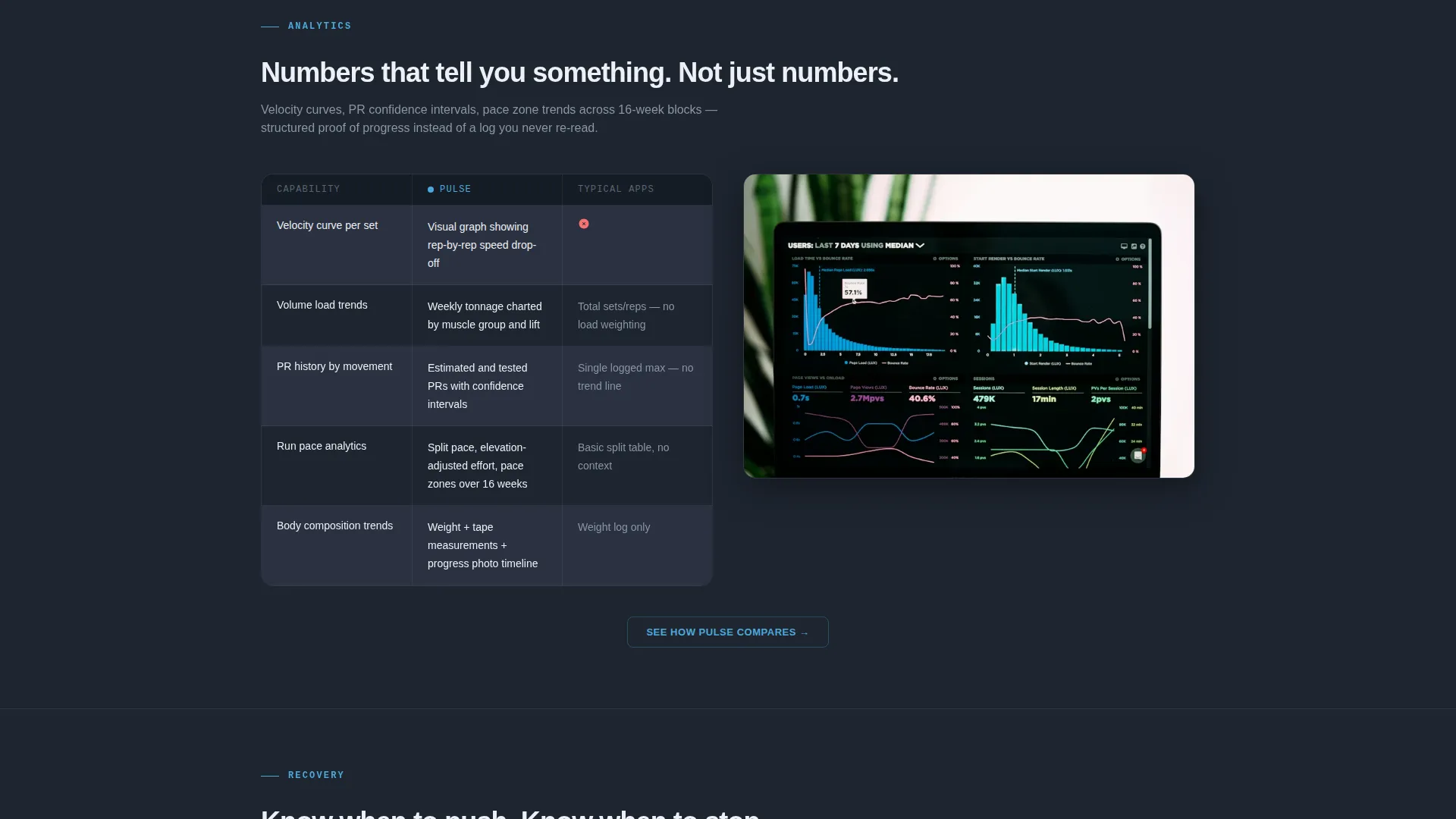
Each of the five anchor sections opens with a two-column table comparing Pulse capabilities against typical fitness apps. Checkmarks, cross marks, and specific capability descriptions replace vague marketing language. The format is designed to feel like research the visitor is doing themselves.
Contextual App Screenshots
Between each comparison table, a single app screenshot shows the relevant feature in active use. This keeps the layout evidence-led without requiring video or animation. One image per section maintains density without visual noise.
Competitive Breakdown Grid
A dedicated full-page section compares Pulse against five named competitors across all key capability dimensions. The secondary call to action "See How Pulse Compares" in each section smooth-scrolls directly to this grid. It functions as the final objection-removal layer before the sign-up form.
Two-Field Sign-Up Form
The sign-up form asks only for an email address and primary training style, with options for strength, endurance, or hybrid. No credit card is required and there is no onboarding quiz. The reduced friction is intentional and consistent with the comparison-first conversion strategy.
Page sections overview
| Section | Purpose |
|---|---|
| Logo Bar Header | Establish credibility with integration and media logos above the hero |
| Hero Dashboard Shot | Show the app in use with a dense, readable mid-workout screenshot |
| Anchor Navigation Bar | Pin five feature spokes and the primary call to action to the viewport top |
| Tracking Comparison | Compare rep, rest, and recovery tracking capabilities against typical apps |
| Programming Comparison | Show volume auto-adjustment and RPE-based programming versus manual logging |
| Analytics Comparison | Contrast live data streams and trend views against basic history logs |
| Recovery Comparison | Highlight recovery window data versus absent or manual recovery tracking |
| Integrations Comparison | List integration depth against single-platform or limited sync alternatives |
| Competitive Breakdown Grid | Full-page side-by-side against five named competitors |
| Sign-Up Form | Capture email and training style with no credit card required |
Design & branding system
The visual identity follows a Data Command theme built to feel like a cockpit instrument panel. Deep charcoal provides the primary background, mid-tone graphite surfaces cards, and sky blue fires on active states, progress rings, and navigation highlights. Chalk white handles all primary text so every metric stands out.
- Color palette: deep charcoal slate (#1E2530) background, graphite (#3A4350) card surfaces, sky blue (#4DA8DA) active states, chalk white (#EDF0F5) text
- The dark foundation ensures that illuminated metrics and comparison checkmarks pop without visual competition from surrounding elements
- The overall palette reads as precise and technical, appropriate for athletes who interpret performance data as part of their training process
Mobile & speed optimization
The layout is designed to remain scannable and evidence-dense at smaller viewport sizes. The anchor navigation and pinned call to action are structured to stay functional as the primary interaction point on mobile screens.
- Comparison tables and app screenshots are laid out to translate clearly to narrower viewports without losing the column structure that makes them readable
- The single static hero image approach avoids carousel or animation dependencies that could disrupt layout on mobile devices
How this template helps you convert
The page is structured around one principle: remove every reason to hesitate before asking for the click. Each section is a discrete proof layer that builds the case without relying on enthusiasm or design tricks.
- The comparison table format puts the visitor in the role of researcher rather than audience, which creates a sense of informed decision-making before the sign-up form appears
- The permanently visible "Start Your Free 14-Day Trial" button in the anchor nav means the conversion path is always one step away, no matter how deep into the evidence the visitor scrolls
- The two-field form with no credit card requirement reduces the final commitment barrier to its lowest possible point, making the trial feel like a logical next step rather than a risk
Other information about this template
This template is categorized under Technology and the Industry Mobile Apps subcategory, with a specific niche alignment to the fitness workout app market. It is built as a hub and spoke single-page layout with anchor navigation rather than a multi-page site structure.
- The template style is Hub and Spoke with Anchor Nav, meaning all five feature sections live on one scrollable page connected through a pinned top navigation
- The creative direction is Feature Matrix, which means the primary content format throughout is structured comparison rather than storytelling or emotional narrative
- The conversion direction is Comparison versus, designed specifically for products that win when the visitor sees the full feature picture laid out next to the competition
- The header concept is a Logo Bar, which front-loads social proof through recognizable integration partners and media placements before the visitor reads a single feature claim
Theme
Data Command
Creative direction
Feature Matrix
Color system
Slate & Sky
Style
Hub & Spoke (Anchor Nav)
Direction
Comparison/Versus
Page Sections
Pinned Anchor Navigation with Call to Action
Logo Bar with Hero Dashboard
Feature Matrix Comparison Tables
Contextual In-app Screenshots
Full-page Competitive Breakdown Grid
Low-friction Two-field Sign-up Form
Related questions
Who is this landing page template designed for?
Does this template include the sign-up form and comparison grid?
Can I customize the comparison table content for my own app features?
How many sections does this landing page template include?
Is a credit card required for the free trial call to action shown in the template?



