Healthcare Digital Presence Specialist Reviews Website Template
Pulse is a healthcare directory landing page template built for platforms connecting patients, HR benefits managers, and clinic owners. It features a live interactive search preview, a three-tier comparison table, and a freemium conversion model. The Tech Glass visual identity pairs deep obsidian with iridescent accents for a design that feels clinical, modern, and immediately trustworthy.
by Rocket studio
Quick summary
Pulse is a single-page healthcare directory template designed to launch a provider listing platform fast. It opens with a functional search preview, flows into a tiered comparison table, and closes with two clear conversion paths: one for patients searching free, one for clinic owners claiming their profiles.
Who this template is for
This template serves three distinct audiences who all need the same thing: a fast, reliable way to navigate healthcare provider information.
- HR benefits managers evaluating provider networks during open enrollment season
- Patients newly relocated to a city who need to find a specialist or dentist accepting their insurance plan
- Clinic administrators who want to claim and manage a public-facing profile to attract new patients
What problem this template solves
Finding the right healthcare provider is frustrating. Patients waste time calling offices, checking outdated directories, and guessing about insurance compatibility. This template gives a directory platform the structure to solve that problem visibly and immediately.
- No clear way to show real-time availability, verified ratings, and insurance filters in one place
- No conversion flow that serves both end users searching for care and providers competing for visibility
- No pricing structure that makes the free tier feel genuinely useful while clearly showing the value of upgrading
What you get with this template
You get a complete, single-page layout built around the core actions of a healthcare directory: search, compare, and convert. Every section is designed to carry a visitor from curiosity to commitment.
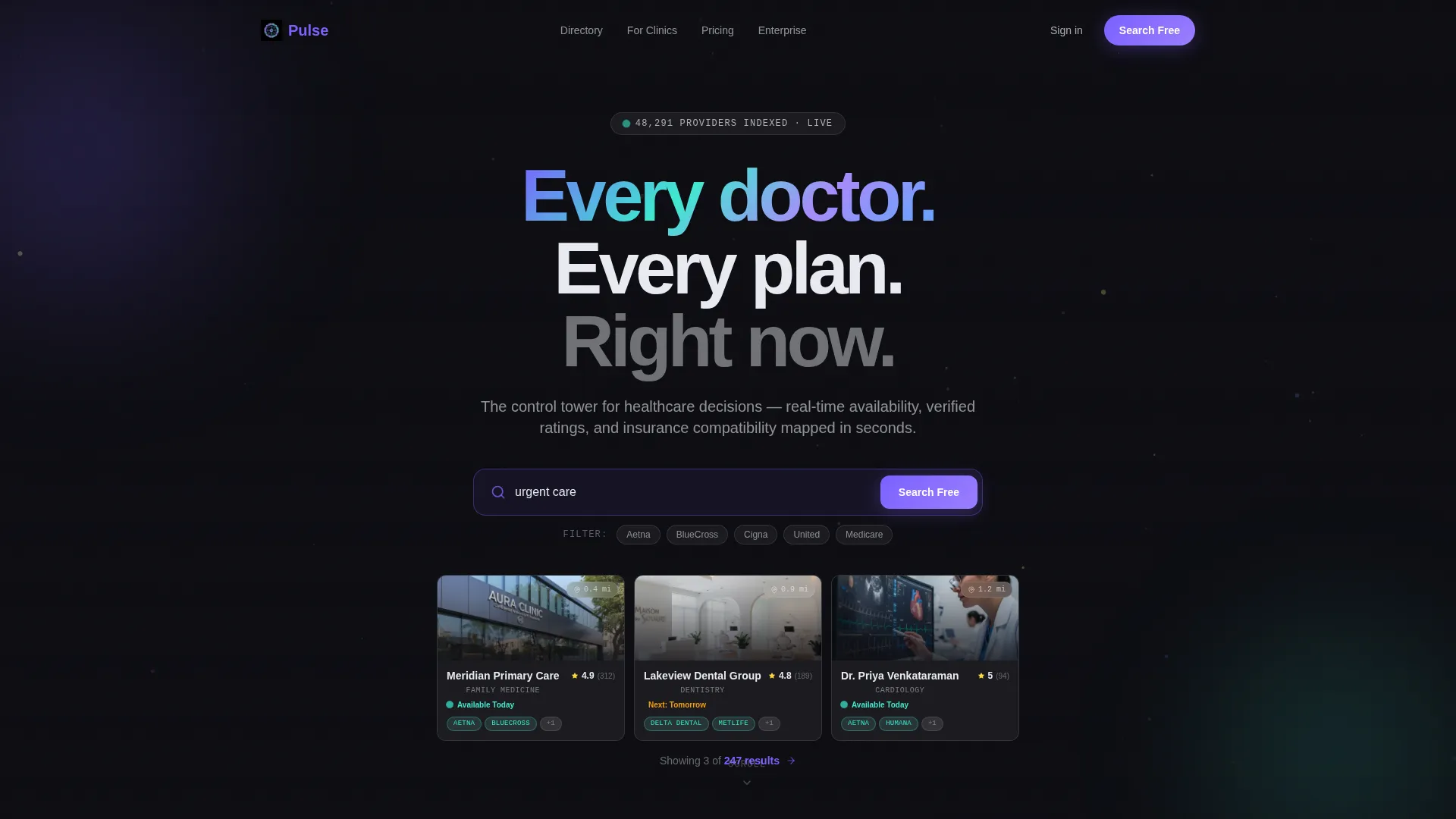
- An interactive header search bar that populates live clinic cards with ratings, distance badges, and availability indicators
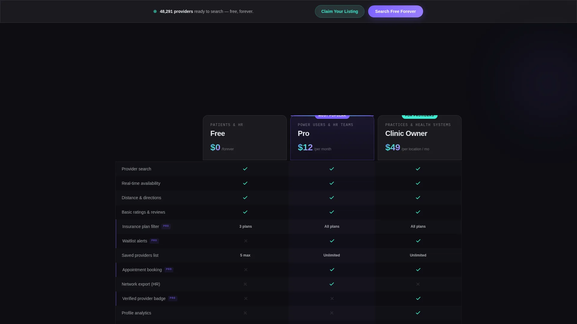
- A three-column comparison table covering Free, Pro, and Clinic Owner tiers, each built as a frosted glass card with hover-illuminated feature rows
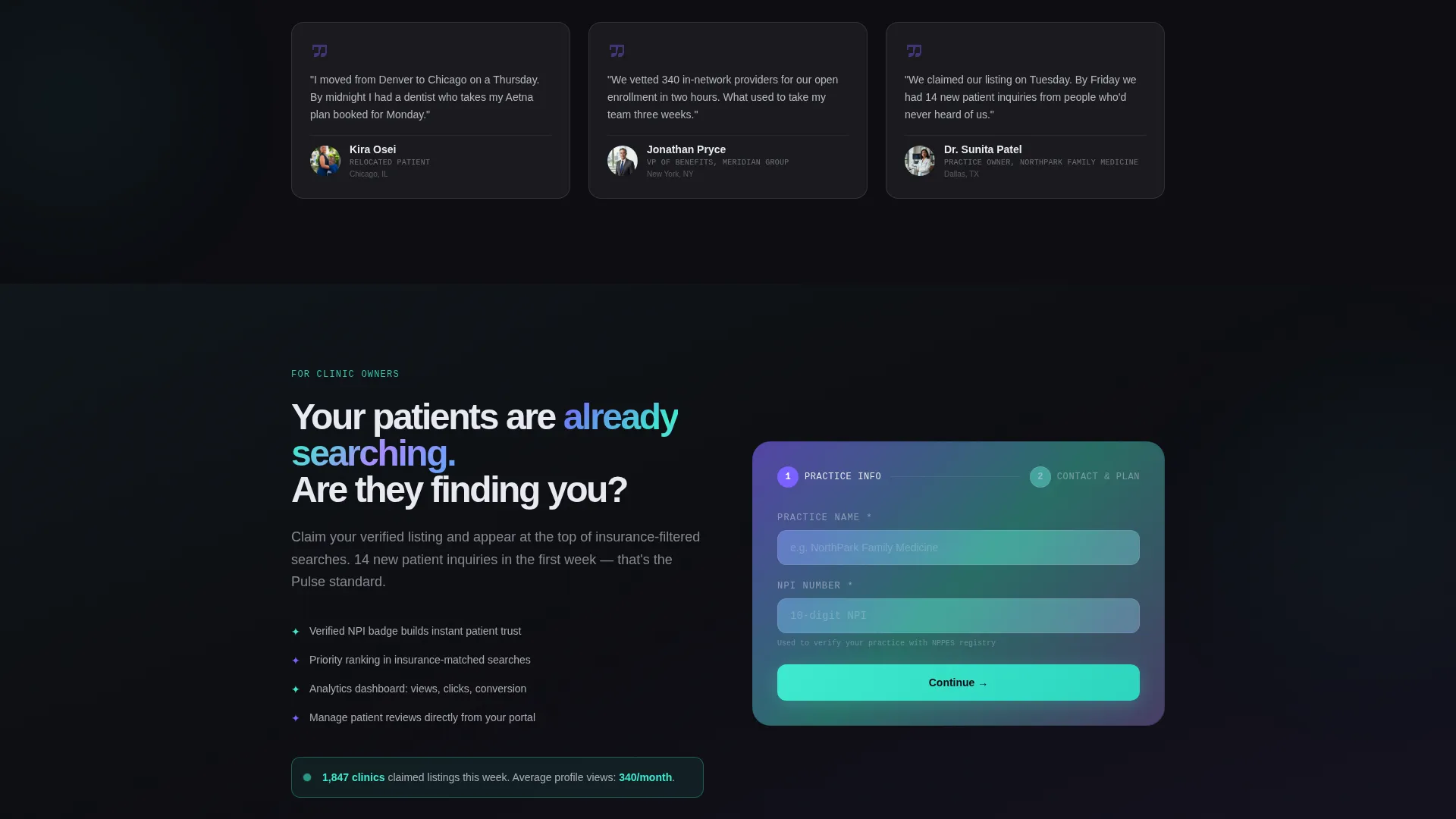
- A sticky bottom call-to-action bar and a two-step clinic owner claim form, both wired to the freemium conversion model
Feature list
This template includes purpose-built sections and interaction patterns designed specifically for a healthcare directory and listing platform.
Live Search Preview Header
The header is not a static hero image. Visitors type a specialty or zip code and watch clinic cards populate beneath their input in real time. Cards display ratings, distance badges, and green availability dots, making the platform's value immediately tangible before any signup.
Three-Tier Comparison Table
The comparison table presents Free, Pro, and Clinic Owner plans as frosted glass columns. Feature rows illuminate on hover. The Pro column highlights insurance match filters and waitlist alerts. A pre-selected "Try Pro 14 Days Free" toggle reduces the upgrade decision to a single click.
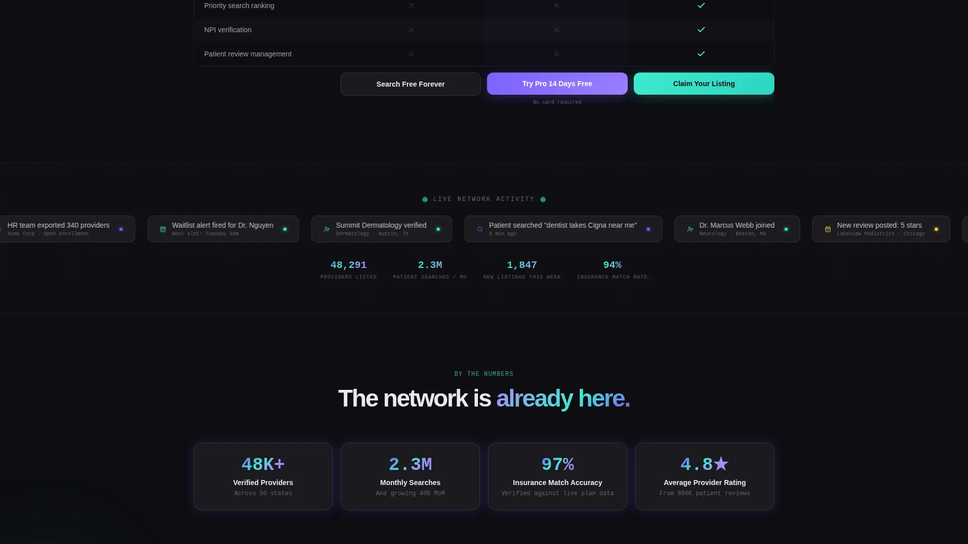
Provider Network Ticker
A scrolling ticker below the comparison tables displays newly listed providers and recent patient searches. This live-feel element signals network density and platform activity, building trust without requiring the visitor to take any action.
Parallax Micro-Animation System
Cards tilt on parallax scroll, numbers count up as they enter the viewport, and availability dots blink on a soft pulse. These micro-animations make the interface feel like an active, scaling platform rather than a static promotional page.
Dual Conversion Call-to-Action Flow
The primary call to action, "Search Free Forever," anchors the header and reappears as a sticky bottom bar. The secondary path targets clinic owners with a "Claim Your Listing" button in holographic teal that opens a focused two-step intake form.
Two-Step Clinic Owner Claim Form
The claim form breaks the signup into two lightweight steps. Step one collects practice name and National Provider Identifier (NPI) number. Step two covers contact details and plan selection, keeping the commitment low and the flow frictionless.
Page sections overview
| Section | Purpose |
|---|---|
| Interactive Search Header | Live provider search with animated clinic result cards |
| Animated Node Canvas | Visual background showing pulsing provider network nodes |
| Comparison Table Block | Three-tier pricing layout with hover-lit feature rows |
| Pro Upgrade Toggle | One-click trial pre-selection for the Pro tier |
| Network Activity Ticker | Scrolling feed of new listings and recent searches |
| Sticky call to action Bar | Persistent bottom bar reinforcing the free search action |
| Clinic Owner Path | Teal-highlighted entry point to the two-step claim form |
| Two-Step Claim Form | NPI and contact intake for clinic profile registration |
Design & branding system
The visual identity follows a Tech Glass theme built on an AI Iridescent color palette. The result feels like clinical precision refracted through light: sharp, modern, and immediately distinctive in a crowded healthcare space.
- Core palette: deep obsidian (#0D0D12) as the primary background, frosted white (#E8EAF0) for glass-card surfaces, violet-blue (#7B61FF) for interactive highlights and hover states, and holographic teal (#3EEACF) reserved for active selections and confirmation moments
- Glass-morphism panel treatment with faint iridescent gradient edges floating over the dark field, keeping text crisp in high-contrast white and muted silver
- Micro-animation language including parallax card tilt, number count-up on scroll entry, and softly blinking availability dots to reinforce a sense of live platform activity
Mobile & speed optimization
The layout is structured for fast scanning across screen sizes. The section-led single-page flow means visitors never lose context as they scroll, whether on a desktop browser or a phone at midnight.
- Sticky bottom call-to-action bar stays accessible on small screens without interrupting scroll behavior
- Comparison table columns are designed for horizontal scroll or stacked layout on narrow viewports so tier differences remain clear
- Micro-animations are scoped to visible viewport sections, keeping transitions purposeful rather than distracting on any device
How this template helps you convert
Pulse is structured around the principle that conversion happens after the product has already proven its value. The page earns trust before it asks for anything.
- The live search preview in the header acts as a working demo. Visitors experience the directory's core function before seeing a single pricing row, making the value concrete rather than claimed.
- The comparison table sequence builds decision momentum. Visitors move from product proof to pricing clarity to social proof in a single, uninterrupted scroll. The pre-selected Pro trial removes friction at the moment of highest intent.
- The dual call-to-action system captures two distinct buyer types in one flow. Patients commit with "Search Free Forever" and clinic owners enter a separate, low-friction path through "Claim Your Listing," so neither audience has to navigate a flow built for the other.
Other information about this template
This section covers additional practical context that helps you evaluate whether Pulse fits your project.
- The template is built for a healthcare directory and listing site, which means it is equally suited to launching a new platform or redesigning an existing provider search experience
- The freemium conversion model is built into the layout structure. The Free tier is positioned to be generous enough to generate real usage, while Pro features like insurance match filters and waitlist alerts create a natural upgrade path
- The "Claim Your Listing" flow uses a National Provider Identifier (NPI) field in step one, signaling credibility to clinic administrators who recognize it as a standard healthcare identifier
- The comparison table template style and the Launch Energy creative direction work together to maintain scroll momentum. Visitors are carried from live demo to pricing to social proof without a dead zone
- The Tech Glass theme and AI Iridescent color system make this template visually distinct from generic healthcare blues and whites, which can help a new directory platform stand out at first impression
Theme
Tech Glass
Creative direction
Launch Energy
Color system
AI Iridescent
Style
Comparison Table
Direction
Freemium/Trial
Page Sections
Live Interactive Search Header
Three-tier Comparison Table
Dual Conversion Call-to-action System
Provider Network Activity Ticker
Parallax Micro-animation System
Two-step Clinic Owner Claim Form
Related questions
Who is this template designed for?
How does the live search preview in the header work?
Can I launch with only the free tier active?
What does the two-step clinic claim form collect?
What visual style does this template use?



