Nonprofit Review Management Landing Page Template
Pulse is a bold brutalist landing page template built for nonprofit reputation management platforms. It features a live terminal-style header, an interactive feature-comparison data grid, and a progressive three-field audit form. The design uses deep blacks, electric teal, and monospaced typography to transform raw review data into a compelling, conversion-focused single-page experience.
by Rocket studio
Quick summary
Pulse is a single-page landing page template designed for nonprofit review management platforms. It opens with an animated terminal code block, flows into a hands-on feature comparison grid, and closes with a frictionless reputation audit form. The brutalist design system makes data feel urgent and alive, guiding fundraising teams and development directors toward one clear action.
Who this template is for
This template is built for SaaS founders and product teams launching tools in the nonprofit software space. It speaks directly to the buyers their platform serves, which means the copy and layout are already shaped around that audience's daily frustrations.
- Fundraising and development teams at mid-size nonprofits who need to monitor and respond to scattered reviews across multiple platforms
- Executive directors preparing board-level sentiment reports and needing a fast, credible summary view
- Consultants managing reputation across a portfolio of nonprofit clients simultaneously
What problem this template solves
Nonprofits often lose grant opportunities because negative reviews go unanswered on public platforms. Review data is scattered, sentiment trends are invisible, and there is no single place to act. This template frames all of that pain clearly before offering the solution.
- Review feedback arrives from multiple sources with no unified view, leaving fundraising teams reactive instead of proactive
- Boards and grant committees see public review scores that the organization has never formally tracked or addressed
- Consultants managing multiple organizations have no efficient way to benchmark or compare reputation health at a glance
What you get with this template
You get a fully structured, design-ready landing page with every visual component already built and positioned. The template removes the guesswork from layout, copy direction, and conversion flow for a reputation management product.
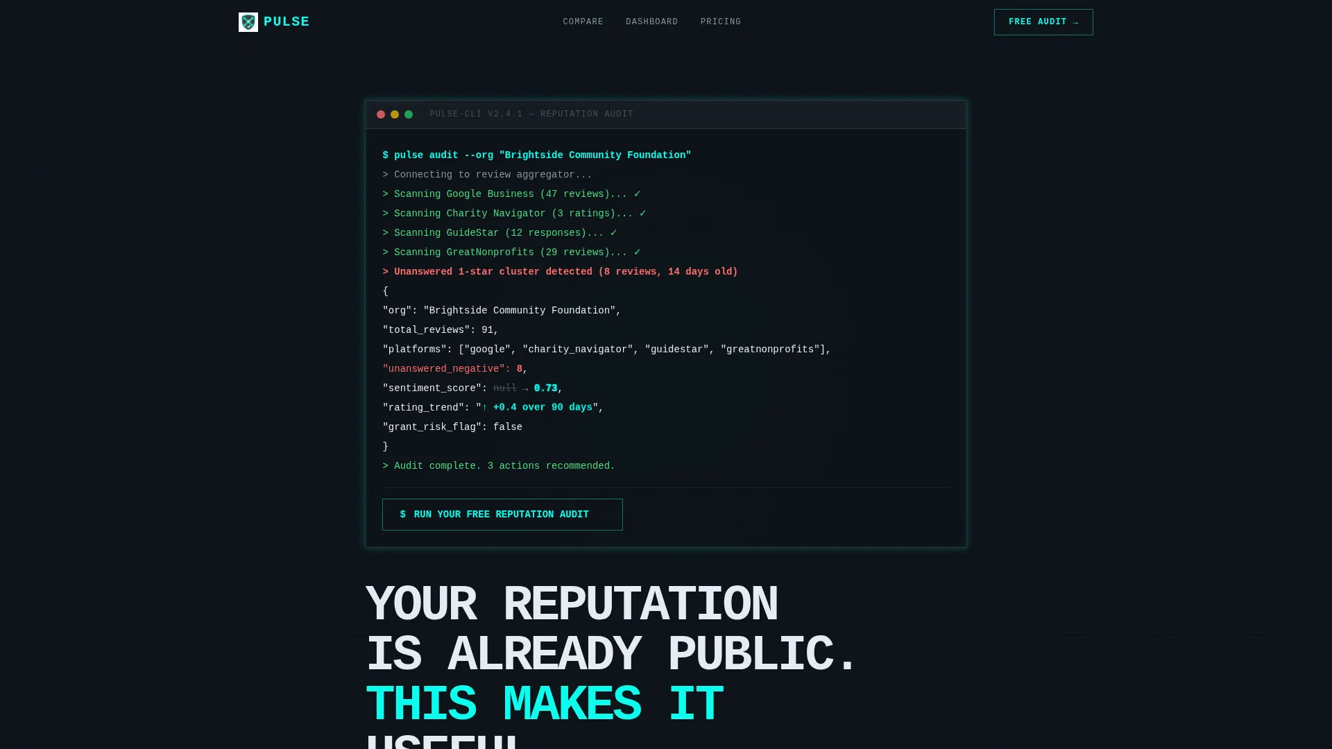
- An animated terminal-style header block with a live API snippet, a pulsing sentiment score reveal, and a primary call-to-action prompt
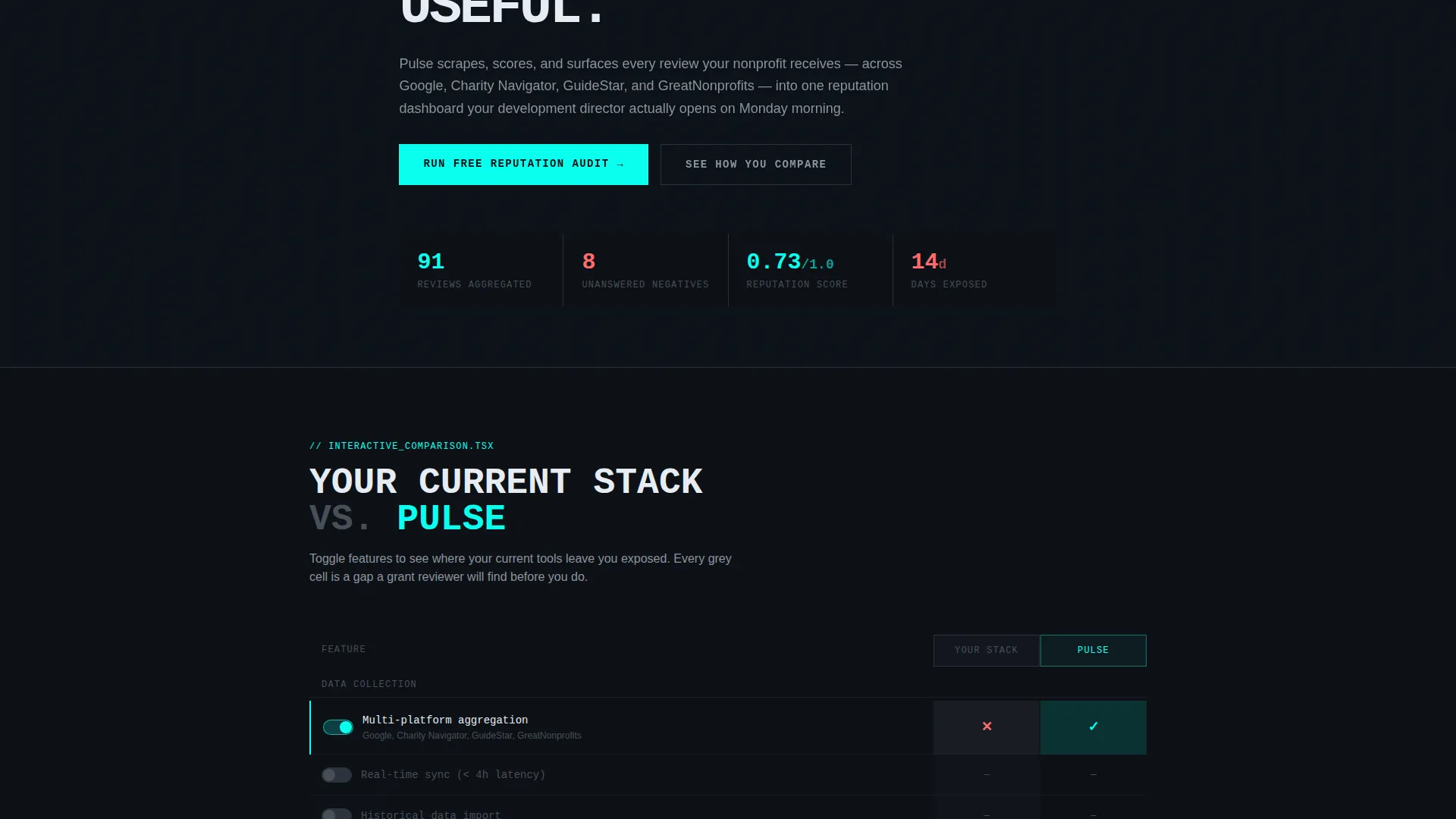
- A two-column interactive feature-comparison grid where visitors toggle capabilities and see real-time visual differences between your platform and alternatives
- A progressive three-field audit form collecting organization name, primary review platform, and work email with no credit card required
Feature list
This template includes six purpose-built components that work together to demonstrate platform value and move visitors toward conversion.
Live Terminal Header Block
The header fills the top third of the viewport with a styled code snippet showing a real API call pulling nonprofit review data. A sentiment score field animates from null to a live value in electric teal, and a rating trend arrow animates upward, making the product's core promise visceral before a single word of body copy is read.
Interactive Comparison Data Grid
A two-column grid sits directly below the header, rendering your platform against a generic competitor stack. Visitors toggle feature switches to activate capabilities. The competitor column grays out where features are absent while the Pulse column lights up in teal, creating an immediate and memorable contrast.
Progressive Disclosure Audit Form
The primary conversion form uses three fields in sequence: organization name, then primary review platform, then work email. Progressive disclosure reduces perceived friction and increases form completion without asking for payment information upfront.
Competitor Score Generator
A secondary conversion path lets visitors enter a competitor name and instantly receive a live side-by-side reputation score built from publicly available data. This delivers tangible value before any commitment, lowering the barrier to engagement significantly.
Persistent Mobile call to action Bar
On mobile viewports, the primary call-to-action anchors itself as a fixed bottom bar throughout the entire scroll. Visitors never lose access to the conversion prompt regardless of how far they read into the comparison sections.
Expandable Data Cards
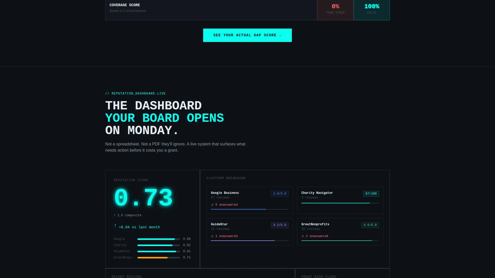
Deeper scroll sections present response time benchmarks, integration counts, and pricing-per-seat comparisons as individual data cards. Visitors can flip, sort, or expand each card, keeping the page interactive and reducing the need to read every section linearly.
Page sections overview
| Section | Purpose |
|---|---|
| Terminal Header Block | Hooks attention with an animated API snippet and primary call to action prompt |
| Feature Toggle Grid | Lets visitors compare platform capabilities interactively in two columns |
| Benchmark Data Cards | Presents response time, integrations, and pricing as expandable comparisons |
| Competitor Score Generator | Delivers instant side-by-side reputation scores from public data |
| Audit Request Form | Captures organization name, review platform, and email progressively |
| Persistent Mobile Bar | Keeps the primary call to action accessible at all scroll depths on mobile |
Design & branding system
The visual identity follows a Bold Brutalist theme built on the Teal Catalyst color palette. Every design decision reinforces the feeling of a live data environment rather than a polished marketing page.
- Core palette: deep terminal black (#0D1117) for backgrounds, electric teal (#0AFFEF) for data highlights and active states, cement gray (#2D333B) for card surfaces and grid borders, and hot coral (#FF6B6B) reserved exclusively for negative-sentiment indicators
- Typography is oversized and monospaced throughout, giving every headline and data label the visual weight of a command-line interface
- Whitespace is structural and intentional, used to isolate data elements and force visual hierarchy rather than to decorate empty space
Mobile & speed optimization
The template is structured so that every interactive component degrades gracefully at smaller viewport sizes. The conversion path stays intact from the first scroll to the final form field on any device.
- The live terminal header scales to a single-column layout on mobile without losing the animated sentiment score reveal
- The two-column comparison grid collapses to a vertically stacked card view, keeping toggle interactions functional on touch screens
- The persistent bottom call to action bar activates only on mobile, ensuring the audit prompt is always one tap away without cluttering the desktop layout
How this template helps you convert
The conversion architecture is built around showing vulnerability before offering a solution. Visitors discover their own public exposure first, which creates genuine urgency rather than manufactured pressure.
- The terminal header immediately surfaces real data the visitor did not know was visible, establishing credibility and relevance before any product claim is made
- The interactive comparison grid lets visitors self-qualify by toggling features they actually need, making the decision feel like their own conclusion rather than a sales push
- The three-field progressive form and instant competitor score generator provide two separate entry points, giving hesitant visitors a low-commitment way to engage before submitting their email
Other information about this template
Pulse sits at the intersection of nonprofit software, SaaS product marketing, and data-led conversion design. A few additional details are worth knowing before you build with it.
- The template is categorized under Technology and Nonprofit Software and SaaS, making it suitable for platforms operating in the nonprofit review management niche
- The Bold Brutalist theme and Teal Catalyst color system are intentional departures from the soft, charity-adjacent aesthetics common in the nonprofit sector, positioning the product as a serious data tool
- The comparison grid and competitor score generator are particularly well-suited for markets where the buyer is already evaluating multiple tools and needs a reason to stop searching
- The template style is Dashboard and Data Grid, meaning the visual language of the page mirrors the product itself, reinforcing trust through design consistency

Theme
Bold Brutalist
Creative direction
Interactive Explorer
Color system
Teal Catalyst
Style
Dashboard/Data Grid
Direction
Comparison/Versus
Page Sections
Live Terminal Header Block
Interactive Feature Comparison Grid
Progressive Disclosure Audit Form
Instant Competitor Score Generator
Persistent Mobile Call to Action Bar
Expandable Benchmark Data Cards
Related questions
Who is this landing page template designed for?
Does this template require coding knowledge to customize?
Can the comparison grid work for a product outside nonprofit review management?
What does the three-field progressive form collect from visitors?
Is there a way for visitors to get value before submitting their email?



