Real Estate Feedback Request Email Landing Page
Pulse is a hub-and-spoke landing page template built for a real estate feedback request email platform. It uses an industry-report structure with anchor navigation, a live-dashboard product screenshot header, and a side-by-side comparison table. The design runs on a Monochrome Steel palette, making the case for automated post-showing feedback with data, methodology, and a gap-analysis conversion flow.
by Rocket studio
Quick summary
Pulse is a single-page, anchor-navigated landing page template designed for a SaaS platform that auto-generates branded feedback request emails after property showings. It follows an industry-report creative structure, opens with a pixel-perfect product screenshot, and builds its conversion case through bold statistics, comparison tables, and an interactive return-on-investment calculator.
Who this template is for
This template is purpose-built for mid-size real estate brokerages and the SaaS founders marketing to them. If your product helps agents capture buyer feedback automatically, this page gives you the credibility architecture to prove it.
- Mid-size brokerages running fifteen to forty agents who lose buyer signals after every untracked showing
- SaaS marketers and founders who need to position an automated feedback tool against manual processes and generic competitors
- Real estate technology teams who want a data-driven, report-style page that converts research-mode prospects into demo requests
What problem this template solves
Every unanswered showing is a gap in the data. Agents move on, buyers go quiet, and pricing signals disappear before anyone can act on them. This template frames that problem with hard numbers and then presents the solution in a structured, evidence-forward layout.
- Brokerages losing objection data, buyer temperature readings, and pricing signals when follow-up never happens
- Marketing teams struggling to differentiate an automated feedback tool from generic customer relationship management auto-emails or standalone survey products
- Sales pages that feel too soft to convince analytically minded brokerage decision-makers who want proof, not promises
What you get with this template
You get a fully structured, single-page layout with five anchor-navigation spokes, each section built to carry a specific part of the business case. The page is organized like a Forrester-style industry report, so every scroll feels like a deliberate reveal of tightening evidence.
- A pinned anchor navigation bar with five labeled spokes: Response Rates, versus. Manual Follow-Up, versus. Competitors, ROI Calculator, and Case Data
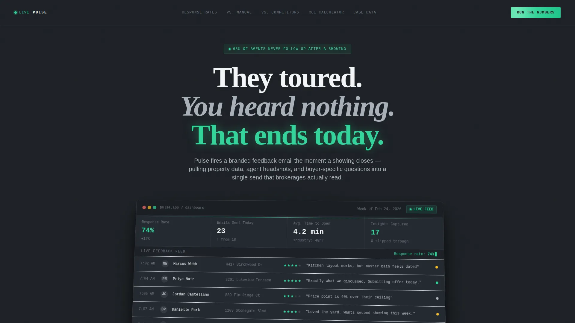
- A full-width product screenshot header showing a live feedback dashboard, bold headline copy, and a primary call-to-action above the fold
- A micro-assessment conversion form that generates a personalized gap analysis and a secondary gated PDF download for visitors not yet ready to commit
Feature list
This template packs deliberate, prompt-backed components across every section. Each feature earns its place in the layout without decoration.
Pinned Anchor Navigation Bar
Five named spokes pin to the top of the page and stay visible as visitors scroll. Each label maps to a specific content section, so readers can jump directly to the comparison or data point most relevant to their decision.
Live-Dashboard Product Screenshot Header
The header renders a pixel-perfect product screenshot on a slight three-dimensional tilt with a soft gunmetal drop shadow. Agent names, property addresses, star ratings, verbatim buyer quotes, and a climbing response-rate percentage are visible inside the screenshot, letting the product prove its value before a single word is read.
Side-by-Side Comparison Table
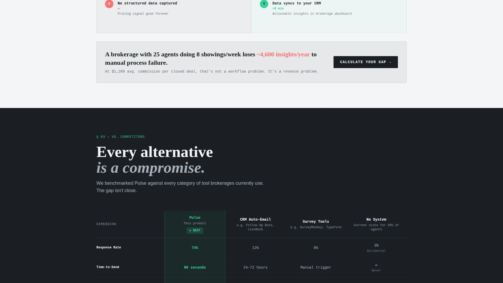
The central spoke pits the platform against manual email follow-up and two named competitor categories: generic customer relationship management auto-emails and standalone survey tools. Scoring runs across five dimensions: response rate, time-to-send, customization depth, CRM sync, and cost per response.
Bold Stat Section Openers
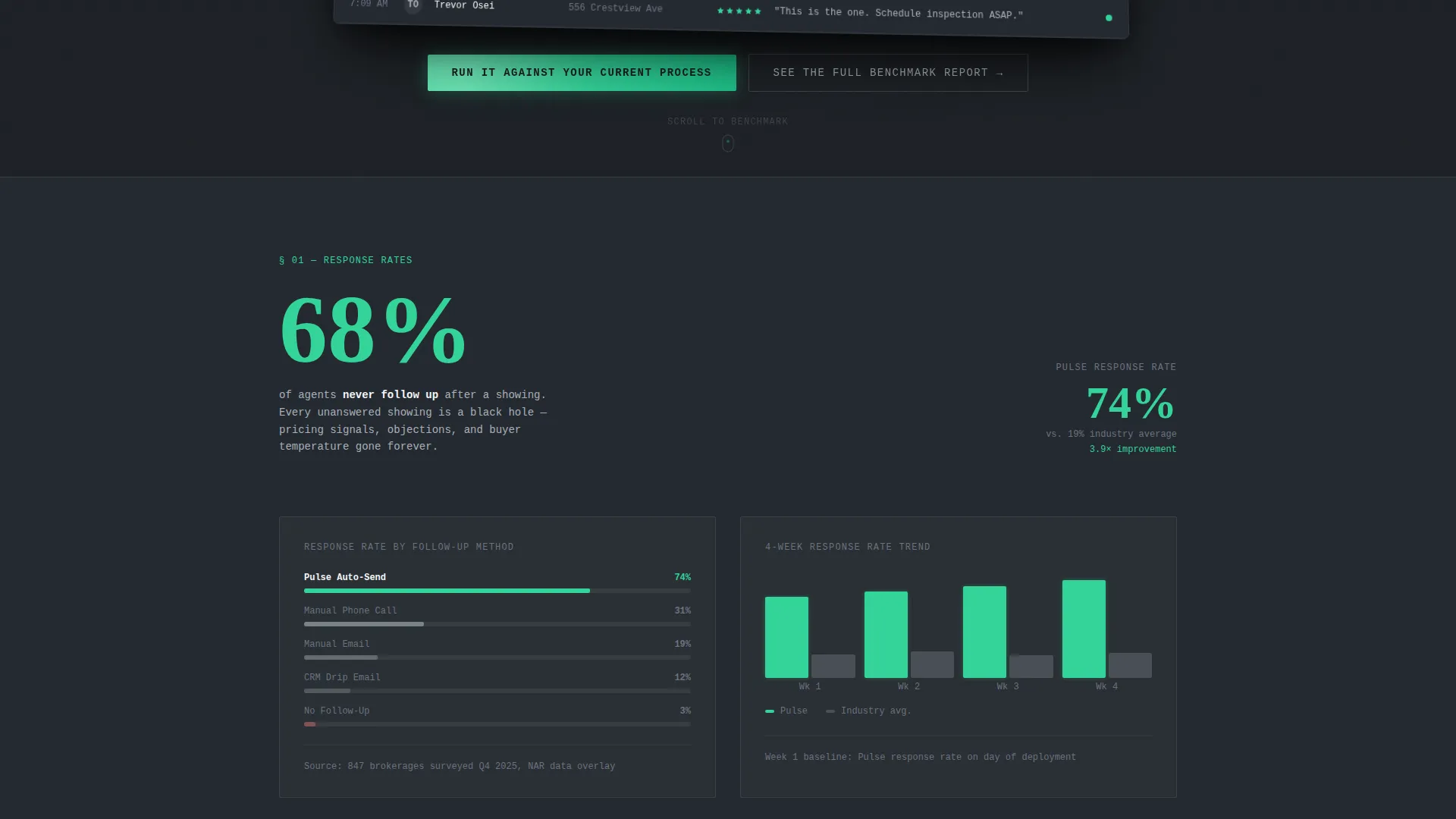
Each spoke opens with a headline statistic drawn from real brokerage data, such as the finding that sixty-eight percent of agents never follow up after a showing. These openers anchor the industry-report tone and establish urgency before the supporting methodology appears.
Micro-Assessment Gap Analysis Form
The primary call-to-action is a short form collecting brokerage size, average showings per week, and current follow-up method. On submission, it generates a personalized gap analysis delivered to the visitor's inbox, turning intent into a qualified lead.
Gated Benchmark Report Download
A secondary call-to-action gates a downloadable PDF benchmark report behind a single email field. This catches research-stage visitors who are not yet ready to commit but are willing to trade a contact address for structured data.
Page sections overview
| Section | Purpose |
|---|---|
| Header / Hero | Introduce the product with a live-dashboard screenshot and the primary headline |
| Pinned Anchor Nav | Give visitors instant access to all five spoke sections from any scroll position |
| Response Rates Spoke | Open with the sixty-eight percent stat and drill into response-rate methodology |
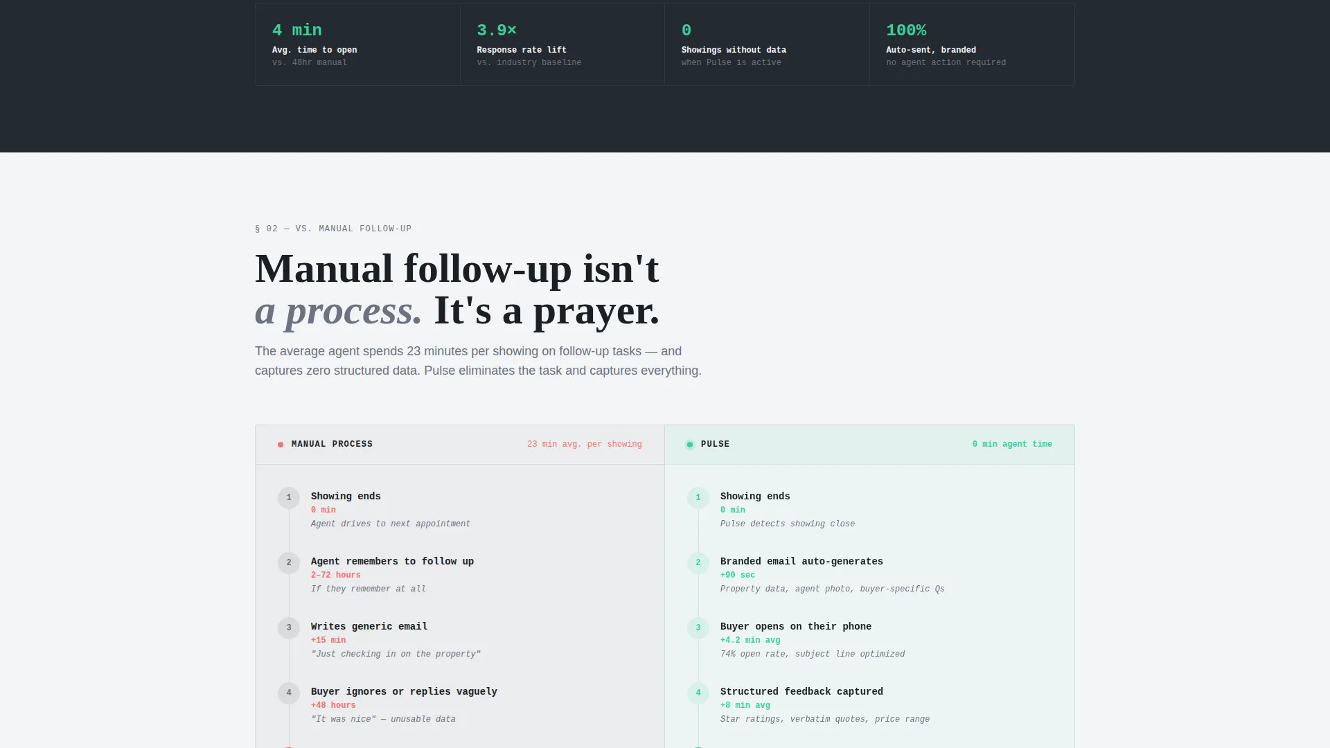
| Manual Follow-Up Spoke | Compare the platform against manual agent email follow-up with data |
| Competitors Spoke | Side-by-side table scoring Pulse against CRM auto-emails and survey tools |
| ROI Calculator Spoke | Let visitors model cost-per-response savings against their current process |
| Case Data Spoke | Present brokerage case data, verbatim results, and sourced methodology |
| Gap Analysis Form | Capture brokerage size, showing volume, and follow-up method for personalized output |
| Benchmark PDF Gate | Collect email addresses from research-stage visitors with a gated PDF offer |
| Footer | Close with final call-to-action and supporting navigation links |
Design & branding system
The visual identity follows a Dashboard Pro theme built on a Monochrome Steel color system. Every design decision prioritizes signal over decoration, making the page feel like a professional data environment rather than a marketing brochure.
- Four-color palette: deep gunmetal (#1B1F24) and cold white panel (#F4F5F7) alternate as section backgrounds, brushed chrome (#A8B0B9) handles dividers and secondary text, and signal green (#34D399) appears exclusively on live-data indicators and primary call-to-action buttons
- Typography pairs monospaced fonts for data points and statistics with geometric sans-serif fonts for headlines, reinforcing the dashboard-terminal aesthetic
- Section dividers are single one-pixel chrome lines with no decorative elements; no illustrations or stock photography appear anywhere on the page
Mobile & speed optimization
The layout is structured to reflow cleanly from the wide desktop data-table format to narrower mobile viewports. The anchor navigation and comparison table are the two most complex elements, and both are built with mobile readability as a baseline requirement.
- The pinned anchor navigation adapts to smaller screens so spoke labels remain accessible without crowding the viewport
- Comparison table columns stack or scroll horizontally on mobile so no data is hidden or truncated for smaller-screen visitors
- The product screenshot header scales with the viewport while preserving the three-dimensional tilt and gunmetal shadow effect
How this template helps you convert
The entire page is structured as a progressive case for action. Each section removes one more reason to delay, until the only logical step is submitting the micro-assessment form or downloading the benchmark report.
- The bold stat openers create immediate recognition of the problem, making brokerage decision-makers feel seen before they read a single feature description.
- The side-by-side comparison table removes the need for independent research by scoring every relevant alternative in one transparent view, building trust with analytically minded buyers.
- The dual call-to-action structure captures both high-intent visitors through the gap analysis form and early-stage researchers through the gated PDF, so no traffic leaves without a contact exchange.
Other information about this template
This template is designed specifically for the real estate feedback request email niche and carries details that reflect how brokerage decision-makers actually evaluate software. A few additional points worth knowing before you use it.
- The industry-report creative direction means the page works especially well for paid traffic arriving from search queries comparing automated feedback tools to manual or competitor processes
- The micro-assessment form output, a personalized gap analysis, functions as a lead magnet and a sales qualification signal at the same time
- All five anchor spokes are independent enough to be updated individually as brokerage data and benchmark figures change over time
- The page is intentionally free of illustrations and stock photography, which keeps the focus on product evidence and real data points throughout
Theme
Dashboard Pro
Creative direction
Industry Report
Color system
Monochrome Steel
Style
Hub & Spoke (Anchor Nav)
Direction
Comparison/Versus
Page Sections
Pinned Anchor Navigation Bar
Live-dashboard Product Screenshot Header
Side-by-side Comparison Table
Bold Stat Section Openers
Micro-assessment Gap Analysis Form
Gated Benchmark Report Download
Related questions
What type of business is this landing page template built for?
Can I update the statistics and benchmark data in each spoke section?
How does the micro-assessment form work in practice?
Does the comparison table cover more than two competitors?
Is this template suitable if I do not yet have a benchmark report ready?



