E-Commerce Software & SaaS Reviews Website Template
Pulse is a dark-themed, data-command landing page template built for e-commerce review management platforms. It opens with an interactive brand-versus-competitor calculator, then guides visitors through a sharp comparison narrative. The design uses a Slate and Sky color system with sky-blue live accents, DM Sans headlines, and JetBrains Mono for metrics, built for operators who make decisions on data, not guesswork.
by Rocket studio
Quick summary
Pulse is a single-page, dashboard-style landing page template designed for e-commerce review management platforms. It leads with an interactive comparison calculator, escalates through a data-grid versus narrative, and closes with a low-friction audit form. The Slate and Sky visual system makes live data feel like it belongs in a control room, not a slide deck.
Who this template is for
This template is purpose-built for B2B SaaS teams selling review intelligence or sentiment monitoring tools to e-commerce operators. It speaks directly to buyers who live and breathe rating data across multiple marketplaces.
- Direct-to-consumer brand managers tracking star ratings across Amazon, Shopify, Google, and TikTok Shop in real time
- Amazon aggregator portfolio leads managing dozens of ASINs who need a single command center view
- Shopify Plus operators who understand how a single unaddressed review cluster can quietly damage a product line
What problem this template solves
Review data is scattered. It lives in Seller Central, in Google Business dashboards, in Shopify admin panels, and inside TikTok Shop tabs that nobody checks consistently. Operators who care about their ratings are forced to patch this together manually, and by the time they notice a problem, the rating has already slipped.
- Visitors arrive without a clear sense of how far behind they are, the template uses an interactive scorecard to make that gap immediate and personal
- Traditional landing pages describe features; this one proves a problem first, then positions the platform as the answer
- The comparison narrative eliminates vague claims by replacing paragraphs with data grids and real numbers
What you get with this template
You get a fully structured, single-page landing page layout built around a Calculator/Tool First creative direction. Every section has a defined job: prove the problem, show the solution, earn the click.
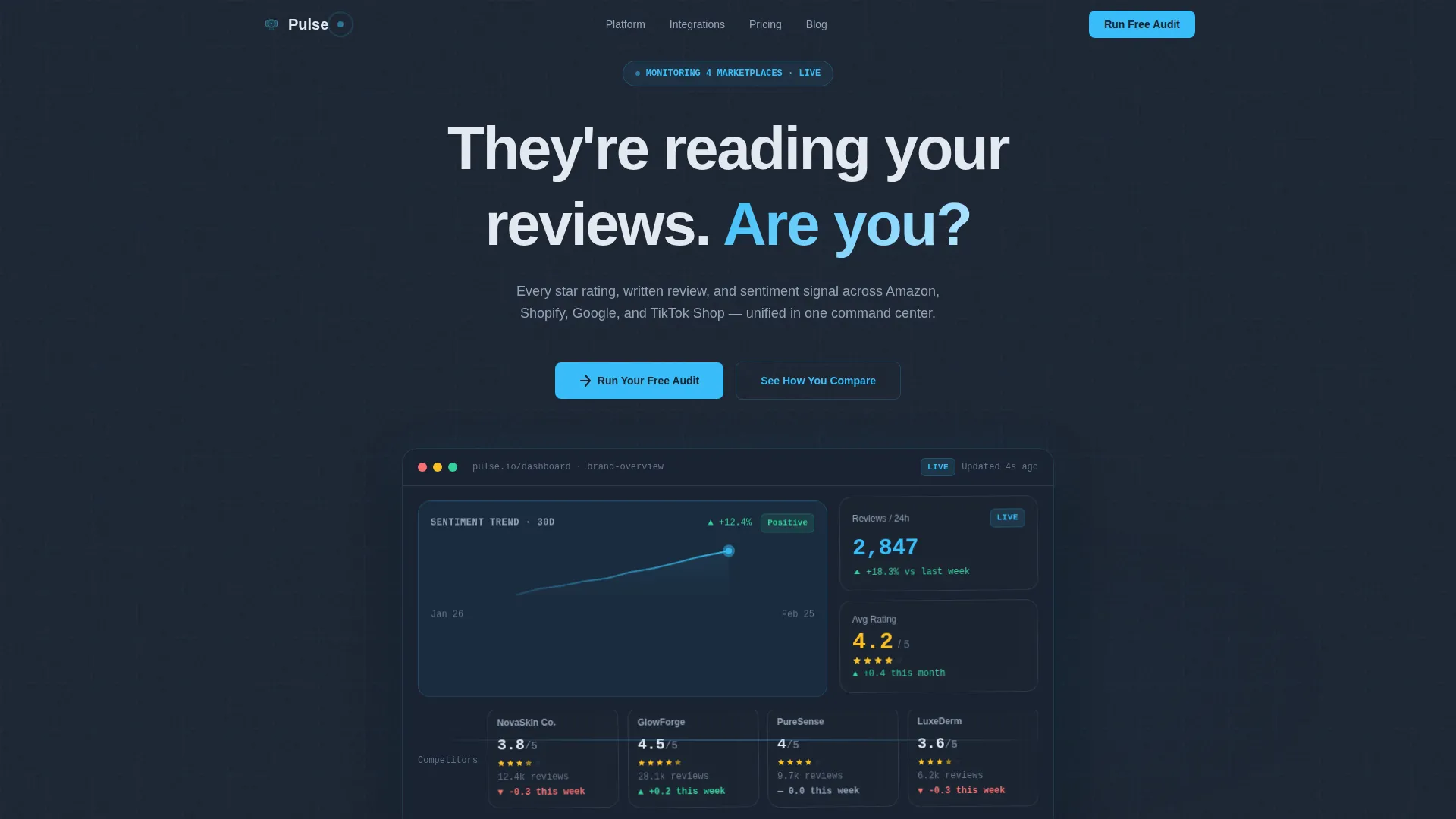
- A hero section with a pulsing radial glow, a floating live-styled dashboard fragment, and a headline designed to create immediate recognition
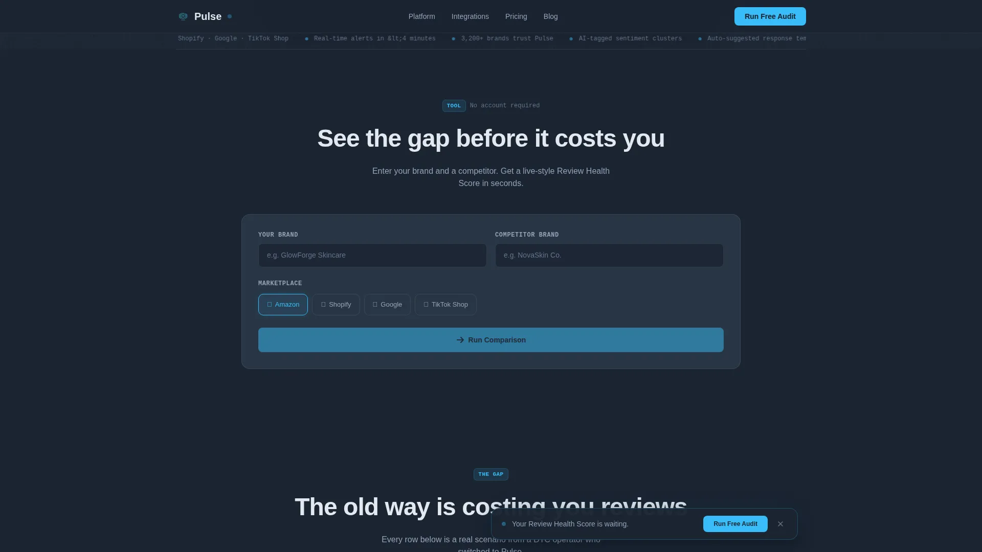
- An embedded brand-versus-competitor calculator with a side-by-side scorecard output covering average rating, review volume, sentiment breakdown, response rate, and a Review Health Score out of 100
- A complete six-section page flow ending in a low-friction audit form with store URL input, marketplace icon toggles, and work email field
Feature list
The following built-in capabilities are included in the Pulse template layout.
Interactive Comparison Calculator
Placed directly below the hero fold, this tool lets visitors enter their brand and a competitor, select a marketplace, and instantly see a side-by-side scorecard. The output includes average rating, review volume, sentiment breakdown, response rate, and a Review Health Score out of 100. It delivers a personalized data snapshot before the visitor reads a single section of copy.
Old Way versus Pulse Way Data Grid
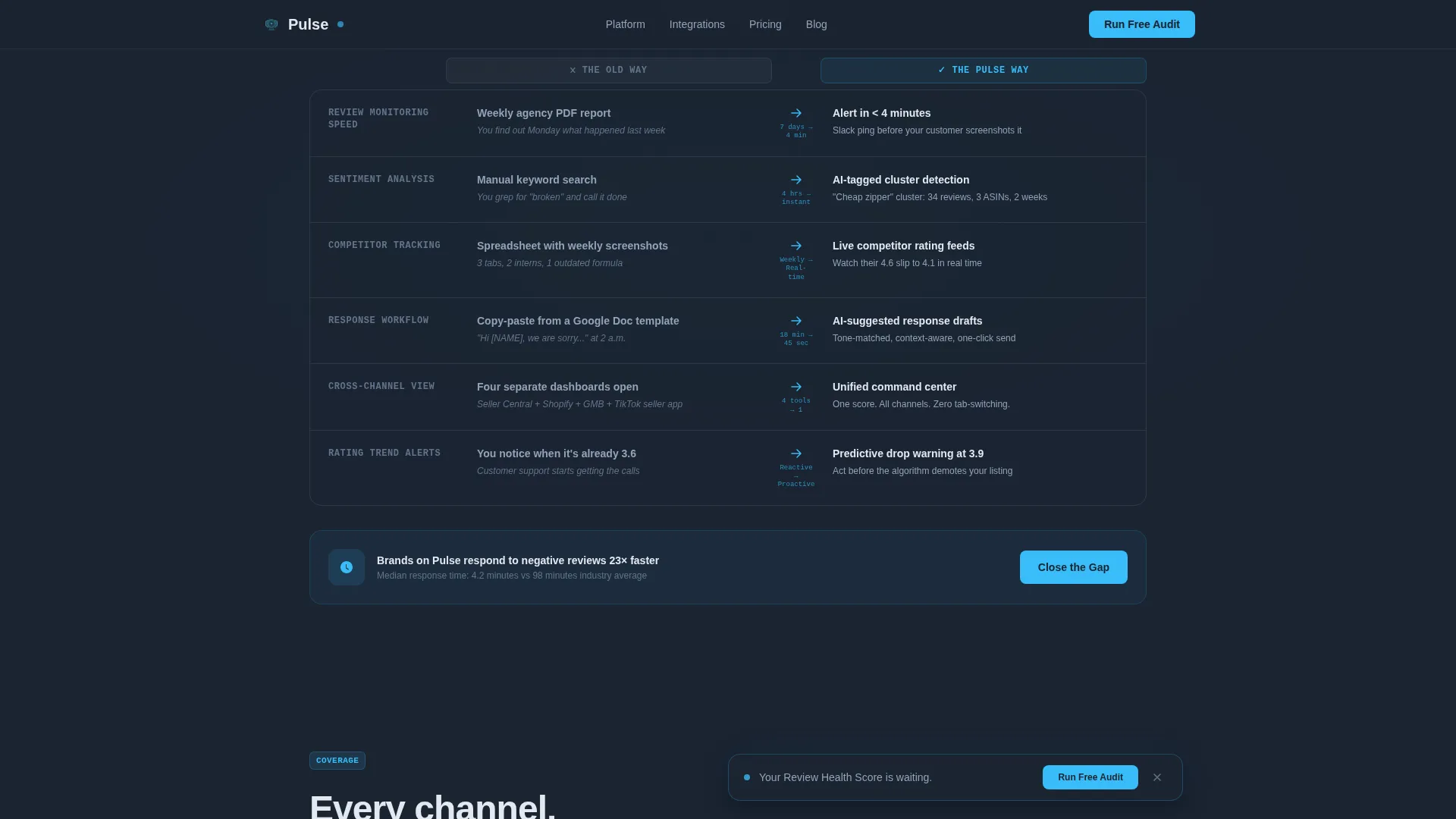
A structured comparison section replaces paragraphs with side-by-side data grids. It contrasts manual workflows like spreadsheets, weekly agency reports, and manual Seller Central checks against real-time alerts, AI-tagged sentiment clusters, and auto-suggested response templates. Every claim carries a number, no vague assertions.
Pulsing Hero with Live Dashboard Fragment
The full-bleed header sits on a deep carbon slate background with a soft radial sky-blue glow that pulses once on page load. Floating inside the glow is a live-styled dashboard fragment showing a sentiment trend line, a review velocity counter, and three competitor columns with star ratings, review counts, and weekly movement arrows.
Sticky Audit Call-to-Action Bar
After the first scroll interaction, a sticky bar appears at the top of the viewport with the primary "Run Your Free Audit" call to action. This keeps the conversion path visible throughout the entire page scroll without interrupting the reading experience.
Platform Bento Feature Block
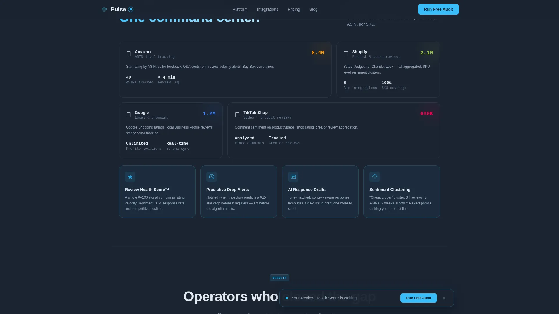
An asymmetric bento-style layout displays coverage across Amazon, Shopify, Google, and TikTok Shop in a single visual grid. Each panel is styled as a data card, consistent with the dashboard aesthetic established in the hero.
Metric-Heavy Social Proof Section
The social proof section uses operator testimonials anchored by specific outcome numbers and role labels rather than generic quotes. This section is designed to build trust through precision, not volume.
Page sections overview
| Section | Purpose |
|---|---|
| Hero with Glow | Establishes atmosphere, surfaces live-styled dashboard fragment, delivers headline |
| Comparison Calculator | Lets visitors score their brand against a competitor before reading any copy |
| Old Way versus. Pulse | Data grids contrast manual workflows with real-time platform capabilities |
| Platform Bento Block | Shows marketplace coverage across Amazon, Shopify, Google, TikTok Shop |
| Social Proof | Metric-driven operator testimonials that reinforce specific outcome numbers |
| Audit call to action Form | Collects store URL, marketplace selection, and work email with minimal friction |
| Footer | Linear single-row dark footer closing the page |
Design & branding system
The visual identity follows a Data Command theme, dark surfaces that recede so data can float forward. Sky-blue carries every interactive signal; slate absorbs everything else.
- Color palette: deep carbon slate (#1B2432) for panel backgrounds, mid-graphite (#3D4F5F) for card surfaces, sky-blue (#38BDF8) for live data accents and interactive states, and cool cloud white (#E2E8F0) for typography and dividers
- Typography pairing: DM Sans handles all headlines and body copy for clean readability; JetBrains Mono renders all data points, metrics, and numeric outputs for a precise, terminal-grade feel
- Animation system: pulsing radial glow on hero load, count-up numbers for key metrics, an animated SVG sentiment trend line, staggered card reveals on scroll, and a sticky audit bar that appears after the first scroll interaction
Mobile & speed optimization
The template is designed desktop-first to serve operators working on dashboard monitors. Full mobile support is included so the experience holds across all screen sizes.
- The interactive calculator, marketplace icon toggles, and FAQ accordion are all built as client components to keep interactivity sharp without blocking the static content
- Static sections use server-rendered components to keep initial load clean and predictable
- The sticky audit bar, scroll-triggered animations, and bento grid all adapt to narrower viewports without losing the data-command visual tone
How this template helps you convert
The Pulse template is built around a Comparison/Versus conversion strategy. It earns the click by delivering value before asking for anything.
- The comparison calculator at the top of the page gives visitors a personalized Review Health Score immediately, making the problem feel real and specific before any marketing copy appears
- The sticky "Run Your Free Audit" bar stays in view throughout the scroll, so the primary call to action is always one tap away without interrupting the narrative flow
- The audit form uses a three-step low-friction sequence: store URL first, then marketplace toggles, then work email, reducing the barrier to submission at each stage
Other information about this template
Pulse is a single landing page template, not a multi-page website. It is designed for one focused conversion goal: audit form completion. The template is built in English with United States dollar formatting and United States date conventions.
- Animation intensity is high by design: the pulsing glow, count-up numbers, animated SVG chart line, and staggered reveals are all part of the template's core visual identity
- The secondary conversion path uses a ghost-button labeled "See How You Compare to [Competitor]" that re-scrolls the visitor to the calculator section, keeping them engaged rather than bouncing
- A FAQ accordion is included as an interactive element within the page, separate from the social proof and audit sections
- The footer follows a linear single-row pattern in the dark theme, consistent with the overall data-command aesthetic
Theme
Data Command
Creative direction
Calculator/Tool First
Color system
Slate & Sky
Style
Dashboard/Data Grid
Direction
Comparison/Versus
Page Sections
Interactive Brand Versus. Competitor Calculator
Data Grid Comparison Section
Pulsing Hero Dashboard Fragment
Sticky Audit Conversion Bar
Asymmetric Platform Bento Block
Metric-anchored Social Proof Section
Related questions
What type of platform is this template designed to represent?
Can I use this template without the interactive calculator section?
What marketplaces does the template reference in its design?
What is the primary call to action on this landing page?
Is this a single landing page or a multi-page website template?



