Pulse - Precision Feedback Landing Page Template
Pulse is a single-page, comparison-table landing page template built for financial services teams that need structured client feedback loops. It leads with data, earns trust through specifics, and converts through a progressive freemium signup flow. The dark-mode Data Command design feels built for professionals who read spreadsheets before 7 AM.
by Rocket studio
Quick summary
Pulse is a precision-designed, single-page landing page template for financial services feedback request campaigns. It opens with a Feature Tab Switcher, anchors its value in a hard-hitting comparison table, and guides visitors toward a no-credit-card freemium trial. Every section earns the next click with data before asking for a commitment.
Who this template is for
This template is built for financial services professionals who need structured, credible client feedback tools. It speaks directly to the people responsible for relationship quality and compliance documentation.
- Wealth managers tracking Net Promoter Score (NPS) across a client book
- Compliance officers who need documented client sentiment trails
- Fintech product leads who require structured feedback loops that protect established client trust
What problem this template solves
Generic survey tools and manual outreach feel misaligned with the standards financial services clients expect. Response rates stay low, data arrives late, and nothing is audit-ready. Pulse addresses each of those gaps with a landing page that leads with proof.
- Low response rates from clients who distrust impersonal survey tools
- No clear comparison showing why a dedicated feedback platform outperforms manual email
- Conversion friction caused by asking for too much information too early
What you get with this template
You get a single-page landing page that moves a visitor from skepticism to signup through staged evidence. The page is structured to show the data gap first, demonstrate the tool in action second, and request commitment only after the case has been made.
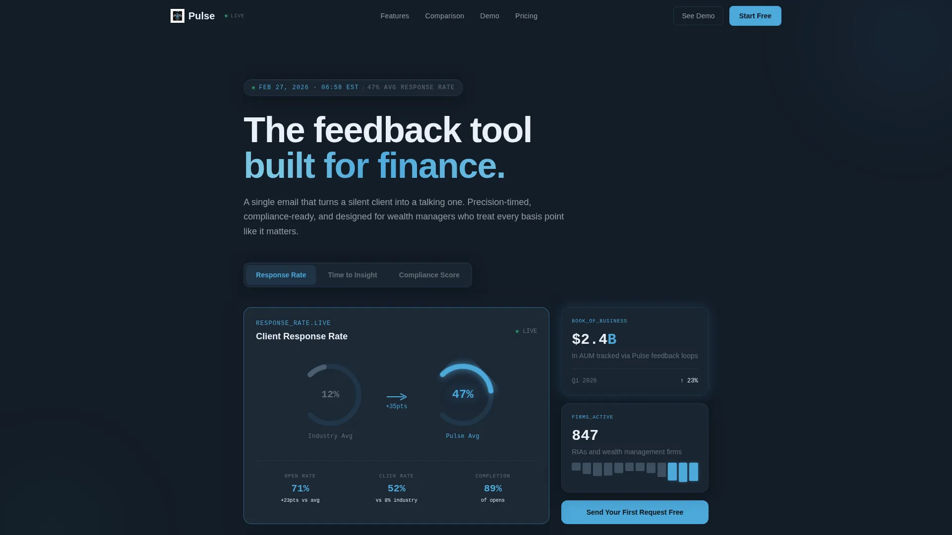
- A Feature Tab Switcher header with three tabs: "Response Rate," "Time to Insight," and "Compliance Score"
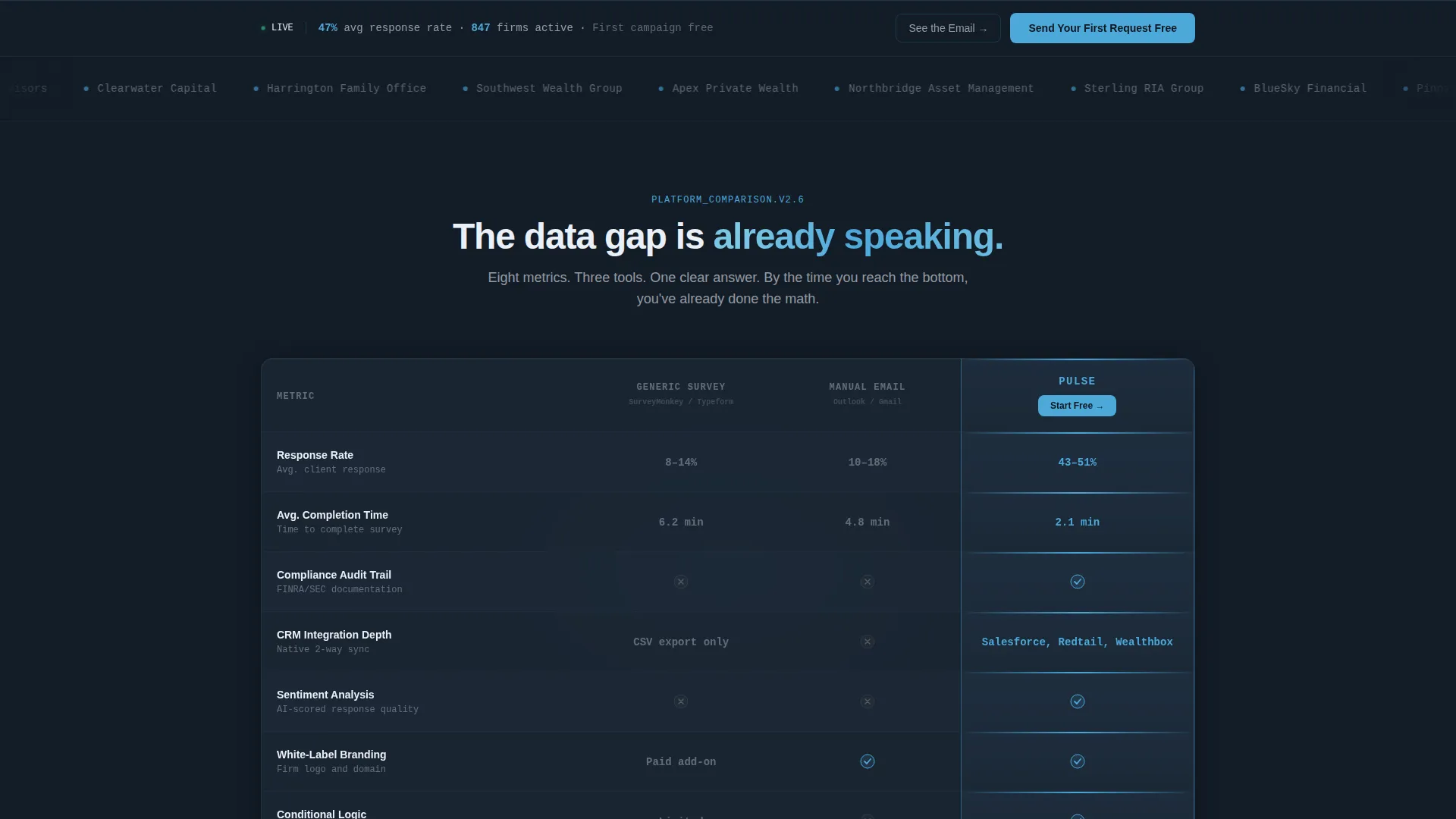
- An eight-row, three-column comparison table contrasting Generic Survey Tool, Manual Email, and Pulse
- Animated email previews and a real-time dashboard mockup showing incoming responses
- A progressive three-field signup form and a secondary "See the Email Your Clients Receive" modal path
- A sticky bottom conversion bar that appears after 40 percent scroll depth
Feature list
This template includes a tightly scoped set of components, each serving a specific conversion role on the page.
Feature Tab Switcher Header
Three clickable tabs let visitors explore "Response Rate," "Time to Insight," and "Compliance Score" independently. The default tab shows an animated response rate gauge moving from a 12 percent industry average up to the platform's 47 percent, rendered with a smooth easing curve and phosphorescent blue numerals on a dark interface.
Eight-Row Comparison Table
The comparison table sits above the fold and benchmarks three options side by side: Generic Survey Tool, Manual Email, and Pulse. It covers response rate, average completion time, compliance audit trail, CRM integration depth, sentiment analysis, white-label branding, conditional logic, and deliverability score. The Pulse column carries a faint stratosphere blue glow to draw the eye without decoration.
Animated Email Preview Section
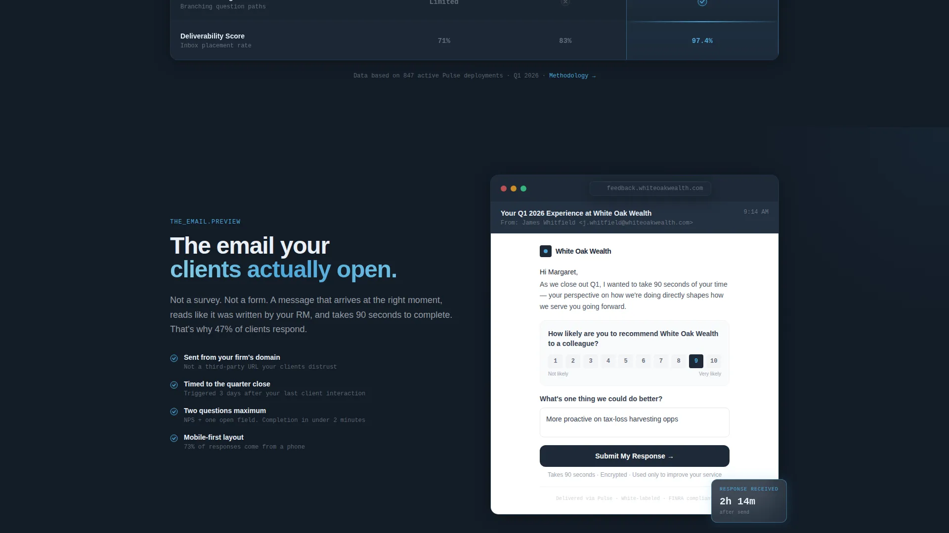
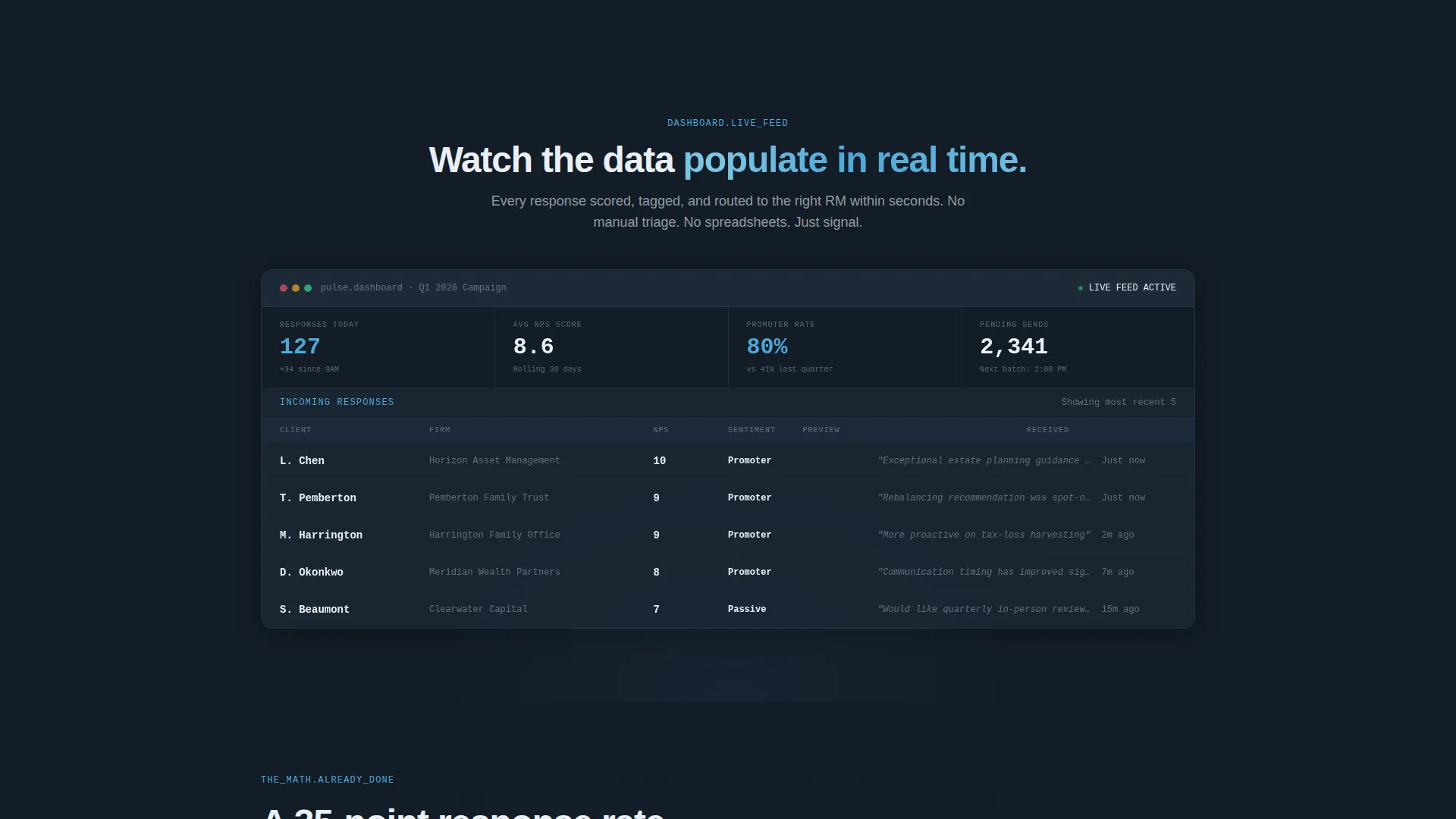
As the visitor scrolls past the comparison, they see the actual feedback request as a recipient would view it in their inbox. This moves the page from argument to demonstration. Following the preview, a dashboard mockup shows responses populating in real time, making the workflow tangible rather than theoretical.
Progressive Freemium Signup Form
The primary signup form asks for three fields in sequence: work email, company name, and number of clients. No credit card is required. The form reduces early friction while still qualifying the lead. The primary call to action reads "Send Your First Feedback Request Free."
Live Preview Modal Path
A secondary conversion path triggers a modal when the visitor clicks "See the Email Your Clients Receive." It requires only an email address to activate. This lower-commitment entry point captures visitors who are not yet ready for the full signup flow.
Sticky Conversion Bar
A sticky bottom bar appears after the visitor has scrolled past 40 percent of the page. It keeps the primary call to action visible without interrupting the reading experience before the visitor has seen the comparison data.
Page sections overview
| Section | Purpose |
|---|---|
| Feature Tab Switcher | Opens with live-data mockups across three metric tabs |
| Comparison Table | Benchmarks Pulse against two common alternatives across eight rows |
| Animated Email Preview | Shows the feedback request exactly as a recipient sees it |
| Dashboard Response View | Demonstrates real-time response population in the platform |
| Freemium Signup Form | Captures leads with three progressive fields, no credit card |
| Live Preview Modal | Secondary conversion path triggered by a single email address |
| Sticky Bottom Bar | Keeps the primary call to action visible after 40 percent scroll |
Design & branding system
The visual identity follows a Data Command theme built on the Slate and Sky color system. The overall feel is a dark instrument panel with precise, glowing indicators, designed to match the professional expectations of financial services audiences.
- Deep charcoal slate (#1E2A38) for primary backgrounds, mid-tone gunmetal (#3D4F5F) for table rows and secondary surfaces
- Stratosphere blue (#4DA8DA) for interactive highlights, active states, and the Pulse column glow in the comparison table
- Pale cloud white (#EAF0F7) for text input fields and breathing room; monospaced typography wherever data values appear
Mobile & speed optimization
The template is structured with a single-page, section-led layout that stays readable on smaller screens. The dark-mode palette and high-contrast type retain legibility without adjustment.
- The sticky bottom bar and modal paths are designed to function within a compact viewport without obscuring key content
- Monospaced data typography and large phosphorescent numerals remain clear at reduced screen sizes
How this template helps you convert
The page is deliberately sequenced to close the knowledge gap before asking for any action. Every section builds on the last, so by the time a visitor reaches the call to action, the case has already been made in numbers.
- The comparison table leads with specifics, showing an eight-row breakdown that lets visitors calculate the value of a 35-point response rate increase for their own client book before scrolling further.
- The animated email preview and dashboard mockup shift the page from argument to evidence, letting visitors see the tool working before they commit to a trial.
- Two conversion paths serve different readiness levels: the three-field freemium form for decision-ready visitors and the single-email preview modal for those who need one more nudge.
Other information about this template
Pulse is designed specifically for financial services feedback request use cases where trust, precision, and compliance visibility matter as much as aesthetics. The template sits inside the Financial Services Email Templates subcategory and is optimized for a freemium trial conversion flow.
- The template style is Comparison Table, making it well suited for any product positioning that needs to win an argument before asking for a signup
- The Stats-First Impact creative direction means proof appears before persuasion, which aligns with how financial professionals evaluate tools
- The Freemium/Trial landing page direction keeps the barrier to entry low while still qualifying leads through progressive form fields
- This template can support campaign pages for client feedback platforms, NPS collection tools, or any financial services software where structured outreach and compliance documentation are selling points
Theme
Data Command
Creative direction
Stats-First Impact
Color system
Slate & Sky
Style
Comparison Table
Direction
Freemium/Trial
Page Sections
Feature Tab Switcher Header
Eight-row Comparison Table
Animated Email and Dashboard Preview
Progressive Three-field Signup Form
Live Preview Modal
Sticky Bottom Conversion Bar
Related questions
Who is this landing page template designed for?
Does this template require a credit card to set up the trial conversion flow?
What makes the comparison table different from a standard feature grid?
How does the secondary conversion path work?
Can this template support products other than a feedback request tool?



