Premium Software & SaaS Professional Website Template
Pulse is a scroll-reveal analytics landing page template built for B2B SaaS teams that need to turn raw data into a single, clean command center. The Void & Violet dark theme, animated KPI tiles, and a Problem-to-Solution narrative arc make it instantly compelling. It is designed to drive leads through a two-step progressive form and a gated demo path.
by Rocket studio
Quick summary
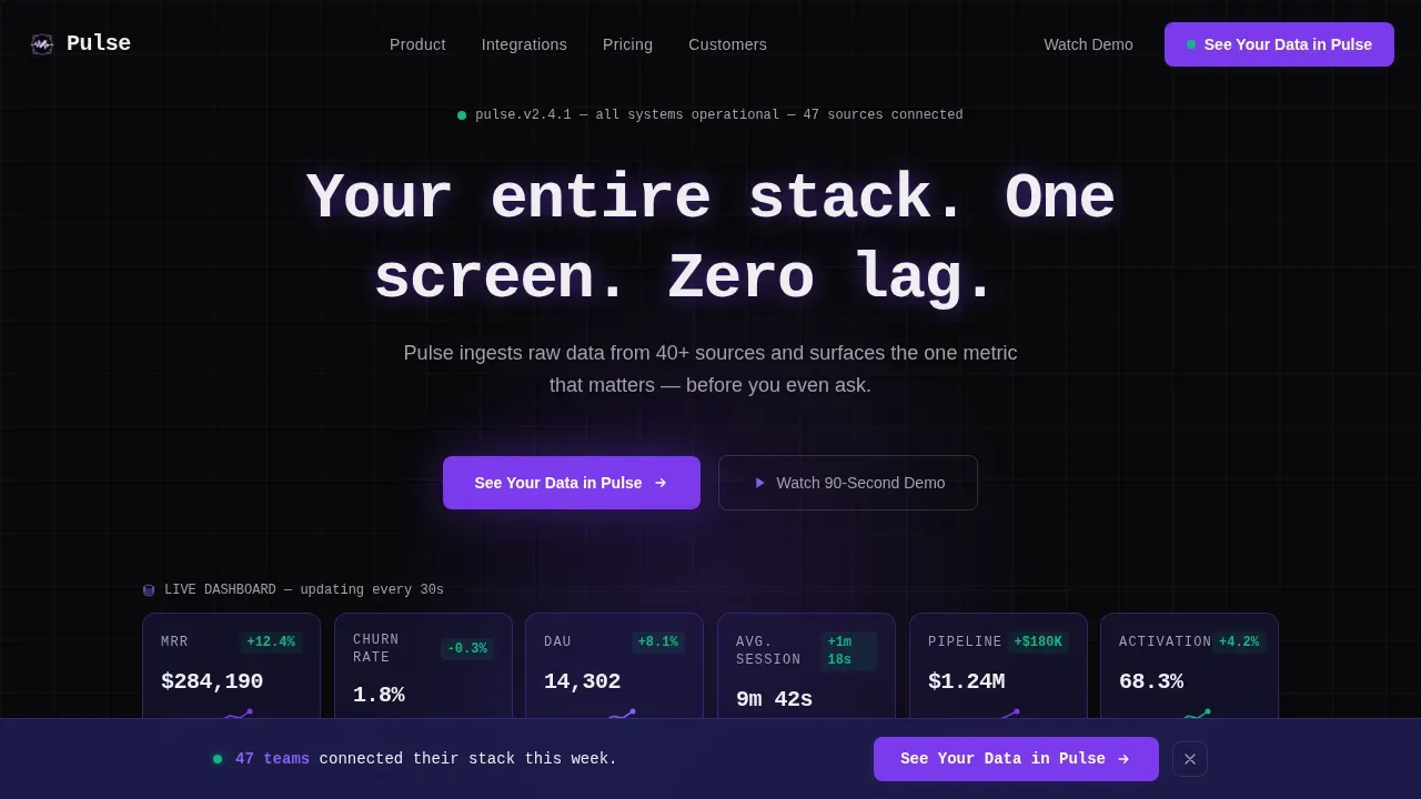
Pulse is a single-page, scroll-reveal landing page template for analytics and business intelligence products. It opens with a live-booting metrics wall, moves visitors through a chaos-to-clarity narrative arc, and closes with a two-step lead generation form. The terminal-dark Void & Violet visual system makes data feel immediate, credible, and worth signing up for.
Who this template is for
This template is built for founders, growth operators, and product teams who sell or position a data product and need a landing page that earns trust before asking for a sign-up. It speaks directly to the people who live inside spreadsheets and dashboards every day.
- Series A founders and growth leads who need to demo the value of unified data analytics fast
- Operations managers preparing board decks who have no time for clunky, multi-tab reporting tools
- Marketing teams and finance teams building custom dashboards for clients or internal stakeholders
What problem this template solves
Most analytics product pages describe features without showing the relief. Visitors arrive already exhausted from juggling disconnected data sources, and a generic hero image does nothing to close that gap. This template solves the credibility and conversion problem at the same time.
- Fragmented data sources mean teams waste hours stitching together Google Sheets, social media exports, and platform reports before a single business decision can be made
- Slow, static landing pages fail to communicate real time data value, leaving visitors unconvinced that the product is worth switching to
- Generic call-to-action flows produce cold leads because they ask for commitment before demonstrating any actionable insights
What you get with this template
You get a fully structured, scroll-reveal landing page template with five major content sections, an animated hero metrics wall, a progressive two-step lead generation form, and a demo gate. Every section is designed to move a skeptical visitor one step closer to conversion by letting the data do the talking.
- An animated stats wall hero that simulates a live dashboard booting up with counter animations, micro-sparklines, and KPI tiles
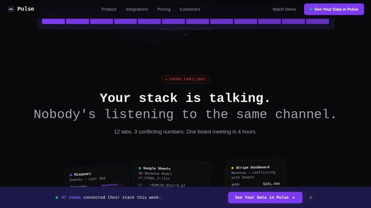
- A Problem-to-Solution Arc layout that takes visitors from a recognizable pain state through pipeline clarity and into a clean dashboard reveal
- A two-step progressive lead gen form with a ghost-button demo path, designed to capture intent at two different readiness levels
Feature list
This template ships with a focused set of design and interaction features, all grounded in the Startup Velocity creative direction and built for lead generation outcomes.
Animated Metrics Wall Hero
The hero section replaces a static image with a living stats wall. Revenue counters tick upward. A churn percentage drops by a decimal. A cohort retention curve draws itself left to right. A monospace typewriter headline completes the effect. Visitors arrive and immediately see the product in motion, which builds trust faster than any stock photograph.
Problem-to-Solution Scroll Arc
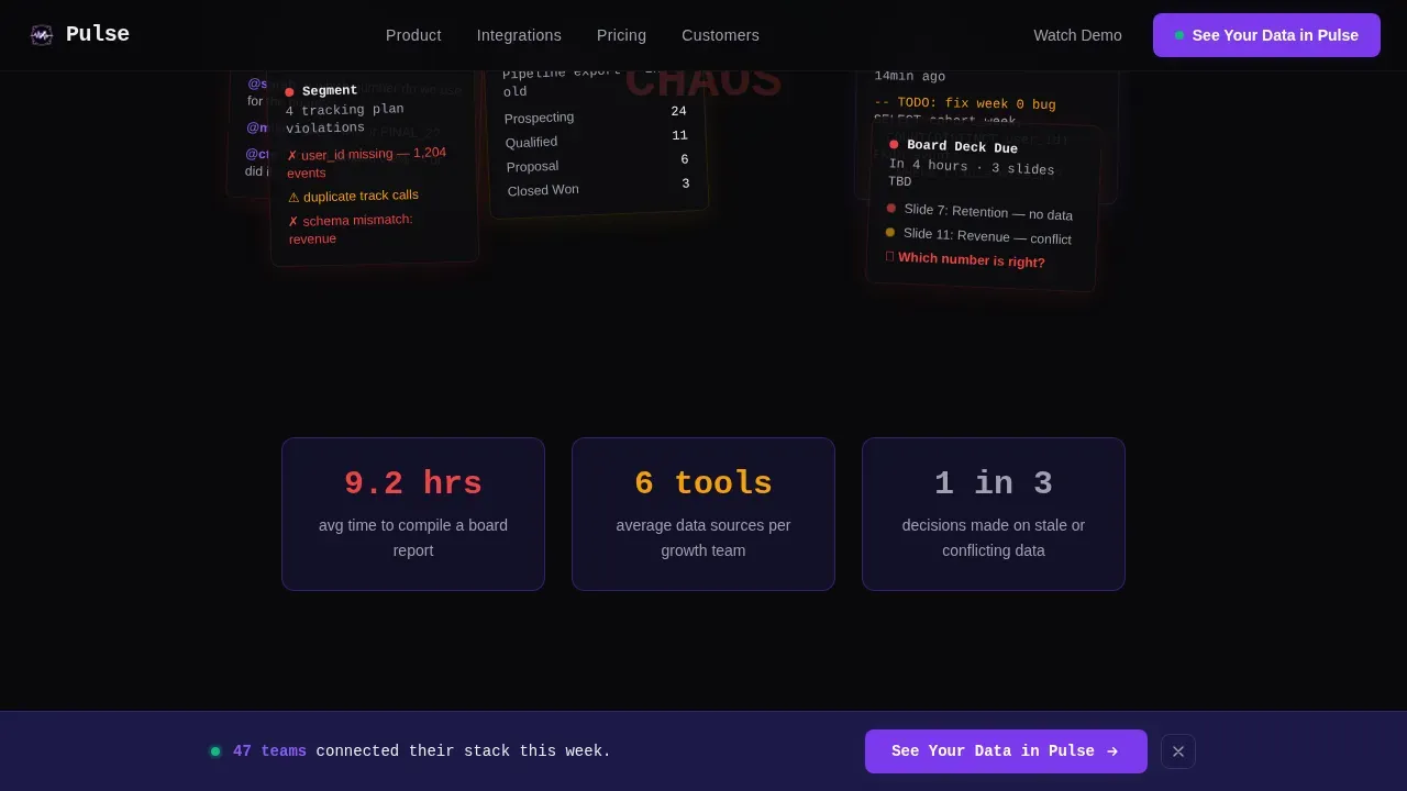
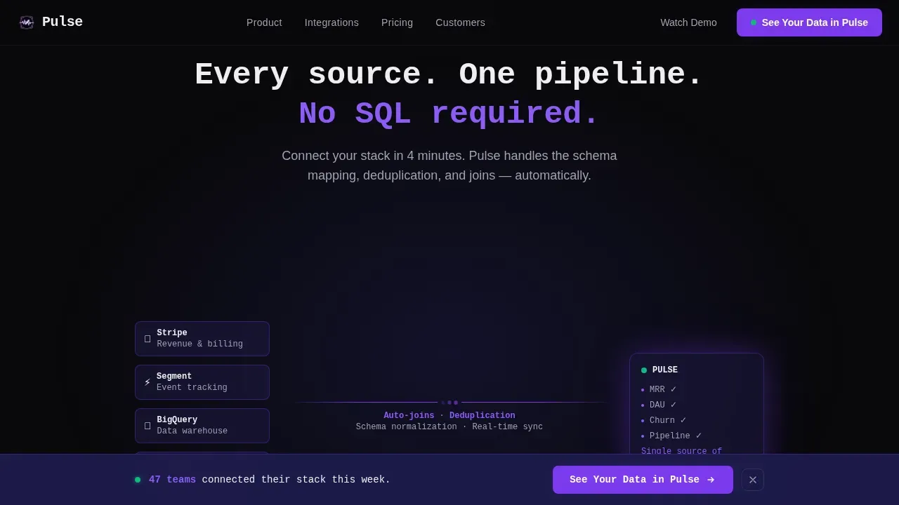
Each scroll reveal strips away a layer of noise. Section one shows the chaotic collage of disconnected tools. Section two collapses multiple data sources into a single pipeline. Section three reveals clean KPI tiles appearing one by one. Section four delivers social proof with a specific metric quote. The structure feels like watching entropy reverse, which keeps visitors engaged all the way to the call to action.
Two-Step Progressive Lead Form
The lead form collects only what it needs, when it needs it. Step one asks for a work email and primary data source from a dropdown that includes options relevant to real workflows. Step two reveals inline, asking for company size and the visitor's biggest reporting pain point. This approach reduces friction and produces higher-quality, more actionable data for the sales team.
Sticky call to action Bar with Dual Path
After the second scroll reveal, a sticky bottom bar appears with the primary call to action. A ghost-button alternative offers a gated 90-second demo for visitors not yet ready to commit, capturing email before playback begins. This dual-path design means neither the ready buyer nor the cautious researcher falls through without leaving contact details.
Scroll-Linked Animation System
Every transition in this template is tied to scroll position using IntersectionObserver and requestAnimationFrame. Counter tick-ups, sparkline draws, tile-reveal staggers, and the chaos-to-clarity transitions all trigger on entry. The result is a page that feels like a live product demonstration rather than a brochure, which is essential for communicating real time insights to a skeptical technical audience.
Social Proof Section with Metric Quotes
The social proof section combines customer logos with a named metric quote and cohort data. A highlighted pull quote, "Cut reporting time from 9 hours to 40 minutes," anchors the value claim with a specific, believable number. Testimonials that cite real metrics consistently outperform generic praise in data-driven decision making contexts.
Page sections overview
| Section | Purpose |
|---|---|
| Hero Metrics Wall | Animate KPI tiles and typewriter headline to open with immediate product credibility |
| Pain State Reveal | Show a cluttered tool collage that triggers recognition in the target visitor |
| Pipeline Collapse | Visualize data sources merging into one stream to communicate simplicity |
| Dashboard Tile Reveal | Stagger clean KPI tiles into view to demonstrate the end state |
| Social Proof and call to action | Deliver metric-backed testimonials and the two-step lead generation form |
| Footer | GitHub Developer Minimal pattern with nav links and compliance signals |
Design & branding system
The visual identity uses the Void & Violet color system, which pairs absolute void black with deep space indigo and electric violet accents. This palette is designed to feel like a terminal screen at 2 a.m. when everything is finally working. It reduces eye strain during extended viewing, which matters when your audience lives in dark-mode environments.
- Colors: void black (#09090B) for backgrounds, deep space indigo (#1E1B4B) for surface layers, electric violet (#7C3AED) for primary accents and interactive states, cool phantom white (#EEEEF0) for typography and data labels
- Typography: JetBrains Mono for headlines and data values to reinforce the terminal aesthetic; DM Sans for body copy to keep readability comfortable at paragraph length
- Layout: F-pattern visual hierarchy with primary KPI tiles placed at the top-left, high-contrast call to action buttons in electric violet positioned clearly above the fold, and ample spacing to reduce cognitive load
Mobile & speed optimization
The template is built desktop-first, reflecting the board deck preparation context of its target audience. Founders and operations managers preparing reports are overwhelmingly at a desk. The animation system uses CSS scroll-behavior and IntersectionObserver to keep transitions smooth without heavy JavaScript overhead.
- Scroll-linked animations use IntersectionObserver for entry triggers and requestAnimationFrame for counter updates, keeping the animation loop efficient
- The sticky call to action bar and two-step form are structured to degrade gracefully on smaller viewports without losing the conversion flow
- Font and color choices maintain strong contrast ratios across different display types, from high-brightness monitors to calibrated studio screens
How this template helps you convert
This template is engineered around a single conversion goal: getting a qualified lead into the "See Your Data in Pulse" form. Every design and copy decision supports that outcome.
- The animated hero builds immediate credibility by showing a working dashboard concept before a single word of copy is read, which shortens the trust gap for data-driven visitors who need to see it to believe it
- The Problem-to-Solution Arc keeps visitors scrolling by matching their lived experience section by section, so by the time the lead form appears, they feel understood rather than sold to
- The dual-path call to action captures both the ready buyer and the cautious researcher, meaning the form completion rate is supported by two entry points instead of one
Other information about this template
This template is positioned to work naturally alongside the ecosystem of tools that modern analytics buyers already use. The page's data source dropdown references real workflow tools, making the lead form feel contextually accurate rather than generic. The footer follows a GitHub Developer Minimal pattern, which signals technical credibility to a developer-adjacent audience.
- This is the Pulse real time analytics BI dashboard landing page template, built specifically for the analytics and business intelligence niche within B2B SaaS
- The template supports comparison contexts where buyers are evaluating power bi dashboard setups, power bi alternatives, or broader bi tools for their stack
- Teams familiar with power bi, tableau cloud workflows, or tableau mobile delivery will recognize the data model and metrics layer concepts built into the page narrative
- The social proof section references the kind of metric improvements that resonate with anyone who has used tableau pulse or explored tableau pulse metrics to track performance across their organization
- Marketing dashboards, sales funnel reporting, and campaign roi tracking are all valid use cases communicated through the template's section copy and form dropdown options
- The template is also relevant for finance teams and any financial analyst who needs to present monthly data clearly to c level executives without rebuilding reports from scratch
- Google analytics, Google Sheets, and other data sources are referenced in the form dropdown, making the template directly relevant to teams pulling data from multiple channels including social media and product analytics platforms
- The page narrative supports ai powered insights positioning, including the concept of natural language insights that allow users to ask follow up questions in plain language without needing to dig deeper into raw exports
- Pulse ensures the landing page communicates data-driven value from the first pixel, with visual cues like toast-style anomaly alerts and threshold breach indicators built into the dashboard reveal section
- The page is designed for external users evaluating the product as much as it is for internal stakeholders, and the ghost-button demo path accommodates visitors who want to explore tableau pulse style functionality before committing
Theme
Startup Velocity
Creative direction
Problem→Solution Arc
Color system
Void & Violet
Style
Scroll Reveal (Progressive)
Direction
Lead Generation
Page Sections
Animated Metrics Wall Hero Section
Problem-to-solution Scroll Arc Layout
Two-step Progressive Lead Generation Form
Dual-path Sticky Call to Action Bar
Scroll-linked Animation System
Social Proof Section with Metric Quotes
Related questions
What animation techniques does this template use?
Can I change the data source options in the lead generation form?
Who is this template designed for?
Does the template include a working demo video or email gate?
How does the two-step lead form work?



