Real-Time IoT Analytics Dashboard Landing Page Template
Pulse is a card grid landing page template built for industrial IoT analytics platforms. It uses a Carbon Fiber visual system, a Dark Full-Bleed hero with a simulated boot sequence, and modular bento sections covering data ingestion, anomaly detection, and integration proof. A sticky ember-orange call-to-action bar with a three-field lead form drives conversions for operations leads, fleet managers, and infrastructure teams.
by Rocket studio
Quick summary
Pulse is a single-page, card grid landing page template designed for real-time IoT analytics platforms. It combines a mission-control aesthetic with a conversion-focused layout. The template uses deep blacks, electric cyan accents, and ember orange alerts to create an environment where device data feels alive and decision making feels immediate.
Who this template is for
This template is built for B2B technology teams who need to earn trust fast and capture qualified leads from a technical audience. The design speaks directly to people who live inside operational data every day.
- Operations leads at smart factories who need to monitor sensor output and catch anomalies before they become outages.
- Fleet managers tracking thousands of refrigerated devices across multiple time zones who rely on real time dashboards to stay in control.
- Infrastructure CTOs and platform engineers evaluating a new IoT platform for scale, integration fit, and reliability.
What problem this template solves
Industrial IoT teams face a specific credibility problem. Their product processes millions of signals per second, but their landing page often looks like a brochure. Visitors arrive skeptical, scroll for ten seconds, and leave before the value lands. The gap between what the platform does and what the page communicates kills conversions.
- Operations teams need to see the dashboard working, not read a paragraph describing it. Static pages fail to show real time data in motion.
- Engineers evaluating IoT systems want integration proof and latency numbers before they talk to sales. Generic layouts bury that evidence.
- CTOs who have been burned by silent outages need to trust the platform immediately. A weak first impression ends the conversation.
What you get with this template
This template delivers a fully structured landing page ready for a real-time IoT analytics product. Every section is purposeful, and every visual choice reinforces the platform's core promise: fast, clear, actionable data.
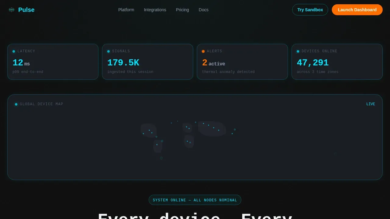
- A Dark Full-Bleed hero section with a simulated boot sequence, live telemetry tick-ups, a world map with device pings, and a typed monospace headline that lands at 11ms latency.
- A modular card grid layout with five distinct sections: ingestion layer, anomaly detection, integration grid, social proof, and a GitHub-style developer footer.
- A sticky bottom bar with a three-field lead capture form (work email, estimated device count, primary cloud platform) plus a secondary sandbox link for engineers.
Feature list
This template is built with specific visual components and conversion mechanics that reflect how industrial IoT buyers evaluate products.
Boot Sequence Hero
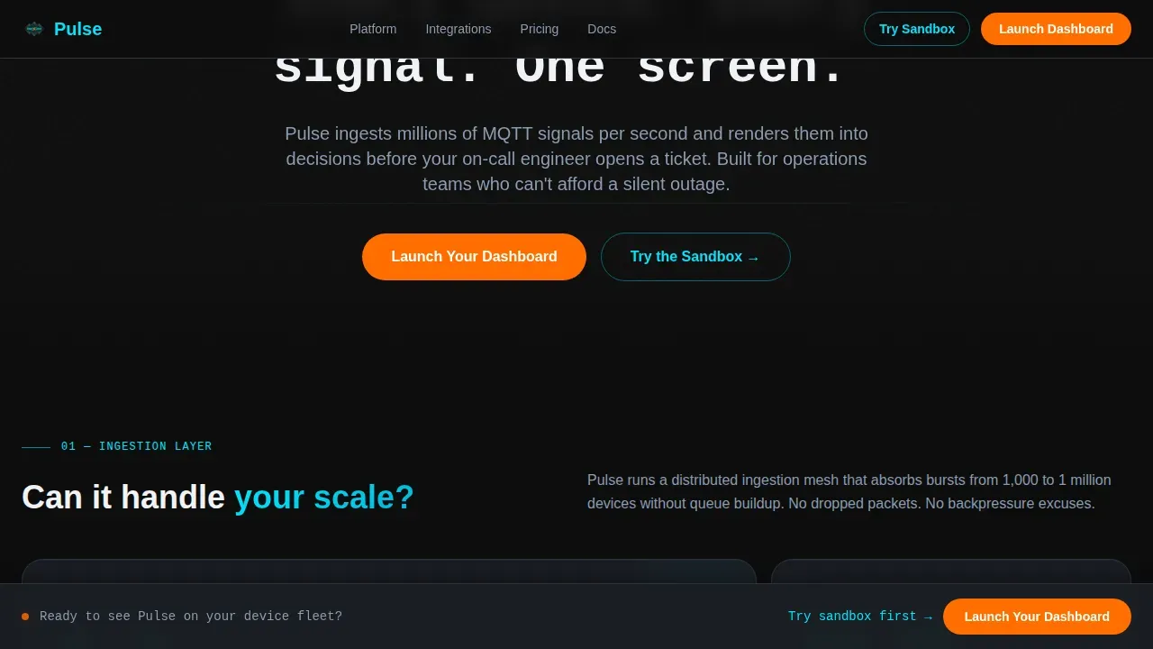
The hero opens on a pure black viewport. A simulated dashboard materializes card by card, each element glowing into view with a soft cyan edge-light as if the system is booting in real time. Telemetry numbers tick upward, a world map blooms with sensor pings, and a latency counter reads 11ms. The headline arrives last, typed out in monospace: "Every device. Every signal. One screen." This boot sequence sets the tone for the entire data flow that follows.
Modular Ingestion Layer Cards
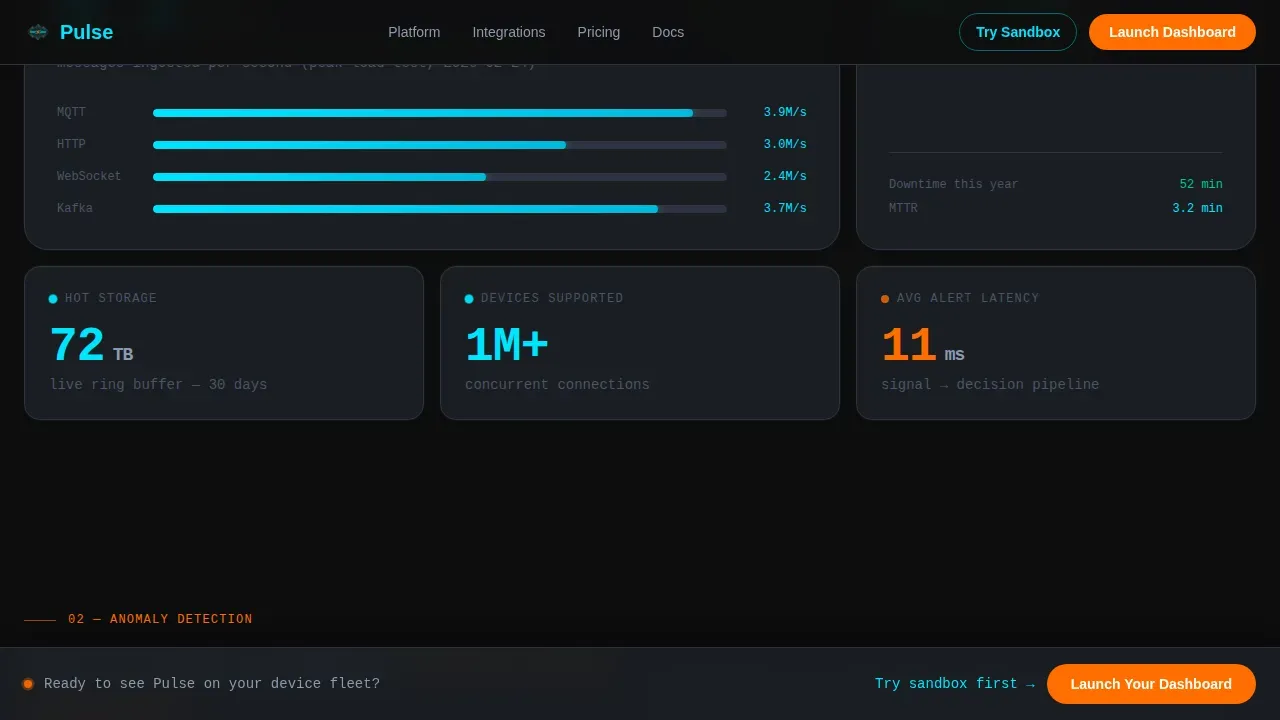
The ingestion section displays raw throughput numbers using animated counter components. Each bento card answers a specific scale question: how many devices are connected, how fast signals are processed, and what data ingestion rates the system sustains. The layout uses IntersectionObserver-triggered card snap reveals, so each metric appears with momentum as the user scrolls.
Anomaly Detection Card with Waveform
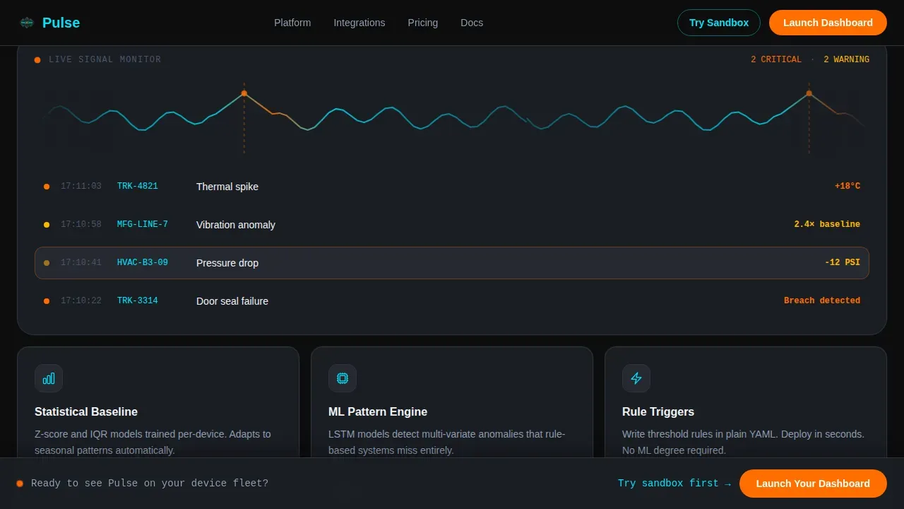
A dedicated card displays a live-style SVG waveform alongside an alert system showcase. Color-coded alerts use ember orange to flag threshold breaches clearly. The section demonstrates how the platform monitors sensor signals, surfaces anomalies, and turns raw device data into actionable warnings. This directly addresses the objection that real time monitoring tools create noise rather than signal.
Integration Grid
The integration section displays a logo wall with AWS IoT, Azure, MQTT (Message Queuing Telemetry Transport), and Kafka to show platform compatibility at a glance. It connects the ingestion narrative to the broader question of whether the IoT platform fits an existing stack. Engineers can query their specific platform match without scrolling past irrelevant copy.
Sticky Lead Capture Bar
A sticky bottom bar uses ember orange to keep "Launch Your Dashboard" permanently visible during scroll. On click, it expands into a three-field form: work email, estimated device count (1K, 10K, 100K, 1M+), and primary platform (AWS, Azure, GCP, or On-Prem). A secondary link to an interactive sandbox gives engineers a path to access the product before talking to sales.
Role-Specific Social Proof
The social proof section includes testimonials formatted for three distinct roles: factory operations leads, fleet managers, and infrastructure CTOs. Each quote references latency figures or uptime numbers to reinforce technical credibility. This pattern of role-specific feedback ensures that actual users from different operational contexts can see themselves reflected in the page.
Page sections overview
| Section | Purpose |
|---|---|
| Dark Full-Bleed Hero | Simulate live boot sequence with typed headline and telemetry |
| Ingestion Layer Cards | Display raw throughput metrics with animated data counters |
| Anomaly Detection Card | Show live waveform and color-coded alert showcase |
| Integration Logo Grid | Prove stack compatibility with platform and protocol logos |
| Social Proof Strip | Build trust with role-specific operational testimonials |
| Sticky call to action Bar | Capture leads via expandable three-field conversion form |
| Developer Footer | Minimal GitHub-style footer with secondary sandbox link |
Design & branding system
The Carbon Fiber visual identity treats the interface like engineered hardware. Every color choice carries a functional meaning: darkness is the default state, cyan confirms activity, and orange demands action. The result feels like a carbon-fiber chassis under UV light, matte and purposeful, interrupted only where something matters.
- Color palette: deep cockpit black (#0D0D0D) for backgrounds, woven graphite (#1A1D23) for card surfaces, electric cyan (#00E5FF) for live-data accents and edge-lights, ember orange (#FF6D00) reserved exclusively for alerts and primary call-to-action elements.
- Typography: JetBrains Mono for all data readouts, headlines, and telemetry displays; DM Sans for body copy and supporting text to maintain readability at scale.
- Animation direction: high-fidelity boot sequence, counter tick-ups on scroll reveal, SVG waveform for the anomaly card, and card snap reveals triggered by IntersectionObserver for a controlled, momentum-building scroll experience.
Mobile & speed optimization
The template is built desktop-first to honor the mission-control aesthetic that operations teams expect on large screens. A mobile fallback ensures the layout remains functional and readable on tablets and smartphones, which matter for on-the-go monitoring scenarios like fleet management.
- CSS animations handle the waveform and card reveals without heavy JavaScript dependencies, keeping the rendering process lightweight and the load sequence controlled.
- IntersectionObserver drives section reveals, so visual components only animate when they enter the viewport, reducing unnecessary processing and preserving scroll performance.
- The card grid layout adapts responsively so that data visualization panels, alert cards, and the sticky call-to-action bar remain accessible on smaller screens without losing the core visual identity.
How this template helps you convert
The layout is engineered around a single conversion goal: lead capture from a technical, skeptical audience. Every section earns the next scroll, and every scroll moves the visitor closer to the form.
- The hero section shows the dashboard working before a single word of copy is read. Live telemetry, a world map of active devices, and a sub-12ms latency counter establish immediate credibility and set the real time standard visitors will measure against.
- The modular card sequence builds a logical argument: the ingestion layer proves scale, the anomaly detection card proves intelligence, and the integration grid proves compatibility. Each section removes a specific objection so that by the time users reach the sticky form, trust is already established.
- Role-specific testimonials and a sandbox link give visitors two low-friction paths forward. Engineers can access the interactive product directly. Decision makers can submit the three-field form and enter the sales process with context already provided.
Other information about this template
This template sits at the intersection of IoT Vertical SaaS and the Technology category, designed specifically for teams building real time IoT dashboards for industrial and operational environments. It reflects current best practices in building real time dashboards for high-scale environments, where data freshness, query speed, and visual clarity all affect whether the platform gets a second conversation.
- The data flow architecture represented in the ingestion and anomaly sections reflects how event driven architectures and message routing systems handle high-frequency sensor streams. Data collection protocols such as MQTT are visually represented in the integration grid.
- The dashboard layout follows an F-pattern scan principle, placing critical metrics and KPIs at top-left so users process the most important information first. Materialized views and drill down interactions are represented as interactive controls within the card structure.
- IoT systems that handle big data streams at scale require specialized approaches to data ingestion, message routing, and query performance. This template surfaces those capabilities visually so that buyers can understand platform depth without reading technical documentation.
- Remote patient monitoring, smart home deployments, and fleet tracking scenarios all benefit from real time IoT dashboards. The template's modular structure can be adapted to represent device data from any of these verticals, including wearable-generated health data for remote patient monitoring programs.
- The integration grid references aws iot core compatibility alongside Azure, MQTT, and Kafka, showing cloud platforms coverage across the most common IoT infrastructure stacks. This matters for platform engineers whose evaluation criteria includes cloud portability.
- Device authentication is shown in context through the integration and security messaging areas. Each device in a real deployment needs unique credentials, and the template creates space for teams to communicate their device authentication and access control story clearly.
- Device management capabilities, predictive models for anomaly forecasting, and machine learning references can be incorporated into the modular card sections as teams customize the template to match their specific IoT platform features.
- For teams concerned about performance bottlenecks at high device counts, the ingestion layer cards are specifically designed to display throughput at the 1K, 10K, 100K, and 1M+ device tiers, directly addressing scale objections from operations buyers.
- The template supports the competitive advantage argument by showing real time analytics in action rather than describing them. When visitors see simulated live data moving at sub-12ms latency, the operational efficiency message lands before any claim needs to be made.
Theme
Startup Velocity
Creative direction
Launch Energy
Color system
Carbon Fiber
Style
Card Grid (Modular)
Direction
Lead Generation
Page Sections
Boot Sequence Hero with Live Telemetry
Modular Ingestion Layer Card Grid
Anomaly Detection Waveform Card
Integration Compatibility Grid
Sticky Three-field Lead Capture Bar
Role-specific Social Proof Section
Related questions
Who is this landing page template designed for?
Does the template include a lead capture form?
Can I adapt the integration grid to show different platforms?
How does the anomaly detection section work visually?
Is this template suitable for verticals beyond smart factories?



