Real-Time Analytics Landing Page Template
Pulse is a single-page, card grid landing page built for a real-time analytics research lab. It opens with an interactive Latency and Throughput Estimator, then unfolds a modular evidence wall of benchmark cards, architecture diagrams, and use-case case studies. The design follows a Data Command theme with an Acid Digital color palette built to signal precision, speed, and technical authority.
by Rocket studio
Quick summary
Pulse is a lead generation landing page for a real-time analytics research lab. It greets visitors with a fully interactive estimator tool, then builds trust through a scroll-driven card grid of benchmarks, architecture diagrams, and client results. The design uses void black, terminal phosphor green, and ultraviolet accents to create a mission control aesthetic that matches the product's promise.
Who this template is for
This template is built for technically sophisticated teams that need to demonstrate streaming data performance to an equally demanding audience. It suits organizations where proof matters more than polish.
- Quantitative finance teams stress-testing signal pipelines before market open
- Adtech engineering teams debugging bid-response latency under live traffic conditions
- IoT platform leads monitoring large sensor networks for anomaly detection
What problem this template solves
Most analytics product pages lead with marketing copy. Pulse flips that by leading with a working tool. The estimator puts real numbers in front of a visitor before they read a single sentence of pitch text, which removes the credibility gap that abstract claims create.
- Visitors arrive skeptical of latency and throughput claims they cannot verify
- Generic landing pages fail to engage engineers who need to see data, not promises
- Traditional lead forms feel intrusive when the product value has not yet been demonstrated
What you get with this template
The template delivers a complete, single-page structure designed around progressive trust-building. Every element from the header tool to the final call to action is designed to move a technical buyer from curiosity to qualified lead.
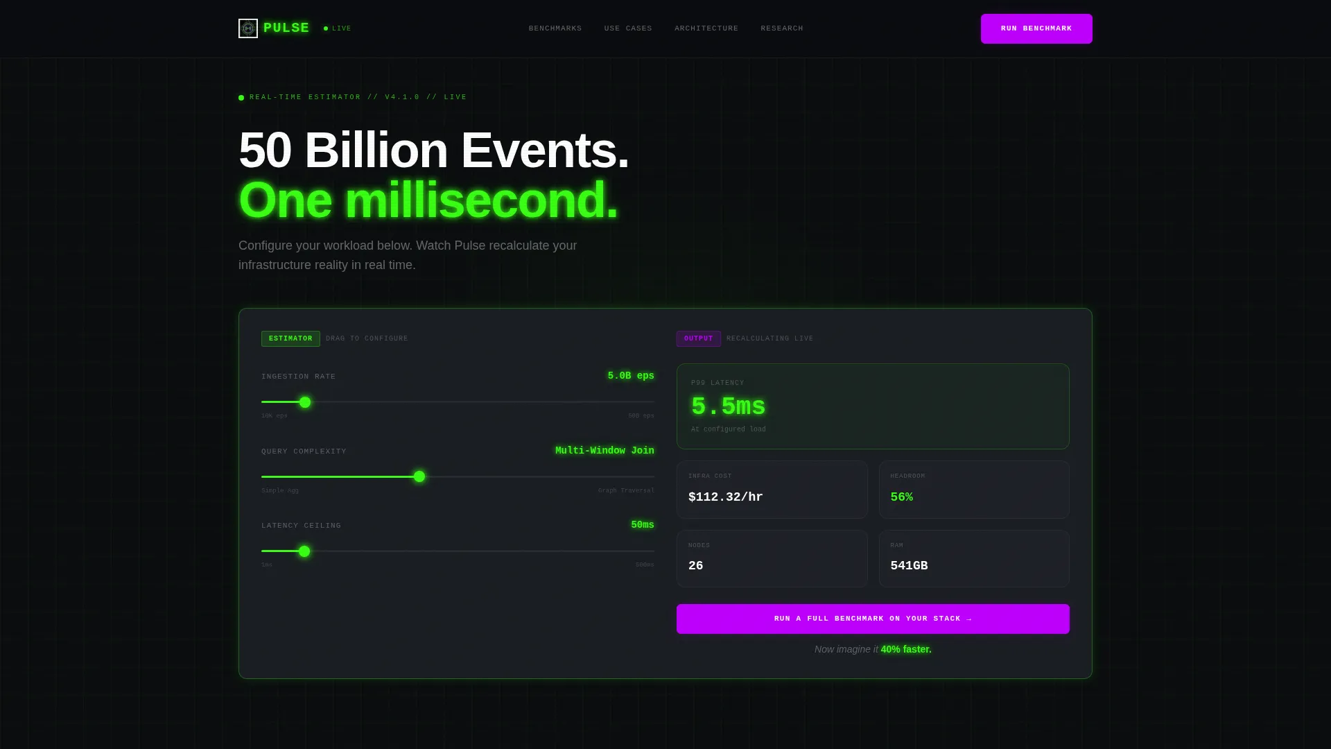
- An interactive three-slider estimator in the header that outputs live infrastructure cost, p99 latency, and throughput headroom estimates
- A scroll-animated modular card grid with benchmark cards, architecture cards, and use-case case studies that materialize row by row
- Two conversion paths: a primary modal form for full benchmark requests and a secondary email-gated whitepaper download
Feature list
This section covers the core functional and visual capabilities built into the Pulse template.
Interactive Latency and Throughput Estimator
Three input sliders sit in the header on a dark glass surface. Visitors adjust ingestion rate (10,000 to 50 billion events per second), query complexity, and acceptable latency ceiling (1 millisecond to 500 milliseconds). As each slider moves, an output card recalculates estimated infrastructure cost, p99 latency, and throughput headroom in real time, with numbers ticking in phosphor green.
Scroll-Triggered Modular Card Grid
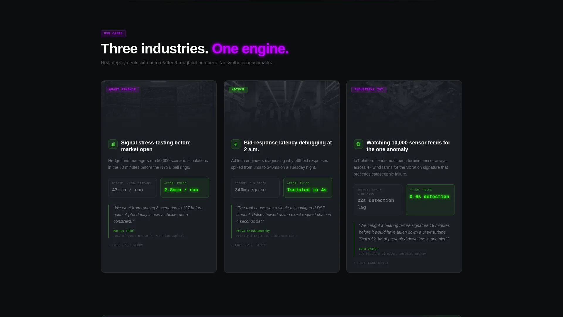
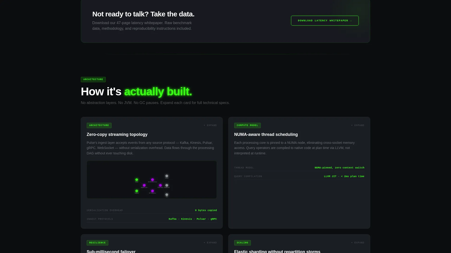
Cards do not load all at once. They materialize row by row as the visitor scrolls, each snapping into place with a micro-animation that mimics data packets arriving. Card types include benchmark comparisons, expandable architecture topology diagrams, and use-case cards that open into mini case studies with before-and-after throughput figures.
Dual Conversion Path System
The primary call to action reads "Run a Full Benchmark on Your Stack" and appears both pinned below the estimator and repeated after every third card row. Clicking opens a focused modal form with three fields: work email, data infrastructure dropdown, and a one-sentence bottleneck description. A secondary path offers whitepaper download gated behind email-only capture for visitors not yet ready to speak with sales.
Acid Digital Color System
The visual identity is built on four specific values: void black (#0B0D0F) for the page base, terminal phosphor green (#39FF14) for live metrics and hover states, ultraviolet (#BF00FF) for calls to action and alert-level callouts, and cold-scan gray (#1A1D23) for card surfaces. Razor-thin 1px phosphor borders glow on hover, reinforcing the live-system feel.
Evidence Wall Architecture
The card grid escalates in content type as the visitor scrolls. It moves from technical benchmark data, to architecture diagrams, to client results, to published research papers. This sequencing is intentional: each row answers "how does it work" before the next row answers "prove it worked for someone else."
Pre-Validated Lead Modal Form
The benchmark request modal captures work email with corporate domain pre-validation, a dropdown for data infrastructure type (supporting multiple streaming platforms), and a free-text field for bottleneck description. This focused form structure reduces friction while qualifying leads before they reach a sales team.
Page sections overview
| Section | Purpose |
|---|---|
| Estimator Header Tool | Engage visitors immediately with interactive throughput and latency calculations |
| Tagline Fade-In | Deliver the product promise with a single fading line of text after estimator interaction |
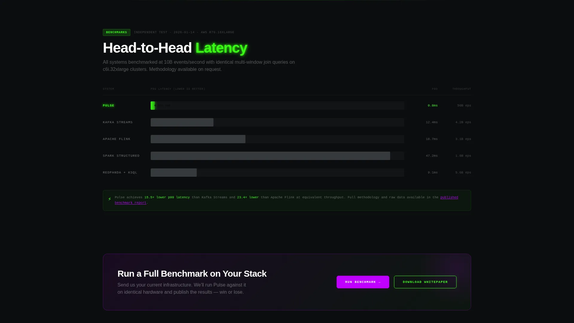
| Benchmark Card Row | Show head-to-head latency comparisons using modular data cards |
| Architecture Card Row | Present expandable topology diagrams for infrastructure transparency |
| Use-Case Card Row | Open mini case studies with before-and-after throughput numbers |
| Repeated call to action Strip | Reinforce the primary call to action after every third card row |
| Research Paper Row | Link to published papers as the final credibility layer on the evidence wall |
| Whitepaper Download | Offer secondary conversion for visitors not ready for a sales conversation |
| Benchmark Request Modal | Capture qualified leads through a focused three-field form |
Design & branding system
The design theme is Data Command, executed through the Acid Digital color system. The overall aesthetic evokes a CRT oscilloscope in a dark lab: electric, high-contrast, and alive with motion. Every visual decision reinforces the idea that the product processes data faster than a human can read it.
- Color palette: void black (#0B0D0F) base, phosphor green (#39FF14) for all live data elements, ultraviolet (#BF00FF) for calls to action, cold-scan gray (#1A1D23) for card surfaces, and muted silver (#A0A4A8) for body text
- Card styling: cold-scan gray backgrounds float over the void with razor-thin 1px phosphor green borders that glow on hover, creating depth without visual noise
- Motion design: scroll-triggered card materialization mimics data packet arrival, while slider interactions drive real-time number updates in phosphor green
Mobile & speed optimization
The modular card grid structure is inherently responsive. Cards reflow naturally at smaller breakpoints, and the slider estimator is designed to remain usable on touch interfaces. The row-by-row materialization animation scales down gracefully so mobile visitors still experience the progressive reveal without layout breakage.
- Touch-compatible slider inputs allow mobile visitors to interact with the estimator without requiring a mouse
- Card grid reflows from multi-column to single-column on smaller screens, keeping benchmark and case study content readable at any size
- Modal form fields are spaced for thumb-friendly tap targets, reducing friction for mobile lead capture
How this template helps you convert
The conversion strategy in Pulse is built on the principle that demonstration creates more trust than description. The estimator is not decoration; it is the first persuasion layer.
- The interactive estimator puts real, personalized numbers in front of the visitor before any copy asks them to trust the product, making the subsequent benchmark form feel like a logical continuation rather than a cold ask.
- The escalating card grid builds an evidence wall that moves from technical proof to client results to published research, so by the time a visitor reaches the repeated call to action, they have accumulated multiple independent reasons to act.
- The secondary whitepaper download path captures visitors who are not yet ready for sales contact, keeping them in the funnel with minimal commitment required.
Other information about this template
Pulse is built as a single-page lead generation landing page, not a multi-page site. All content flows vertically in one continuous scroll experience. The template is categorized under Technology, specifically within the Real-Time Analytics Technology subcategory, and is designed for the Real-Time Analytics Research Lab niche.
- The creative direction is Calculator and Tool First, meaning the interactive estimator functions as the primary trust-building mechanism before any written copy appears
- The template style is Card Grid (Modular), which means individual proof-point cards can be updated, reordered, or replaced without restructuring the full page layout
- The header concept is a Calculator and Estimator, a pattern particularly effective for technical buyers who respond to data before messaging
- Teams evaluating streaming data infrastructure platforms such as Kafka, Kinesis, Pulsar, and Redpanda will recognize the dropdown options in the lead modal as directly relevant to their existing stack
Theme
Data Command
Creative direction
Calculator/Tool First
Color system
Acid Digital
Style
Card Grid (Modular)
Direction
Lead Generation
Page Sections
Interactive Latency and Throughput Estimator
Scroll-triggered Modular Card Grid
Dual Conversion Path System
Acid Digital Color System
Evidence Wall Card Sequencing
Pre-validated Lead Capture Modal
Related questions
Who is this landing page template designed for?
Can I adjust the slider ranges in the estimator?
What are the two conversion paths available on this page?
How does the card grid build credibility as visitors scroll?
Does the template include a defined visual identity or do I need to supply my own?



