Event Tech Vertical SaaS Directory Website Template
Pulse is a bold brutalist landing page template built for event tech analytics platforms. It features an interactive live-dashboard header, a modular card grid styled as an industry report, and a click-through conversion flow. Designed for event directors, agency producers, and trade show organizers, it turns raw event data into a compelling product story that earns the demo click before a single form appears.
by Rocket studio
Quick summary
Pulse is a single-page, card-grid landing page template for real-time event analytics platforms. It opens with a functioning micro-dashboard as the hero, unfolds like a proprietary benchmark report through modular stat and feature cards, and closes with a conversion flow built around a personalized demo rather than a gated form. Every design decision reinforces urgency, authority, and live intelligence.
Who this template is for
This template is built for event technology companies that need to communicate the power of real-time data to a skeptical, data-literate audience. It speaks directly to buyers who live inside event operations and need proof before they commit.
- Event directors managing large multi-track conferences and needing instant visibility across sessions and venues
- Experiential agency producers who must prove return on investment to Fortune 500 sponsors after every activation
- Trade show organizers who need floor-level foot traffic intelligence from the first hour of Day One
What problem this template solves
Most event analytics products are sold through generic SaaS landing pages that list features without demonstrating them. Buyers in this space are sophisticated and skeptical. They have seen dashboards before, and a screenshot does not move them.
- The template replaces static hero imagery with a live interactive preview, so visitors experience the product rather than read about it
- Stat cards anchored to industry-wide benchmarks manufacture urgency by exposing gaps in the visitor's current analytics setup
- The demo-first conversion path removes form friction, routing interested buyers directly into a personalized environment instead of a lead-capture dead end
What you get with this template
You get a fully structured, single-page landing page built around a modular card grid. Every section is pre-designed to a bold brutalist visual standard and organized to guide visitors from curiosity to conversion in a single scroll.
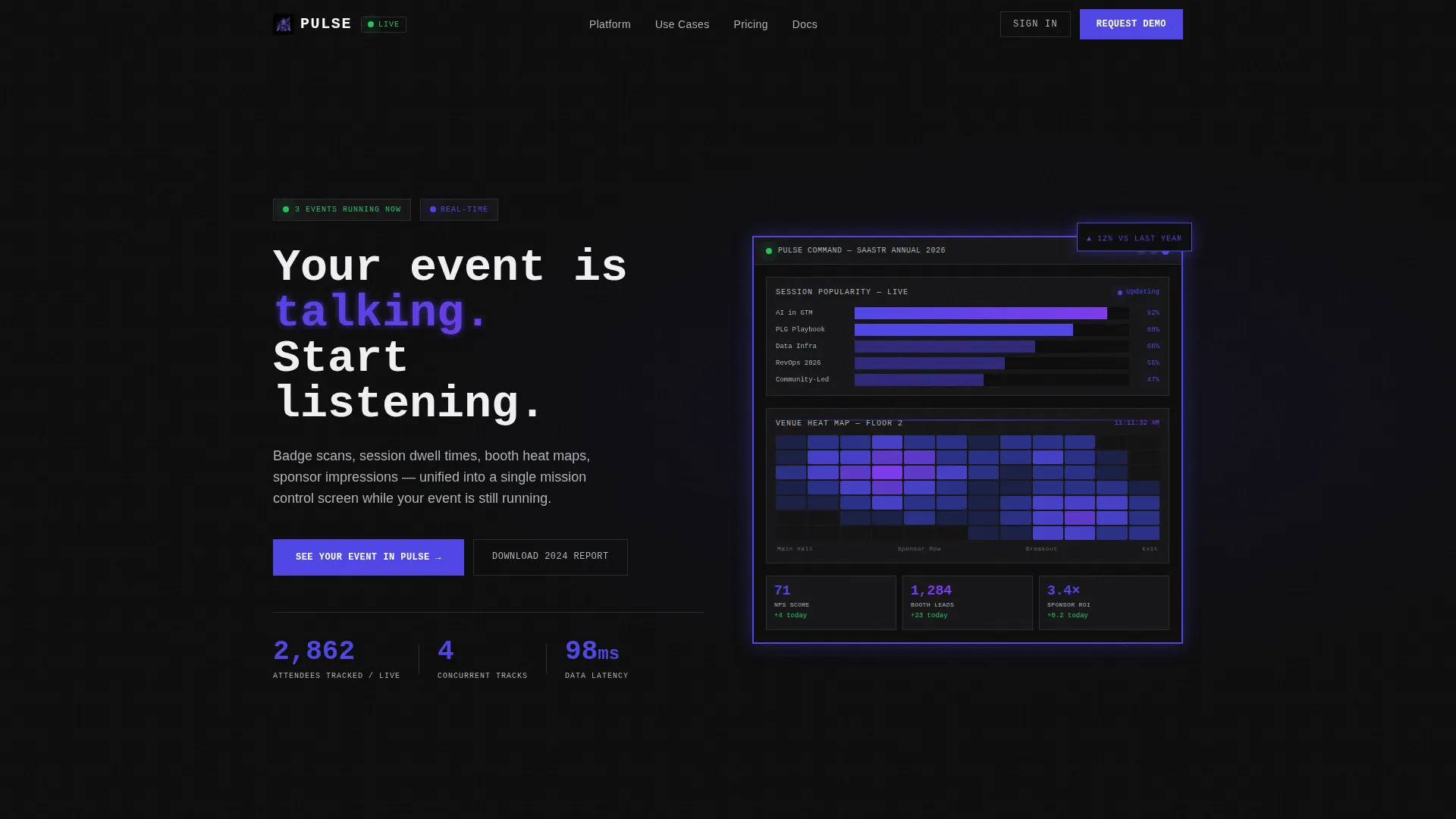
- An interactive header micro-dashboard with simulated live event data, including an attendee counter, a resorting session bar chart, and a blooming venue heat map
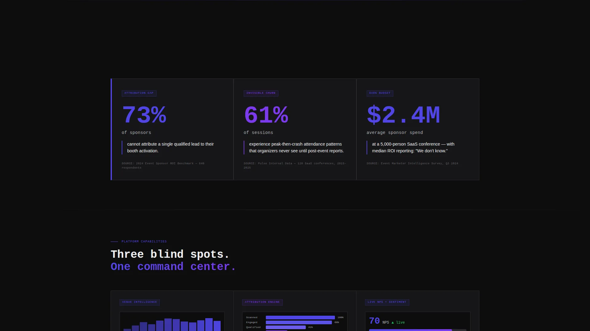
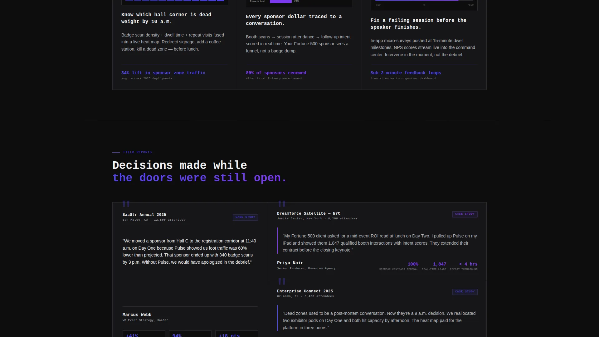
- Three rows of content cards covering industry stat authority, product feature proof, and named case study social proof
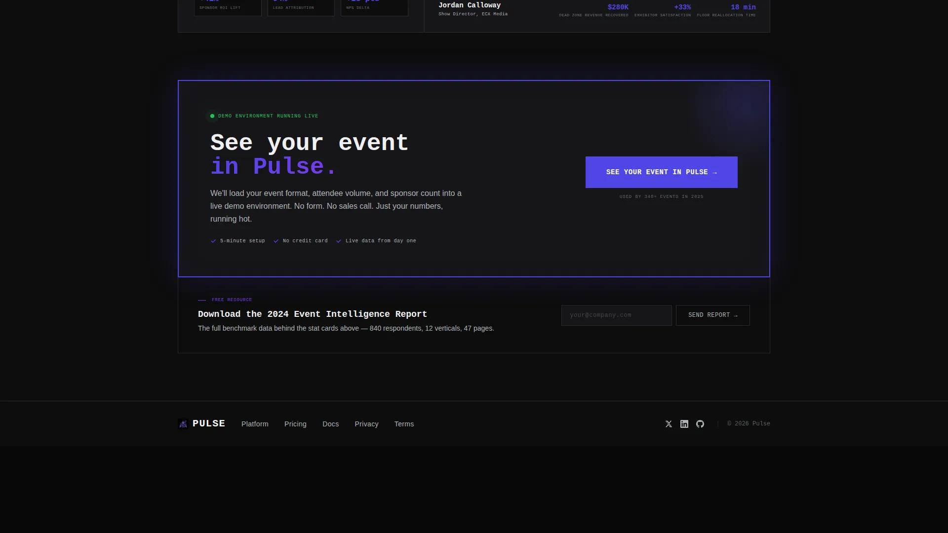
- Two conversion touchpoints: a sticky bottom call-to-action bar and a full-width brutalist conversion block, plus a secondary email-capture offer for a gated benchmark report
Feature list
This template packages several purpose-built components that work together to build trust and drive action.
Interactive Live-Dashboard Header
The header embeds a functioning micro-dashboard directly in the first viewport. Visitors see an attendee count ticking upward, a session popularity bar chart resorting in real time, and a venue heat map transitioning from blue through indigo to violet as foot traffic concentrates. Hovering over data points triggers tooltip population, making the product prove itself before any copy is read.
Modular Stat Card Row
The first content row contains three stat cards presenting industry-wide benchmark numbers. Each card is styled like a page from a proprietary research study, using oversized metric typography and thick indigo borders. The figures establish authority and create urgency by exposing how blind most event setups currently are.
Product Feature Card Row
The second row translates each stat into a direct product answer. Cards cover heat maps, attribution funnels, and real-time net promoter score (NPS) scoring. Each card is a brutalist slab with a single animated micro-chart reinforcing the specific metric being addressed.
Case Study Card Row
The third row presents named events, measurable percentage lifts, and pull quotes from real organizers. This social proof row arrives after the stat and feature rows, so by the time visitors read it, the credibility context is already set and the claims feel earned rather than promotional.
Sticky Conversion Bar
After the second scroll depth, a sticky bottom bar surfaces the primary call to action: "See Your Event in Pulse." It persists as visitors continue reading, keeping the demo path visible without interrupting the research-report scroll rhythm.
Secondary Email-Capture Offer
A secondary call to action offers the "2024 Event Intelligence Report" as a gated download. It captures email addresses from visitors who are not yet ready to book a demo, using the same benchmark data teased throughout the card grid as the value exchange.
Page sections overview
| Section | Purpose |
|---|---|
| Interactive Dashboard Header | Demonstrates live product value in the first viewport |
| Monospaced Headline Block | Anchors brand voice and frames the core promise |
| Industry Stat Cards | Establishes authority and exposes analytics blind spots |
| Product Feature Cards | Maps each stat to a specific Pulse capability |
| Case Study Cards | Delivers named social proof with measurable outcomes |
| Sticky call to action Bar | Keeps the primary demo path visible throughout scroll |
| Full-Width call to action Block | Closes the page with a high-impact conversion moment |
| Email Capture Offer | Captures non-demo-ready visitors via gated report |
Design & branding system
The visual identity follows a bold brutalist design language built entirely around function. No stock imagery, no decorative illustration. Every color and typographic choice carries a specific signal.
- The color system uses deep void black (#0D0D0D) as the primary background, electric indigo (#4F46E5) as the dominant accent across charts and interactive states, cold titanium (#B0B3B8) for secondary type and axis labels, and searing ultraviolet (#7C3AED) reserved for live-data indicators and hover states
- Typography pairs a monospaced headline face for the hero block with oversized metric numerals inside stat and feature cards, creating the visual feel of a live mission control screen
- Borders are thick and deliberate, cards are heavy slabs with no rounded softness, and every element earns its space by carrying data or driving action
Mobile & speed optimization
The card grid layout is modular by design, which means each row and card can reflow naturally across screen sizes without losing the brutalist visual hierarchy. The template is structured for clean adaptation to narrower viewports.
- The interactive header micro-dashboard is scoped to perform within the constraints of a single viewport, keeping the animated components focused and contained
- Modular card rows stack vertically on smaller screens, preserving the research-report reading rhythm and keeping stat typography legible at reduced sizes
How this template helps you convert
Pulse is engineered around a specific conversion philosophy: earn the click by making the visitor feel like they have already used the product. Every section is sequenced to build sunk-cost attention before the demo ask arrives.
- The interactive header creates an immediate product experience, so visitors arrive at the feature cards already engaged and already trusting the data story
- The escalating card grid, moving from industry stats to product proof to named case studies, steadily raises the stakes and makes the visitor's current analytics setup feel more inadequate with each row
- The primary call to action routes to a personalized demo environment rather than a form, removing the commitment barrier at exactly the moment conversion intent is highest
Other information about this template
This template is part of a broader category of event tech vertical software-as-a-service (SaaS) landing page templates designed for high-stakes B2B product marketing. A few additional details worth noting:
- The template style is card grid modular, making it straightforward to reorder, add, or remove card rows as a product's messaging evolves
- The bold brutalist theme and electric indigo color system are intentionally distinctive within the event technology space, where most competitors default to generic blue-gradient SaaS aesthetics
- The creative direction draws on the industry report format, a format familiar to event professionals who regularly consume benchmark studies and sponsor ROI decks
- The landing page is categorized under Technology and the Event Tech Analytics Dashboard niche, making it suitable for positioning products that process badge scans, session dwell times, booth heat maps, and sponsor impression data
Theme
Bold Brutalist
Creative direction
Industry Report
Color system
Electric Indigo
Style
Card Grid (Modular)
Direction
Click-Through
Page Sections
Interactive Live-dashboard Hero
Industry Stat Card Row
Animated Product Feature Cards
Named Case Study Cards
Sticky Demo Call-to-action Bar
Secondary Gated Report Offer
Related questions
Does this template require a live data connection to work?
Can I customize the stat card numbers and case study details?
Who is the primary audience this landing page is designed to reach?
What are the two conversion paths built into this template?
What design style does this template use?



