Software & SaaS Cost Calculator Website Template
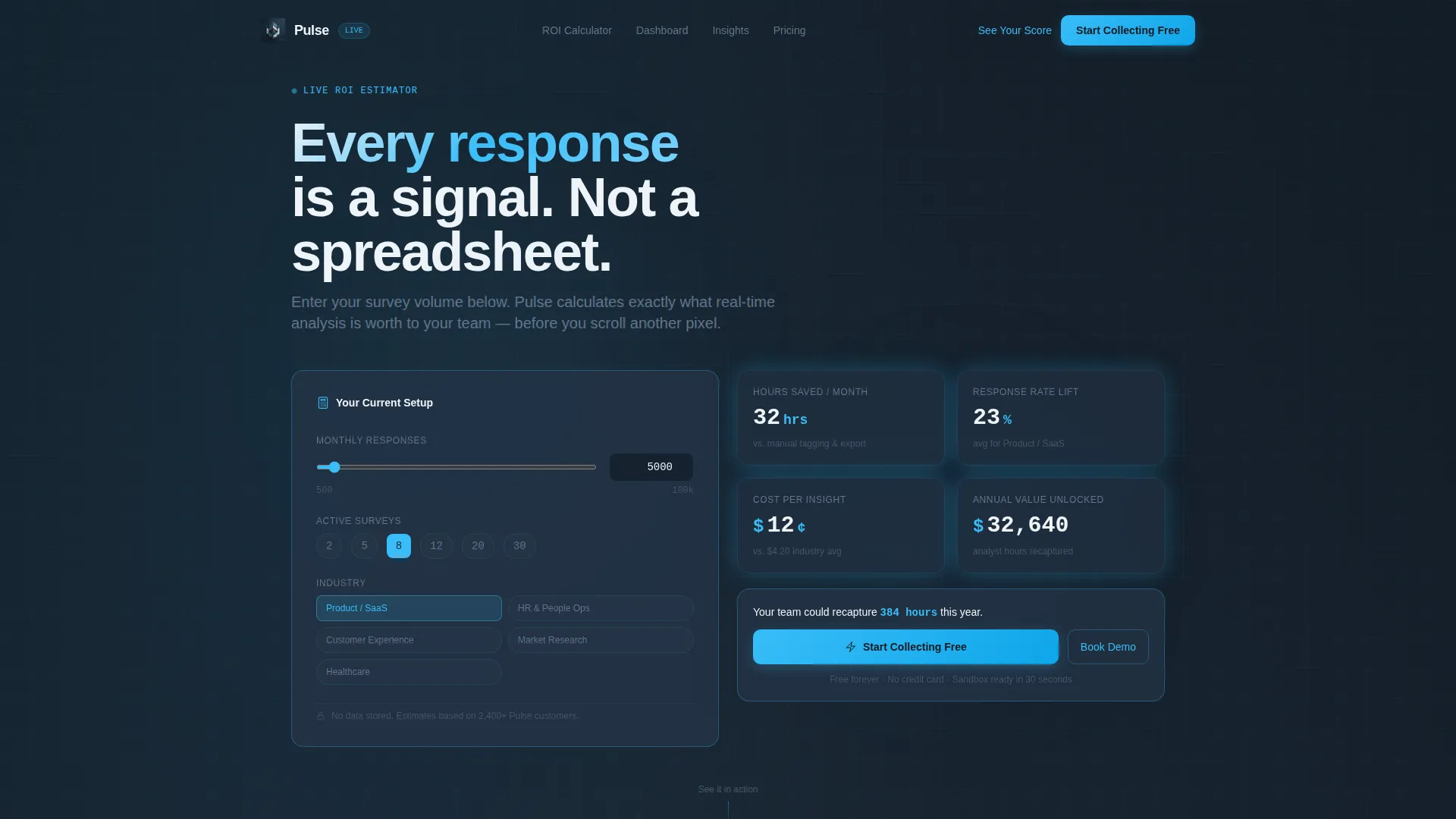
Pulse is a real-time feedback landing page template built for teams who need to turn survey responses into clear, visual insight fast. It features a live ROI estimator in the header, animated industry-report-style scroll sections, a simulated dashboard grid, and a freemium signup flow. The design follows a Tech Glass aesthetic in deep slate and sky blue.
by Rocket studio
Quick summary
Pulse is a single-page template designed for feedback survey tools. Visitors open the page to an interactive ROI calculator that immediately shows projected value. As they scroll, animated research cards and a live dashboard grid build the case. The page closes with a frictionless free-tier signup. Every section is built to move a visitor from curious to converted.
Who this template is for
This template is built for software and SaaS teams that collect structured feedback at scale and need to communicate that value quickly to new visitors.
- Product managers tracking Net Promoter Score (NPS) after a feature release
- HR directors measuring employee engagement across multiple office locations
- Customer experience leads proving that design changes reduced friction in a checkout flow
What problem this template solves
Most feedback tool landing pages describe features in static text. Visitors leave without understanding what they would actually gain. Pulse solves this by making the value calculation personal and immediate.
- Visitors who skip the estimator see generic claims; Pulse gives them a "See Your Score" return path instead
- Teams struggle to justify tool spend without concrete numbers; the ROI panel generates projected savings before a visitor scrolls
- Static pages cannot show a live product feel; the animated dashboard grid simulates exactly what the tool does
What you get with this template
Pulse delivers a complete, structured landing page ready to be customized. Every section is intentional and tied directly to a conversion goal.
- A frosted-glass calculator header that renders personalized ROI output from two simple inputs
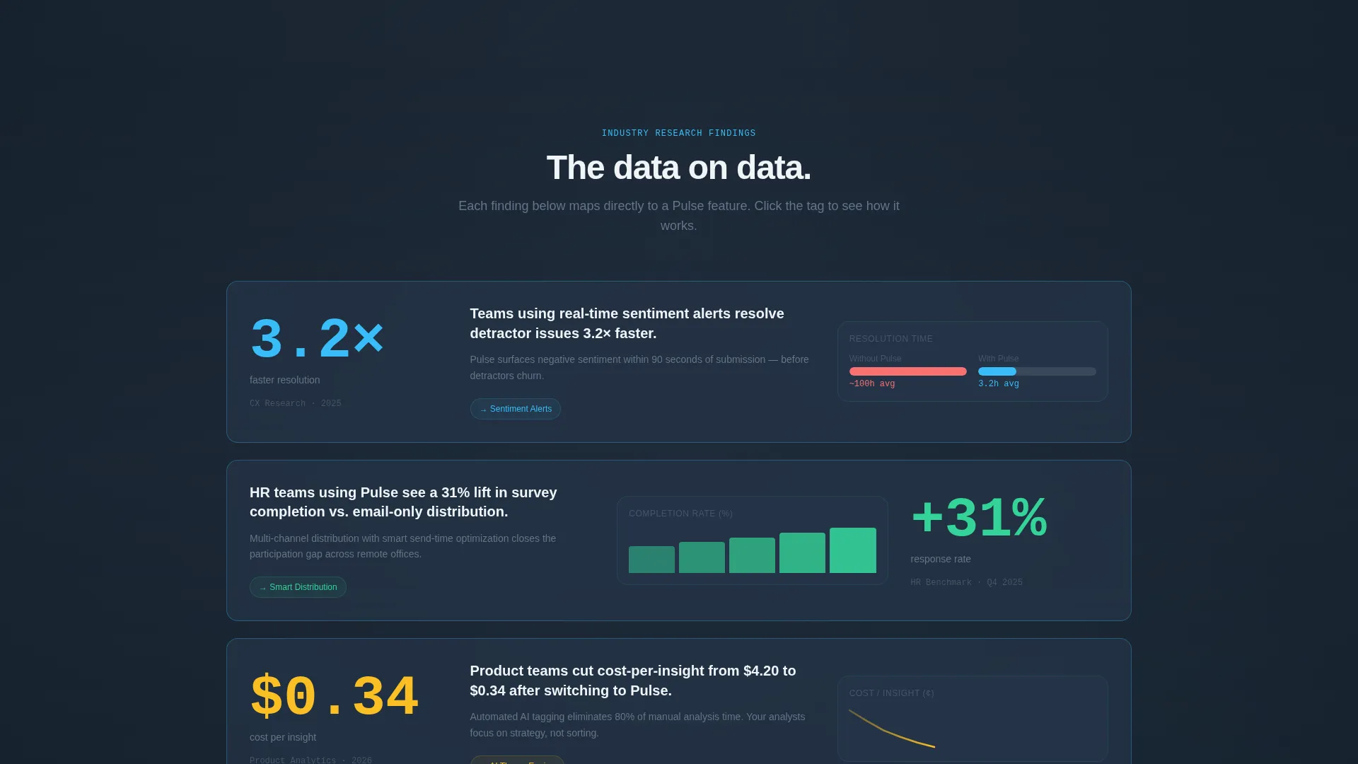
- Scroll sections styled as animated research insight cards with benchmark comparisons
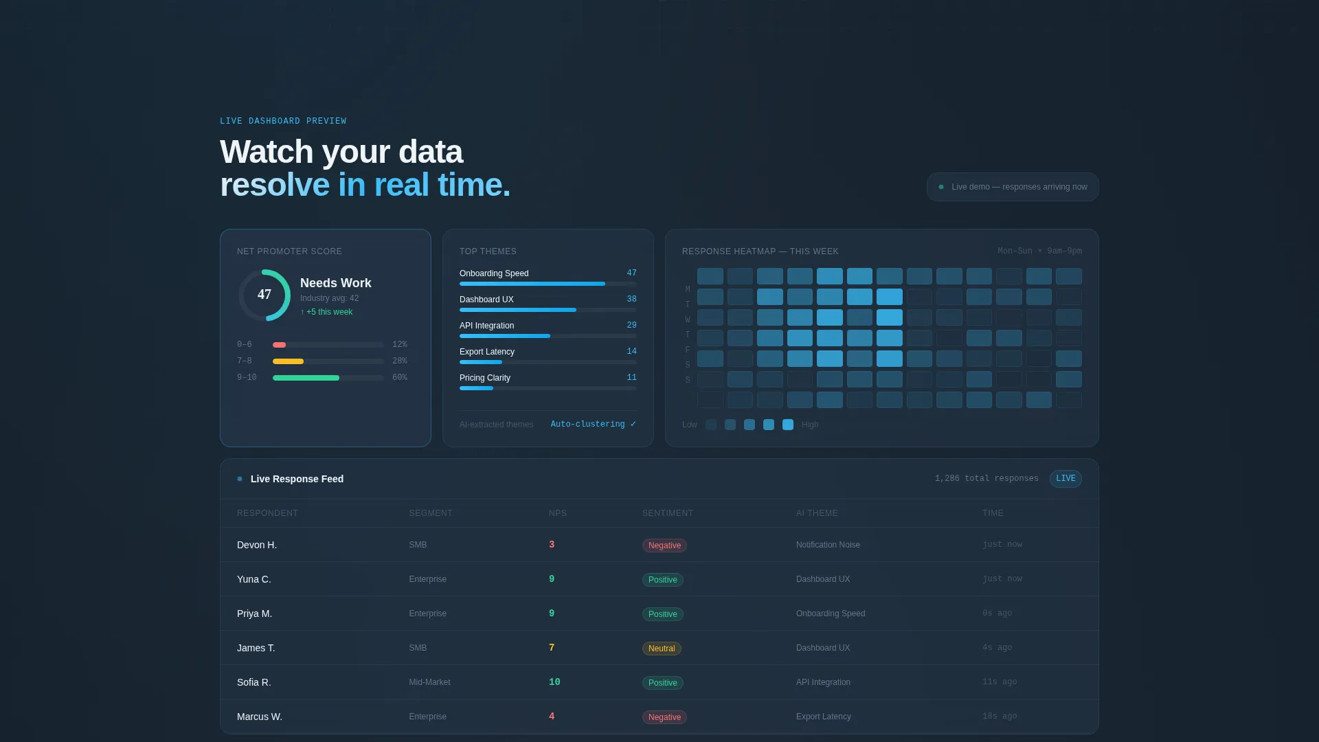
- A simulated dashboard grid that mirrors the visitor's selected industry from the estimator
- A pinned navigation bar with a primary call-to-action and a secondary estimator return loop
Feature list
Pulse is built around a focused set of components, each directly tied to either persuasion or product demonstration.
Live ROI Estimator Header
Visitors enter their monthly response volume and number of active surveys into a frosted-glass input card. The tool instantly calculates hours saved on manual analysis, estimated response rate lift, and cost-per-insight compared to their current stack. The numbers animate upward like a trading ticker, making the value feel immediate and personal.
Animated Industry Report Scroll
Each scroll section presents a data-backed finding as a styled research insight card. Charts animate on entry, and benchmark comparisons slide in from opposing sides. The cadence mirrors a high-quality analyst report where every stat connects back to a specific product feature.
Simulated Dashboard Grid
A live-feeling dashboard grid populates with sample data matched to the industry the visitor selected in the estimator. This gives prospective users a realistic preview of heatmaps, sentiment scores, and actionable dashboard panels without requiring a login.
Freemium Signup Flow
The primary call-to-action, "Start Collecting Free," is pinned in the frosted navigation bar throughout the page. It leads to a single-field email signup that provisions a sandbox workspace. Visitors who scrolled past the header can return to the calculator via the secondary "See Your Score" path.
Frosted Glass Visual System
The Tech Glass design theme uses deep graphite slate, mid-tone steel, frosted glass white, and a sky-blue accent for interactive elements. Active states, progress bars, and highlights all use the sky-blue tone. The overall palette creates a cool, precise, data-forward atmosphere across every section.
Page sections overview
| Section | Purpose |
|---|---|
| ROI Estimator Header | Personalizes value before the visitor scrolls |
| Insight Card Row | Presents data-backed findings as research cards |
| Benchmark Comparison | Slides in comparative stats from opposing sides |
| Simulated Dashboard Grid | Shows a live product preview by industry |
| Feature Detail Cards | Links each stat back to the generating product feature |
| Pinned Nav Bar | Keeps the primary call to action visible at all scroll depths |
| Email Signup Block | Converts interest into a provisioned free workspace |
| Secondary call to action Loop | Returns skipped visitors to the estimator |
Design & branding system
The Pulse template uses a Slate and Sky color system that feels like a rain-washed glass office tower at dusk. Every surface is cool, reflective, and precise, with data elements glowing softly against dark panels.
- Deep graphite slate (#1E2A38) for backgrounds, mid-tone steel (#475569) for secondary surfaces, and frosted glass white (#F0F4F8) for card faces
- Sky-blue accent (#38BDF8) applied to active states, progress bars, animated tickers, and all interactive highlights
- The Tech Glass theme creates a coherent visual language where every component reads as part of a unified, premium data product
Mobile & speed optimization
The template layout is structured so that the dashboard grid, estimator card, and insight rows all reflow cleanly at smaller viewport sizes. The design keeps the core conversion path usable regardless of screen width.
- The frosted-glass input card and ROI panel are sized to remain readable and tappable on mobile screens
- Animated chart entries and benchmark slide-ins are designed to feel intentional rather than heavy, keeping the scroll experience smooth
How this template helps you convert
Pulse is built around a single insight: once a visitor sees their own projected numbers, the free tier feels like found money. Every layout decision reinforces that moment.
- The header estimator creates a personalized anchor before the visitor encounters a single feature description, making all subsequent claims feel directly relevant to their situation.
- The "See Your Score" secondary path recaptures visitors who scrolled past the estimator, routing them back to the calculator before presenting the final signup prompt.
- The pinned "Start Collecting Free" call-to-action remains visible throughout the entire scroll journey, so the path to conversion is never more than one tap away.
Other information about this template
Pulse fits naturally into a broader SaaS marketing strategy and is flexible enough to support multiple audience segments without a redesign.
- The industry-selection input in the estimator makes the simulated dashboard grid feel tailored, which supports use cases ranging from employee engagement platforms to customer satisfaction tools
- The template style is Dashboard and Data Grid, making it well suited for any product that leads with data visualization as its core value proposition
- The page type is a single-page landing structure; all conversion paths resolve within one scroll journey
- Teams evaluating feedback survey software, online survey platforms, or real-time response analytics tools will find the template layout immediately familiar and credible

Theme
Tech Glass
Creative direction
Industry Report
Color system
Slate & Sky
Style
Dashboard/Data Grid
Direction
Freemium/Trial
Page Sections
Live ROI Estimator Header
Animated Industry Report Scroll
Simulated Dashboard Grid
Pinned Freemium Conversion Bar
Tech Glass Visual Theme
Related questions
Can I customize the estimator inputs and output metrics?
Is this template suitable for a B2B software audience?
Does the simulated dashboard grid use real data?
Can the page support more than one call-to-action path?



