Expert Fitness & Gym Software Professional Website Template
Pulse is a bento grid fitness landing page built for gym fundraising teams who are tired of spreadsheets. It showcases real-time donor tracking, pledge management, campaign thermometers, and automated receipts in one dark-mode dashboard interface. The Tech Glass design and staggered tile animations make every capability feel immediate, electric, and ready to launch.
by Rocket studio
Quick summary
Pulse is a single-page template purpose-built for gym fundraising programs. It replaces cluttered manual tools with a focused, real-time donor management interface. The bento grid layout staggers eight capability tiles on scroll, and a live terminal demo in the header proves the engine works before visitors read a single word of copy.
Who this template is for
This fitness landing page is designed for operators who run giving programs inside gym and wellness environments. It fits teams that track dozens or hundreds of donors and need clarity fast.
- CrossFit box owners running annual equipment drives or member pledge campaigns
- Nonprofit fitness directors managing grant match deadlines with live donor data
- Community gym boards tracking giving from 100 to 500 members across multiple programs
What problem this template solves
Gym fundraising often lives across spreadsheets, group chats, and Venmo screenshots. That chaos slows sales cycles, loses pledges, and makes it hard to showcase progress to donors or board members.
- No single view of donor status, campaign totals, or outstanding pledges
- Manual follow-up means donors fall through the cracks and wellness programs lose funding
- No embeddable proof of progress to share on the gym website or social channels
What you get with this template
This template gives a fitness business a complete, ready-to-customize landing page structure. Every section is written and designed to move visitors from curious to committed.
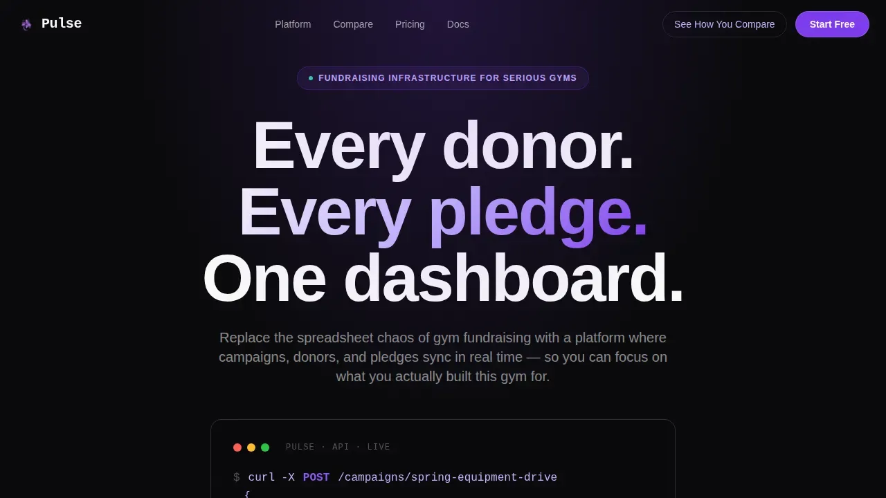
- A terminal-style hero that renders a live API call and pulsing donation total above the fold
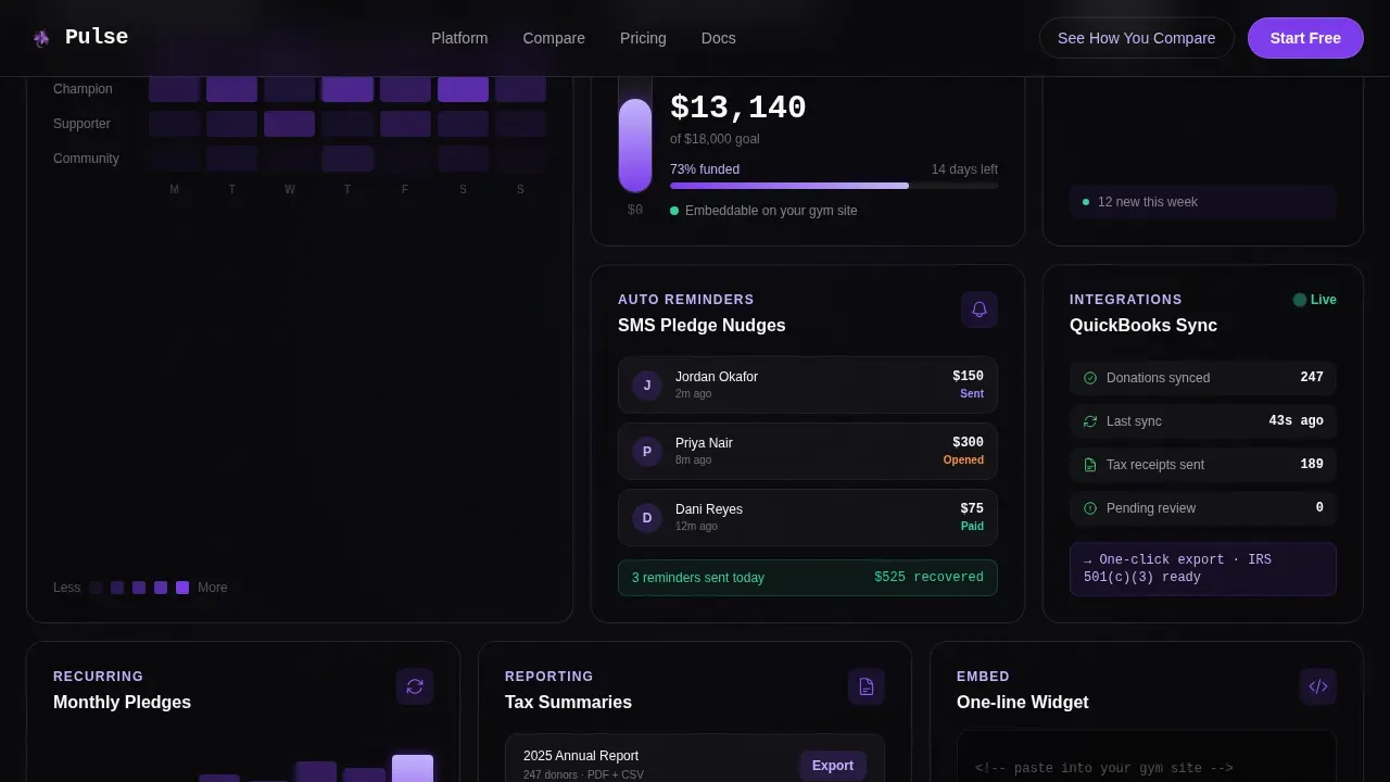
- Eight bento grid tiles that each highlight a specific donor management capability
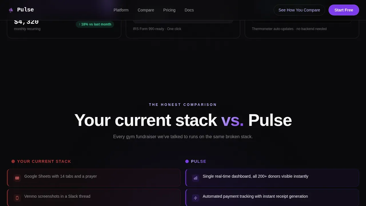
- A two-column versus section contrasting manual tools against the platform, row by row
Feature list
This template ships with a precise set of built-in features. Each one addresses a real pain point that gym fundraising teams face when managing health programs and donor relationships.
Live Terminal Hero Block
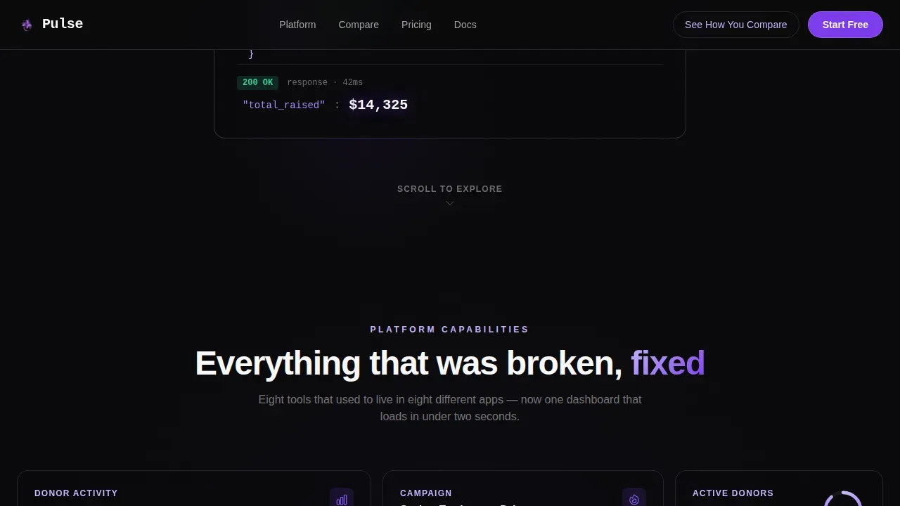
The header opens with a code snippet rendered in lilac monospace on void black. It shows a real POST request, a JSON payload with donor name and pledge amount, and a 200 OK response with a total rising in real time. No stock images, just proof the platform works.
Staggered Bento Grid
Eight tiles reveal one by one as visitors scroll down the page. Each tile is a self-contained micro-demo with subtle animation, covering capabilities like donor heatmaps by membership tier, automated pledge reminders via text, embeddable campaign thermometers, and accounting sync status. The grid rearranges responsively so the layout always fits the screen.
Versus Comparison Section
A prominent two-column section puts the current manual stack on the left and the platform on the right. Each row uses a color shift from red to violet, turning a list of problems into a visual transformation. This section is designed to raise conversion rates by making the gap between old and new immediately clear.
Diagnostic Call to Action
The primary call to action reads "See How You Compare" and opens a short diagnostic. Visitors answer three questions about gym type, donor count, and biggest fundraising headache, then receive a personalized gap analysis. call to action buttons are positioned at key points to capture intent at peak scroll momentum.
Social Proof Strip and Testimonial Cards
A metric strip showcases dollars raised, active gyms, and pledges automated. Testimonial cards from CrossFit box owners and nonprofit directors support every claim with real voices. Social proof at this level helps build trust with first-time visitors who arrive skeptical.
Secondary Demo Capture
A secondary call to action beneath the comparison grid offers a 90-second demo video. Visitors who are not ready to complete the diagnostic can sign up with their email to watch. This gives the page two distinct conversion paths and supports both high-intent and early-stage visitors.
Page sections overview
| Section | Purpose |
|---|---|
| Terminal Hero Block | Prove platform works instantly |
| Bento Grid Tiles | Showcase eight core capabilities |
| Versus Comparison Section | Contrast manual tools versus platform |
| Social Proof Strip | Highlight key fundraising metrics |
| Testimonial Cards | Build trust with real reviews |
| Diagnostic Call to Action | Capture high-intent leads |
| Demo Video Capture | Sign up lower-intent visitors |
| Footer Pattern | Link to resources and contact |
Design & branding system
The visual identity follows a Tech Glass theme built on the Void and Violet color system. The palette feels like a phone screen glowing in a dark gym at 5 AM: electric, focused, and hard to look away from.
- Colors: absolute void black (#09090B), deep ultraviolet (#7C3AED), frosted glass lilac (#C4B5FD), and interface white (#FAFAFA) for text and dividers
- Typography: JetBrains Mono for all terminal and code elements, DM Sans for body and interface labels
- Bento tiles float on the dark background with 1px frosted-glass borders; hover states bloom in full ultraviolet
Mobile & speed optimization
The landing page is built desktop-first to match how dashboard buyers research and purchase, with full responsive behavior down to mobile breakpoints. Over 58% of web traffic is mobile, so the layout adapts without losing visual quality.
- Touch-friendly call to action buttons scale to meet mobile tap targets, including the primary donate and diagnostic actions
- Bento grid columns reflow cleanly on smaller screens so no capability tile is hidden or clipped
- Static sections use server components while animated tiles use client components to keep render performance balanced
How this template helps you convert
This page is structured around a single clear goal: move gym fundraising operators from awareness to action. Every design and copy decision supports that outcome.
- The above-the-fold terminal demo delivers instant credibility before a visitor reads the headline, reducing early bounce and setting high expectations
- The staggered bento grid keeps visitors engaged as they scroll, with each tile answering a different pain point so more audience segments find their reason to act
- The dual call to action paths, diagnostic and demo video, let visitors self-select their readiness level and increase overall conversion rates without forcing a single commitment
Other information about this template
This template is one of the more technically ambitious fitness landing page examples available for the gym fundraising niche. It is a strong foundation for any fitness business that wants to promote a giving program without building from scratch.
- The premium version of this template includes all animation layers, GSAP ScrollTrigger stagger sequences, and the full diagnostic modal component
- Teams inspired by high converting landing pages in the wellness and health industry will find the bento structure easy to adapt for related programs such as workouts-for-donations events or annual fund campaigns
- The page is written and structured to perform well in search engines without sacrificing readability for human visitors
- Builders looking to create fitness landing pages quickly can use this template to save time and launch a polished donor management page in days rather than weeks
- The pulse real time gym donor management landing page template is the reference implementation for this niche on the platform
Theme
Tech Glass
Creative direction
Launch Energy
Color system
Void & Violet
Style
Bento Grid
Direction
Comparison/Versus
Page Sections
Live Terminal Hero Block
Staggered Bento Grid Layout
Versus Comparison Section
Diagnostic Call to Action
Social Proof Strip and Testimonials
Secondary Demo Video Capture
Related questions
Who is this landing page template designed for?
Can I customize the bento grid tiles and color system?
Does the template include the diagnostic modal and demo capture form?
How does the page address common questions from donors?
Is the landing page fully responsive for mobile visitors?



