Healthcare Software & SaaS Advanced Professional Website Template
Pulse is a split-screen healthcare point-of-sale landing page template built for clinics, pharmacies, and specialty practices. It pairs a glassmorphic Dashboard Pro visual identity with a Problem-to-Solution narrative arc, guiding front-desk managers and practice administrators from daily billing pain points to confident action with a single, well-placed call to action.
by Rocket studio
Quick summary
Pulse is a single-page, split-screen landing page template designed for healthcare point-of-sale software. It uses a glassmorphic dark-panel aesthetic to walk clinic managers, pharmacy owners, and multi-location practice administrators from their biggest daily frustrations straight to a clear, demo-driven call to action.
Who this template is for
This template is built for healthcare software teams and SaaS founders who need to sell a point-of-sale system to clinical and pharmacy buyers. The visual tone and section flow speak directly to the people who actually use the software every day.
- Office managers handling insurance verification and front-desk operations simultaneously
- Independent pharmacy owners managing claim rejections and inventory under pressure
- Multi-location practice administrators who need one reliable dashboard across sites
What problem this template solves
Front-desk healthcare staff face three compounding problems: claim denials that stall revenue, inventory blind spots that create dispensing errors, and end-of-day reconciliation that stretches late into the evening. A generic SaaS landing page cannot speak to that specificity. Pulse solves the template problem by making those exact pain points the structural backbone of the page.
- Generic templates bury product value behind vague benefit headlines
- Healthcare buyers need scenario-specific proof before they trust software
- A weak call-to-action flow loses high-intent visitors before they reach the demo
What you get with this template
You get a complete, single-page landing page layout structured around a healthcare point-of-sale use case. Every section is pre-designed and purposefully sequenced to move a skeptical clinical buyer from recognition to action.
- A 50/50 split-screen header with dual frosted-glass panel layout
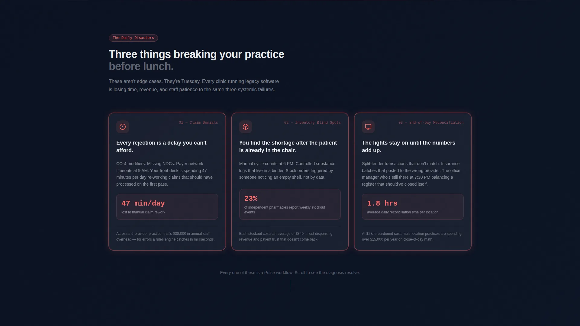
- A Problem-to-Solution Arc with three animated coral-accented pain-point cards
- A closing conversion section with primary and secondary call-to-action paths
Feature list
This section covers the core built-in design and layout capabilities delivered with the Pulse template.
Split-Screen Header Layout
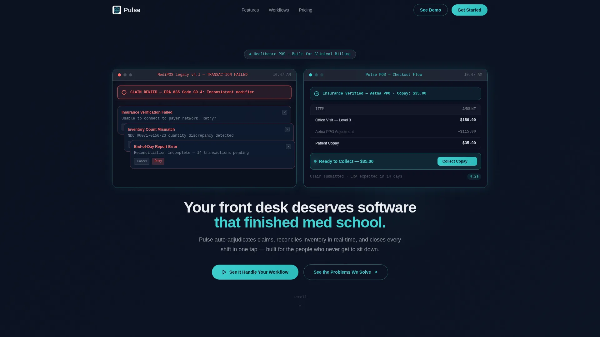
The header divides into two equal frosted-glass panels. The left panel displays a legacy point-of-sale screen mid-transaction, complete with a rejected claim banner and stacked error modals. The right panel shows Pulse's clean checkout flow with insurance verified, copay calculated, and a green confirmation chip at the bottom. No photography is used, just the two contrasting screens.
Problem-to-Solution Scroll Arc
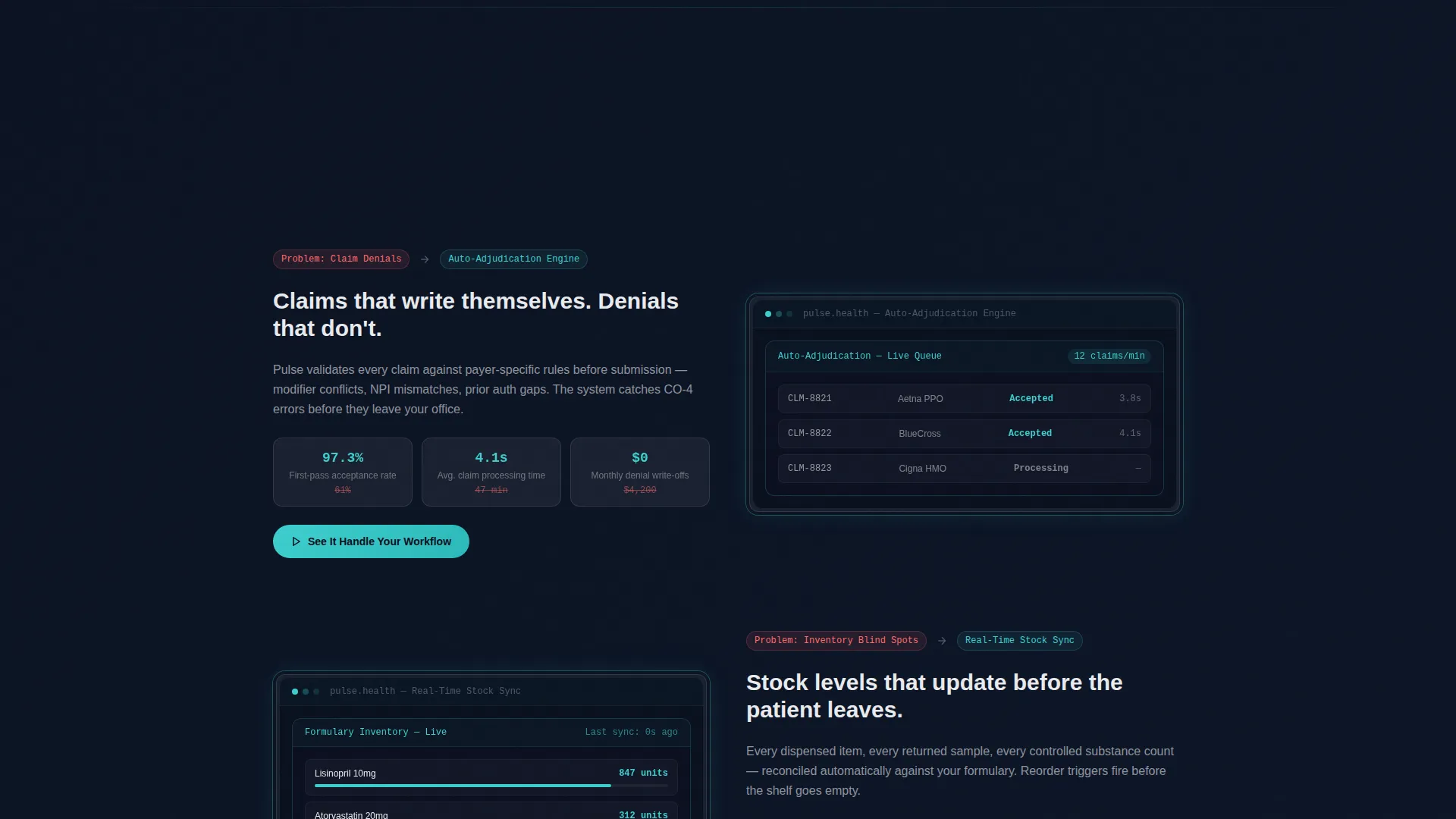
Three frosted cards below the fold each name a real clinical pain point: claim denials, inventory blind spots, and end-of-day reconciliation. As the visitor scrolls, each card animates open and the corresponding solution slides in from the right. The tension builds deliberately from daily annoyance through systemic failure to financial risk, then releases into a live dashboard walkthrough.
Animated Dashboard Walkthrough
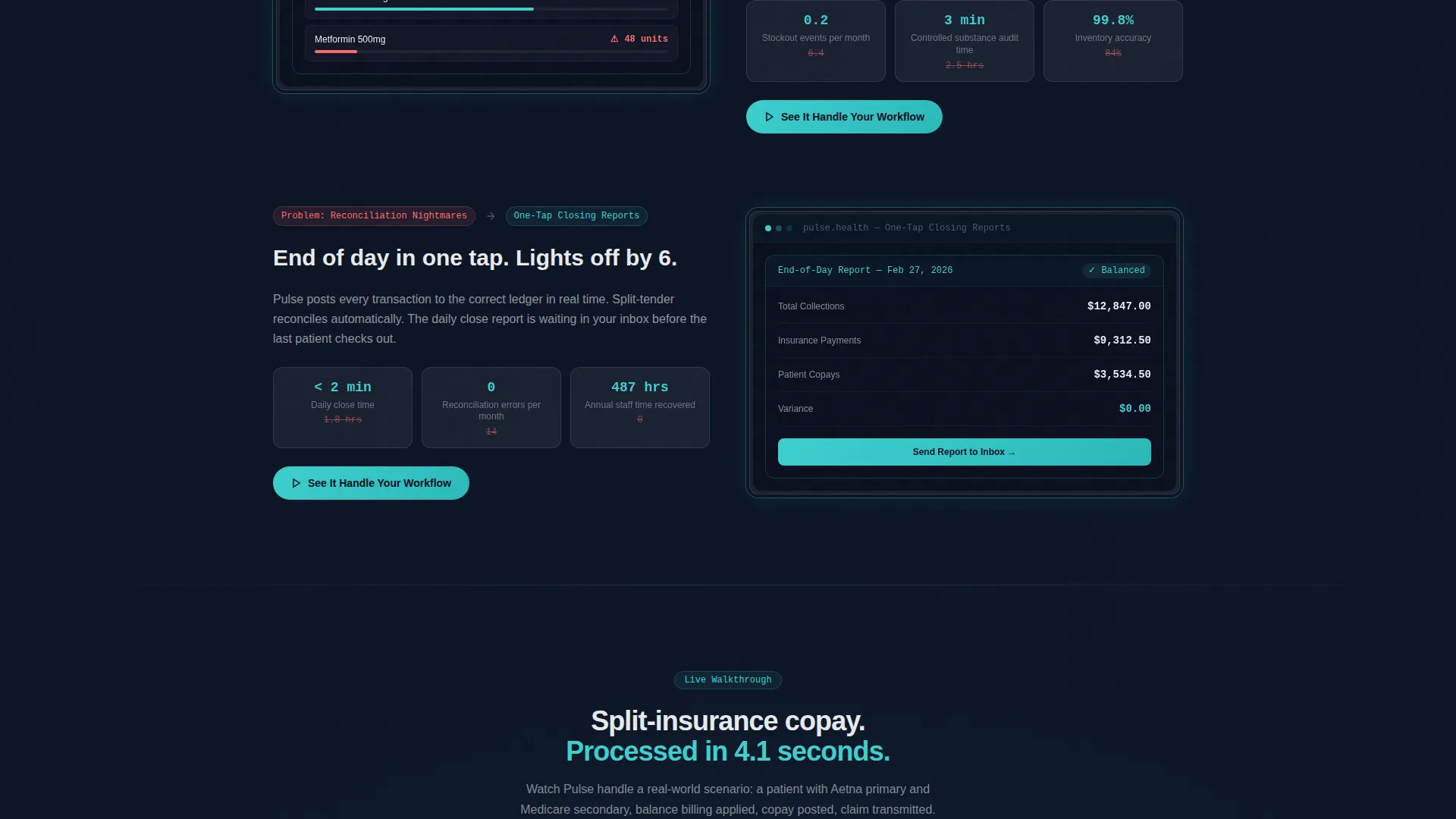
After the problem arc resolves, a live dashboard sequence animates key numbers toward zero-error states. This section shows the product processing a split-insurance copay scenario in a visible, timed flow. It gives buyers concrete proof of the software's speed before any commitment is requested.
Floating and Anchored call to action System
The primary call-to-action button, "See It Handle Your Workflow," appears three times across the page. It floats as a glass button after the header, anchors to the right solution panel in every reveal, and dominates the closing section. This repetition keeps the conversion path visible without feeling aggressive.
Dual Closing Conversion Section
The final section pairs the primary demo call to action with a secondary path: "Talk to a Specialist" alongside a single-field email capture. This gives high-intent buyers a direct demo route and gives research-stage visitors a lower-commitment option. Both options sit in the same visual block for clean decision framing.
Glassmorphic Color and Panel System
The entire template uses layered translucent panels with subtle blur effects. Coral accents pulse on pain-point elements, teal edges highlight interactive components, and anti-flash white text sits crisp over the deep navy background. Every color choice is functional, not decorative.
Page sections overview
| Section | Purpose |
|---|---|
| Split-Screen Header | Contrast legacy versus. modern POS visually |
| Headline Fade-In | Establish brand voice immediately |
| Problem Cards Row | Surface the three core clinical pain points |
| Solution Reveal Panels | Pair each problem with its direct resolution |
| Dashboard Walkthrough | Demonstrate real-time zero-error performance |
| Floating call to action Button | Keep the demo path always accessible |
| Anchored Solution calls to action | Reinforce conversion at each solution reveal |
| Closing call to action Section | Drive demo signups and specialist inquiries |
| Email Capture Field | Capture research-stage leads with low friction |
Design & branding system
The visual identity follows a Dashboard Pro theme built on a glassmorphic color system. Deep surgical navy forms the base, while frosted translucent panels layer over it with subtle blur. The result feels like a vitals monitor in a low-lit room: calm, purposeful, and precise.
- Core palette: deep navy (#0B1120), frosted glass white at 12% opacity, soft clinical teal (#3ECFCF), and alert coral (#FF6B6B)
- Typography: crisp anti-flash white (#E8EAED) on dark backgrounds for high contrast and easy scanning
- Interactive states: teal-edged pulse effects on buttons and hover states; coral reserved for pain-point callouts only
Mobile & speed optimization
The template is structured as a single-page layout, which keeps the asset footprint contained and the scroll path linear. Each section is designed to stack cleanly on smaller viewports without losing the visual hierarchy of the split-screen and panel system.
- The 50/50 split-screen header is designed to restack vertically on narrower screens
- Glassmorphic panel elements use CSS-based blur and opacity rather than heavy image assets
- The floating call to action button remains accessible throughout the scroll on all screen sizes
How this template helps you convert
Every structural decision in this template is made in service of a single outcome: getting a qualified healthcare buyer to click "See It Handle Your Workflow" before they leave the page.
- The header immediately creates contrast between the broken legacy experience and the clean Pulse interface, earning attention without a single word of explanation.
- The Problem-to-Solution Arc builds narrative momentum, so by the time the visitor reaches the demo call to action, they have already watched the software resolve their specific pain points.
- The dual closing section removes the binary pressure of a single call to action, giving both ready buyers and cautious evaluators a path forward that matches their readiness.
Other information about this template
This template is built for healthcare software and SaaS product teams operating in a competitive point-of-sale market. It is equally effective for new product launches and for teams repositioning against legacy clinic management software.
- The template style is Split Screen (50/50), making it well-suited for direct product comparisons
- The creative direction follows a Problem-to-Solution Arc, a proven structure for high-consideration SaaS purchases
- The header concept uses Dark Glass Panels to create immediate visual differentiation without relying on stock photography
- The landing page direction is optimized for Click-Through, meaning every section feeds forward toward the interactive demo environment
Theme
Dashboard Pro
Creative direction
Problem→Solution Arc
Color system
Glassmorphic
Style
Split Screen (50/50)
Direction
Click-Through
Page Sections
Split-screen Header with Dual Panels
Problem-to-solution Scroll Arc
Animated Dashboard Walkthrough
Floating and Anchored Call to Action Placement
Dual Closing Conversion Section
Glassmorphic Panel and Color System
Related questions
Who is the Pulse template designed for?
Can I customize the color palette and branding?
How does the Problem-to-Solution Arc work in the page layout?
Does this template work for a new healthcare SaaS product launch?
Is the email capture field ready to collect leads?



