Transparent Customer Feedback Board Landing Page
Pulse is a hub-and-spoke landing page template built for product teams that need a transparent customer feedback board. It combines a Bold Brutalist visual style with a Glassmorphic color system, an interactive live feedback board in the header, and an industry-data-driven scroll narrative, all driving visitors toward a simple, no-credit-card sign-up form.
by Rocket studio
Quick summary
Pulse is a single-page feedback board landing page template designed for SaaS teams. It opens with a fully interactive kanban-style preview and scrolls through five anchor-linked sections loaded with product-management research stats. The Bold Brutalist design, frosted-glass user interface panels, and electric violet accents make every feature request and upvote impossible to miss.
Who this template is for
This template is built for the people who live at the intersection of customer signal and product decisions. If your feedback currently lives in a tangled mix of spreadsheets and chat threads, Pulse was designed for you.
- SaaS product managers who need one organized place to triage feature requests before sprint planning
- Customer success leads who collect promises from customers and need somewhere reliable to send that feedback
- Startup founders who still personally read every feedback post and want a board that matches that level of attention
What problem this template solves
Feedback gets lost. It lands in Slack threads, gets tagged in support tools, and disappears into spreadsheets that nobody opens during roadmap meetings. The result is a product team making priority calls on incomplete signal, and churned users who asked for a feature that was already on the roadmap.
- No central, visible place where customers and teammates can see what feedback exists and what its current status is
- No clear prioritization signal, so roadmap decisions rely on whoever spoke loudest in the last standup
- No proof of responsiveness, which erodes customer trust and quietly damages retention
What you get with this template
You get a complete, ready-to-customize landing page that makes the case for a transparent feedback board before the visitor even scrolls. The page is designed to earn the sign-up by letting visitors interact with the product first and overwhelming them with evidence second.
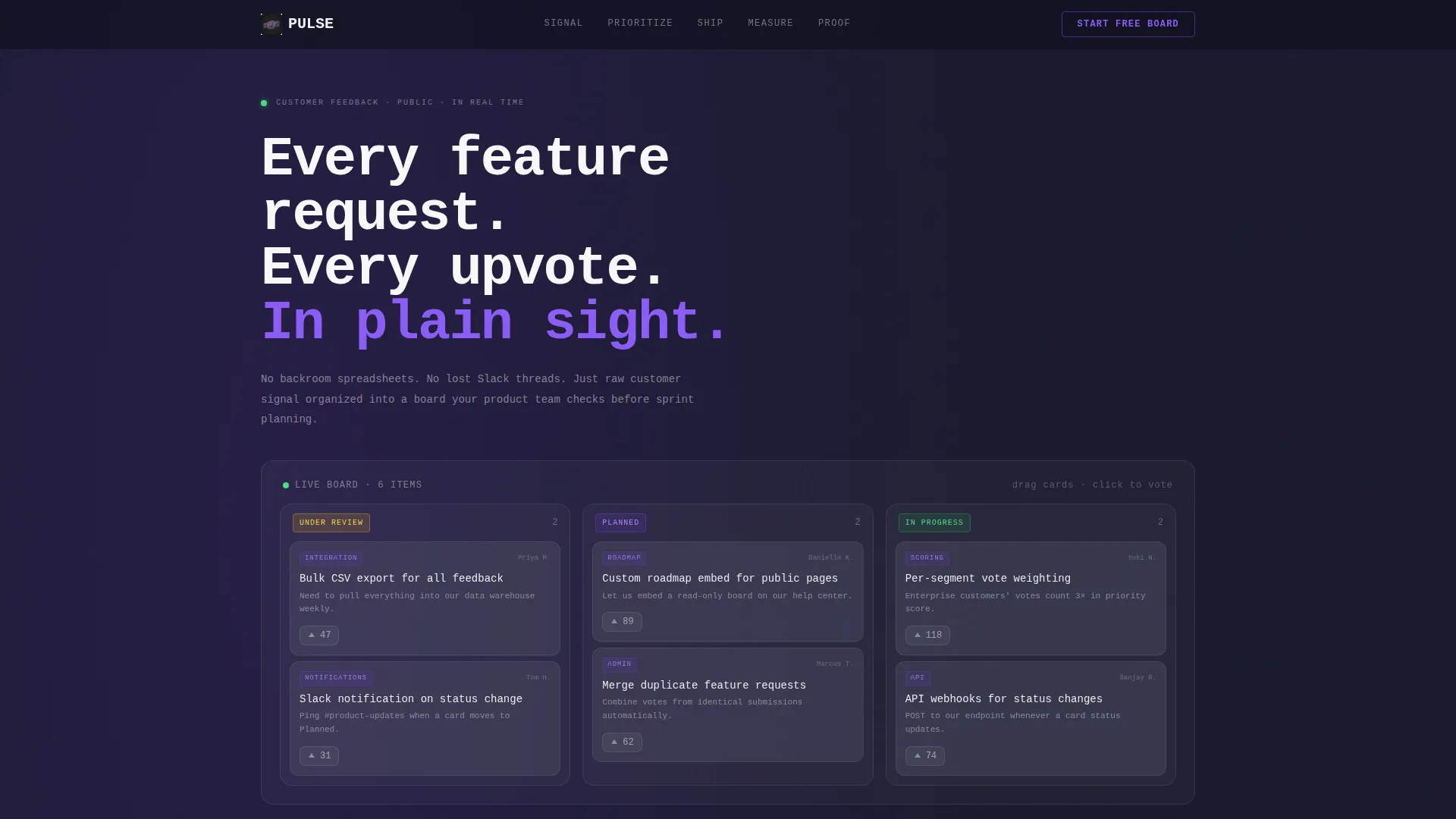
- A fully interactive feedback board rendered live in the header, with draggable cards, animated vote counters, and glowing status pills
- Five anchor-navigated content sections, each opening with a bold research statistic and unpacking a specific product-feedback failure
- A three-field lead generation form with a persistent call-to-action in the anchor nav, requiring no credit card to get started
Feature list
This template is built around a specific set of functional and visual components drawn directly from the brief.
Live Interactive Header Board
The header is not a screenshot. It renders a fully functional feedback board at full fidelity inside the viewport. Visitors can click to upvote cards and watch the count animate upward in real time. They can also drag cards between the "Under Review," "Planned," and "In Progress" columns and feel the snap of the transition.
Anchor Navigation with Five Spokes
A sticky anchor nav pins to the top of the page and links to five named sections: Signal, Prioritize, Ship, Measure, and Proof. A persistent ghost button for the primary call-to-action lives inside this nav at all times, keeping the sign-up option visible throughout the scroll.
Industry-Data Scroll Narrative
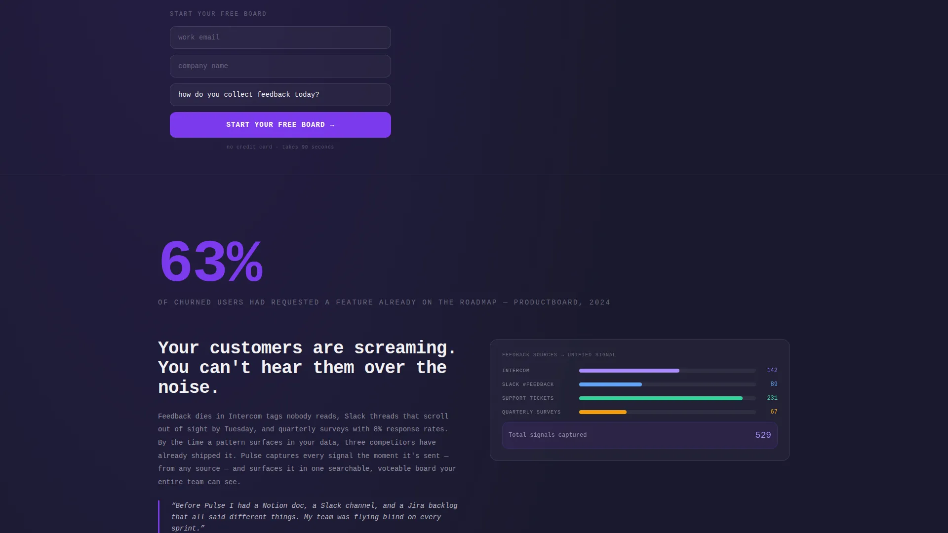
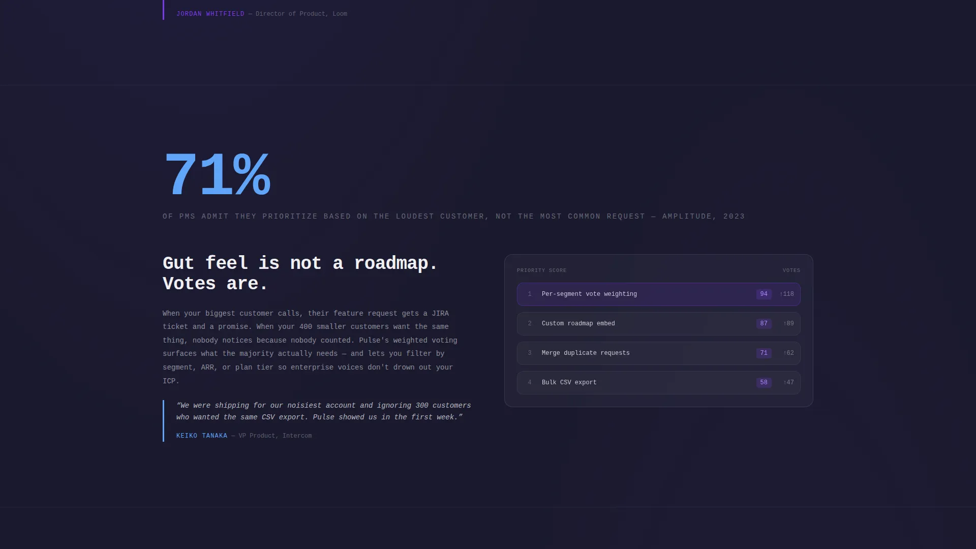
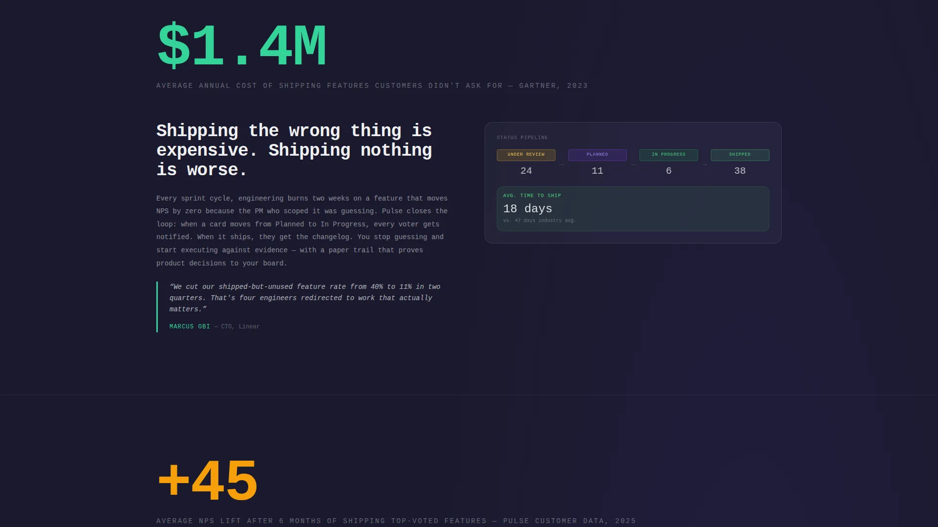
Each of the five anchor sections opens with a single oversized statistic, rendered in 120-pixel type, sourced from real product-management research. The data hit is followed by an explanation of the problem, a frosted user interface panel showing the relevant feature in context, and a pull-quote from a named product manager at a recognizable company.
Three-Field Lead Generation Form
The sign-up form asks for a work email, a company name, and a single dropdown question: "How do you collect feedback today?" The dropdown options are spreadsheet, Slack or Teams, an existing tool, and "we don't." No credit card is required at any point.
Bold Brutalist Frosted-Glass user interface Panels
Each content section includes a frosted-glass user interface panel that shows the relevant Pulse feature in realistic context. These panels use the Glassmorphic color system, backdrop blur, 60-percent-opacity frosted white layered over deep asphalt black, so the product user interface feels tangible and inspectable, not decorative.
Escalating Stakes Structure
The five sections follow a deliberate narrative arc. Stakes rise from losing individual feedback items, to mispriorritizing the roadmap, to shipping the wrong thing, to watching customer satisfaction scores fall. By the final section, the cost of not having a feedback board feels specific and quantified rather than abstract.
Page sections overview
| Section | Purpose |
|---|---|
| Interactive Header Board | Show the live feedback board and introduce the primary call-to-action |
| Signal Section | Illustrate how feedback gets lost without a centralized board |
| Prioritize Section | Show the cost of roadmap decisions made on incomplete signal |
| Ship Section | Connect poor prioritization to shipping the wrong features |
| Measure Section | Link missed feedback to declining customer satisfaction scores |
| Proof Section | Deliver pull-quotes and social proof from named product managers |
| Lead Generation Form | Capture work email, company name, and current feedback method |
Design & branding system
The visual identity is Bold Brutalist filtered through a Glassmorphic color system. The combination feels like a glass whiteboard mounted on a poured-concrete wall, translucent layers floating over something heavy and deliberate.
- Color palette uses deep asphalt black (#1A1A2E) as the base, frosted glass white at 60% opacity (#FFFFFF99) for panel surfaces, electric violet (#7C3AED) for votes, hover states, and status badges, and concrete slab gray (#3D3D56) for card backgrounds
- Typography is monospaced and oversized, styled like stenciled warehouse signage, with the 120-pixel statistic type being the most dramatic expression of this approach
- Interactive accents pulse in violet on hover states, vote counters, and status pills, reinforcing the sense that the board is alive and responsive
Mobile & speed optimization
The template is designed to remain usable and visually coherent on smaller screens, where the interactive board and frosted panels are the most layout-sensitive elements.
- The kanban board in the header adapts so cards and columns remain readable and tappable on mobile viewports
- Frosted-glass panels and backdrop blur effects are contained within the layout grid so they do not break on narrow screens
- The anchor nav and persistent call-to-action ghost button remain accessible throughout the scroll on all device sizes
How this template helps you convert
Pulse is structured to earn the sign-up through experience before it asks for anything. The conversion logic is deliberate and sequential.
- The interactive header board lets visitors touch the actual product interface before reading a single line of copy, establishing immediate, tactile proof of value
- The five-section industry-data narrative escalates the perceived cost of inaction, so by the time visitors reach the form, the problem feels urgent and personal
- The three-field form with no credit card requirement removes friction at the moment of highest intent, making the decision to sign up feel low-risk and obvious
Other information about this template
Pulse sits within the Documentation and Support category, specifically the Community and Forum subcategory, targeting the customer feedback board niche. The template style is Hub and Spoke with anchor navigation, meaning all five content spokes are accessible from the persistent top nav at any point during the scroll. The creative direction follows an Industry Report cadence, a format that mirrors how product leaders already consume research and benchmark data. The header concept is an Interactive Preview, which distinguishes this template from static mockup-based landing pages in the same category. This template is well suited for teams evaluating tools in the customer feedback board space who want to present their product with both emotional immediacy and data credibility.
- The intersection match score for this template is 13, reflecting a strong alignment between the Hub and Spoke template style, Bold Brutalist theme, Glassmorphic color system, Industry Report creative direction, Interactive Preview header, and Lead Generation landing-page direction
- All five anchor sections include a frosted user interface panel and a named pull-quote, providing both visual evidence and social proof within each content spoke
- The template requires no third-party integrations to display or demonstrate; the interactive board and form fields are self-contained within the page layout
Theme
Bold Brutalist
Creative direction
Industry Report
Color system
Glassmorphic
Style
Hub & Spoke (Anchor Nav)
Direction
Lead Generation
Page Sections
Live Interactive Feedback Board Header
Sticky Anchor Navigation with Five Spokes
Industry-data Scroll Narrative
Three-field Lead Generation Form
Glassmorphic Frosted-glass User Interface Panels
Escalating Narrative Arc Across Sections
Related questions
Can visitors actually interact with the feedback board in the header?
Is a credit card required to sign up through the form on this template?
What are the five anchor sections included in this template?
Who is this landing page template designed for?
Can I change the colors and fonts to match my own brand?



