Healthcare Email Marketing Specialist Privacy Policy Website Template
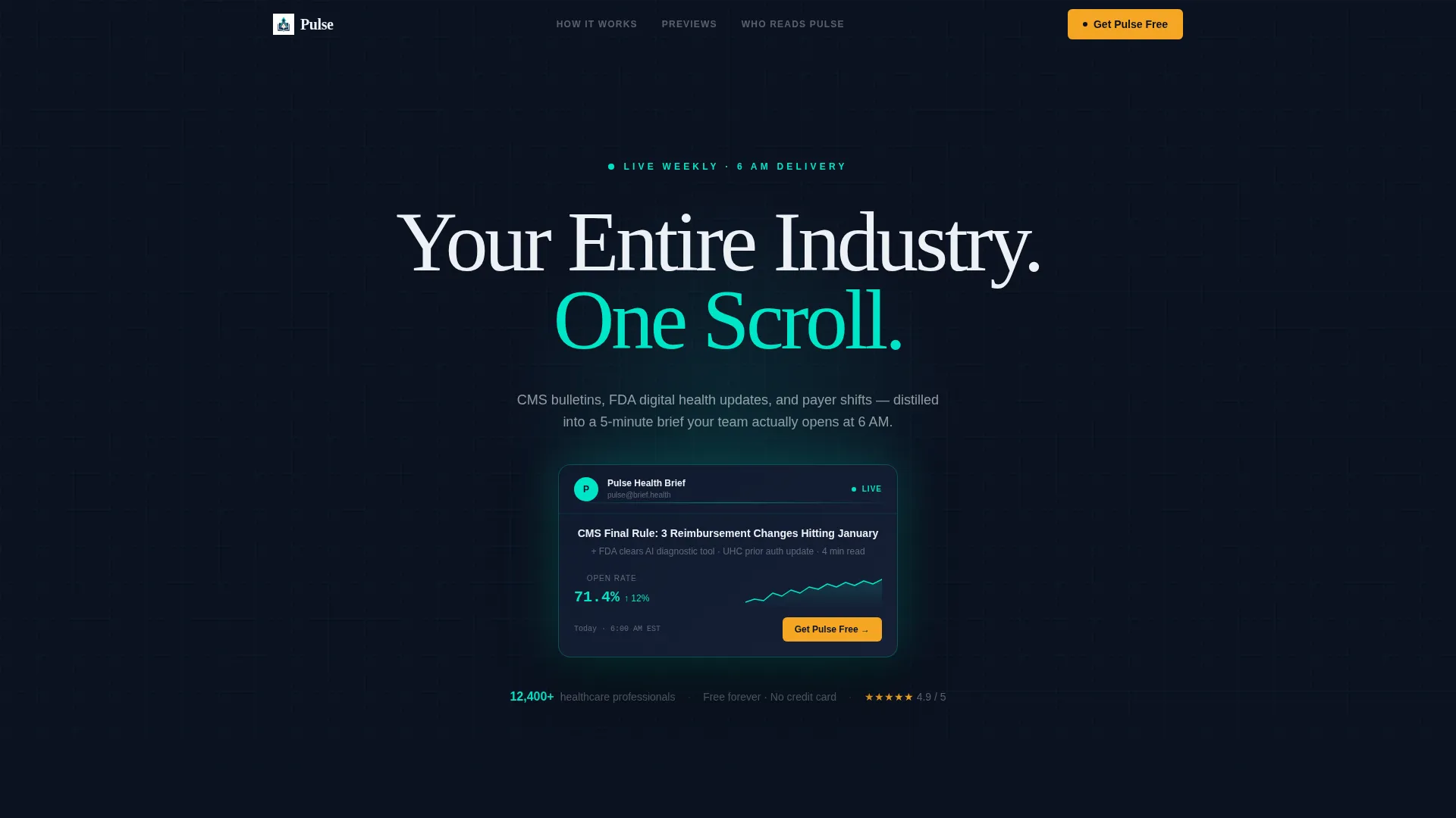
Pulse is a bento grid healthcare newsletter landing page template built for teams that need clinical research, policy updates, and payer news delivered in one scannable weekly briefing. Designed with a dark Midnight Blue palette and surgical teal accents, the page guides visitors from inbox chaos to a clean newsletter subscription with a single amber call-to-action.
by Rocket studio
Quick summary
Pulse is a single-page bento grid landing page template for healthcare newsletter publishers. It follows a Problem-to-Solution scroll arc, moving visitors from regulatory inbox overload to a clear subscription moment. The dark navy and teal visual system feels like a live mission-control dashboard, and every section earns the sign-up before asking for it.
Who this template is for
This template is built for publishers, founders, and marketing teams who distribute healthcare intelligence to busy professionals. If your product is a weekly briefing that distills complex medical or policy content into something readable before 7 AM, this layout was designed for your audience.
- Practice managers and clinical administrators who track Centers for Medicare and Medicaid Services (CMS) policy changes
- Health-technology founders monitoring United States Food and Drug Administration (FDA) digital health guidance
- Hospital marketing directors who need to sound informed before Monday morning stand-ups
What problem this template solves
Healthcare professionals are buried in regulatory email. CMS bulletins, payer memos, and clinical research updates arrive daily with no filter and no hierarchy. A newsletter landing page needs to instantly communicate that your product cuts through that noise rather than adding to it.
- Visitors arrive skeptical because their inboxes are already full of low-value health industry email
- Generic newsletter sign-up pages fail to show the product before asking for a commitment
- Busy clinicians and administrators need proof of value in seconds, not paragraphs
What you get with this template
You get a fully structured bento grid landing page that earns subscriber trust by showing the newsletter working before the sign-up form appears. Every layout decision is intentional and mapped to a specific conversion moment.
- A dark full-bleed header with a floating newsletter preview card, open-rate sparkline, and live-feeling teal ambient glow
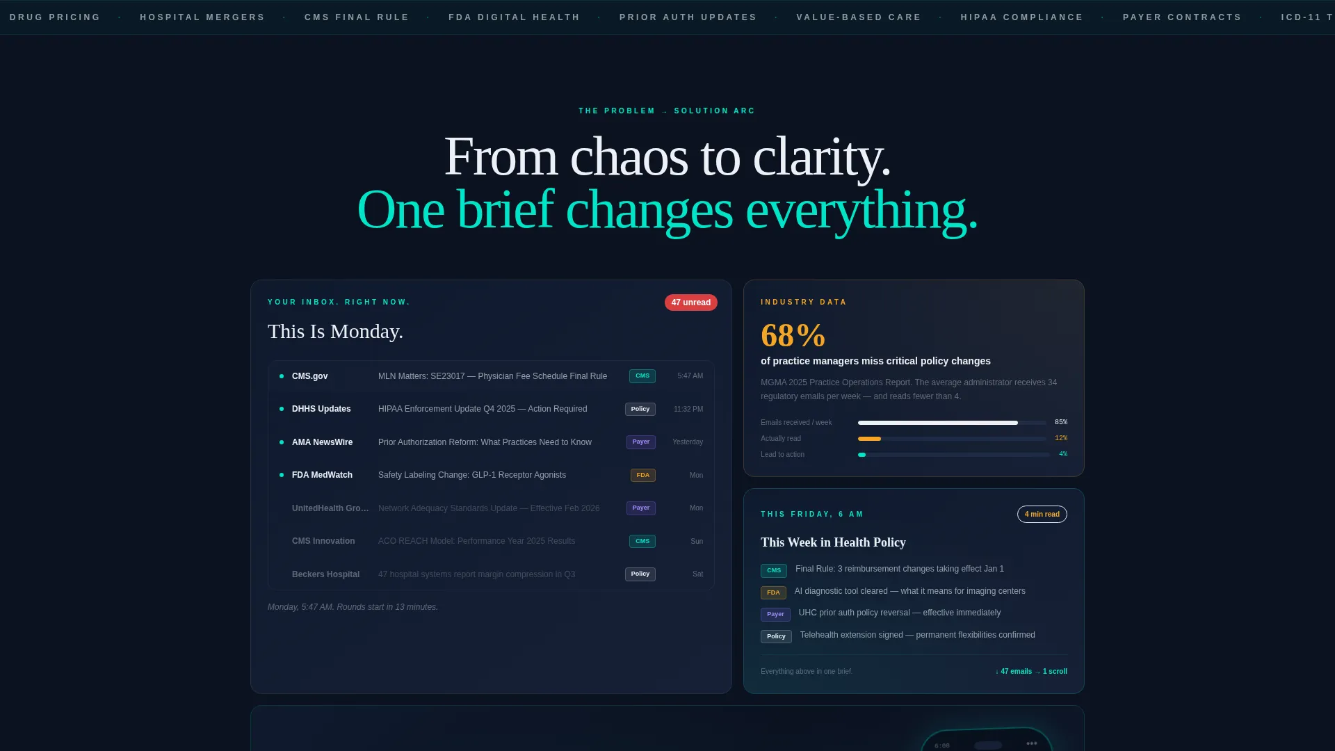
- A Problem-to-Solution scroll arc with an inbox chaos mockup, a policy-miss stat card, and a clean newsletter reveal
- Three mid-page interactive bento tiles where visitors can swipe through real newsletter issue previews
- A two-field subscription form with a role selector and one-tap App Store and Google Play download badges
- A sticky mobile bottom bar and a final full-width phone lock screen tile reinforcing the primary call-to-action
Feature list
This section covers the core functional components built into the Pulse landing page template.
Dark Full-Bleed Header with Newsletter Preview Card
The header spans edge to edge in deep terminal navy. A single newsletter preview card floats center-frame, casting a soft teal ambient glow beneath it. The card displays a real subject line, a sender avatar, an open-rate sparkline, and a timestamp. The headline "Your Entire Industry. One Scroll." fades in above the card in off-white display weight type.
Bento Grid Problem-to-Solution Arc
The page layout uses a bento grid that tightens as the visitor scrolls. The first tile shows a cluttered inbox with 47 unread regulatory emails. The second tile presents a stat card stating that 68 percent of practice managers miss critical policy changes. The grid progresses from visual chaos to clarity, ending with a composed full-width tile.
Interactive Newsletter Preview Tiles
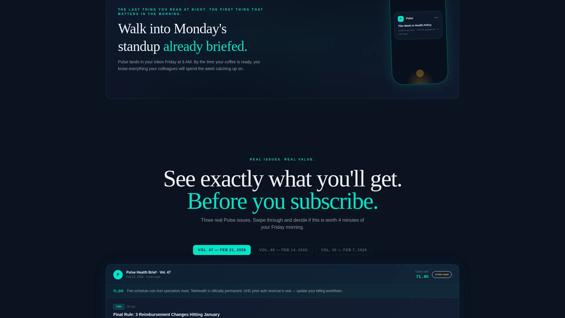
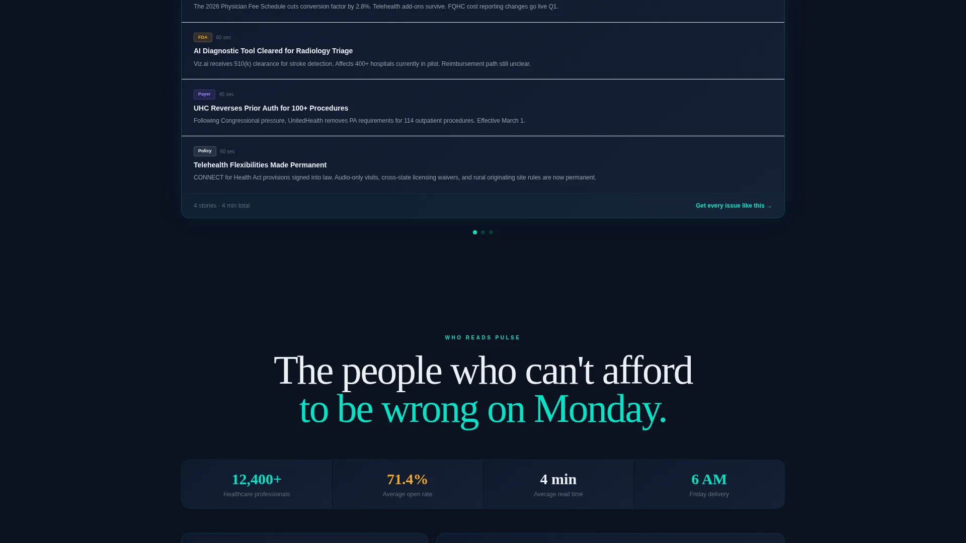
Three mid-page bento tiles display real newsletter issue previews. Visitors can swipe through actual issues, with sections color-coded by topic and read-time badges glowing in alert amber. This component lets visitors verify the product's value before filling in any form field.
Two-Field Subscription Form with Role Selector
The sign-up form collects a work email address and a role selection from four options: clinician, administrator, founder, and marketer. Below the form, one-tap badges for App Store and Google Play sit side by side, making the download path immediate and frictionless.
Sticky Mobile Bottom Bar
On mobile viewports, the primary call-to-action "Get Pulse Free" persists as a sticky bottom bar. This ensures the conversion trigger stays visible no matter how far a visitor scrolls through the preview content.
Amber Call-to-Action System
Alert amber is reserved exclusively for interactive moments: the primary button inside the header card, sticky mobile bar, notification badges on the preview tiles, and the final full-width tile. This color restraint means every amber element signals a tap point without visual competition.
Page sections overview
| Section | Purpose |
|---|---|
| Dark header hero | Introduces the product with a floating newsletter preview card and headline |
| Inbox chaos tile | Shows the problem: 47 unread regulatory emails |
| Policy-miss stat card | Quantifies the cost of missing updates with a 68 percent figure |
| Newsletter reveal tile | Presents the solution as a clean, color-coded newsletter issue |
| Interactive preview tiles | Three swipeable issues that prove value before sign-up |
| Subscription form | Collects work email and role, with app download badges |
| Full-width lock screen tile | Final call to action tile showing the newsletter on a phone beside a bedside lamp |
Design & branding system
The visual identity follows a Startup Velocity theme built on a Midnight Blue color system. The palette is designed to feel like a live monitoring dashboard: dark enough to reduce cognitive load, bright enough at the edges to signal urgency and activity.
- Deep terminal navy (#0B1120) floods every background tile, providing consistent visual grounding across the bento grid
- Surgical teal glow (#00E5C7) traces tile borders, hover states, and ambient glows, functioning like vitals on a medical monitor
- Chart-line white (#EDF0F5) carries all body text and the hero headline, staying readable against the dark background
- Alert amber (#F5A623) appears only on calls-to-action, notification badges, and read-time indicators, directing taps without visual noise
Mobile & speed optimization
The template is designed with mobile-first behavior as a structural requirement, not an afterthought. The sticky bottom bar, swipeable preview tiles, and compact bento grid layout are all sized and spaced for one-handed phone use.
- The sticky amber bottom bar keeps "Get Pulse Free" visible on every scroll position on mobile viewports
- Swipeable bento tiles let phone users interact with newsletter previews using natural touch gestures
- The final lock screen tile is designed as a phone-framed visual, natively resonant for mobile visitors
How this template helps you convert
The Pulse template is structured to build trust incrementally before it asks for anything. Each scroll step either proves value or removes a reason not to subscribe.
- The header preview card shows a real newsletter issue immediately, so visitors understand the product within three seconds of arriving on the page
- The Problem-to-Solution bento arc validates the visitor's pain before presenting the solution, making the sign-up feel like relief rather than a sales pitch
- Three interactive preview tiles let visitors read actual content before the form appears, so the two-field sign-up feels like a natural next step rather than a cold ask
Other information about this template
This template is suited for any healthcare newsletter publisher launching a new briefing product or refreshing an existing subscription page. The layout can support a range of healthcare intelligence formats, from clinical research digests to health-technology policy roundups.
- The bento grid structure makes it straightforward to swap in your own newsletter issue previews and subject lines
- The role selector in the sign-up form is pre-configured with four audience segments: clinician, administrator, founder, and marketer
- The amber and teal color system is consistent with dark-mode interface trends common in health-technology product design
Theme
Startup Velocity
Creative direction
Problem→Solution Arc
Color system
Midnight Blue
Style
Bento Grid
Direction
App Download
Page Sections
Dark Full-bleed Header with Preview Card
Bento Grid Problem-to-solution Arc
Interactive Swipeable Newsletter Previews
Two-field Form with Role Selector
Sticky Mobile Call-to-action Bar
Amber-only Interactive Signal System
Related questions
Who is this landing page template designed for?
Does the template show newsletter content before the sign-up form appears?
What fields does the subscription form include?
Can I replace the preview card content with my own newsletter issues?
How does the template handle mobile visitors?



