Local Dental Software Professional Website Template
Pulsepoint is a dental survey and feedback landing page template built for practice managers, solo dentists, and dental service organization directors who need to act on patient experience data. It combines an interactive hero dashboard, drag-and-drop survey tools, and a three-step lead capture form into one clean, conversion-focused single page.
by Rocket studio
Quick summary
Pulsepoint is a dashboard-style dental survey landing page template. It maps patient satisfaction, wait-time friction, and chairside manner across providers and locations. The design feels clinical and organized, the interactions reward curiosity, and every section moves a visitor closer to starting their first survey.
Who this template is for
This template is built for dental professionals who manage patient feedback at scale or who are just starting to take it seriously. It speaks clearly to people who need data, not just impressions.
- Multi-location dental group practice managers tracking Net Promoter Score (NPS) across twelve or more offices
- Solo practitioners who received a critical online review and want structured insight into what went wrong
- Dental service organization (DSO) operations directors benchmarking provider performance ahead of an acquisition
What problem this template solves
Most dental practices collect patient feedback in fragmented ways: paper comment cards, scattered Google reviews, or nothing at all. There is no single view that connects satisfaction scores to specific providers, rooms, or time periods. Pulsepoint addresses this directly.
- Practices cannot see which hygienist, operatory, or quarter is driving dissatisfaction
- Group practice managers lack a reliable way to compare performance across locations
- DSO directors need provider-level benchmarks but have no standardized collection method
What you get with this template
The template delivers a fully structured, single-page layout designed for lead generation and interactive exploration. Each section is a functional demonstration of what the platform does, not just a description of it.
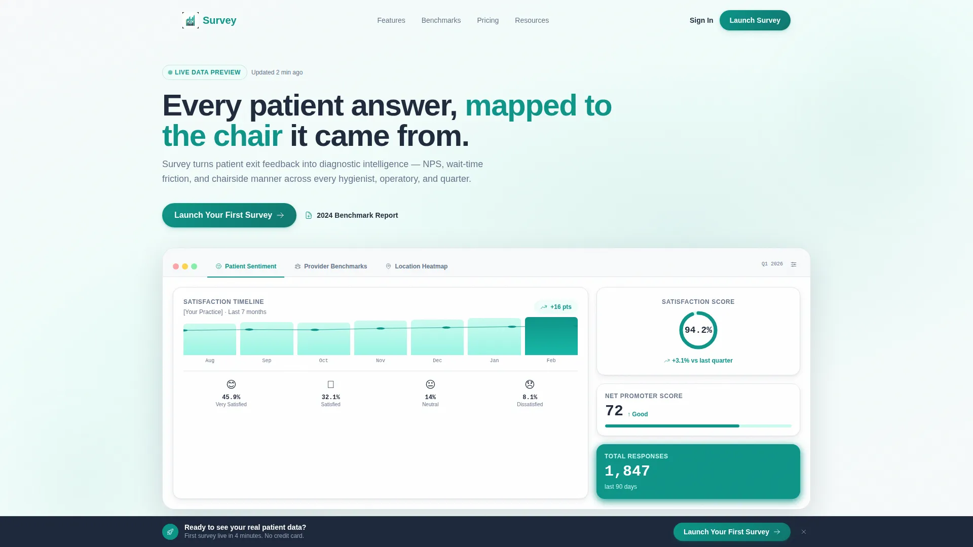
- A three-tab hero dashboard showing sentiment timelines, provider comparison grids, and a geographic dot map
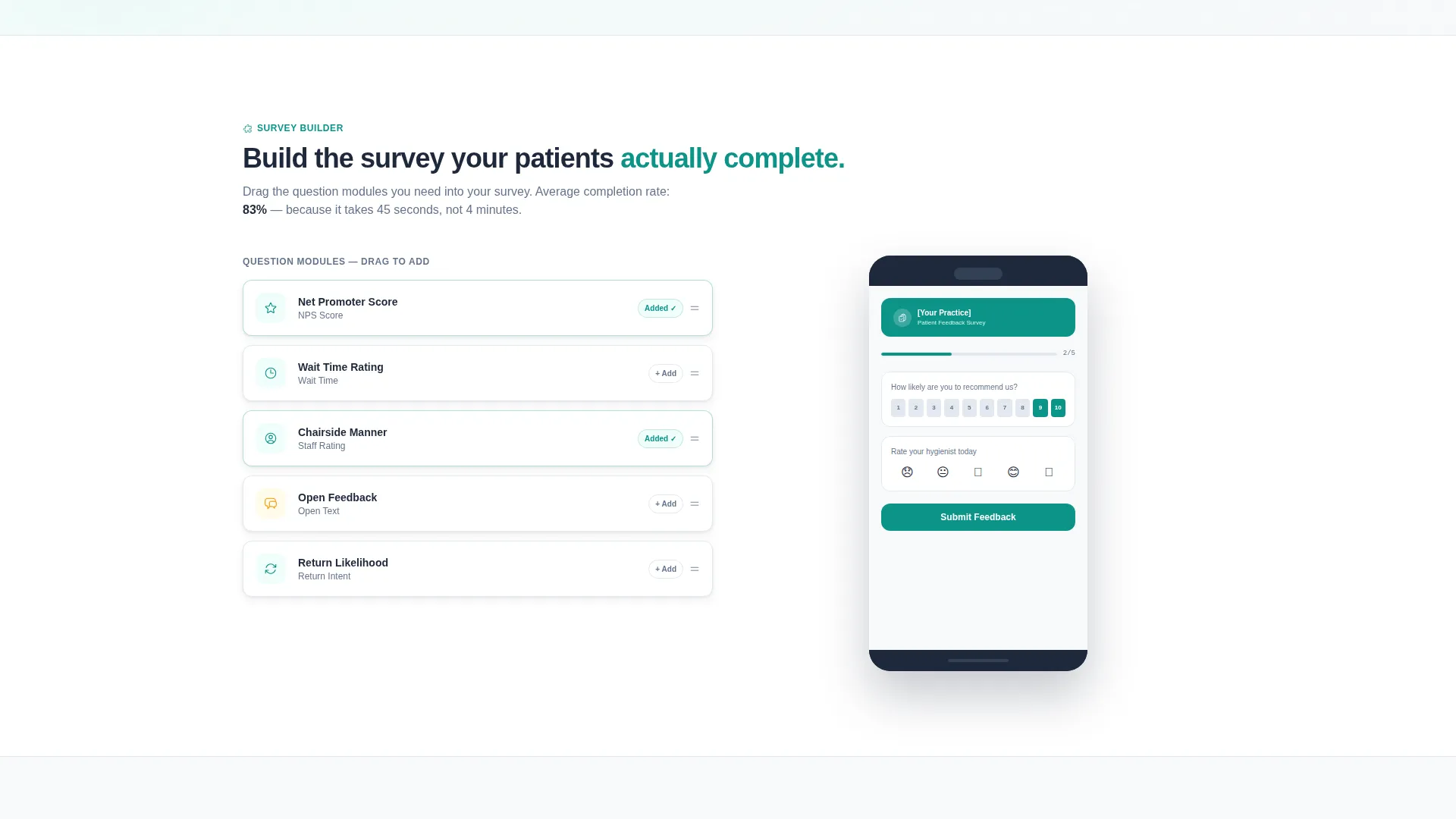
- Three interactive mid-page tools: a drag-and-drop survey builder, a live response simulator, and a specialty benchmark selector
- A three-step progressive disclosure lead capture form and a secondary soft-gate email capture for a benchmark report download
Feature list
This template is built around interactive components that let visitors experience the product before they sign up. Every feature listed here is present in the page as described in the brief.
Three-Tab Hero Dashboard
The hero section uses a Feature Tab Switcher with three labeled tabs: "Patient Sentiment," "Provider Benchmarks," and "Location Heatmap." Each tab reveals a distinct live-data view inside the same fixed frame. Transitions between tabs use smooth crossfades, keeping the layout stable while the data rotates.
Sentiment Timeline with Animated Scores
The default hero tab shows a satisfaction score that animates from zero to 94.2% on load, alongside emoji-coded response clusters. Practice names are redacted to "[Your Practice]" so visitors immediately map the data to their own context.
Drag-and-Drop Survey Builder
Below the hero, visitors drag survey modules into a preview phone screen. This hands-on interaction lets practice managers visualize how a patient exit survey would look before they commit to anything.
Live Response Simulator
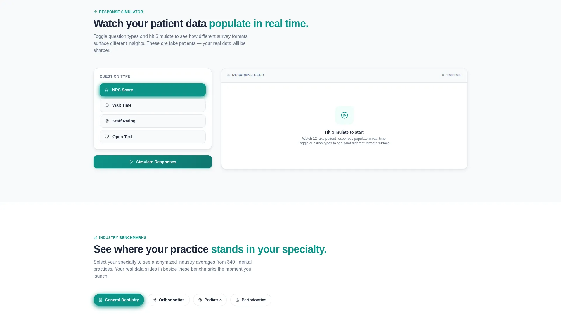
A response simulator populates realistic fake patient answers in real time as visitors toggle between question types. It turns passive browsing into active exploration and builds a sense of ownership in the tool.
Specialty Benchmark Selector
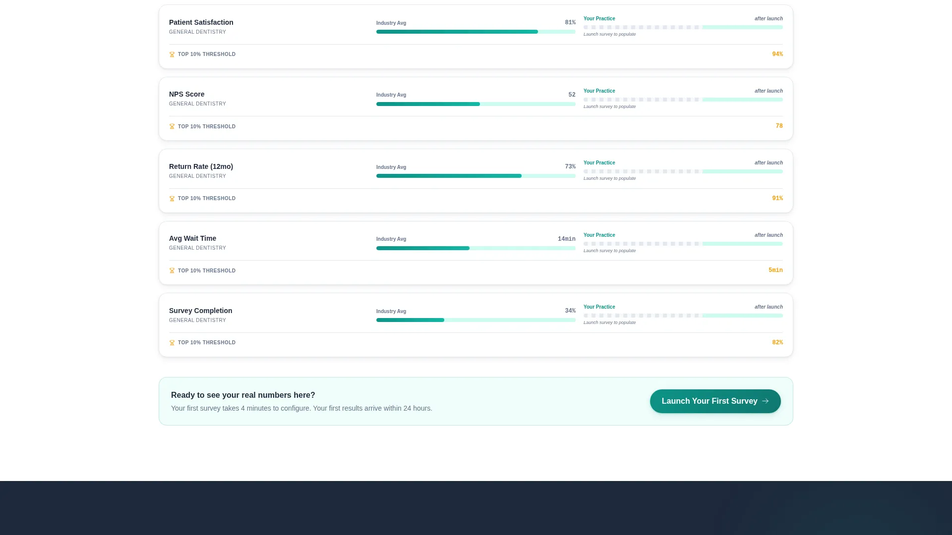
Visitors choose their specialty from a dropdown covering general dentistry, orthodontics, pediatric dentistry, and periodontics. Anonymized industry averages slide into view beside placeholder bars for the visitor's own practice data, making the comparison feel immediately personal.
Progressive Disclosure Lead Form
The primary call to action uses a three-step form. Step one collects practice name and location count. Step two asks for the current feedback method. Step three captures an email address and preferred demo format. This staged approach reduces friction and increases completion rates.
Page sections overview
| Section | Purpose |
|---|---|
| Feature Tab Hero | Showcase three dashboard views in one fixed frame |
| Sentiment Timeline Tab | Animate satisfaction scores and emoji-coded clusters |
| Provider Benchmarks Tab | Rank anonymized hygienists by patient return rate |
| Location Heatmap Tab | Display a pulsing geographic dot map by response volume |
| Survey Builder Tool | Let visitors drag question modules into a phone preview |
| Response Simulator Tool | Populate live fake answers as question types are toggled |
| Benchmark Comparison Tool | Slide industry averages beside specialty-matched placeholders |
| Benchmark Report Gate | Capture email in exchange for the 2024 benchmark report |
| Pinned call to action Bar | Keep "Launch Your First Survey" visible after second scroll |
| Three-Step Lead Form | Collect practice details, feedback method, and contact info |
Design & branding system
The visual identity follows a Directory and Discovery theme using the Teal Catalyst color system. The palette references a freshly sterilized instrument tray under LED panel lighting: antiseptic confidence with just enough warmth to stay human.
- Clinical teal (#0D9488) dominates interactive states including hover fills, toggle switches, and active tab underlines; operatory white (#F8FAFB) keeps card backgrounds clean; charcoal scrub (#1E293B) grounds data labels and headings
- Warm amber (#F59E0B) appears only on alerts, trend arrows, and notification badges, functioning the way a single chart flag draws the eye without overwhelming the layout
Mobile & speed optimization
The template is built with the scrollable, touch-first behavior of a single-page layout in mind. Interactive tools are designed to remain functional and readable on smaller screens.
- Each interactive section, including the survey builder and response simulator, is laid out to work within a mobile viewport without requiring horizontal scrolling
- The pinned bottom call to action bar is especially effective on mobile, staying visible as users scroll through each tool section without interrupting the reading flow
How this template helps you convert
Every design and interaction decision in this template serves the goal of moving a dental professional from curious visitor to qualified lead. The page is structured as an escalating commitment ladder.
- The hero dashboard creates immediate visual credibility by showing real-looking data with the visitor's practice name implied, making the product feel already familiar before they have signed up
- The interactive mid-page tools create a sense of partial investment, so leaving the page feels like abandoning something half-built, a deliberate friction that increases the likelihood of form completion
- The soft-gate benchmark report offers a lower-commitment conversion path for visitors not yet ready for a demo, warming them with useful data before the primary ask
Other information about this template
This template sits at the intersection of dental software technology and patient experience data, making it well suited for the dental survey and feedback niche. It is designed for use on platforms where a polished, interactive landing page supports a software-as-a-service (SaaS) product demo flow.
- The template style is Dashboard and Data Grid, meaning the visual language prioritizes structured information, clear hierarchy, and scannable metrics over decorative elements
- The creative direction is Interactive Explorer, which means each scroll depth introduces a new hands-on tool rather than a static content block
- The header concept is a Feature Tab Switcher, a pattern commonly used in software product pages to demonstrate multiple use cases without requiring separate pages
- The lead generation direction is reinforced throughout: the pinned call to action bar, the three-step form, and the soft-gate report download all serve distinct segments of the same audience
Theme
Directory & Discovery
Creative direction
Interactive Explorer
Color system
Teal Catalyst
Style
Dashboard/Data Grid
Direction
Lead Generation
Page Sections
Three-tab Feature Hero Dashboard
Animated Satisfaction Score on Load
Drag-and-drop Survey Builder
Live Response Simulator
Specialty Benchmark Comparison Tool
Three-step Progressive Lead Form
Related questions
Who is this landing page template designed for?
What interactive elements are included in the template?
How does the three-step lead capture form work?
Is there a conversion path for visitors not ready to book a demo?
Can the template support both solo practices and large dental groups?



