Fitness & Gym Software Specialist Reviews Website Template
Pump is a split-screen email marketing landing page built for gym owners, boutique studio founders, and fitness franchise managers. It leads with bold performance numbers, features a live dashboard preview, and drives visitors toward a single clear action. The glassmorphic dark design feels like a live gym floor display, every element built to move the click.
by Rocket studio
Quick summary
Pump is a high-performance email marketing landing page template for fitness businesses. It opens with a 50/50 split-screen dashboard, delivers ROI stats before feature copy, and funnels every visitor toward one conversion action. The design uses deep black backgrounds, frosted glass panels, and electric lime accents to communicate speed, results, and credibility.
Who this template is for
This template is built for fitness professionals who run email campaigns and want a landing page that matches the energy of their results. It is direct, data-forward, and built to earn the click before the visitor reaches the bottom.
- Boutique studio founders who need a sharper alternative to generic email template pages
- Fitness franchise managers promoting campaigns across multiple locations
- Personal trainers and gym owners who want to show email ROI at a glance
What problem this template solves
Most email marketing landing pages are cluttered with feature lists and weak visuals. Gym owners need a page that proves performance instantly, not one that buries the numbers in paragraphs. Pump puts the data first, so visitors understand the value before they even read a headline.
- Visitors leave before converting because the page earns no trust early
- Generic templates do not reflect the pace or brand of a fitness business
- Too many pages hide key metrics behind long copy and delayed calls to action
What you get with this template
You get a single-page, section-led layout designed around one conversion goal. Every section serves the click. The copy, animations, and visual hierarchy all point in one direction.
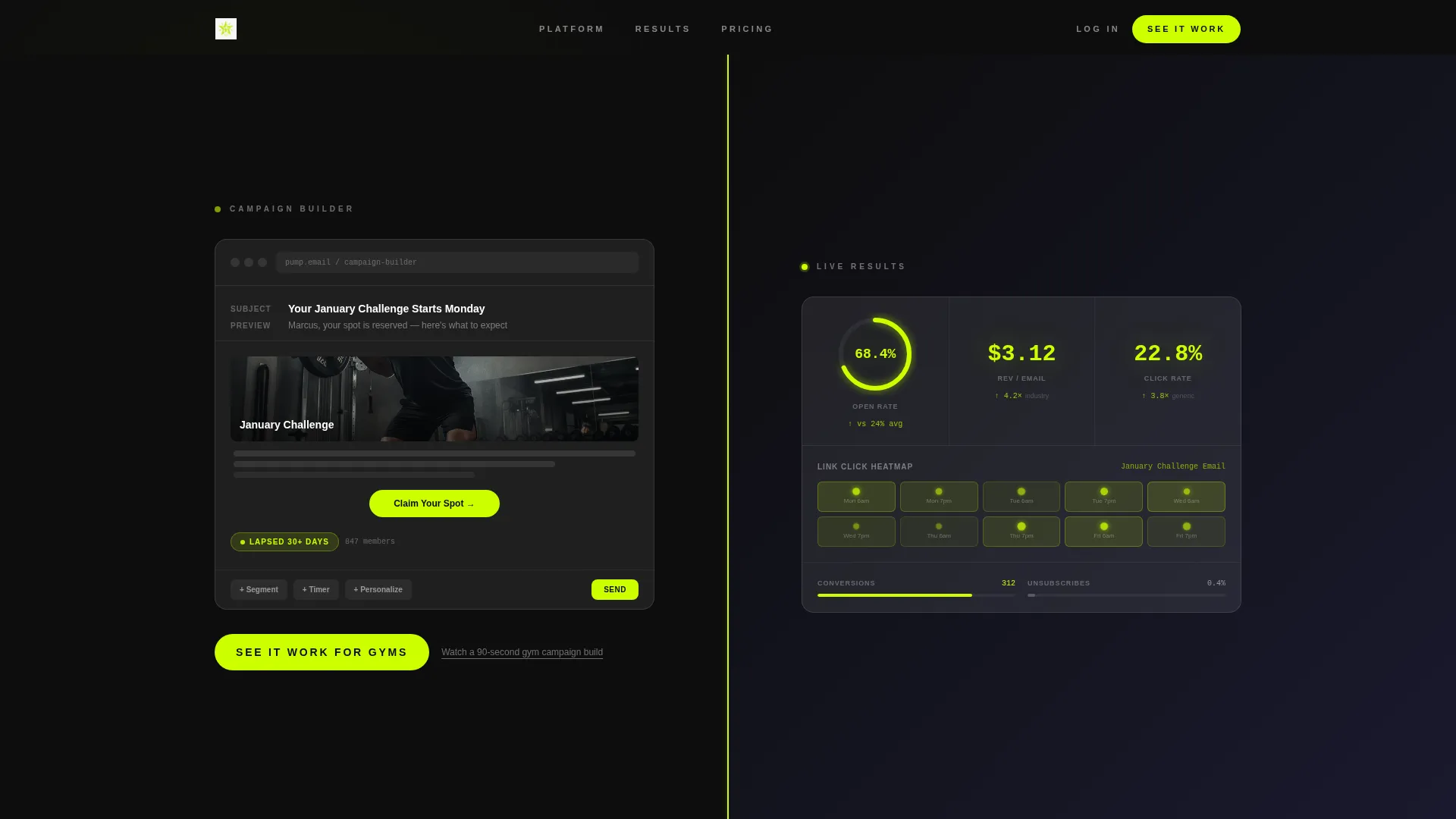
- A 50/50 split-screen header showing a live campaign builder on the left and a results dashboard on the right
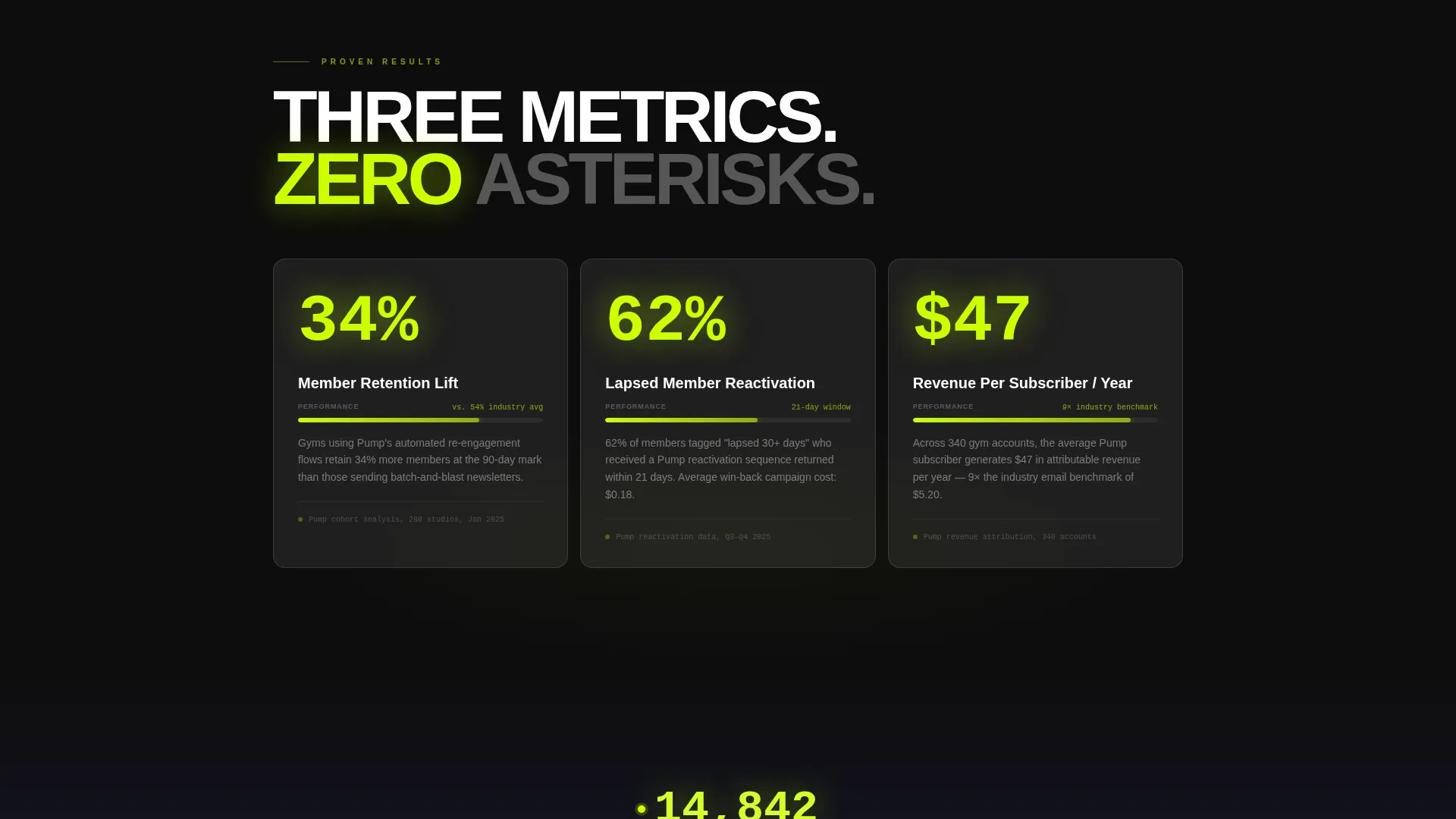
- Animated stat cards displaying retention lift, reactivation rate, and revenue per subscriber in sequence
- Two strategically placed primary calls to action and a secondary text link for visitors who need one more nudge
Feature list
This template packs a focused set of visual and structural features into a single high-converting layout. Each element is purpose-built for fitness email marketing positioning.
Split-Screen Dashboard Header
The header divides cleanly into two panels with a thin lime dividing line that pulses once on load. The left panel shows a frosted-glass email campaign builder mid-draft. The right panel displays a live results dashboard with an open rate climbing at 68.4%, a revenue-per-email ticker at $3.12, and a lime-glowing link heatmap over a class schedule.
Stats-First Scroll Structure
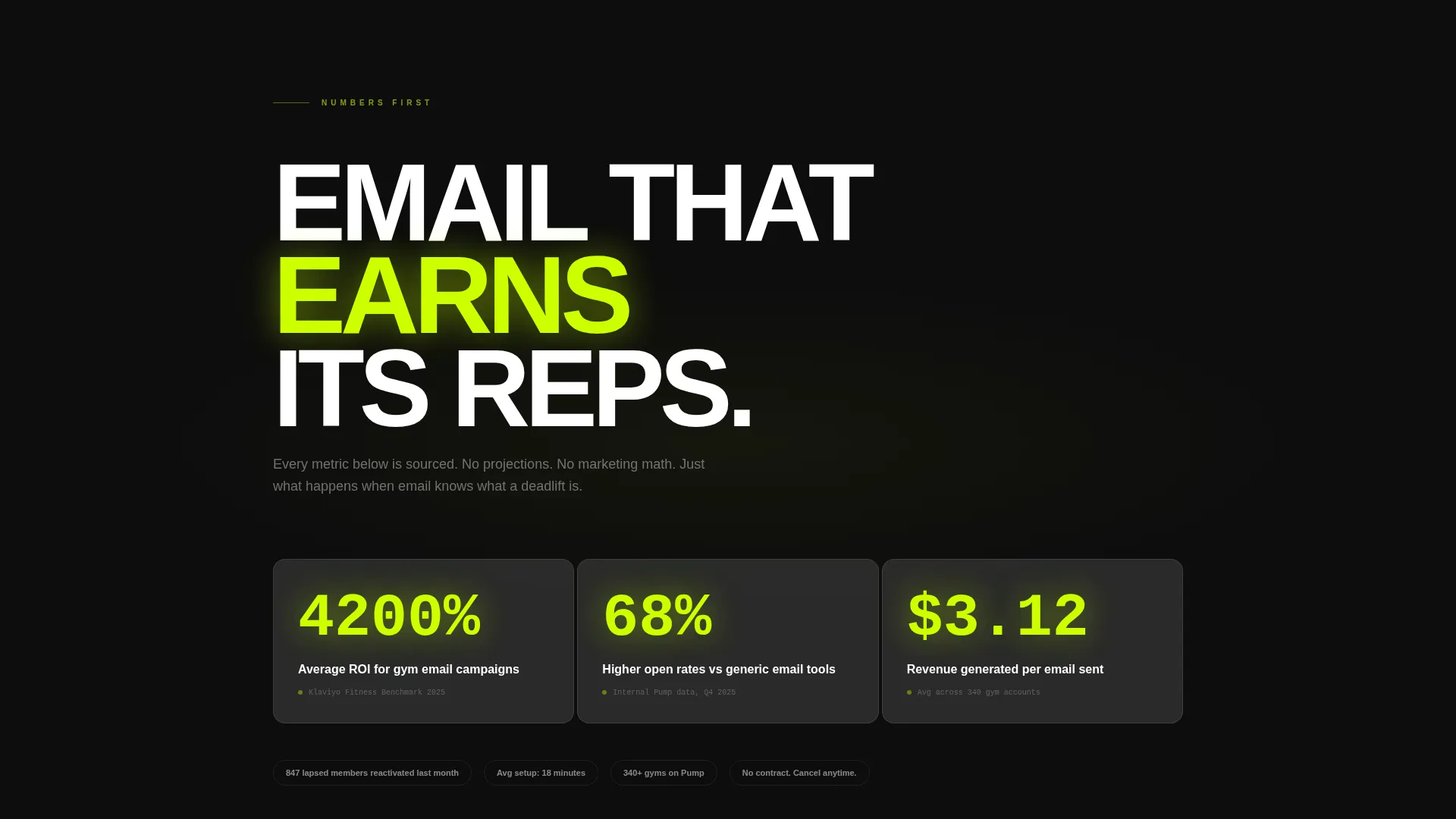
The page delivers a bold number before every explanation. Visitors see "4,200% average ROI for gym email campaigns" in electric lime before reading a single feature paragraph. Each scroll section accelerates with fewer words, bigger numbers, and faster animations.
Animated Metric Cards
Three frosted-glass metric cards animate into view in sequence. Each card displays a specific, sourced performance stat: retention lift, reactivation rate, and revenue per subscriber. The animation mimics the momentum of a campaign that is already performing.
Before-and-After Email Visual
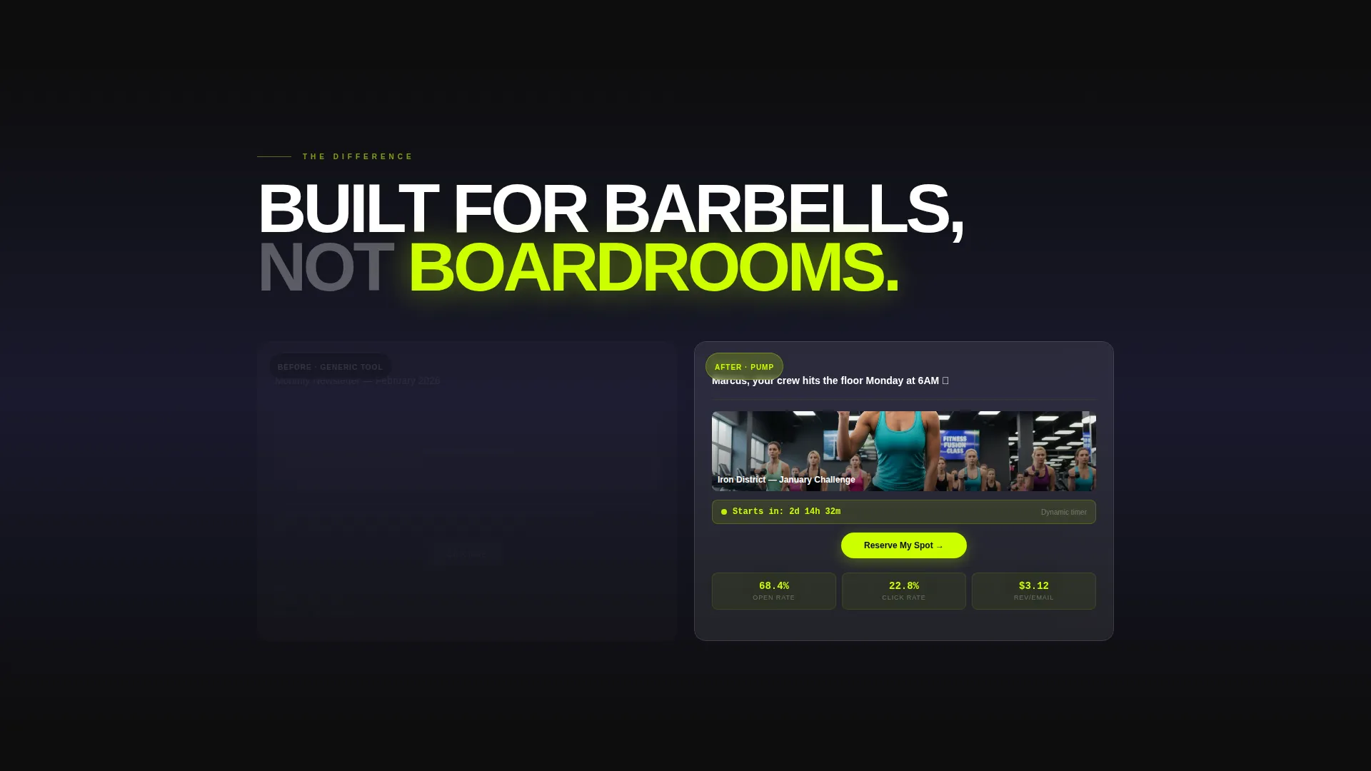
A mid-page split shows a dull generic template graying out on the left while a gym-branded email assembles itself on the right. The right side includes class photos, member first names, and dynamic countdown timers. This section communicates personalization without a single word of explanation.
Dual call to action Placement with Secondary Link
The primary call to action, "See It Work for Gyms," appears twice: once floating at the base of the header and once anchoring the final section. A secondary text link beneath each call to action reads "Watch a 90-second gym campaign build" for visitors who are not yet ready to commit. There is no form on this page.
Live Campaign Counter
The final section includes a live-style counter showing campaigns sent this month, ticking upward. This creates urgency through social proof rather than pressure copy.
Page sections overview
| Section | Purpose |
|---|---|
| Split-Screen Header | Show campaign builder and live results side by side |
| ROI Impact Statement | Lead with the 4,200% ROI stat before feature copy |
| Before-and-After Split | Contrast generic templates with gym-branded email assembly |
| Animated Metric Cards | Display retention, reactivation, and revenue stats in sequence |
| Live Campaign Counter | Build urgency with a ticking campaigns-sent number |
| Final call to action Section | Anchor the conversion with the primary call to action and secondary link |
Design & branding system
The visual identity follows a Startup Velocity theme built on a glassmorphic color system. The palette is deliberately dark and kinetic, every bright element earned by movement rather than decoration.
- Deep void black (#0D0D0D) as the base background, cool slate (#1A1A2E) behind glass layers, and frosted glass panels at 12% white opacity (#FFFFFF1F)
- Electric lime (#CDFF00) reserved for live data accents, call to action buttons, stat highlights, and the pulsing header divider line
- Glass cards float over dark backgrounds with soft blur borders, creating depth without clutter
Mobile & speed optimization
The template is structured for clean rendering on smaller screens. The split-screen layout adapts so both panels remain readable without horizontal scrolling. Animations are sequenced to feel smooth on mobile without overwhelming the viewport.
- Frosted glass panels and dark backgrounds maintain visual fidelity across screen sizes
- Stat cards stack vertically on mobile while preserving their animation sequence
- call to action buttons remain full-width and prominently placed on all viewport sizes
How this template helps you convert
Pump is designed to remove hesitation at every scroll point. The page earns trust through data before it asks for anything.
- The header dashboard shows real campaign metrics immediately, so visitors understand the platform's results before reading a single marketing claim.
- The ROI stat and animated metric cards build a case through numbers alone, reducing the cognitive load of evaluating a new tool.
- The dual call to action placement with a low-commitment secondary link means both ready buyers and cautious visitors have a clear next step.
Other information about this template
This template is a strong fit for fitness email marketing use cases where the audience already understands the value of email but needs proof of performance before committing to a platform or demo. The page is designed to stand alone without a form, letting the click do all the qualifying work.
- The template is built for single-page deployment and is not configured as a multi-page site
- The design system is fully documented with hex values, opacity levels, and font hierarchy ready for customization
- This template suits gym email marketing campaigns positioned against entry-level tools commonly used in the fitness industry
Theme
Startup Velocity
Creative direction
Stats-First Impact
Color system
Glassmorphic
Style
Split Screen (50/50)
Direction
Click-Through
Page Sections
Split-screen Dashboard Header
Stats-first Scroll Layout
Animated Frosted-glass Metric Cards
Before-and-after Email Comparison
Dual Call to Action with Secondary Text Link
Live Campaign Counter
Related questions
Is this template suitable for a single gym location or only for larger operations?
Does this landing page include a signup form or lead capture field?
Can I update the stats and numbers shown in the dashboard and metric cards?
What makes this layout different from a standard email marketing landing page?
Is coding knowledge required to customize this template?



