Software & SaaS Professional Website Template
Punchlist is a construction project management landing page template built around a dashboard-style feature matrix. It targets mid-size general contractors, project engineers, and owner's reps who need clarity across RFIs, schedules, submittals, and budgets. The glassmorphic design, amber calls to action, and progressive lead-capture form make it easy to convert serious PM buyers into sign-ups.
by Rocket studio
Quick summary
Punchlist is a single-page landing page template designed for construction project management software. It uses a frosted-glass dashboard layout to showcase features like RFI tracking, submittal management, and schedule oversight. The primary goal is lead generation, moving project engineers, general contractors, and owner's reps from first scroll to a qualified sign-up.
Who this template is for
This template speaks directly to construction software teams selling to field-facing buyers. It is built for teams who need their landing page to feel as organized as the product itself.
- Mid-size general contractors running projects in the $5M to $80M range who have outgrown spreadsheets
- Project engineers juggling multiple subcontractor schedules and needing one place to track progress
- Owner's representatives who require real-time percent-complete data without making phone calls
What problem this template solves
Active jobsites generate a flood of information. RFIs pile up, submittals get buried in email threads, and schedules slip without anyone noticing until it is too late. Most construction teams either rely on spreadsheets or pay for bloated enterprise platforms with features they never use.
- No single place where the superintendent, general contractor, and owner's rep all see the same project status
- Document control and field reporting scattered across disconnected tools and inboxes
- No way to let a prospective buyer evaluate features before committing to a demo
What you get with this template
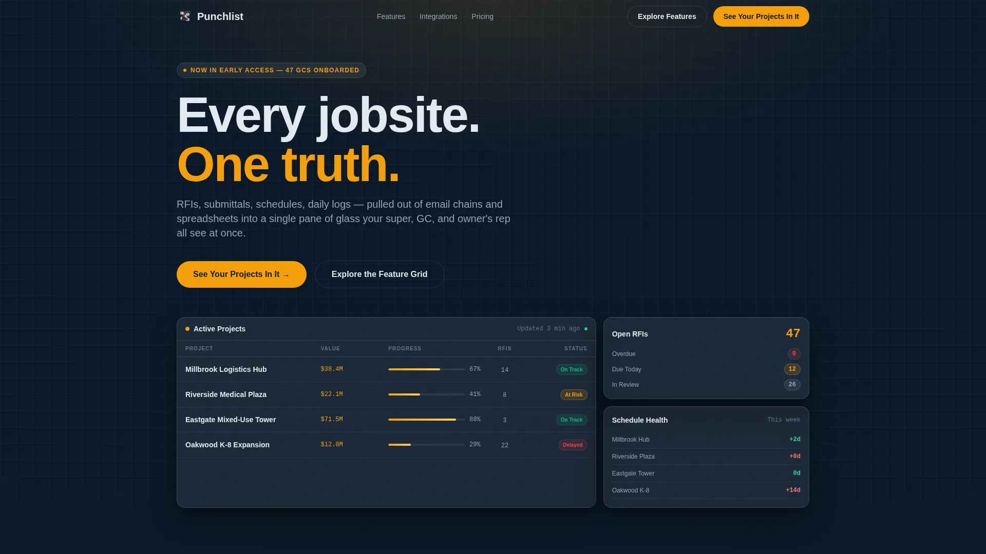
You get a full single-page layout structured around a living data grid that simulates a real construction dashboard. Every section is purposeful, and the design signals professionalism without overcomplicating the message.
- A sticky frosted navigation bar with a persistent primary call-to-action button
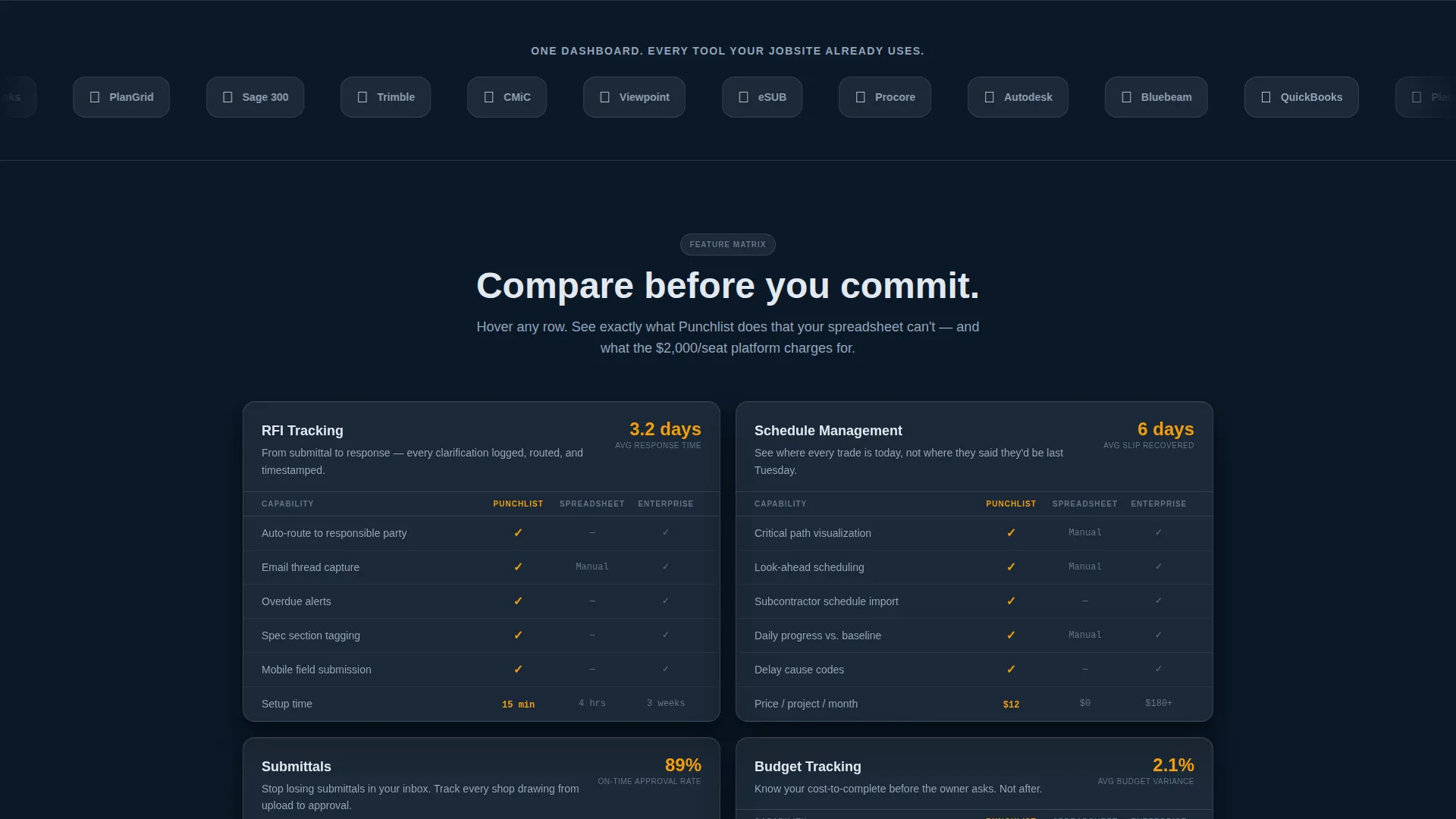
- A horizontal logo bar header that communicates integration depth at a glance
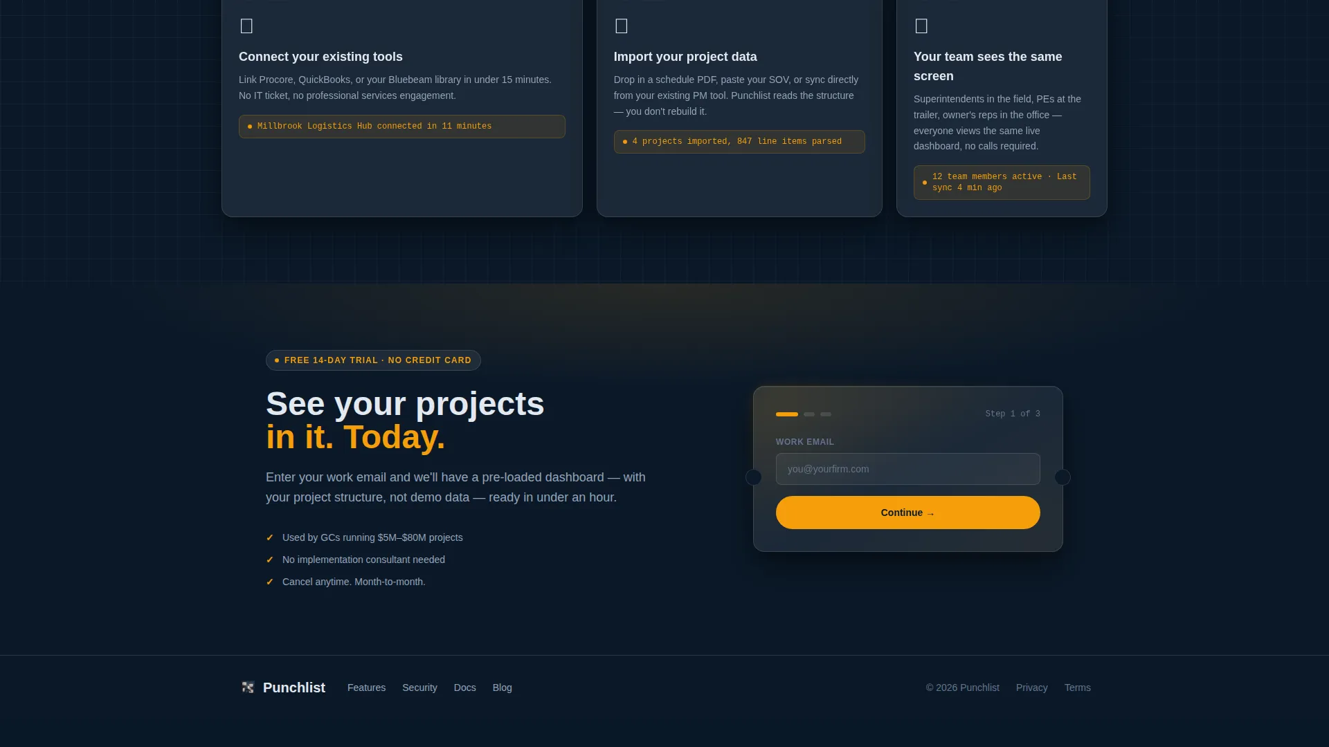
- A progressive three-field lead capture form designed to qualify buyers by company size and pain point
Feature list
This template is built around interactive, data-rich sections that walk a prospect through the full capability of a construction PM platform. Each feature card is a frosted glass panel with real placeholder data.
Scrolling Integration Logo Bar
The header opens with a slow-scrolling horizontal ribbon of construction ecosystem logos on a frosted glass rail. The headline beneath reads "One dashboard. Every tool your jobsite already uses," immediately anchoring the product as a connector, not a competitor.
Living Feature Matrix Grid
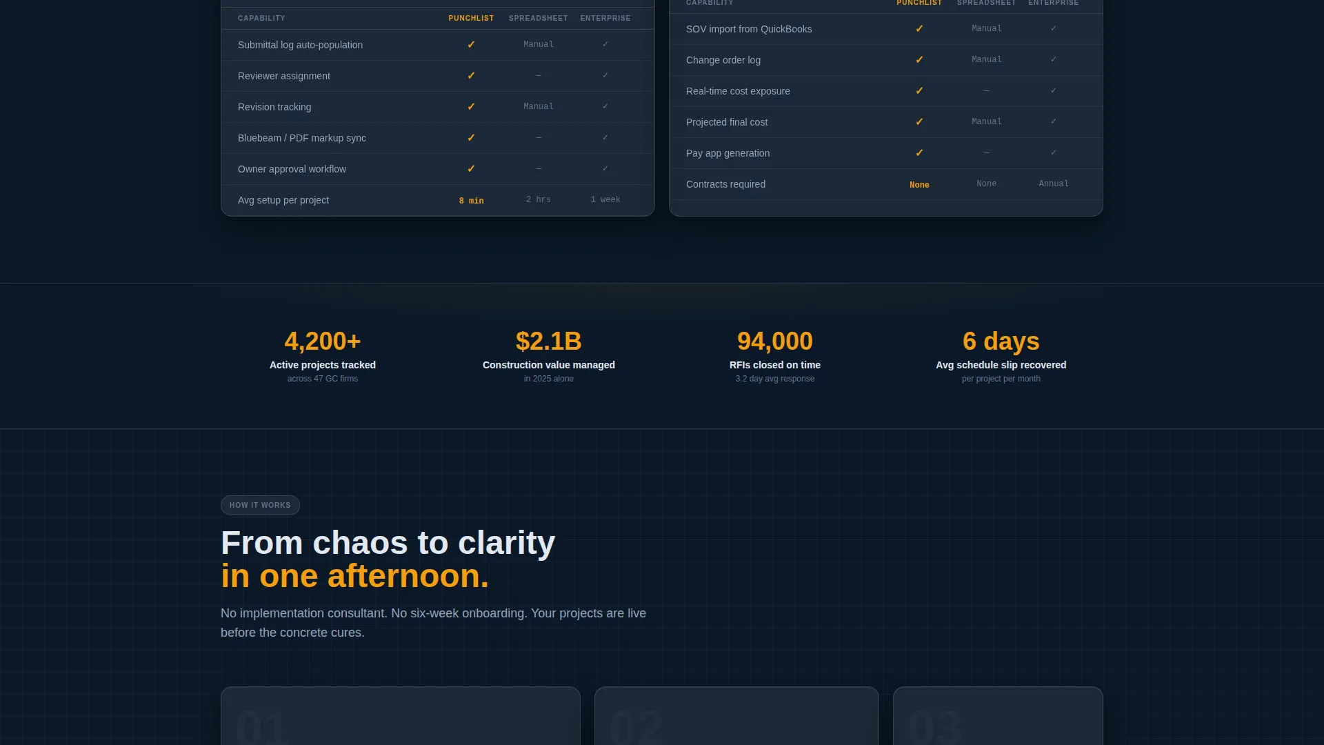
The core of the page is a data grid where each frosted glass card covers a distinct capability: RFI tracking, schedule management, daily logs, budget tracking, submittals, and punch lists. Rows highlight in safety-vest amber on hover, giving the grid an interactive dashboard feel.
Realistic Placeholder Data
Instead of generic filler text, every grid cell uses realistic project names, trade partner names, and completion percentages. This makes the template feel inhabited and helps prospective buyers visualize their own projects inside the product.
Sticky Navigation with Persistent call to action
The frosted nav bar stays fixed at the top of the page. The primary call-to-action button "See Your Projects In It" travels with the user, reducing friction between interest and conversion at any scroll depth.
Progressive Lead Capture Form
The form collects a work email first, then company size (1 to 10 projects per year, 10 to 50, or 50 and above), then a primary pain point from a dropdown. This sequence qualifies leads without overwhelming them, making every submission more useful to the sales team.
Secondary Exploration Path
A secondary call-to-action, "Explore the Feature Grid," scrolls directly to the interactive matrix. It lets cautious buyers compare features before committing, earning the click through value rather than pressure.
Page sections overview
| Section | Purpose |
|---|---|
| Sticky Nav Bar | Anchors primary call to action at every scroll depth |
| Integration Logo Bar | Signals ecosystem fit and integration breadth |
| Hero Headline Block | States the product value in one clear line |
| Feature Matrix Grid | Showcases all PM capabilities in a data grid |
| RFI Tracking Card | Details request-for-information management |
| Schedule Management Card | Shows schedule oversight and slip detection |
| Daily Logs Card | Covers field reporting and daily records |
| Budget Tracking Card | Illustrates cost visibility across the project |
| Submittals Card | Manages submittal workflows and approvals |
| Punch List Card | Tracks granular task-level completion items |
| Lead Capture Form | Qualifies and converts visitors into leads |
| Secondary call to action Block | Repeats primary offer after the feature matrix |
Design & branding system
The visual identity follows a Directory and Discovery theme using a glassmorphic color system. The overall effect is like looking through a rain-spattered windshield at a lit-up jobsite trailer at dusk: dark surroundings, warm interior glow, every element floating just above the surface.
- Deep site-blueprint navy (#0B1929) as the page background, frosted panel white at 12% opacity (#FFFFFF1F) for card surfaces, and safety-vest amber (#F59E0B) for active states and primary call-to-action buttons
- Rebar charcoal (#1E293B) for typography and data row text, keeping grid content sharp against translucent card backgrounds
- Thin 1px borders and soft blur edges on every card panel, creating a sense of depth and layering without heavy drop shadows
Mobile & speed optimization
The template is designed so that its dashboard grid and glassmorphic card surfaces translate cleanly to smaller viewports. The sticky navigation and persistent call to action remain accessible regardless of screen size.
- Frosted glass cards reflow into a single-column stack on mobile, preserving the data-grid feel without horizontal scrolling
- The progressive form sequence works as well on a phone screen as on a desktop, keeping each field step clear and tappable
- The scrolling logo bar adjusts its pace and spacing to remain legible on narrower displays
How this template helps you convert
The page is structured around a lead generation funnel that respects the buyer's need to evaluate before committing. Every design and copy decision reduces the distance between first impression and qualified sign-up.
- The sticky "See Your Projects In It" call to action stays visible at all times, so the moment a visitor is ready to act, the button is already in front of them without requiring a scroll back to the top.
- The secondary "Explore the Feature Grid" path lets skeptical buyers drill into capabilities first, building enough confidence to submit the lead form after seeing real placeholder data that mirrors their own workflow.
- The three-field progressive form collects a work email, company size, and primary pain point in sequence, so each submission arrives pre-qualified and ready for a meaningful follow-up conversation.
Other information about this template
This template is part of a broader set of construction technology landing page templates. It is built to serve software teams in the construction PM software niche who are positioning against both legacy spreadsheet workflows and heavyweight enterprise platforms.
- The template style is Dashboard and Data Grid, making it well suited for any SaaS product that benefits from showing its interface before asking for a sign-up
- The feature matrix creative direction is reusable across other software categories where side-by-side capability comparison drives purchase decisions
- The glassmorphic color system and Directory and Discovery theme can be adapted for adjacent construction technology products, field service platforms, or project tracking tools
Theme
Directory & Discovery
Creative direction
Feature Matrix
Color system
Glassmorphic
Style
Dashboard/Data Grid
Direction
Lead Generation
Page Sections
Scrolling Integration Logo Bar
Interactive Feature Matrix Grid
Realistic Placeholder Data
Sticky Navigation with Persistent Call to Action
Progressive Three-field Lead Form
Secondary Exploration Call to Action Path
Related questions
Can I customize the feature matrix cards with my own project data?
Is the lead capture form connected to a backend system?
Who is this landing page template best suited for?
Can I update the scrolling logo bar with different tool logos?
Can this template be adapted for software products outside construction?



