Construction Software Professional Website Template
Punchlist is a construction quality management landing page template built for SaaS platforms that track jobsite deficiencies. It uses a scroll-reveal layout to simulate an inspection workflow from capture to closeout. With a Tech Glass aesthetic, live metric animations, and interactive demos, it guides quality managers, general contractors, and owner's reps toward an app download without friction.
by Rocket studio
Quick summary
Punchlist is a single-page, scroll-reveal landing page template for construction quality management platforms. It opens with a live metrics dashboard, walks visitors through an inspection workflow in sequence, and closes with a frictionless app download call to action. The design runs on a Void and Violet color system with high interactivity and a mobile-first build priority.
Who this template is for
This template is built for construction technology teams that need a landing page capable of earning trust before asking for a download. It speaks directly to the people on the jobsite and in the trailer, not just the people in the boardroom.
- Quality managers and general contractors who need to demonstrate fast, auditable deficiency tracking to skeptical stakeholders
- Owner's representatives and project managers who require photographic proof and timestamped records before signing off on substantial completion
- Construction software founders and product teams launching a mobile-first inspection platform to a deadline-driven B2B audience
What problem this template solves
Construction quality management platforms face a real credibility gap. Potential users want to see the workflow before they commit to a download, and a generic landing page with screenshots does not close that gap.
- Visitors leave before converting because they cannot visualize how the platform fits into their actual jobsite routine
- Static feature lists fail to communicate the speed and precision of a real inspection cycle to time-pressured contractors
- App download pages without proof or context generate low tap rates, especially from procurement-aware owner's reps and quality managers
What you get with this template
You get a fully structured, scroll-reveal landing page that simulates the complete inspection workflow from deficiency capture through report generation and stakeholder notification. Every section is designed to build confidence before asking for a commitment.
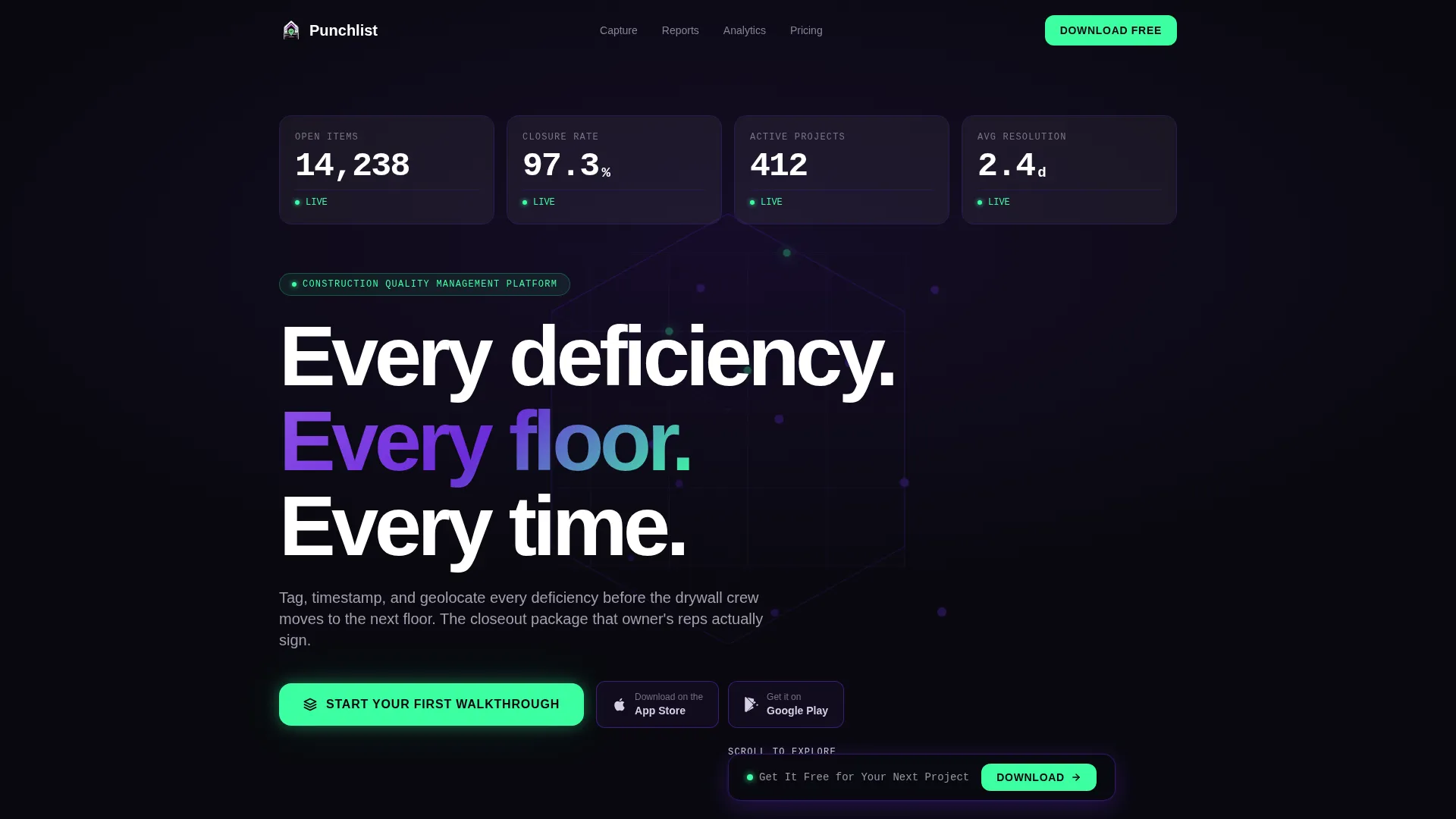
- A live metrics hero section with animated counters, an isometric building wireframe, and a bold headline that sets authority immediately
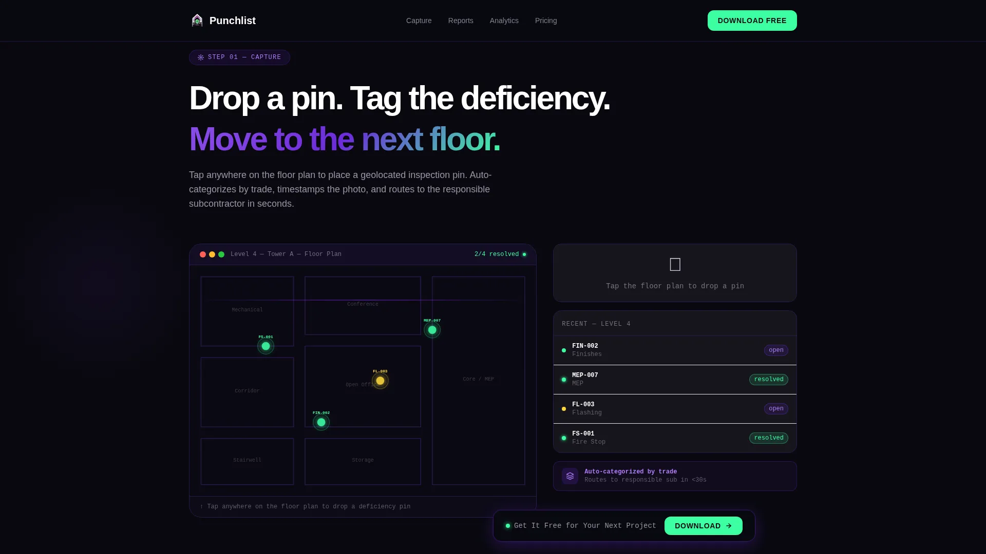
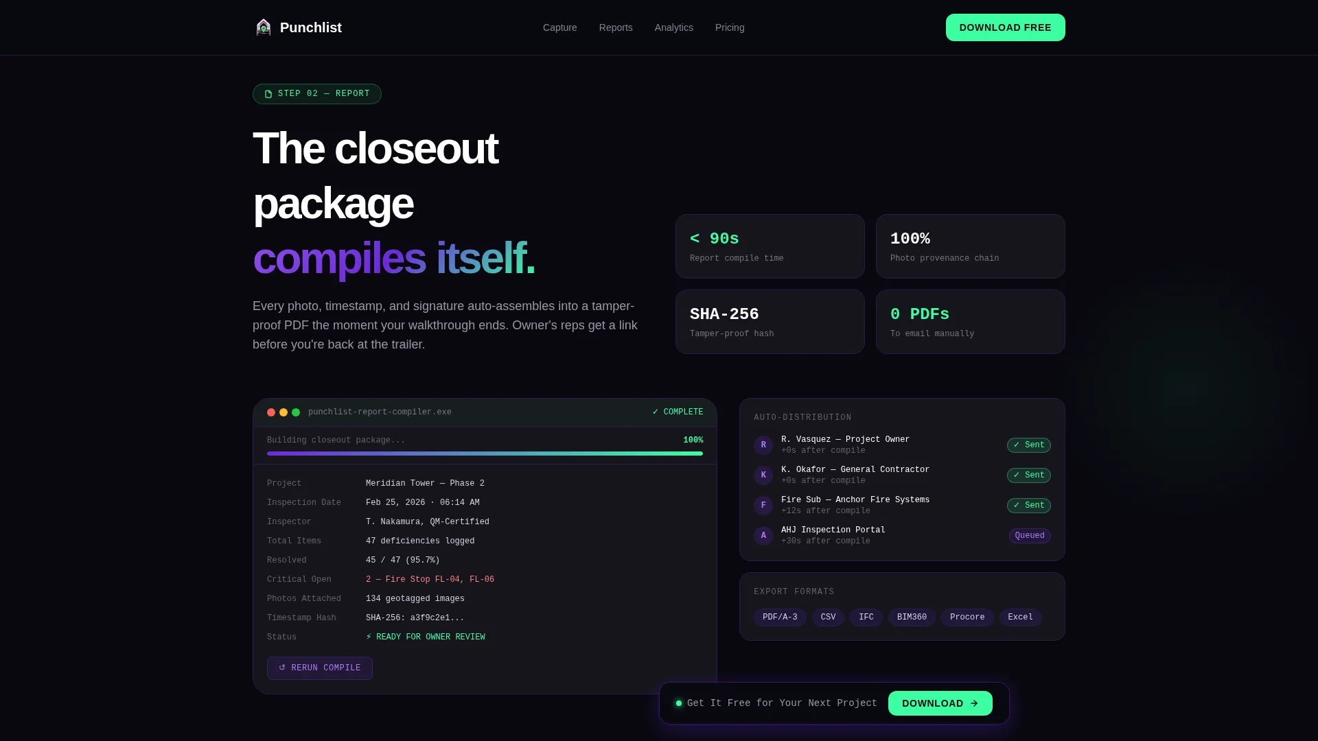
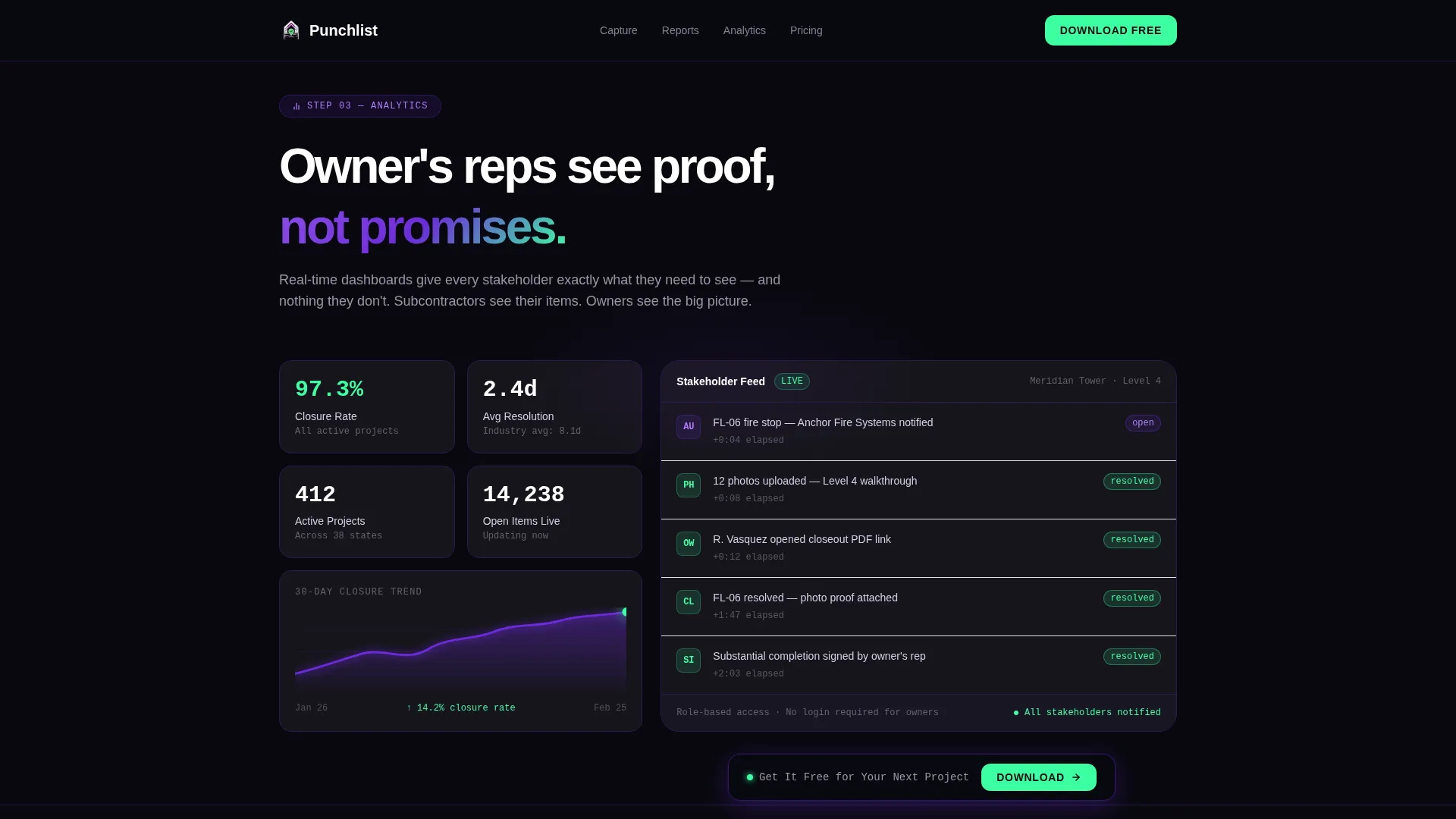
- Interactive embedded demos including a drag-to-pin floor plan simulation, an automated PDF report compilation visualization, and a stakeholder notification flow display
- A frictionless app download section with App Store and Google Play badge containers, a sticky secondary call to action, and a social proof strip showing resolution statistics
Feature list
This section covers the core functional components built into the Punchlist template as described in the source brief.
Animated Live Metrics Dashboard
The hero section opens with four oversized real-time counters rendered in a monospaced typeface. Numbers tick upward on load, displaying active project counts, closure rates, open items, and average resolution time. Behind the metrics, a faint isometric building wireframe pulses with violet nodes at each inspection point, making the data itself the visual centerpiece.
Scroll-Reveal Workflow Simulation
Each scroll step unlocks the next layer of the platform, moving from inspection capture through automated reporting, analytics, and stakeholder notifications. Glass panels materialize from the void as the user scrolls, creating a progressive reveal that mirrors an actual inspection cycle sequence.
Interactive Inspection Capture Demo
Visitors can drag a deficiency pin onto an embedded floor plan, watch the item auto-categorize, and see a photo-plus-markup interface respond in real time. This embedded simulation lets users experience the capture workflow without leaving the page or downloading anything.
Automated Report Compilation Visualization
A dedicated section shows a PDF report assembling itself on screen, pulling in pinned deficiencies, photos, timestamps, and geolocation data. The visualization communicates the closeout package concept in seconds without requiring explanation.
Sticky Secondary Call to Action
After the third scroll section, a secondary call to action bar locks to the viewport and stays visible for the remainder of the scroll. It displays "Get It Free for Your Next Project" and persists without obscuring content, keeping the conversion prompt accessible at all times.
Social Proof and Contractor Logo Strip
The page closes with a marquee-style strip of contractor company logos alongside the stat that 1.2 million deficiencies were resolved in a single quarter. This section pairs platform scale with industry credibility and supports the primary app download call to action directly above it.
Page sections overview
| Section | Purpose |
|---|---|
| Hero Metrics Dashboard | Establishes platform scale with animated stats and a bold headline |
| Inspection Capture Demo | Simulates deficiency pin drop and markup interaction on a floor plan |
| Automated Report Section | Visualizes PDF closeout package compiling from captured data |
| Analytics and Notifications | Displays stakeholder dashboard and automated notification flow |
| Social Proof Strip | Reinforces trust with contractor logos and a resolution volume stat |
| App Download Call to Action | Drives App Store and Google Play installs with frictionless badge containers |
Design & branding system
The template uses a Tech Glass visual identity built on the Void and Violet color system. Every surface floats against an absolute void black background, with frosted glass panels and glowing violet accents giving the layout a heads-up display quality that fits the early-morning construction trailer context.
- Core palette: void black (#09090F) for backgrounds, deep structural violet (#6C2BD9) for interactive and accent elements, frosted glass panel (#E8E3F3) at 60% opacity for card surfaces, electric confirmation green (#3DFFA2) reserved for resolved-status indicators and call to action buttons, frosted lavender-white (#D6D0E4) for body text, and (#2A1A4E) for structural dividers
- Typography pairing: JetBrains Mono for all metric and numeric displays, DM Sans for headlines and body copy
- Hover states bloom violet on interaction, scroll reveals use GPU-accelerated glass panel transitions, and the isometric wireframe pulses continuously to reinforce the live-platform feel
Mobile & speed optimization
The template is built mobile-first, reflecting the reality that quality managers and general contractors use this platform on iPads and phones while walking active jobsites. Desktop layout receives equal visual polish, but the base experience is optimized for touch and handheld interaction.
- All animations use GPU-accelerated transforms and Intersection Observer triggers to keep scroll-reveal transitions smooth on mobile hardware
- The sticky call to action, drag-and-pin demo, and badge containers are sized and spaced for thumb reach on tablet and phone screens
- Counter animations and glass panel reveals are scoped to avoid layout shift, keeping the reading experience stable as content loads progressively
How this template helps you convert
The Punchlist template is structured to earn the download tap before it asks for one. Visitors move through a guided experience that mirrors real platform use, reducing the perceived distance between landing and committing.
- The hero metrics dashboard establishes immediate credibility with real numbers and a visual that communicates platform scale, so skeptical contractors see proof before reading a single feature description
- The interactive workflow simulation across scroll sections lets visitors mentally complete an inspection cycle, making the app feel familiar and low-risk before any download prompt appears
- The frictionless call to action removes all form friction and pairs the primary "Start Your First Walkthrough" button with App Store and Google Play badges, making the conversion step as short as a single tap
Other information about this template
The Punchlist template is designed for construction technology teams that prioritize both visual impact and practical clarity for a B2B mobile audience. A few additional details worth knowing before you use or customize this template are listed below.
- The template is localized for English-language markets, using United States date formats and USD conventions throughout
- Animation intensity is intentionally high, including counter animations, marquee loops, isometric pulse effects, and scroll-reveal glass transitions, which makes this template best suited for platforms that want to lead with technical sophistication
- The footer follows a linear single-row layout pattern, keeping the bottom of the page clean and focused on the final call to action rather than secondary navigation
- No form fields appear anywhere on the page; the entire conversion path leads directly to app store download links, making it a true zero-friction download page
- The social proof strip is designed as a marquee component that can display multiple contractor logos in sequence alongside the 1.2 million deficiencies resolved statistic
Theme
Tech Glass
Creative direction
Interactive Explorer
Color system
Void & Violet
Style
Scroll Reveal (Progressive)
Direction
App Download
Page Sections
Animated Live Metrics Hero
Scroll-reveal Workflow Progression
Interactive Floor Plan Pin Demo
Automated Report Visualization
Sticky Secondary Call to Action
Social Proof and Logo Strip
Related questions
Who is the primary audience for this landing page template?
Does this template require users to fill out a form to convert?
Can I customize the metric numbers shown in the hero dashboard?
What makes the scroll-reveal structure different from a standard feature list page?
Is this template suited for a platform that has not yet launched publicly?



