AI-Powered Lead Scoring Landing Page Template
Qualify is a split-screen, dark-ops-aesthetic landing page template built for food and beverage AI lead scoring platforms. It pairs an animated lead-score dial, a cycling signal feed, and a side-by-side Manual Scoring versus AI comparison table to turn VP-level revenue operators into confident sign-ups. The design runs on void black, iridescent violet, and holographic teal.
by Rocket studio
Quick summary
Qualify is a high-intensity, single-page landing page template designed for AI lead scoring platforms serving restaurant chains, CPG brands, and beverage distributors. The layout uses a 50/50 split-screen structure, a Data Command visual theme, and a Comparison/Versus narrative engine. Every section builds the case that manual qualification is costing money, and every call to action earns the click before it appears.
Who this template is for
This template is built for founders, product marketers, and growth teams launching or repositioning an AI lead scoring platform in the food and beverage vertical. It speaks directly to the buyer persona without needing heavy customization. The layout, copy structure, and visual hierarchy are already calibrated for a sophisticated, data-literate audience.
- VP Revenue and Sales Operations leaders at mid-market food and beverage companies who need to show the pipeline impact of lead scoring fast
- Regional beverage distributors and franchise development teams whose sales representatives waste quota hours on leads that were never going to convert
- Marketing teams and revenue teams launching lead generation campaigns who need landing pages that communicate technical credibility and close the gap between signal and sale
What problem this template solves
Most landing pages for AI-powered software look the same: a hero image, a bullet list of features, and a generic call to action. That approach does not work for a product that replaces gut-feel lead prioritization with machine learning algorithms. Buyers need to feel the problem before they believe in the solution.
- Manual qualification is slow, inconsistent, and relies on human judgment that does not scale across hundreds of new leads arriving from multiple marketing channels each week
- Sales teams lose quota hours chasing low-value contacts because there is no reliable scoring system to separate hot leads from cold ones before the day starts
- Without predictive scoring, sales workflows break down: follow up messages go to the wrong contacts, contact details sit unranked in a spreadsheet, and promising prospects slip through unnoticed
What you get with this template
The template ships as a fully structured, single-page layout with five distinct content sections, a footer, and all the interaction patterns mapped out. You get the complete visual and structural foundation, ready to customize with your brand voice, copy, and data.
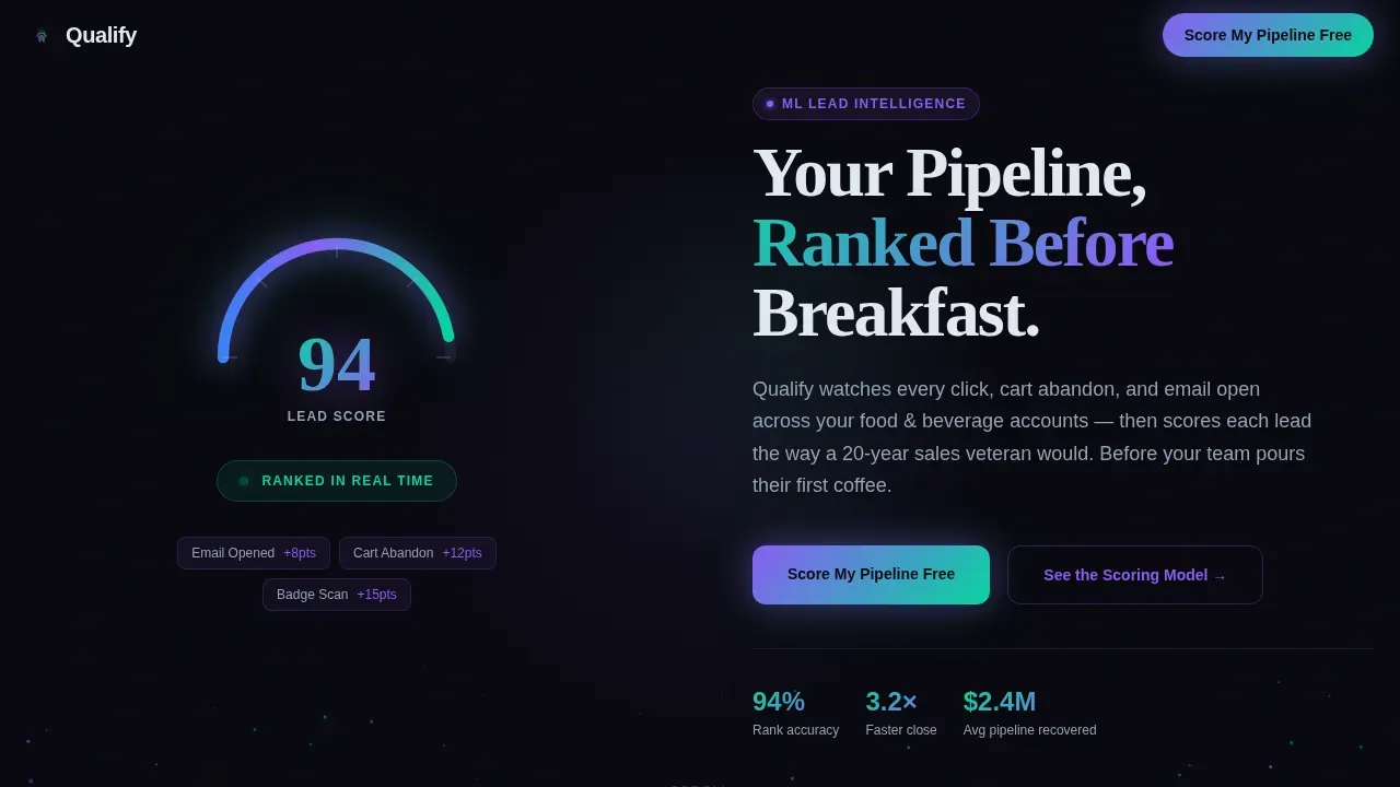
- A hero section with an animated lead-score dial (counting from 0 to 94), a particle system, a split headline, and a primary "Score My Pipeline Free" call to action
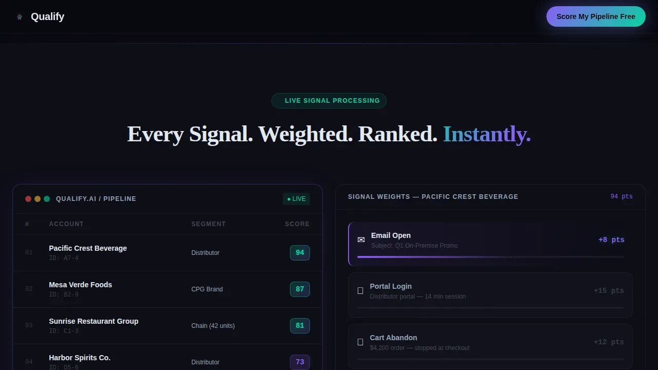
- A Signal Leaderboard split showing a static scored lead leaderboard on the left and a cycling AI signal feed on the right, covering email opens, trade-show badge scans, and distributor portal logins
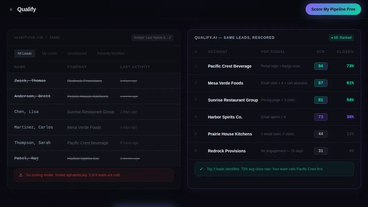
- A full versus section contrasting the old spreadsheet approach with AI-rescored leads showing predicted close rates, a territory heat map view, a quarterly revenue projection panel, and a dual call to action summary table comparing Manual Scoring versus AI across speed, accuracy, revenue impact, and ramp time
Feature list
This template comes with a focused set of built-in components that serve one purpose: convert leads from skeptical visitors into engaged sign-ups. Below are the key features included.
Animated Lead-Score Dial Hero
The hero is built around a single glowing dial that counts from 0 to 94 in real time. The arc sweeps from cold blue through iridescent violet into holographic teal, making lead scoring feel immediate and alive. Micro-particles of iridescent light drift upward around the dial, reinforcing the data-command atmosphere without any stock photography or food imagery.
Signal Leaderboard Split Panel
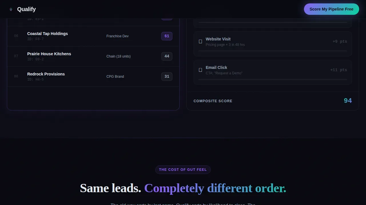
The left panel locks a static leaderboard of anonymized scored leads, ranked by their AI lead score. The right panel cycles through the behavioral signals the AI agent read to generate each score: email opens, website visits, trade-show badge scans, and distributor portal logins. Each signal lights up its corresponding weight in the scoring model, giving visitors a clear visual sense of how the AI powered lead engine works.
Old Way versus AI Comparison Engine
The core narrative section flips the split: the left side shows spreadsheet chaos and gut-feel lead prioritization, while the right side shows the same leads rescored by the AI agent, reordered by predicted close rate. This is where the template converts leads from curious to convinced. The predictive scoring result is visible, not just described, making the cost of manual qualification concrete.
Territory Heat Map and Revenue Escalation
Below the comparison, the template escalates the stakes from individual lead scores to territory-level insights. A heat map view shows lead density across regions. A quarterly revenue projection panel shows numbers climbing, reinforcing the pipeline forecasting value of the platform. Each panel uses the same iridescent accent system so engagement data feels like it generates its own light.
Dual Call-to-Action Form and Gated PDF Path
The primary call to action, "Score My Pipeline Free," appears twice: once floating after the first split-screen comparison, and again anchored at the bottom beside the summary table. The smart form captures work email, company size (via a dropdown: under 50 reps, 50 to 200, or 200 or more), and CRM platform. A secondary path offers a gated PDF titled "See the Scoring Model," capturing email only for visitors who want to understand the math before committing.
Versus Summary Table with Dual call to action
The bottom section anchors a side-by-side table comparing Manual Scoring and the AI platform across four dimensions: speed, accuracy, revenue impact, and ramp time. This section removes the last objection before the button. Both call-to-action paths are visible here, allowing sales teams and marketing teams to capture visitors at different levels of readiness.
Page sections overview
| Section | Purpose |
|---|---|
| Animated Hero Dial | Introduce lead scoring with a live-counting score dial and particle system |
| Signal Leaderboard Split | Show scored leads left, cycling AI signals right |
| Old Way versus. AI | Contrast manual qualification with AI-rescored leads and predicted close rates |
| Territory Heat Map | Escalate from individual scores to regional pipeline view |
| Revenue Projection Panel | Show climbing quarterly numbers tied to predictive lead scoring |
| Versus Summary Table | Compare Manual Scoring versus. AI across four business dimensions |
| Dual call to action Form | Capture work email, company size, and CRM platform or gated PDF email |
| Footer | Single-row linear footer pattern |
Design & branding system
The visual identity follows a Data Command theme built entirely on the AI Iridescent color system. Backgrounds stay near-black at all times. Iridescent accents appear only where data lives, making every number feel like it is generating its own light. The palette was designed to feel synthetic, luminous, and precisely intelligent, like light refracting through a prism onto a matte-black server rack.
- Color palette: void black (#09090F) for all backgrounds, iridescent violet (#8B5CF6) and holographic teal (#06D6A0) for score indicators, graph lines, and hover states, and cool silver-white (#E2E8F0) for body text and data labels
- Typography: DM Sans handles all body text, user interface labels, and data displays; Fraunces handles display headlines, giving the page an editorial authority that contrasts cleanly with the technical density of the data panels
Mobile & speed optimization
The template is designed desktop-first, matching the ops-center aesthetic and the data-dense split-screen layout. The design still includes a mobile fallback so the page remains functional and readable on smaller screens. Mobile optimization ensures that visitors who arrive from a phone or tablet can still engage with the core message and reach the call to action without breaking the experience.
- GPU-accelerated transforms power the particle system, dial counter, and signal cycling animations, keeping motion smooth without layout jank
- Intersection Observer scroll reveals control when each section animates into view, so content loads progressively and the experience feels like a countdown to deployment rather than a dump of information
How this template helps you convert
The Comparison/Versus framework is the conversion engine of this template. Every section raises the stakes before a call to action appears, so when the button does show up, the visitor has already felt the cost of not switching. AI lead scoring research shows that responding to high-intent leads within five minutes can increase qualification rates by 21 times, and the template is structured to communicate that urgency without stating it directly.
- The hero dial creates immediate credibility by showing lead scoring in motion, not just in a bullet list, anchoring the visitor's attention before any claims are made about accuracy or speed
- The Old Way versus AI section makes the cost of manual qualification visible in the same frame as the AI-powered alternative, so the call to action that follows is not a pitch but a natural next step for any revenue leader who recognizes the gap
Other information about this template
This template is built for a specific intersection: food and beverage as the vertical, AI lead scoring as the product, and VP-level revenue operators as the primary audience. That specificity makes it more effective than a generic conversion template, because the layout, narrative arc, and interaction patterns are all calibrated to the same buyer context.
- The scoring model visualization is designed to give visitors a deep understanding of how AI powered lead evaluation works without requiring a sales call first; the gated PDF path, "See the Scoring Model," supports this by nurturing visitors who need more context before connecting their pipeline
- AI lead scoring uses machine learning, predictive analytics, and data science to evaluate and rank potential customers based on their likelihood to convert; predictive lead qualification utilizing AI can reach accuracy rates of 85 to 90 percent by identifying hidden patterns from historical data, and this template is built to communicate that credibility through show-don't-tell design
- The qualify ai powered lead scoring landing page template is structured so that the ai agent behind the scoring system is always visible through data, not through marketing copy; ai insights appear as live numbers, ranked leads, and territory patterns, giving sales representatives and marketing teams a concrete reason to act
- AI lead scoring systems should be continuously reviewed and refined to improve accuracy over time; the template supports model training transparency through the scoring model PDF path and the signal leaderboard, which both demonstrate how the ai lead engine weighs engagement data and behavioral signals
- The template supports data enrichment concepts visually: the cycling signal feed shows how the ai agent pulls from multiple data points including job title, company size, portal login activity, and email engagement patterns to build each score; this helps potential customers understand lead quality before they ever fill out the smart forms
- For teams evaluating paid plans versus a free plan, the dual call-to-action structure accommodates both paths: the primary form captures high-intent visitors ready to score their pipeline, while the gated PDF path nurtures visitors who need more time; this makes the template effective for both small businesses entering the ai lead scoring space and larger revenue teams managing hundreds of potential leads across complex sales workflows
- The template also supports lead research workflows by showing how the ai powered system surfaces promising prospects from existing CRM data and crm data exports, reducing manual data entry and allowing sales teams to focus outreach on high potential prospects with confirmed engagement patterns; loyal customers and reactivation-ready contacts can also be surfaced through the same predictive analytics layer
- Conversion rate improvements tied to ai driven insights are reflected in the design itself: every iridescent data point is a visual argument for switching; ai-powered systems can analyze hundreds of behavioral signals to score leads instantly for real-time prioritization, and the template shows that process unfolding in front of the visitor across every scroll section
Theme
Data Command
Creative direction
Launch Energy
Color system
AI Iridescent
Direction
Comparison/Versus
Page Sections
Animated Lead-score Dial with Particle System
Cycling AI Signal Feed Panel
Old Way Versus AI Comparison Section
Territory Heat Map and Revenue Projection
Dual Call-to-action with Smart Form and Gated PDF
Versus Summary Table at Page Bottom
Related questions
Who is this landing page template designed for?
What sections are included in this template?
Does this template support a gated content path?
What information does the primary form collect?
Can this template be adapted for verticals outside food and beverage?



